
Most advertising is seen without really being seen. That sounds slightly bleak for an industry that spends extraordinary amounts of money attempting to attract attention, but it’s the reality of the environment we’re working in. People walk through cities surrounded by commercial messages, scroll through feeds containing hundreds of branded images and watch television with another screen sitting somewhere within easy reach. We have become highly efficient filters. The brain recognises the general shape of an advert, works out roughly what kind of information it contains and frequently decides whether it deserves further attention before the conscious part of us has become particularly involved.
That is what makes the rare advert that interrupts this process so valuable. You know the feeling because it normally happens before you have time to rationalise it. You walk past a poster, register it, take another couple of steps and then look backwards. Something hasn’t quite resolved. Perhaps the billboard itself seems to be behaving incorrectly. Maybe the photograph is showing a product doing something advertising convention tells us a product absolutely shouldn’t do. Perhaps there are only a handful of words on it and your brain has to finish the thought, or a familiar object has been placed in such an unfamiliar context that you need another second to work out what you’re seeing.
That second matters. Kantar’s work on advertising attention treats it as a gateway to effectiveness rather than an end in itself. Visibility isn’t enough; useful attention needs to connect the audience to a brand, idea or association worth remembering. An advertisement can therefore be extremely noticeable and still achieve remarkably little if the thing people remember is entirely disconnected from whoever paid for it.
This is why the best creative advertising is rarely just louder advertising. Bright colours, enormous lettering and a twenty-metre screen can certainly attract the eye, but visual volume is easy to copy. The more interesting eye catching ads create a temporary problem for the viewer instead. Something is contradictory, missing, oddly funny or somehow behaving in a way it shouldn’t, and the brain wants to resolve it.
The audience stops being a passive recipient for a moment and becomes part of the communication.
What Makes an Ad Impossible to Ignore?
Horizon FCB MENA
SomeOne Founder Simon Manchipp puts the challenge rather more aggressively:-
“An ad that blends into the environment is a donation to the media owner; if you aren't disrupting the scenery, you shouldn't be paying to be there. The secret to making people stop is cognitive dissonance—showing them something that their brain cannot immediately resolve. Put a swear word in an elegant serif font, show a pristine product being destroyed, or make a claim so audacious it borders on the illegal. The goal is to deeply offend the status quo so that the people who matter fall madly in love with you. Safe work is instantly forgettable work, and forgettable work is the most expensive mistake a brand can make.”
There is obviously a deliberately provocative edge to that, and not every successful advert needs to offend anybody. Plenty of brilliant work operates through warmth, beauty or understatement. But the idea of cognitive dissonance is useful because advertising always exists inside a set of expectations. Roadsides are covered in rectangles. Food photography has conventions. Fashion advertising has its own visual language. Banks, supermarkets, automotive brands and charities each tend to communicate in recognisable ways. Viewers have absorbed these codes over decades even if they couldn’t consciously describe them, which means work that obeys every convention can often be understood, categorised and ignored extraordinarily quickly.
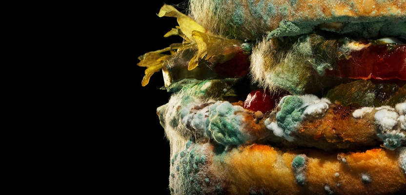
The more useful form of disruption is therefore not simply making something look strange. It is finding a convention worth breaking because breaking it exposes the proposition more clearly. Burger King’s famous Moldy Whopper (as glimpsed in the header image) remains the textbook version. Fast-food photography had spent decades pretending ageing did not exist, so showing a Whopper slowly decomposing was immediately unsettling. The image broke practically every rule of appetising food photography, but the contradiction resolved directly into the message about removing artificial preservatives.
That distinction is everything. If the mould were unrelated to the claim, it would merely have been disgusting. Because the decay itself demonstrated the product truth, the shock became communication rather than decoration.
This is a recurring characteristic of great advertising design. The part that catches the attention and the part that communicates the idea are usually the same thing.
Creativepool Annual 2026: Ads That Make You Look Twice
You don’t have to spend long exploring the Creativepool Annual 2026 winners to find contemporary examples of this principle. What’s interesting is how differently they create that moment of interruption. Some use humour, some use visual metaphor, some turn the media format itself into the demonstration, and some use an incredibly simple object or symbol to make an abstract problem suddenly tangible. The common thread is not a particular visual style. It is that each piece finds one recognisable expectation and then does something more interesting with it.
Samsung Galaxy A Series: An Ad That Erases Ads
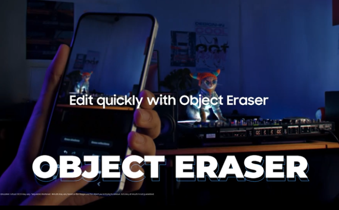
Starcom Bangladesh’s An Ad That Erases Ads is almost suspiciously neat as a creative proposition. Samsung needed to demonstrate the Galaxy A Series’ AI Object Eraser, but simply buying another digital banner to advertise the feature would have placed the campaign inside exactly the kind of clutter people habitually ignore.
Instead, the advertising became the unwanted object.
Working with online news publishers, the team invited users to physically circle intrusive advertisements on screen using the same gesture required by Samsung’s Object Eraser. The banner then disappeared. The media placement stopped describing the product feature and started behaving like it. According to the Creativepool case study, the campaign generated more than 4.1 million impressions, around 271,000 clicks and saw more than 632,000 ads erased by users. It went on to take Silver in both Advertising: Digital and Digital at the Annual.
What makes it a particularly useful example is that the media frustration and the product benefit are identical. The viewer doesn’t have to imagine why Object Eraser might be useful because the advert creates a small moment in which they actively want it.
Lidl by Lidl
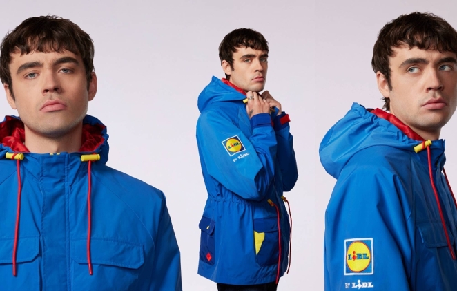
The Romans’ Lidl by Lidl took a completely different route, hijacking the cultural heat around the Oasis reunion without spending the sort of money required to become an official sponsor. The campaign played on the supermarket and band’s pre-existing banter, producing limited-edition Lidl-branded jackets that looked like credible pieces of fan merchandise rather than conventional grocery advertising.
According to the Creativepool project, around 195,000 people tried to get hold of the jackets, with proceeds going to charity, and even Noel Gallagher’s agent reportedly got in touch about jackets for the band. The campaign won Silver and People’s Choice in OOH as well as Silver in Integrated at the Annual.
The double take here comes from category collision. Lidl is behaving like a music and streetwear brand at precisely the cultural moment when doing so makes sense. It doesn’t simply attach its logo to Oasis fever. It finds an object people actually want.
That difference between participating in culture and merely sponsoring it is substantial.
Cadbury: Made to Share 2.0
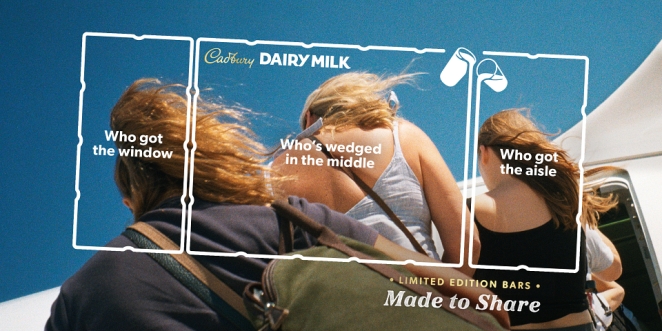
VCCP’s Made to Share 2.0 demonstrates another route: take an asset the audience already understands and make it perform the creative idea. A Dairy Milk bar is divided into 36 chunks, so the campaign used those physical divisions as a way of visualising who deserves the biggest share in different relationships and situations.
In airport DOOH, for instance, the familiar outline of the chocolate bar was laid across images of travellers and friendship groups, allocating chunks according to relatable behaviours. The campaign took Silver for Copywriting and Print and Bronze in OOH in the 2026 Annual.
What makes it effective is that the packaging isn’t simply shown. Its structure becomes the visual language of the campaign. The product contains the idea.
Brands spend fortunes creating distinctive assets and then often use them as little more than badges at the bottom of advertisements. Cadbury demonstrates what happens when the asset itself is allowed to become creative material.
The Toothless Brush
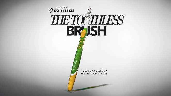
Inbrax’s The Toothless Brush for Fundación Sonrisas is perhaps the purest visual metaphor among the Annual winners. Oral-health inequality in Chile was severe but struggled to command media or political attention. Instead of producing another awareness campaign built around statistics, the agency manufactured something instantly wrong: a toothbrush with no bristles.
The object looked like a premium oral-care product until people noticed the one feature that made it completely useless. That absence became the metaphor for a health system failing to provide access to basic dental care. The campaign was seeded to journalists, influencers and opinion leaders and, according to its Creativepool case study, reached 9.4 million people and generated more than 311,000 organic interactions. It won Silver in Social Good at the Annual.
This is precisely the kind of cognitive dissonance Manchipp is talking about. We know what a toothbrush is supposed to look like, so the missing bristles create immediate friction. More importantly, solving the visual puzzle delivers the entire argument.
A healthcare report may require concentration.
A toothbrush that cannot brush teeth requires almost none.
UN Women Türkiye: Full Stop
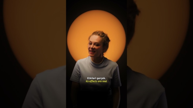
Publicis Groupe Türkiye’s Full Stop proves that stopping power can also be created with something tiny. The campaign addressed digital violence against women by turning a simple orange dot emoji into a recognisable symbol people could place beneath abusive social-media comments. The dot functioned both as a visual “full stop” and as a public signal that a line had been crossed.
The campaign deliberately relied on participation rather than heavy paid media, spreading through volunteers, brands, sports clubs, broadcasters and academic communities. The Creativepool case study reports millions of impressions across digital, television, print and outdoor, and the work took Silver in Social Good at the Annual.
It’s an important reminder that creative ads do not need endless information to make an issue visible. Sometimes an incredibly small symbol becomes powerful because the audience immediately understands both how to use it and what using it means.
The simplicity also makes participation easier. Nobody needs to download a branded tool, learn a new interaction or write an essay. One orange dot is enough to join the message.
Sex Education for Parents
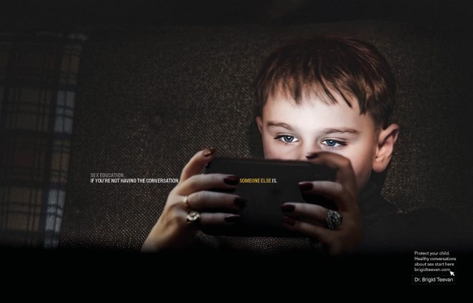
Thought Boxes’ Sex Education for Parents, which won Bronze in Print, starts from an uncomfortable but highly recognisable tension: parents often delay conversations about sex, consent, pornography and online influence because those conversations feel awkward, while their children continue learning about those subjects from somewhere else anyway.
The strategic thought is essentially that silence isn’t empty. If parents don’t fill the space, peers, platforms and strangers online will. The campaign turns that uncomfortable truth into a direct reason to act rather than relying purely on fear or generic “have the conversation” messaging.
The lesson here is less about visual spectacle than psychological recognition. An ad can make people stop because it shows them something they haven’t seen before, but it can also stop them by articulating something they already know and have been avoiding.
That can be equally powerful.
Primark: Shockingly Chic
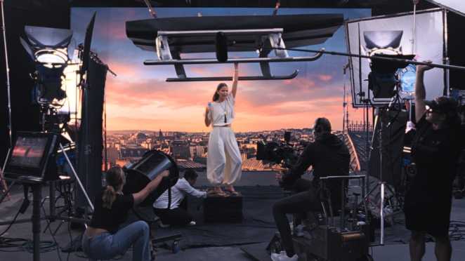
VCCP’s Shockingly Chic for Primark deserves a place here because its entire proposition is built around the double take. The campaign was constructed to resemble a highly serious, high-fashion advert before revealing that the styling and clothes were Primark, at prices dramatically below what the visual language had encouraged the viewer to expect.
Primark itself described the campaign as bringing to life the “double-take moment” when shoppers realise that something appearing expensive is unexpectedly affordable. The work won Bronze and People’s Choice in Advertising: TV in Creativepool’s Annual 2026.
The advertising works by exploiting category codes. The audience knows what luxury-fashion advertising normally looks like, so the surprise is not that the film is visually strange. It is almost the opposite. It looks too convincingly expensive for the brand and price eventually revealed.
Once again, the dissonance leads directly back to the proposition.
What Brands and Agencies Can Actually Learn From These Ads
Stink Films
Looking across those Annual winners, plus the longer history of memorable outdoor and print work, the practical lessons are surprisingly consistent. None requires a particular technology or media budget, but all require a degree of strategic discipline before anybody begins designing the execution.
- Find the convention before you try to break it. “Make it disruptive” is useless creative direction unless you first understand what the audience normally expects from the category, medium and brand.
- Make the interruption prove something. Samsung erases the ad because the phone erases unwanted objects. The Toothless Brush is useless because the campaign is about lack of access to useful dental care. The creative mechanism should make the proposition clearer.
- Turn distinctive assets into ingredients, not logos. Cadbury’s chunks become the idea. McDonald’s can turn Arches into directions. A strong brand system gives creatives more material to play with than a logo placed in a corner.
- Let the media behaviour do some of the explaining. Digital banners can become product demos. Billboards can fold. Locations, weather, movement and audience behaviour can all become part of the execution rather than merely carrying it.
- Give people a gap they can comfortably close. The best visual metaphors and jokes require a moment of participation, but the answer shouldn’t need a strategy deck. A second look is useful; bafflement isn’t.
- Be ruthless about the number of ideas in one execution. Stop-and-look-twice advertising is usually built around one strong contradiction, image, line or behaviour. More information rarely makes the core thought stronger.
- Make sure the brand owns the attention. If audiences remember the stunt but attribute it to a competitor, the creative has worked harder for somebody else than it has for you. Distinctive assets and brand behaviour need to sit inside the idea.
- Ask what the second look reveals. Surprise is only the beginning. Once somebody has stopped, what have they learned? The strongest work rewards curiosity with a product truth, brand belief or genuinely useful point.
That final question is particularly important because attention has become fashionable as a metric in its own right. There is obviously value in being looked at, particularly in an environment where so much advertising receives barely conscious processing, but a brand ultimately needs more than the physical fact that somebody’s eyes paused for another second.
The second look needs somewhere to go.
The Advertising Design Behind the Big Idea
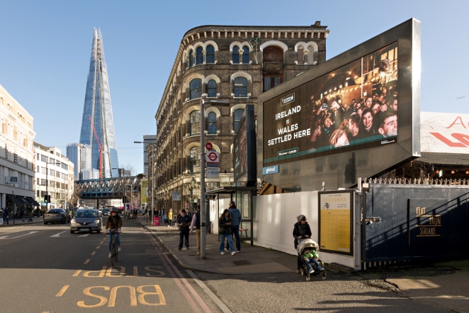
Posterscope
This is where design becomes much more than styling. Great advertising design does not simply make a strategic idea attractive once the clever people in the meeting room have finished thinking. It controls how quickly the audience encounters the contradiction, what information arrives first and how satisfying the eventual resolution feels.
That is why so many visually powerful campaigns are simpler than their weaker competitors. They have a clear hierarchy. Something attracts the eye, something creates the question and something allows the brand or proposition to resolve it.
The discipline is often subtraction rather than addition.
Outdoor advertising makes this especially obvious because nobody is obliged to stop and read. A billboard can contain seven product benefits, but the person passing it is under no contractual obligation to care about any of them. The Economist’s classic work understood this, as did McDonald’s Follow the Arches, Apple’s Shot on iPhone and British Airways’ Magic of Flying. Each campaign makes one creative move strong enough to justify the space.
Creativepool’s own retrospective of the best OOH advertising of all time repeatedly returns to that economy. The best executions tend to be describable in one sentence because the strategic complexity has been compressed before it reaches the audience.
That is difficult work.
“Fold the billboard because the phone folds” sounds obvious after the fact. “Turn part of the Golden Arches into directions” sounds obvious too. The achievement lies in finding the simple move among the hundred more complicated ones that could have been made.
This is why brands need to resist the temptation to insure every idea against misinterpretation. A visual metaphor that works does not require a headline explaining it. A product demonstration does not need six accompanying claims. If the audience can work something out for themselves, allowing them to do so can create a more memorable interaction than telling them the answer twice.
The job of design is to make sure the gap is deliberate.
Why Humour, Metaphor and Context Work So Well
Edelman
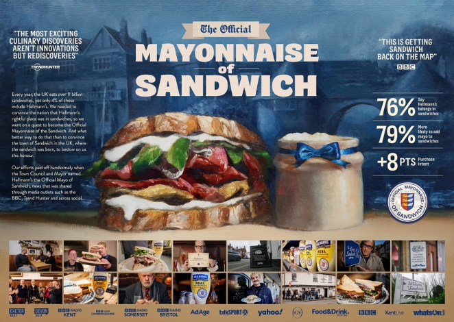
Humour is particularly effective because it gives people an immediate reward for attention. IPA research published in 2024 found that 64% of UK adults surveyed agreed they were more likely to remember advertising they found funny, although responses varied considerably by age, category and style of humour.
What matters creatively is whether the joke strengthens the brand or simply occupies the audience for a few seconds. Burger King tends to do this well because the humour frequently emerges from something true about its products, category or rivalry with McDonald’s.
Visual metaphor performs a similar function without requiring a punchline. The Toothless Brush works because the audience immediately understands that the object is broken, then discovers that the broken object represents a broken system. Moldy Whopper asks people to reconcile the unpleasant image with the claim about preservatives. Cadbury’s chocolate chunks turn the physical product into a diagram of generosity.
These devices work because the audience participates in completing the communication. The advert gives you two pieces of information that don’t initially seem to fit and the small pleasure of understanding the relationship makes the experience more active.
Context can perform the same job. Lidl by Lidl becomes more interesting because it appears inside a live cultural conversation around Oasis. Samsung’s Object Eraser becomes more meaningful because it operates in exactly the kind of cluttered digital environment users want to clean up. A piece of creative can therefore become far more arresting when the location, moment or medium supplies part of the idea.
The implication for agencies is significant. Media should not always arrive after the concept has been approved. Sometimes the interesting creative question is inseparable from where and how people encounter the work.
If you could put this idea anywhere, it may not yet be specific enough.
A Second Look Is Only Valuable if the Brand Owns It
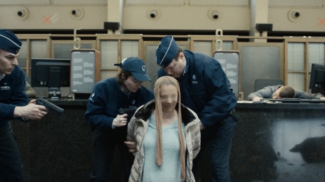
CZAR Be
This is the part of the attention conversation creative people occasionally prefer not to discuss. Advertising can be spectacularly memorable while the advertiser remains strangely absent from the memory.
Everyone knows the funny ad.
Nobody knows whose funny ad it was.
That is why creative advertising and distinctive branding have to work together. If the thing producing attention is generic enough that another business could have made it, the brand is relying on attribution happening afterwards.
Strong brands have a considerable advantage because they possess assets audiences already know. McDonald’s can show part of an arch. Cadbury can build ideas around the structure and colour of its packaging. A distinctive character, sonic cue, type treatment, verbal rhythm or product silhouette can perform the same function.
This does not mean making logos enormous. It means recognising that branding should exist throughout the creative idea rather than being applied after it.
Indeed, one sign of a mature identity is that the brand can sometimes become less explicit. The audience gets pleasure from recognising a fragment. The missing information becomes part of the game.
But that freedom has to be earned through consistency.
A company that changes visual language every campaign cannot suddenly expect people to recognise its colour from fifty metres away.
Surprise Is Bigger Than Shock

Manchipp’s argument about cognitive dissonance is useful, but it would be a mistake to reduce it to offensiveness. Shock is only one form of violated expectation.
An advert can surprise because it is beautiful in a category that normally looks ugly. It can be quiet in an environment full of noise. It can become useful. It can behave with unexpected humility. It can acknowledge an obvious problem competitors pretend does not exist. It can appear somewhere strangely specific.
Primark’s Shockingly Chic actually works because the first impression is almost aggressively conventional. It looks like expensive fashion advertising. The disruption arrives when the brand and price contradict the assumptions created by that aesthetic.
Samsung does something different by allowing people to remove the advert itself. Full Stop takes something as mundane as punctuation and turns it into a collective social signal. The Toothless Brush uses absence.
Different devices.
The same deeper principle.
The audience expects A.
The brand gives them B.
Then explains, through the execution itself, why B makes more sense.
That is much more durable than simply asking how to be shocking.
What Makes These Advertisements Memorable?
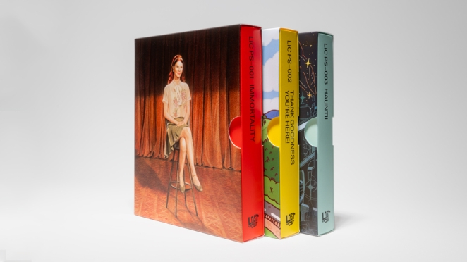
Lost In Cult
The answer is not their awards, production budgets or technologies. Those things may help, but they are not what ties the work together.
They each contain a thought that can survive outside the case-study film.
- A toothbrush with no bristles.
- An advert you can erase.
- A Lidl jacket caught up in Oasis mania.
- A chocolate bar divided according to who deserves the largest share.
- An orange dot that ends digital abuse.
- A luxury-fashion film revealed to be Primark.
You can describe each idea without needing to describe every execution, which is usually a very good sign.
This is also why the strongest examples of creative advertising tend to feel simple after somebody else has made them. All the strategy, production, argument and iteration have been compressed into something the audience can understand without knowing any of that work happened.
That simplicity should not be mistaken for obviousness.
The industry produces thousands of posters containing too much information precisely because finding one clear, surprising idea is difficult. It is easier to make the headline bigger than it is to find a better headline. Easier to add animation than identify what deserves to move. Easier to buy a larger media format than create a reason for somebody to look at it.
Stopping power ultimately comes from having something worth stopping for.
So, How Do You Make Someone Look Twice?
VML
Start by understanding what the first look normally contains.
What does advertising in your category usually show? What does everybody say? Which visual conventions have become almost invisible through repetition? What does the customer already assume the advert is going to tell them?
Then look for the productive contradiction.
Not randomness. Not controversy for its own sake. Not a giant CGI product smashing through a building because somebody saw another brand do it last year.
Find the contradiction that reveals something true.
If the product removes things, perhaps the advert should disappear. If your brand is about sharing, perhaps the product itself can show how sharing works. If the problem is invisibility, make the invisible absence physical. If the proposition is unexpectedly good value, perhaps the advertising should initially look far more expensive than the price.
The creative leap should make the strategic idea easier to understand, not harder.
That is what the best Creativepool Annual winners demonstrate so clearly. Their executions vary wildly, but the attention mechanism and the communication are rarely separate.
They don’t ask people to stop simply because the work is unusual.
They make being unusual the shortest route to the point.
And that is probably the distinction worth remembering the next time somebody asks for an ad that “really cuts through”.
Don’t start by asking how to make it louder.
Ask what expectation you can make the audience reconsider.
Give them something they think they understand.
Change one important thing.
Then reward them for looking again.