


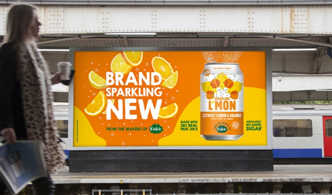
Out-of-home advertising has always had a nasty habit of exposing weak thinking. A TV spot can hide behind music, pacing and a decent casting choice. A social campaign can survive on repetition, targeting and a few algorithmic favours. A poster gets none of that. It has to work in public, at speed, often in bad weather, against distraction, routine and half a dozen competing stimuli. That’s precisely why the best OOH ads of all time still feel so impressive. They don’t merely occupy space. They command it. And because out-of-home is, by definition, advertising seen in public spaces, the very best work becomes part of the texture of a city rather than an interruption imposed on it.
That still matters now. Industry bodies report that OOH reaches 98% of the UK population every week, that the average UK adult spends more than three hours a day out and about, and that 98% of marketers already use OOH in purchase-driven initiatives.
WARC, meanwhile, reported healthy global growth in digital out-of-home, forecasting worldwide DOOH spend to reach $17.6bn in 2025. In other words, outdoor advertising isn’t some nostalgic holdout from the age of glue and six-sheets. It’s still a live, growing, highly public medium with real reach, real authority and an increasingly serious role in the media mix.
So, when we talk about the best out-of-home advertising of all time, what we’re really talking about is a canon of ideas that understood the medium’s pressure and used it brilliantly. Some of these billboard ads are funny. Some are elegant. Some are technical marvels. Some are barely ads at all in the conventional sense. A few come from categories or cultural moments we’d approach very differently now.
But all of them prove the same underlying point: when a brand gets outdoor right, it can sear itself into public memory with a speed most media can only envy.
Why great out-of-home advertising still wins

Posterscope
There’s a reason outdoor advertising inspires such affection among creatives. It is brutally clarifying. The best OOH ads do not have the luxury of over-explaining themselves. They are built around compression: one thought, one visual move, one line, one tension, one moment of recognition. OOH is a medium of memorability, presence, impact and where strategy has to become visible. If the idea isn’t legible at a glance, it doesn’t matter how clever the deck looked in the meeting.
That’s why the greatest billboard campaigns tend to feel inevitable once you’ve seen them. They don’t read like hard work. They read like truth delivered with confidence. The audience is usually asked to do a tiny amount of decoding, but never too much. Enough to feel smart. Not enough to feel burdened. That balance is harder than it looks. Most weak outdoor work fails for one of two reasons: either it’s trying to say five things at once, or it’s so pleased with its own cleverness that it forgets people are walking past with coffee, shopping bags and ten other things on their minds.
The best poster ads know better. They understand that public space rewards boldness, but it also rewards courtesy. Great outdoor respects the audience’s time. It arrives quickly, lands cleanly and leaves a residue. Sometimes that residue is a laugh. Sometimes it’s admiration. Sometimes it’s just the satisfying feeling that a brand has said exactly the right thing in exactly the right way. That residue is what turns a billboard into a memory, and a memory into fame.
The best OOH ads ever made
Virgin Atlantic: “BA Don’t Give a Shiatsu”

Virgin Atlantic’s “BA don’t give a Shiatsu” remains one of the sharpest examples of challenger-brand poster copy ever produced. The line took a real service benefit, the shiatsu massages available to Virgin passengers, and weaponised it against British Airways in six wickedly efficient words. Briffa notes that the campaign appeared on giant billboards placed outside Heathrow airport, underlining its comparative sting at the exact location where the rivalry mattered most.
What makes it work is the total collapse of joke and proposition. The line is funny, but it’s not just funny. It tells you what Virgin offers, tells you who Virgin is positioning itself against and gives the brand a cheeky underdog swagger in one hit.
That kind of poster writing looks easy until you try to do it. Then you realise just how rare it is for a line to be provocative, useful and on-brand all at once.
The Economist: “I Never Read The Economist”

If you want to understand why headline-led outdoor still terrifies mediocre writers, start with The Economist. The 1988 poster “I never read The Economist.” — “Management trainee. Aged 42.” did not merely sell a publication. It established a whole worldview: dry, superior, self-aware, flattering to the reader and faintly cruel to the person outside the club. Creative Review describes David Abbott’s 1988 poster campaign as effectively launching The Economist brand as we know it today in nine words.
Its power comes from what it leaves unsaid. The viewer completes the joke. The line does not say, “Successful people read The Economist.” It lets you infer the insult, which is much more pleasurable and much more memorable.
That is the trick with great headline-led OOH. It doesn’t lecture. It lets the audience feel clever for arriving at the point themselves.
Channel 4: “Friends Ends Fri”

Channel 4’s “Friends Ends Fri” is an almost absurdly elegant example of how little a billboard sometimes needs to do. Released in May 2004 by 4Creative for Channel 4, the ad promoted the final UK airing of Friends by simply rearranging the letters and visual rhythm of the sitcom’s title into a public goodbye.
The genius is in the restraint. This could have been sentimental. It could have been loud. It could have been stuffed with cast photography and emotional copy. Instead, it uses the familiar dot-separated typography of the title treatment and lets the audience feel the ending for themselves.
It works because it understands the cultural temperature of the moment. Fans did not need persuading that the finale mattered. They needed a shared sign that the ending was happening. The poster gave them that, and it did so with a smile rather than a sob.
Wonderbra: “Hello Boys”

Wonderbra’s 1994 “Hello Boys” poster is impossible to discuss honestly without acknowledging its complications. The image of Eva Herzigová in a black bra, looking down at her cleavage, became one of the most famous British billboards of the 1990s. It is also very much a product of an era when the male gaze was not exactly hiding in the corner. Glamour later reported that the ad had been voted the most iconic billboard of all time, which says something about both its impact and its ability to lodge itself in popular memory.
As a piece of outdoor advertising, it is brutally immediate. Black-and-white photography. Minimal copy. A provocative line. A model whose expression seems to complete the joke before the audience does. It is not subtle, and it was never trying to be.
Its legacy is more complicated now, but its place in the OOH canon is secure because it shows the medium’s ability to create instant fame. It made the brand unavoidable almost overnight, which is exactly what a billboard is built to do.
Silk Cut

Silk Cut is a very different kind of landmark. Where Wonderbra went for blunt-force immediacy, Silk Cut built a long-running visual system out of suggestion, symbolism and lateral thought. Stanford’s tobacco advertising archive notes that in 1984 the Gallaher Group hired Charles Saatchi’s agency to create a campaign that could obey UK cigarette advertising restrictions while still promoting the brand. The result was a series of visual puns using purple silk and literal cuts through fabric.
The category itself now feels dated at best and toxic at worst. That matters, and it should not be brushed aside. But the creative principle remains worth studying. Silk Cut showed how distinctive brand assets can do the work of communication even when explicit messaging is restricted.
The ads trained the audience to decode the brand through colour, material and visual metaphor. That is a powerful lesson beyond tobacco: when a brand system is strong enough, suggestion can carry enormous weight.
Absolut

Absolut’s outdoor and print work deserves its place because it turned a product silhouette into an almost inexhaustible creative system. The brand’s own history points to “Absolut Perfection”, created by TBWA in 1980, as the first Absolut vodka ad, and the bottle became the organising idea for decades of advertising that followed.
The bottle shape did not merely appear in the work. It governed the work. City by city, object by object, situation by situation, the campaign kept finding new ways to make the same asset feel fresh.
That is much harder than constant reinvention. Any brand can chase novelty by throwing away its assets every few years. Absolut did the more disciplined thing. It repeated with variation until the bottle became a visual language.
The wider lesson for OOH is obvious: distinctive assets are not decoration. In outdoor, they are often the whole game.
IBM: People for Smarter Cities

IBM’s People for Smarter Cities remains one of the cleanest examples of outdoor advertising becoming genuinely useful. The posters bent into ramps, benches and rain shelters, transforming billboards into small pieces of urban infrastructure. Fast Company reported that the campaign, created by Ogilvy France, won the Outdoor Grand Prix at Cannes, while D&AD described the work as advertising that could inform and provide a service at the same time.
What makes it endure is not simply the construction. It is the fact that the creative idea proves the brand promise instead of merely stating it. “Smarter cities” is not a claim on a poster. It is a bench. It is a shelter. It is a ramp.
That’s outdoor at its best: not a message placed in the world, but an idea that changes how a tiny piece of the world behaves.
McDonald’s: Follow the Arches

Geoff Wilton
McDonald’s Follow the Arches is so simple it almost feels rude. D&AD describes the campaign as a wayfinding system created by cropping the Golden Arches into directional paths, turning an under-used brand asset into a design system adaptable to global markets.
The confidence here is extraordinary. The campaign does not show the full logo. It barely needs to. It slices the arches down into fragments and trusts the public to understand the instruction. That trust is the idea.
It is also a reminder that the strongest brand assets can survive damage. In fact, sometimes they become more powerful when partially withheld. A brand that can be recognised from a cropped fragment has earned a level of visual equity most marketers only pretend to have.
British Airways: Magic of Flying

British Airways
British Airways’ Magic of Flying is still the textbook example of digital OOH using technology for wonder rather than gimmickry. The One Club describes the work as the world’s first billboards that reacted to planes flying overhead, displaying the flight number and origin of the passing BA aircraft, with dynamic retail messaging matched to each route. D&AD’s case study adds that the billboards ran in Piccadilly Circus and on the M4 route to Heathrow, triggering when a BA flight flew overhead.
For all the technical sophistication, what people remember is not the data plumbing. It is the child pointing up at the sky.
That is why the campaign worked. The technology served a human moment. It made people look up, literally and emotionally. The data gave the ad credibility. The gesture gave it magic.
Spotify: “Thanks, 2016. It’s Been Weird”

Spotify’s Thanks, 2016. It’s Been Weird showed how data-led OOH could feel human rather than cold. The One Club notes that the campaign used 164 unique data stories across 11 countries, placing hyper-local creative in the neighbourhoods where those listener behaviours came from.
That is the difference between data as surveillance and data as cultural observation. Spotify did not simply say, “We know what you listened to.” It used aggregate listening behaviour to tell jokes about the year, about communities and about the weirdness of shared taste.
So much data-driven advertising arrives dressed as insight but sounds like admin. Spotify’s outdoor had a pulse. It turned analytics into personality.
Apple: Shot on iPhone

Apple’s Shot on iPhone platform made an equally important point in a quieter register. The original World Gallerycampaign turned outdoor space into a public photography exhibition, showcasing iPhone images from users around the world. One Club described the 2015 work as Apple turning outdoor advertising space over to iPhone 6 users, while 9to5Mac reported that the World Gallery featured images from 162 users across 73 cities in 25 countries.
The idea was brilliantly economical. Product proof, user creativity and brand aspiration all became the same thing. Apple did not need to claim the camera was powerful in a long body-copy argument. It simply put the evidence on buildings at enormous scale.
The platform has endured too. In 2025, Cannes Lions awarded Shot on iPhone the Creative Effectiveness Grand Prix, with Contagious reporting that Apple and TBWAMedia Arts Lab won the honour for the long-running campaign.
What the best OOH ads of all time still teach brands
Look across the best OOH ads of all time and the same lessons keep surfacing.
One idea beats ten messages every single time
The Economist, “Friends Ends Fri” and “Follow the Arches” all work because they are reduced to a single. clean move. One deduction. One joke. One visual instruction. There is no clutter to fight through and no explanatory paragraph waiting to rescue the work later. That kind of reduction feels risky inside organisations because it leaves nowhere to hide. But in outdoor, that is exactly the point.
Distinctive brand assets aren’t a nice extra, they are often the whole game
The best billboard campaigns are usually built around something only that brand could plausibly own: the red-and-white authority of The Economist, the purple slash of Silk Cut, the bottle silhouette of Absolut, the Golden Arches of McDonald’s, the recognisable user-made aesthetic of Apple’s Shot on iPhone. Brands that lack those assets tend to compensate with volume, complexity or borrowed style. Brands that possess them can whisper and still be heard.
Humour remains one of outdoor’s great unfair advantages
Humour is still one of the fastest ways to make a fleeting encounter memorable, which is exactly what Sharman was getting at in that long, enthusiastic defence of headline-led posters. Virgin’s anti-BA line still gets repeated because it’s funny. Spotify’s data jokes travelled because they were funny. Even “Friends Ends Fri” gets its emotional sting from a sly typographic smile. Outdoor is not the place for indulgent wit that takes thirty seconds to unpack. But it is absolutely the place for a line or visual turn sharp enough to make somebody feel briefly delighted on the way to somewhere else.
The medium itself can and should contribute to the idea
IBM’s posters became infrastructure. British Airways made a billboard react to the sky above it. McDonald’s turned brand signage into directions. This is one reason OOH still feels so alive, even after every new platform has spent years promising to replace it. Outdoor has a relationship with real place, real movement and real public life that other media still struggle to replicate. When a campaign makes genuine use of that fact, it gains a kind of authority you can’t fake on a feed.
The greatest out-of-home advertising never feels like it’s trying too hard
That doesn’t mean it was easy. Usually the opposite is true. “Effortless” outdoor is almost always the result of brutal editing, deep strategic clarity and a creative team willing to kill anything that slows the idea down. But when that discipline is there, the finished work takes on a strange kind of public grace. It feels as though it belongs where it is. As though the city was waiting for that line, that image, that visual trick all along.
That is why the best billboard ads endure. They are not simply clever pieces of advertising history. They are public artefacts. People quote them years later. They reference them in briefs, in award juries, in pub arguments, in agency corridors, in magazine features exactly like this one. Some of them survive because they were funny. Some because they were beautiful. Some because they made the medium itself feel newly possible. All of them survive because they understood a hard truth that remains true now: if you can say something brilliantly in a glance, you can last a very long time indeed.
How Creativepool Can Help You Find the Right OOH Advertising Partner
Michael Scantlebury
The best out-of-home advertising looks simple when it works. A cropped arch becomes a direction. A headline becomes a brand worldview. A billboard reacts to a plane overhead. A phone camera turns public space into a global gallery. But that kind of simplicity is rarely simple to make. It usually takes a sharp strategy, a brave creative idea, brutal editing, strong art direction, smart media thinking and a team that understands how people actually move through the world.
That’s where Creativepool can be a useful place to start. For brands, marketers and founders planning an outdoor campaign, Creativepool’s company directory offers a way to discover agencies, studios and creative companies with experience across advertising, campaign strategy, media, design, copywriting, experiential, production and digital out-of-home. That matters because OOH is not just another format to resize. It’s a public medium with its own rules.
A brand looking for a classic billboard campaign may need a creative team that can reduce a complex proposition to one unforgettable line or image. A business planning a digital OOH campaign may need a partner who understands data, location, motion, timing and context. A challenger brand may need an agency capable of finding the kind of provocative, single-minded positioning that made campaigns like Virgin Atlantic’s “BA Don’t Give a Shiatsu” so memorable. A larger brand may need a studio that can turn distinctive assets into a flexible outdoor system, as McDonald’s did with Follow the Arches or Apple did with Shot on iPhone.
Creativepool can also help businesses find the individual specialists who make outdoor campaigns work. Through the Creativepool talent network, brands and agencies can connect with art directors, copywriters, designers, motion specialists, creative technologists, photographers, illustrators and production talent who understand how to make work land quickly and clearly. That can be particularly useful for smaller brands that don’t need a huge agency relationship, but do need the craft and discipline required to make outdoor feel properly considered.
For brands still shaping the brief, browsing Creativepool Awards and agency case studies can also help clarify what good OOH thinking actually looks like. The strongest outdoor campaigns don’t simply fill a media space. They use that space intelligently. They understand location, movement, scale, public behaviour and the strange little contract between a brand and someone passing by with half their attention elsewhere.
That’s the real lesson from the best OOH ads of all time. Outdoor rewards brands that know what they want to say and have the confidence to say it with discipline. Creativepool can help those brands find the agencies, studios and creative talent capable of doing that work: the people who can turn a brief into a public idea, a poster into a memory and a media placement into something that actually belongs in the world.


John Martin May 3rd, in the morning
Well done - good read.