
A logo is one of the few decisions a small business makes that compounds over time. It doesn’t just sit on a website or a sign. It becomes a signal. A shortcut. A way for customers to recognise, remember and judge a business in seconds.
And yet, for something so influential, logo design is still often treated as a finishing touch rather than a strategic starting point.
Of course, you’ll find thousands of small business logo examples online but what’s often missing is context. Why do certain logos actually work in the real world? How do they help businesses grow? And what separates the ones that quietly succeed from those that hold brands back?
What Defines a Strong Small Business Logo?
A strong logo isn’t about style. It’s about performance.
For small businesses, that performance is measured in clarity, recognition and adaptability. It needs to work harder than a corporate logo because it often carries more of the brand burden. A multinational can support its identity with big campaigns, retail environments, sponsorship, PR, packaging systems and years of accumulated memory. A small business often has a shopfront, a website, an Instagram profile, a business card and a few precious moments to make an impression.
That makes clarity essential. The best small business logos remove friction. They don’t ask the audience to decode meaning. They communicate quickly enough to be useful.
Memorability matters too, but not in the way people often assume. Memorability does not come from stuffing a logo with detail. It comes from owning a clear idea. The mark needs a shape, rhythm, typographic treatment or visual cue that can be recognised after repeated exposure.
Flexibility is just as important. A small business logo might need to appear on packaging one day, a social avatar the next, then signage, uniforms, invoices, pitch decks, email signatures, loyalty cards, delivery bikes or event stands. If it only works in one polished mock-up, it isn’t doing enough.
And then there’s alignment. A logo should feel like a natural extension of the business behind it. A bakery, vineyard, physiotherapy practice, vegan challenger brand, community organisation and digital-first fitness label all have different needs. The logo should understand those differences rather than blindly follow whatever visual trend happens to be circulating on design Instagram.
Best Small Business Logo Examples
Rabbit Rabbit: Memorability Through a Single Idea
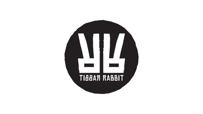
The Rabbit Rabbit branding leans into its name as a conceptual device. That’s often the smartest place for a small business logo to begin: not with abstraction for the sake of it, but with something genuinely ownable already sitting inside the business.
The repetition of “Rabbit Rabbit” becomes visual, rhythmic and distinctive. Rather than searching for a generic symbol, the identity builds directly from what makes the name memorable. That clarity of thinking is what gives the logo its strength. It is recognisable not because it tries to stand out artificially, but because it commits fully to a single idea.
That’s a useful lesson for small businesses. Distinction doesn’t always require complexity. Sometimes it comes from noticing the strongest thing already present in the brand and sharpening it until it can carry the identity.
Sow the City: Flexible Identity With Real-World Use in Mind
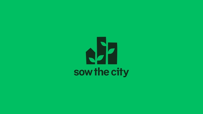
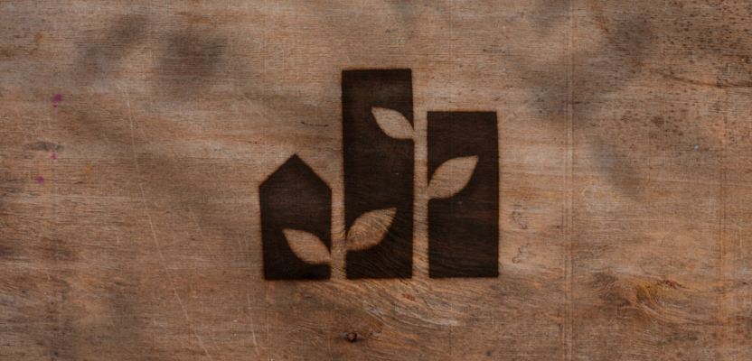
The Visual Identity for Sow the City is designed with that reality in mind. It adapts across signage, printed materials and digital platforms without losing coherence, which is exactly what a small organisation needs from its logo and identity system.
The logo isn’t rigid. It is structured enough to remain consistent, but flexible enough to work in different environments. That balance is what allows the identity to scale alongside the organisation. It can support communications, community work, events and digital content without needing to reinvent itself every time it appears.
What makes the Sow the City identity especially useful as a small business logo example is its authenticity. It avoids many of the visual clichés associated with sustainability and community work. Instead of leaning too heavily on predictable green-branding shorthand, it feels grounded, practical and unpretentious.
The result is a mark that communicates purpose without overexplaining it. For mission-driven businesses, that’s a delicate but important balance.
Bonbird Chicken Shop: Visibility in a Busy Category
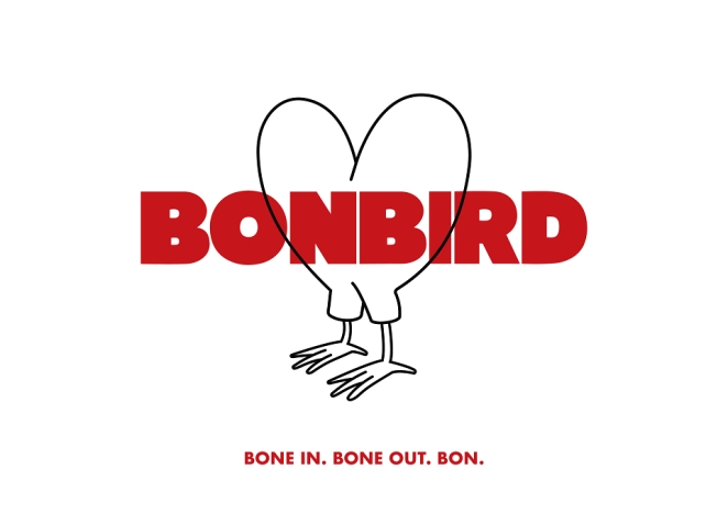
The Bonbird Chicken Shop identity reflects the pace and energy of fast-casual dining. That matters because restaurant branding has to work in unusually demanding conditions. It needs to read quickly, carry atmosphere and remain legible across menus, signage, delivery platforms, social content and packaging.
Bonbird’s identity is bold, direct and highly visible. The typography has the confidence needed for a category where customers often make decisions quickly and where visual noise is everywhere. It doesn’t try to be overly clever. It focuses on being effective, which is exactly what the category demands.
That restraint is worth noting. Food and hospitality brands often overcomplicate their logos in an attempt to show personality. Bonbird shows that personality can come from confidence, clarity and energy rather than decorative overload.
Domaine de Mourchon: Premium Without Pretension
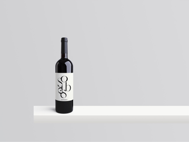
The Domaine de Mourchon Logo and Soubois Label Design operates in a category where perception is everything.
Wine branding often leans heavily on heritage cues, sometimes to the point of indistinguishability. Crests, scripts, seals, estates, tasteful restraint: all useful in theory, but very easy to overdo.
Here, the logo uses classic typographic structure but applies it with restraint. The letterforms are refined without being ornate. The spacing is deliberate, giving the mark room to breathe. This creates a sense of quiet confidence, which is often more persuasive than overt signals of luxury.
In a retail context, this matters enormously. Customers make decisions quickly, often based on visual cues alone. The logo communicates credibility immediately, positioning the brand as established and trustworthy without needing to shout.
The lesson for small businesses is clear: premium doesn’t have to mean fussy. Often, the more confident move is to remove what isn’t needed.
Frozen Bliss Creamery: Designing for Experience
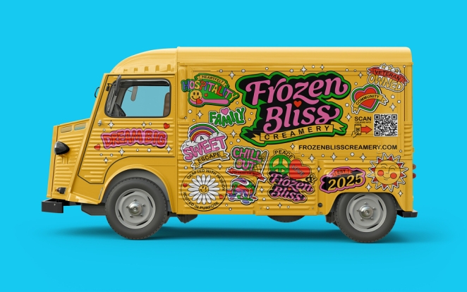
The Frozen Bliss Creamery Visual Identity Kit is built as a system rather than a standalone logo. That’s the important thing here.
The mark itself is expressive and playful, but its real strength lies in how it integrates with illustration, colour and pattern. Across packaging, food trucks and social content, the logo becomes part of a larger visual language.
This consistency builds recognition over time. Each interaction reinforces the brand. The logo doesn’t carry the full weight of the identity by itself, which is exactly how good branding should work. A logo is important, but it’s rarely enough on its own. It needs a world around it.
For small businesses in experience-led categories, Frozen Bliss is a useful reminder that the logo should help set the tone, not merely label the product.
The Flavourists: Designed to Scale
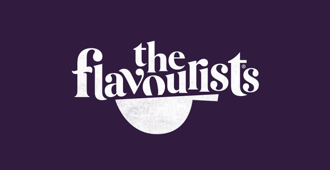
The Flavourists identity is deliberately restrained. The logo doesn’t attempt to dominate the system. Instead, it acts as a foundation for a broader brand world.
Typography plays a central role, offering clarity and flexibility. The design is highly legible, adaptable across applications and built with growth in mind. That last point matters because a small business logo shouldn’t only serve the business as it exists today. It should leave room for the business it could become.
For small businesses with long-term ambitions, this approach is critical. A logo that is too tied to one product, one moment or one narrow expression can become restrictive surprisingly quickly. The Flavourists shows the value of a mark that enables expansion rather than blocking it.
VFC: Branding With a Point of View
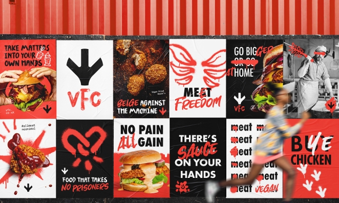
The VFC identity shows how a logo can help a challenger brand communicate its attitude instantly. The branding is bold, direct and unapologetic. That matters because challenger brands don’t usually win by blending in. They need to make their position clear before the audience reads a line of copy.
The logo works because it reflects the brand’s stance. It has urgency, simplicity and confidence. For small businesses entering crowded or highly competitive sectors, that kind of clarity can be invaluable.
The lesson here is that a logo doesn’t need to explain every detail of the proposition. But it does need to signal the brand’s posture. Is this business calm, rebellious, precise, warm, premium, practical, playful, local, expert or disruptive? The best logos begin answering that question before the copy arrives.
Medium: The Power of a Wordmark
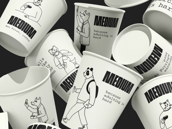
The Medium project shows how powerful a wordmark can be when executed well. The logo relies entirely on typography. There are no supporting elements to distract or compensate. That places enormous emphasis on proportion, spacing and rhythm. Every detail matters because there is nowhere for poor execution to hide.
That simplicity creates versatility. The logo works across platforms, scales effectively and maintains clarity in different contexts. It’s a reminder that strong typography can outperform more complex approaches.
For small businesses, this is especially relevant. There’s often a temptation to assume that a logo needs an icon to be memorable. It doesn’t. A carefully designed wordmark can be distinctive, ownable and highly practical, particularly for businesses whose name is already strong.
Flyt Seaweed: Icon-Based Design Without Literalism
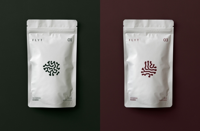
Flyt Seaweed uses an icon that reflects the product without becoming literal. The form is fluid and organic, echoing the qualities of seaweed while remaining abstract enough to feel contemporary. Paired with clean typography, it creates a balanced identity that is both distinctive and practical.
This is a good example of how small businesses can use icons well. The icon does not need to illustrate the product like a diagram. In fact, that often makes a logo feel clumsy. The better approach is to capture a quality: movement, texture, origin, behaviour, mood.
Flyt Seaweed works because the icon gives the brand a recognisable visual cue while leaving enough room for the identity to feel modern and scalable.
Commonwood Vineyard: An Emblem With Restraint
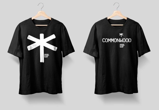
The Commonwood Vineyard identity demonstrates how to reference tradition without becoming trapped by it. The emblem is structured and disciplined. It communicates craft and history, but avoids unnecessary complexity. This restraint keeps the design feeling current.
For businesses in heritage sectors, this balance is essential. Too much tradition can make a brand feel dusty. Too little can make it feel rootless. Commonwood Vineyard sits in the more useful middle ground, borrowing the authority of emblematic design without overloading the mark.
The small business lesson is that heritage cues need editing. A good emblem should create confidence, not visual clutter.
Rise Bookselling: A Logo Built for a Network
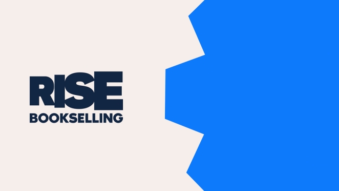
Rise Bookselling operates as a network, which requires a different kind of identity. The logo is not simply representing one shopfront or one founder. It has to work for a collective.
That means flexibility becomes central. The identity needs to adapt across multiple contexts while still feeling cohesive. This system-based approach reflects a broader shift in branding. Logos are no longer static marks used in isolation. They are part of dynamic systems that respond to different environments.
For small businesses, especially those building communities, franchises, networks or multi-location concepts, this matters. The logo should provide enough consistency to hold everything together without making every expression feel identical.
4 Legged Friends: Emotional Clarity
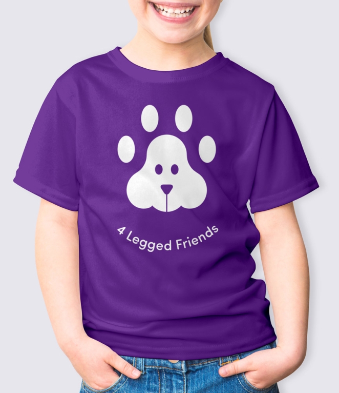
The 4 Legged Friends project is built around warmth and trust. The logo feels approachable without becoming overly playful.
This balance is critical in categories where emotional connection drives decision-making. A pet-focused brand has to feel caring, but it also needs to feel credible. If it becomes too cute, it risks losing authority. If it becomes too clinical, it loses the emotional connection that makes the category distinctive.
The identity works because it finds the middle ground. It reassures without overwhelming, creating a visual tone that feels friendly, accessible and dependable.
The Fabric of Norwich: Cultural Identity
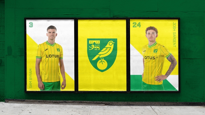
The Fabric of Norwich extends beyond traditional branding. The project reflects community, history and shared identity.
What makes this interesting from a logo and identity perspective is the way it treats design as a cultural marker. It isn’t simply about recognition. It’s about belonging.
For small businesses rooted in local communities, this is a powerful lesson. A logo can do more than identify a company. It can reflect place, memory and shared experience. When that happens, the brand becomes part of a wider story rather than just another commercial presence.
Marta Mejuto Physiotherapy: Branding Through Interaction
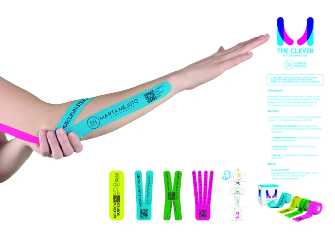
The Clever Little Business Card for Marta Mejuto Physiotherapy highlights something many businesses overlook. A logo is rarely experienced in isolation.
Here, the business card becomes part of the brand experience. It turns a practical touchpoint into something memorable, reinforcing the identity through interaction rather than visibility alone.
For small businesses, this is especially useful. You don’t need a huge media budget to make branding work harder. You need thoughtful applications that turn everyday moments into brand-building opportunities.
Small Businesses That Grew Because of Their Logos
Innocent Drinks: Humanising a Category
Innocent’s early logo played a significant role in its growth. The hand-drawn halo and informal typography created an immediate sense of honesty and approachability. The hand-drawn halo and informal face created a kind of visual innocence that matched the name perfectly.
The origin story has become part of the brand’s mythology. Logo Design Love quotes the story that the logo emerged from a simple brief for “a face with a halo above it,” with designer Gravy at Deepend doodling the idea in response. That simplicity is exactly what made it powerful.
In a market dominated by polished, corporate branding, Innocent felt different. It felt human. The logo didn’t make the brand look like a faceless drinks company. It made it feel like a person talking to you from the fridge.
That distinction helped the brand build trust quickly, particularly with younger audiences looking for alternatives to established players. It’s one of the clearest examples of a small brand using a logo to make a category feel warmer.
BrewDog: Signalling Disruption
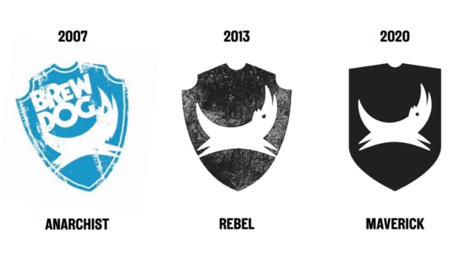
BrewDog’s original identity positioned it as a challenger from the outset. The brand did not try to look like a traditional brewery. It leaned into a more abrasive, punk-inflected visual attitude that matched its early anti-corporate positioning. When BrewDog launched in 2007, its logo and labels were bold, brightly coloured and grungy, appealing to beer drinkers looking for something different.
Whatever one makes of BrewDog’s later controversies and corporate evolution, the early identity is still instructive from a logo and small business perspective. It told customers quickly that this was not a polite, heritage-led beer brand. It was a challenger. It had a stance.
That clarity helped the brand attract a loyal following. The logo didn’t just identify the business. It reinforced its attitude.
Gymshark: Built for Digital Culture
Gymshark’s early logo was designed for the environments the brand lived in: social media, apparel, fitness communities and digital commerce.
The combination of a strong icon and clean typography made it adaptable across clothing, avatars, content and community touchpoints. Gymshark’s own story stresses that the brand’s early strength came from being part of the lifting community rather than simply marketing to it.
That context matters. A logo built for a community has to feel like something people are willing to wear, share and identify with. The Gymshark mark worked because it could behave as both a brand identifier and a badge of belonging.
For small businesses building in digital-first spaces, this is a crucial lesson. The logo needs to travel where the audience already is.
Gail’s Bakery: Quiet Confidence
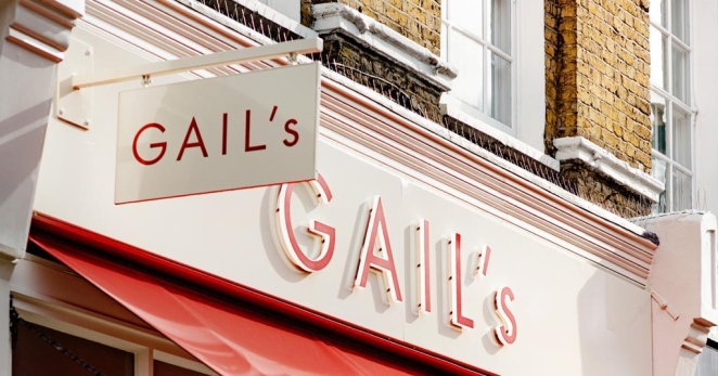
Gail’s uses typography to signal quality. The logo is understated, but that’s what gives it strength. It avoids over-design, allowing the product and experience to take centre stage.
A Common Purpose’s work for Gail’s describes an identity and packaging system built around the act of making, ingredients, expressive language and typography.
That’s exactly why the branding works. It feels warm, crafted and premium without tipping into exclusivity. The restraint gives the product room to lead. The typography supports the experience rather than competing with it.
For small food and drink businesses, Gail’s is a useful example because it proves that confidence doesn’t always need loudness. Sometimes the smartest logo is the one that lets everything else feel better made.
Why Some Small Business Logos Succeed While Others Fail
Many logos fail not because of budget constraints, but because of flawed thinking.
Overcomplication is one of the most common issues: Businesses try to communicate everything at once, resulting in designs that feel cluttered and unclear.
Trend dependency is another: Logos built entirely around current styles often lose relevance quickly.
Execution also plays a critical role: Poor typography, inconsistent spacing and weak proportions can undermine even strong ideas.
Finally, a lack of contextual thinking limits effectiveness: Logos need to be designed for real-world use. Projects like Frozen Bliss Creamery, Bonbird and Marta Mejuto Physiotherapy succeed because they consider the full environment, not just the mark itself.
How to Choose the Right Logo Style for Your Small Business
Tasmin Otter-Lunn
Start With Positioning
What do you want your business to be known for? Who are you trying to reach? What do you want people to feel when they encounter your brand?
A logo should come after those answers, not before them.
Design for Real-World Use
Think about where your logo will appear most often. A café, a consultancy, a food truck, a vineyard and an online community all have different needs.
A logo that looks good on a presentation slide may fail on packaging, signage or a mobile screen.
Build for Growth
Your logo should work for the business you are building, not only the one you have today.
That doesn’t mean making it vague. It means avoiding decisions that box the brand into one product, one audience or one channel too early.
Prioritise Clarity
If the logo isn’t immediately understandable, it isn’t working hard enough.
Small businesses don’t always have the luxury of long customer attention spans. Clarity is not a compromise. It’s a commercial advantage.
Small Business Logo Design Trends That Actually Work
Another Colour
Simplified Typography
Clean, well-crafted type continues to dominate because it improves clarity and scalability.
This doesn’t mean generic type. The best wordmarks use subtle adjustments in spacing, weight and proportion to create distinction.
Flexible Identity Systems
More small businesses are moving beyond single static logos to flexible systems that can adapt across platforms.
This is especially important for brands that operate across social media, packaging, events, print and digital products.
Subtle Distinctive Details
Small details, such as custom letterforms, unusual spacing or a distinctive icon, can make a logo memorable without making it complicated.
The key is restraint. A single strong detail is usually more effective than five competing ideas.
Context-Driven Design
The best logos are designed with their environment in mind.
A restaurant logo needs to be seen quickly. A wine label needs to build confidence. A community organisation needs to feel credible and human. A product brand needs to stand out at the point of decision.
Good design understands those differences.
How to Use Creativepool to Find a Logo Designer for Your Small Business
Rob Pratt
The easiest way to find a good logo designer is not to search for someone who can “make a logo.” It is to find someone who understands the kind of business you are building, the market you are entering and the role the logo needs to play.
That is where Creativepool can be especially useful. Creativepool describes itself as a creative industry network built around a community of creative professionals, and its talent pages allow businesses to browse designers, connect with them and review their work.
For a small business, the first step is to look beyond the job title. A logo project might need a graphic designer, branding designer, packaging designer, typographer, illustrator or small design studio depending on the brief. Creativepool has dedicated talent directories for graphic designers and branding designers, making it easier to start with people whose work is already relevant to identity design.
The second step is to review portfolios by context, not just taste. Don’t only ask, “Do I like this?” Ask, “Has this designer solved problems like mine?” A food truck needs different thinking from a vineyard. A consultancy needs different thinking from a pet care brand. A fast-growing ecommerce business needs different thinking from a local cultural project.
The third step is to write a sharper brief. Creativepool’s own guidance on choosing a graphic design company notes that logo design should align with a company’s brand identity and values, which is a useful starting point for any small business. A good brief should explain the business, audience, competitors, desired perception, practical applications and what success looks like. It should not simply say, “make it modern.”
The fourth step is to use Creativepool to compare fit. Look at whether a designer’s work shows strong typography, adaptable systems, clear thinking and real-world application. The best logo designers don’t just present a mark on a blank background. They show how it behaves across signage, packaging, social, web, print and everyday touchpoints.
Finally, talk to the designer before commissioning. Ask how they approach strategy, how many routes they usually explore, what deliverables are included, whether they provide usage guidelines, and how they handle future adaptations. A cheap logo file may feel like a saving, but a properly designed identity system can save a small business years of inconsistency later.
FAQs: Small Business Logo Design
How do I know if my business logo is hurting my brand?
If your logo feels unclear, dated, hard to read or inconsistent with what you sell, it may be working against you. Other warning signs include poor performance at small sizes, lack of distinction from competitors and difficulty applying it across digital and physical touchpoints.
What makes a logo memorable for small businesses?
Memorability comes from a clear idea, strong execution and consistent use. A logo doesn’t need to be complex to be remembered. In most cases, the simpler and more distinctive it is, the better it performs.
Should small businesses follow logo trends or stay timeless?
Small businesses should understand trends but not be led by them. Trends can make a brand feel current, but timeless principles such as clarity, proportion, relevance and adaptability matter more.
How simple should a small business logo be?
As simple as it can be while still communicating the right idea. Simplicity should never mean blandness. The goal is to remove what isn’t needed so the strongest elements can work harder.
Can a cheap logo design still be effective for a business?
It can, but only if it’s based on strong thinking and executed with care. Cost alone doesn’t determine effectiveness, but logos created without strategy often become expensive later because they need replacing, correcting or rebuilding.
The Best Small Business Logos

Saboteur
The best small business logos don’t succeed because they look good in isolation. They succeed because they work in context, in markets and over time.
The examples explored here show that clarity consistently outperforms complexity. Strategy matters more than style. And the most effective logos are built with real-world use in mind.
For small businesses, this represents a significant opportunity. A logo isn’t just a visual asset. It’s a decision that shapes perception, builds recognition and supports growth.
Get it right, and it becomes one of the most valuable tools your business has.