
There is a particular moment in the life of almost every small business when the founder realises the company no longer looks like the company they think they are building.
Perhaps the work is good. The customers are happy. The product has improved enormously since launch. Revenue is moving in the right direction and there are now several actual employees rather than one slightly exhausted person switching between six Slack accounts. Then somebody sends over the website for approval, or the company appears next to a much larger competitor in a pitch, and suddenly there is a problem.
The business still looks like it was assembled over a wet weekend.
This is one of the strange inequalities that branding can either reinforce or dismantle. Bigger companies have obvious advantages: budgets, distribution, teams, media spend, years of accumulated recognition and the reassuring ability to occupy enormous buildings with their name attached to the top. A smaller company cannot usually compete with those things directly. What it can do is control an extraordinary amount of how it is perceived.
A prospect meeting your business for the first time does not immediately know that you employ six people while the competitor employs six thousand. They see the website. The presentation. The proposal. The packaging. The Instagram account. The product interface. The email signature. The language you use when explaining what you do. Collectively, those signals create a surprisingly rapid judgement about whether the organisation feels credible, specialist, premium, cheap, experienced, interesting or still in the process of working itself out.
This is where small business branding becomes much more commercially useful than “getting a nicer logo”. Good branding allows a young or relatively tiny organisation to behave with a level of coherence and confidence normally associated with much larger businesses. It cannot manufacture capabilities you do not possess, and it certainly cannot save a bad product indefinitely, but it can stop scale becoming the first and most obvious thing somebody notices about you.
Research into distinctive brand assets backs up part of the mechanism. The Ehrenberg-Bass Institute describes distinctive assets as non-name elements such as colours, logos, characters and other cues that help people recognise brands quickly, while Kantar similarly treats visual and other brand assets as shortcuts that trigger recognition and accumulated meaning.
For a small company, that matters because you rarely have enough money to introduce yourself from scratch every time.
You need the things you make to start looking related.
And, ideally, unmistakably yours.
Why Some Small Businesses Look More Established Than Others
Friend + Johnson
There is a temptation when discussing branding for startups to treat credibility as a matter of polish. Make the website cleaner. Buy some better photography. Pick an expensive-looking font. Remove the clip-art rocket from the pitch deck and suddenly the business has grown up.
Those things can help, but polish is only part of the effect. The businesses that appear established usually feel as though somebody has made decisions. There is a clear sense of what they are, who they are for and how they intend to behave. The identity is not trying six different personalities depending on which page you happen to visit.
That coherence is important online, where small businesses often meet customers before any human interaction has taken place. In other words, trust does not emerge because the logo has been given a tasteful amount of white space.
People are gathering signals:-
- Does the website work?
- Do the words sound confident?
- Can I understand what this company does?
- Does the photography look intentional?
- Can I find the people behind it?
- Does one page look as though it belongs to the same company as the next?
- Does the overall experience suggest that somebody cares about the details?
SomeOne Founder Simon Manchipp puts the competitive opportunity much more entertainingly:
“A great brand identity allows a two-person startup operating out of a shed to punch the lights out of a multi-national conglomerate. The mistake small businesses make is trying to look "professional," which is just code for looking boring, safe, and entirely replaceable. To look the part, you must look like you already own the category. You need a symbol of intent, a proprietary typeface, and a tone of voice that swaggers into the room. A strong identity is an asymmetric weapon; it allows you to charge premium prices for commodity services simply because you look like you give a damn.”
There’s obviously some Manchipp-grade theatricality in there. A two-person company does not automatically get to behave like a category leader merely because somebody commissioned an excellent wordmark, and a proprietary typeface would be a spectacularly inefficient first purchase for many bootstrapped businesses.
But the central challenge is exactly right.
Small companies frequently try to reduce the perceived risk of being small by making themselves as unobjectionable as possible. The founder wants something “clean”. The designer is told to keep it corporate. The copy gets stripped of anything resembling an opinion. Blue appears. Then a geometric sans serif. Then an abstract mark involving two shapes coming together to represent “connection”. Within a fortnight the business looks reassuringly similar to twelve companies it is supposedly trying to beat.
We already explored precisely this problem recently when asking whether AI can make a business look professional without making it look like everyone else. As tools make baseline visual polish increasingly accessible, professional-looking execution itself becomes less distinctive. The competitive value migrates towards specificity, judgement and a recognisable point of view.
That should be liberating for smaller businesses.
You probably cannot outspend the multinational.
You may be able to out-character it.
Large organisations often have to negotiate branding through extensive stakeholder structures, legacy systems and multiple markets. A small company can decide on Tuesday that its category communicates terribly and start doing something different on Wednesday.
Agility is an asset.
Don’t brand it out of yourself.
What Makes a Small Business Brand Look the Part?
MS ~ Magdart ~ Design Studio
A convincing small business brand identity is not determined by how many assets are in the brand-guideline PDF. You can have 140 pages of rules and still look forgettable. Equally, a relatively small identity system can create enormous presence when its few elements are distinctive and used consistently.
Our guide to building a brand identity defines identity as the collection of visual, verbal and behavioural cues through which an organisation becomes recognisable, rather than simply a logo or colour scheme. That distinction is particularly important for smaller businesses because there is little value in commissioning a beautiful mark if everything surrounding it remains generic.
The logo is part of the system.
It is not the system.
The more useful question is whether somebody encountering several pieces of your communication would know they came from the same place.
That requires a relatively small set of decisions made unusually well:
- A clear proposition. Before designing the brand, establish what the business is competing on. “Great service” and “high quality” are not positioning unless the rest of the market has somehow committed itself to terrible service and shoddy products.
- One or two distinctive assets worth building. That might be a colour, shape, character, illustration behaviour, piece of typography, photographic treatment or recurring verbal device.
- Typography with character and practical range. Manchipp is right about the power of type, even if a fully proprietary font is beyond many startup budgets. The point is not necessarily to commission an alphabet from scratch. It is to stop treating type as invisible plumbing. A well-chosen family, distinctive hierarchy and consistently handled wordmark can establish enormous character.
- A verbal personality. How does the business sound when it introduces itself, explains something difficult, sells something and apologises when something goes wrong? A useful tone of voice needs enough range to survive all four.
- A photographic or illustrative point of view. “Authentic lifestyle photography” is not much of a direction when several million brands have arrived at exactly the same conclusion. Decide what you photograph, from where, with what kind of light, framing and human presence.
- A system designed for the places you actually appear. A local restaurant requires a different identity toolkit from a SaaS startup. One might live through menus, signage, packaging and social content; the other through product UI, decks, demos and a website. Build for reality rather than filling a guidelines document with imaginary applications.
This is also why small business branding ideas should begin with behaviour rather than decoration. Think about the moments where customers actually experience the company. A beautifully designed logo cannot compensate indefinitely for an invoice that looks as though it escaped from Windows 95, nor can a brave challenger tone survive if the customer-service emails immediately revert to “Dear Valued Customer, Your Ticket Has Been Logged”.
The identity has to travel.
SomeOne’s own approach is instructive here. Manchipp has described the agency’s preference for creating complete “BrandWorlds” rather than treating the logo as the principal piece of intellectual property: story, voice, typography, colour, motion and behaviour all become part of making the organisation feel like “somebody, not just something”. We explored that philosophy in our Company Spotlight on SomeOne.
A startup clearly does not need to build an enormous global BrandWorld on day one.
But it does need enough world to exist outside the logo.
Small Brand Identities That Punch Above Their Weight
Some of the most useful branding references for small businesses are not multinational rebrands with implementation budgets larger than your annual turnover. They are identities where a comparatively focused business has taken one distinctive idea and stretched it far enough to create a world.
Our roundup of the most beautiful brand identities of 2025 is full of examples that demonstrate how smaller and emerging businesses can appear unusually complete without attempting to imitate enormous corporate systems.
Bugg
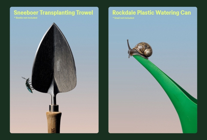
Bugg, the New Zealand gardening brand created with Seachange, is a lovely place to start because it demonstrates how much personality can sit inside a fairly simple system. The mirrored “g” characters in the logotype suggest insect antennae, while a playful ecosystem of characters and an earthy-but-acidic palette positions the company somewhere between premium lifestyle brand and genuinely enthusiastic garden obsessive. It doesn’t look “small”. More importantly, it doesn’t look like somebody searched “premium gardening brand” and selected the safest answer.
The useful lesson is not to put insects in your logo.
It is to let something particular to the product shape the identity.
Butter Baby
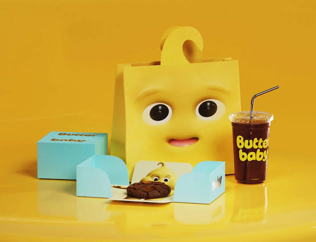
Butter Baby, a Jakarta dessert business branded by Universal Favourite, takes that commitment much further. Its world centres on a butter-alien mascot, backed by a deliberately maximal yellow-and-blue universe and packaging that behaves more like character merchandise than routine dessert-shop branding. It’s worth noting how unusually far the brand takes its mascot, building the entire identity around a piece of narrative rather than introducing a little character after the more serious branding had already been finished.
For a small hospitality or product brand, that is enormously instructive. You do not necessarily need fifty visual assets.
You may need one good asset with fifty lives.
Mascots, symbols, phrases and characters become commercially useful when they can keep generating communication rather than appearing identically on every surface.
Pooch & Mutt
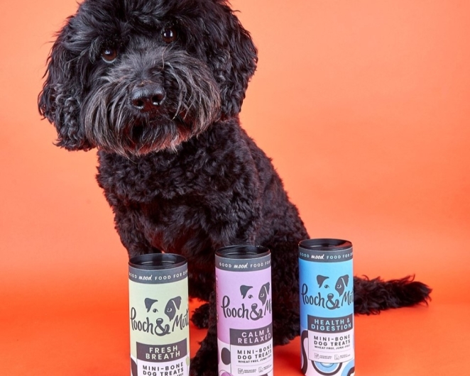
Pooch & Mutt, redesigned by Brands & People, demonstrates another useful tension: personality and credibility do not have to cancel one another out. The Mexican pet-wellness brand uses a chunky wordmark whose animated letterforms reveal wagging tails, alongside a bright visual system that deliberately balances warmth with the functional clarity expected of a wellness product.
That is a useful model for smaller companies entering categories where trust matters. You do not need to remove personality to signal competence. Sometimes the most credible thing a business can do is look as though it understands precisely what it is.
MAG
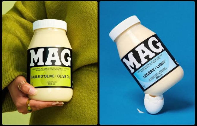
Then there is MAG, the Quebec condiment brand redesigned by LG2. Its wonderfully gloopy wordmark looks almost as though mayonnaise has been asked to typeset its own name, while a pared-back packaging system gives different sauces clear colour and shape recognition. The identity works because the product has been allowed into the design rather than sitting behind it.
Again, this sounds obvious until you look at how many businesses systematically remove the details of what they make while branding themselves. The coffee company becomes “a community of modern ritual”. The accounting practice is “empowering possibility”. The recruitment consultancy is “where potential meets tomorrow”.
Sometimes the best small business branding idea is simply to become much more interested in your own product.
VerifyLabsAI
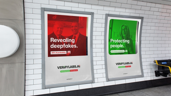
B2B startups can play this game too. VerifyLabsAI, created by Brand & Deliver, took the difficult subject of identifying AI-generated and manipulated content and translated ideas of verification, protection and clarity into a much more confident brand system.
The important move was elevating the company beyond appearing like another technical utility and giving it an identity capable of carrying a larger argument about authenticity and trust in synthetic media.
Resugar
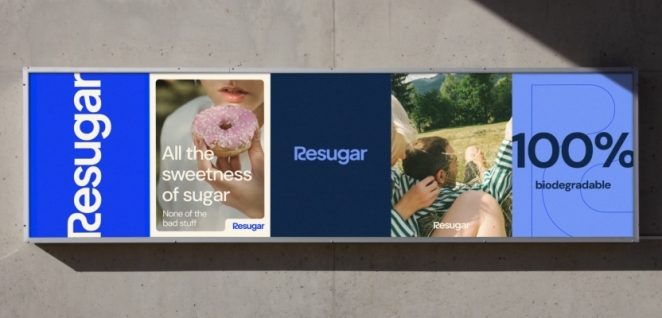
Similarly, SIDE ST’s rebrand of Resugar shows what happens when a technical startup stops treating technical seriousness as a reason to communicate anonymously. Resugar operates in food technology, producing a sugar alternative for manufacturers, and the new system deliberately brought together cues from molecular structures, sugar cubes, nature and food to connect science, environmental impact and appetite. Crucially, the agency began with competitive and audience research rather than aesthetic preference, then developed a system flexible enough to remain recognisable across future communications.
What links all of these businesses is not stylistic boldness for its own sake.
They look decided.
You can disagree with the aesthetic and still understand that somebody has made a choice.
That confidence is what many small brands lack when they talk about wanting to “look bigger”. Looking bigger does not mean imitating a corporation. In fact, doing so may strip away one of the only advantages you genuinely possess.
The better ambition is to look complete.
Like the company knows what it is doing.
Like the visual language has arrived on purpose.
How to Build a Brand Identity on a Small Business Budget

Untangld
This is the point at which the nice inspirational examples meet somebody’s actual bank account.
Professional branding costs money, sometimes a lot of it. Our guide to rebrand costs puts a limited visual refresh for a very small business at roughly £3,000–£15,000, while a more substantial growing-company rebrand involving strategy, messaging and identity commonly begins around £15,000–£60,000. Those are indicative ranges rather than a price list, but they help explain why two projects that both appear to contain “a logo, colours and fonts” can receive wildly different quotes.
Our graphic designers directory gives another useful reference point, noting common designer day rates of approximately £200–£450, depending on experience, specialism and location, with senior brand and packaging talent able to command more.
A small business does not need to spend £60,000 merely to prove that it takes itself seriously.
The trick is separating the things you can sensibly postpone from the things that will become expensive mistakes if you get them wrong.
Naming is one obvious example. Before falling in love with a company or product name and building an entire identity around it, UK businesses can search existing trade marks through the Intellectual Property Office. As of October 2026, registering a UK trade mark online starts at £205 for one class, with additional classes costing extra.
That is considerably cheaper than discovering after a launch that the name has a problem.
At the other end of the spectrum, there are things you almost certainly do not need immediately. The two-person consultancy probably does not need a custom sonic identity, 80-page motion manual and proprietary variable type family before its first invoice. A founder-led business may be perfectly well served by a carefully chosen commercial typeface, distinctive colour system, excellent wordmark, clear verbal idea and enough templates to keep the basic communications coherent.
This is where doing some of the work yourself can be completely reasonable.
A small business can establish a surprising amount internally: customer interviews, competitor research, defining the proposition, collecting reference material, auditing what is inconsistent and deciding where the identity actually needs to work. AI and templates can also help prototype territories and produce routine applications. These tools can now support moodboards, imagery, mock-ups, packaging exploration and campaign prototypes extraordinarily quickly.
The danger arrives when “we can make something polished ourselves” is mistaken for “we have solved the identity problem”.
Software can help you generate options.
It cannot tell you reliably whether you have chosen the same visual territory as six competitors, whether a seemingly attractive asset will remain useful as you scale, whether the name is strategically limiting or whether the apparently boring thing you removed was actually the most ownable part of the company.
That is the difference between execution and judgement.
For a limited small-business budget, prioritise in roughly this order:
- Get the positioning clear before paying to decorate confusion.
- Invest in the core identity rather than dozens of applications you do not yet need.
- Protect one or two distinctive assets and use them consistently.
- Build templates for the things you repeatedly make yourself.
- Spend on good photography, illustration or copy only where those things materially define the brand.
- Leave room for rollout. A brilliant identity that cannot afford to reach the website is an oddly theoretical investment.
There is also nothing wrong with phasing the work.
Strategy and core identity first. Website next. Packaging when the product is ready. Motion when the content programme justifies it. More extensive guidelines once enough people are actually touching the brand for inconsistency to become a problem.
The aim is not to make the company look as though £100,000 was spent.
It is to make every pound look intentional.
Consistency Builds Trust, but Sameness Builds Wallpaper
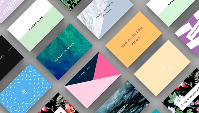
Strut and Fibre
Once a small business has something distinctive, perhaps the hardest thing is resisting the urge to redesign it every six months.
Founders are unusually vulnerable to this because they see the identity constantly. What still feels new to customers can feel desperately familiar internally. A competitor appears with an interesting website, a fashionable typeface starts appearing everywhere and suddenly everybody wants “a bit of a refresh”.
This is how distinctive assets get killed shortly before they become useful.
Distinctive assets help create quick recognition and should be developed and protected rather than left to intuition or continually replaced. Treats logos, colour, shape and other brand cues as recognition shortcuts whose value comes from accumulated associations.
Consistency, though, is not the same as making every communication identical.
That is where basic brand guidelines earn their keep. A good small-business set does not need to resemble a multinational governance manual. It needs to prevent the most common forms of accidental brand erosion.
At minimum, it should answer some practical questions. Which versions of the logo exist and when should each be used? What colours are primary and secondary? Which fonts are licensed and what hierarchy should people follow? What does the photography look like? What does it emphatically not look like? How should social posts relate without becoming one repeating template? What language do you naturally use, and which corporate phrases would sound ridiculous coming from you?
Then add examples.
People understand “don’t stretch the logo” because they can see the stretched logo. They understand tone of voice more easily when given a bland sentence and its recognisably branded equivalent. They understand imagery when shown five approved examples and five images the brand would never use.
Good guidelines remove trivial decision-making.
They do not remove creativity.
This also helps answer one of the more interesting questions in small business branding: how does a startup look trustworthy before it has a mountain of customer reviews?
You cannot invent social proof you have not earned, obviously. But you can remove unnecessary reasons for doubt.
A coherent website, clear explanation of the offer, identifiable people, visible expertise, accessible contact information, consistent language and professionally handled design all contribute credibility signals. Verifiable information, organisational legitimacy, expertise, real people and clear contact details are all legitimate ways of improving website credibility.
This is important because “trustworthy” does not mean “looks like a bank”.
- Transparency is a brand behaviour.
- Clarity is a brand behaviour.
- Answering the phone is a brand behaviour.
- Putting an actual human being on the About page is a brand behaviour.
Brand identity is at its most convincing when those behaviours and the aesthetics agree.
- A friendly brand whose cancellation process requires six emails is not friendly.
- A premium brand sending proposals full of typographical errors is not premium.
- A technology startup calling itself radically simple while requiring fourteen clicks to find the price has a brand problem, however lovely the gradient.
The details eventually testify against you. Or for you.
When Should a Small Business Invest in Professional Branding?
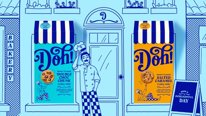
Brandon Consultants
Not every small business needs a rebrand.
Sometimes the logo is fine and the problem is that nobody has developed a coherent system around it. Sometimes the identity works but the website has been neglected. Sometimes the design is blamed for a positioning problem. And sometimes, frankly, the branding looks terrible but the business is six weeks old and the smarter use of cash is proving that somebody actually wants the product.
Professional branding becomes more urgent when the gap between the company you have built and the company people see begins actively getting in the way.
You may have moved upmarket but still look cheap. You may have entered a more competitive sector where looking generic is now costly. Sales teams might be constantly rebuilding decks because there is no usable system. The website may no longer explain the proposition. A business assembled around one service may now have several, leaving the original name and identity increasingly awkward. Or perhaps the company has simply reached a point where several people are producing communications and everyone appears to work for a slightly different organisation.
Those are business problems with identity consequences.
A logo update alone may not solve them.
Our branding designer directory is useful at this stage because it lets businesses assess people through the work they have actually made rather than relying entirely on titles. Creativepool’s own guidance recommends starting from portfolio relevance, shortlisting several creatives whose work matches the sector and level of ambition, then comparing candidates against a consistent brief.
For a tightly scoped identity, an experienced freelance branding designer may be exactly enough. For work requiring research, naming, positioning, verbal identity, design, digital systems and rollout, a specialist agency or studio will often make more sense.
Creativepool supports both routes: businesses can search for creative talent, post a freelance studiogig, or brief agencies through Creativepool depending on the scale of the project.
What you should not do is choose solely on who can produce the prettiest logo in isolation.
Look at systems.
How did the designer turn the idea into packaging, social content, websites, presentations and actual day-to-day communications? Can they explain why the work looks the way it does? Have they worked with growing businesses where budgets are real and internal design teams are nonexistent? Does the identity still look strong once it leaves the case-study hero image and encounters a mundane sales PDF?
For a startup, that practical intelligence matters enormously.
Your designer is not handing the work to a 40-person global brand team after launch.
They may be handing it back to you.
Which brings us, rather neatly, to Manchipp’s phrase about looking like you “give a damn”.
That might ultimately be the most useful definition of what good branding does for a small business. It does not magically disguise the number of people employed, nor should it. Small can mean specialist, agile, personal, obsessive and unusually close to the customer. Those are often advantages worth amplifying rather than hiding.
What the identity can disguise is amateurism.
The website no longer looks accidental. The language no longer sounds borrowed. The proposal feels like it belongs to the same company as the product. The colour has become yours through repetition. The typography carries a little character. The photographs come from a world rather than a stock-library search. Somebody receiving a document with the logo removed could probably still guess who sent it.
At that point, you are no longer trying to look bigger.
You are beginning to look distinctive.
And distinctiveness is one of the few competitive weapons that does not care how many floors your head office has.
The multinational still has the bigger budget.
It still has more people, more history and considerably more money to spend reminding the market that it exists.
But you do not necessarily need to look like the smaller proposition.
You need to know what you stand for, make a handful of brave choices around it, protect the assets that become recognisable and carry those choices through with enough consistency that the organisation feels deliberate everywhere it appears.
Do that properly and the two-person startup in the shed may still look like a two-person startup.
Just one with absolutely no intention of behaving like a minor player.