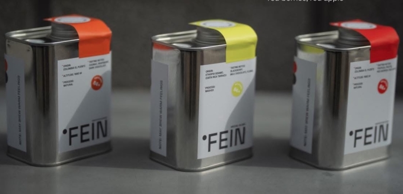

I’m currently in Yerevan and came across a coffee shop called FEIN.
And it made me question something that feels almost… unquestioned in branding.
The rule we rarely challenge
A brand should have a colour palette. Defined, controlled, consistent.
We treat it almost like a law.
But the more I think about it, the less sense it makes.
Colour is one of the easiest things to replicate. It’s not distinctive enough to carry identity on its own.
And yet we build entire systems around it.
What happens when you stop following it so strictly
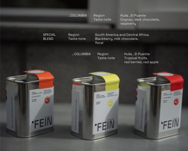
At FEIN, there’s no obvious “one colour”.
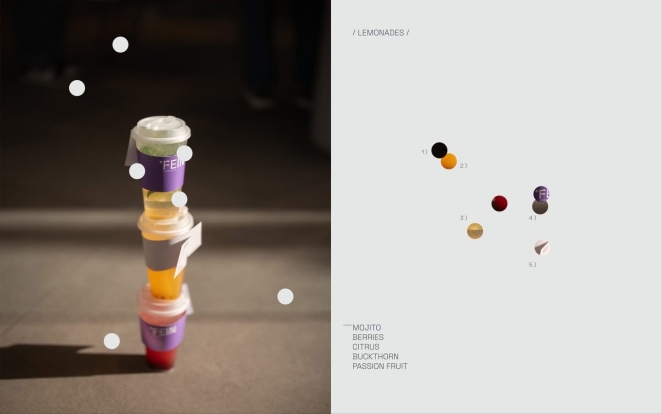
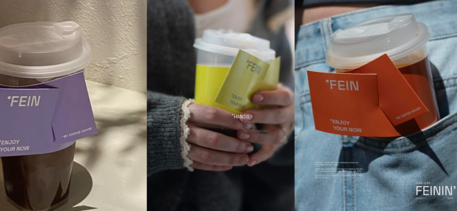
Each product, each detail shifts. And instead of feeling chaotic, it feels… right. More alive. More engaging.
Because colour isn’t doing the heavy lifting.
What actually creates consistency
The consistency comes from something less obvious.
A shared tone. A feeling.
Calm, soft, slightly playful, very intentional.
Every colour fits because it belongs to that same emotional space — not because it matches a predefined palette.
Maybe this is the shift
Maybe strict colour palettes are becoming less valuable.
Or at least — less central than we think.
Because consistency isn’t about sameness. It’s about coherence.
About whether things feel like they come from the same place.
Colour doesn’t need to be fixed to achieve that.
So
You don’t have to be afraid of using more colour.
You don’t have to lock your brand into one palette and protect it at all costs.
If there’s a clear idea behind it — colour can move, shift, expand.
And still feel completely consistent.
I tried to find this project online and couldn’t.
So if anyone knows the designers behind FEIN,
I’d genuinely love to see more of their work.