
The most valuable piece of social media design might be the one where nobody needs to see the logo.
That sounds slightly perverse when we’ve spent decades putting logos in corners, expanding clear-space rules and producing brand-guideline documents heavy enough to prop open a fire door. But social media is a particularly unforgiving environment for conventional branding. People don’t encounter your carefully curated Instagram grid in isolation. They encounter one post while scrolling past a friend’s holiday photograph, a breaking-news clip, a creator complaining about an airline, three videos of dogs and somebody they went to school with announcing the launch of their “personal brand”. Your design rarely receives the courtesy of being studied. It gets milliseconds to announce where it came from.
That changes the job. Strong social media branding isn’t simply about applying a logo, font and colour palette consistently across a series of templates. It is about creating enough distinctive visual, verbal and behavioural cues that people begin recognising the brand almost instinctively. The colour treatment feels familiar. The crop feels familiar. The way the type moves feels familiar. The illustration style, photography, humour or strange little visual habit feels familiar. Ideally, by the time somebody finds the logo, they already know whose post they’re looking at.
That is the difference between visibility and recognition. Brand awareness on social media is essentially whether people know that the brand exists. Recognition is more specific: can they identify it when they encounter its assets, content or behaviour? You can generate enormous awareness through media spend, influencers or a viral post and still fail to build a recognisable brand if every subsequent piece of content looks like it came from somebody else.
The brands that become truly distinctive on social tend to understand that difference. They are not simply filling feeds. They are steadily teaching people what the brand looks, sounds and behaves like.
Recognition Happens Before the Logo
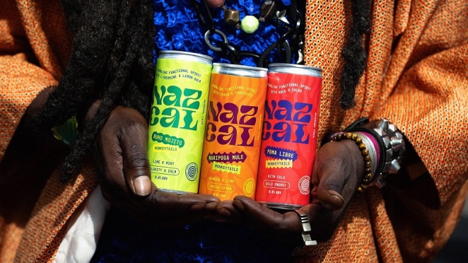
Amblr Studio
The science behind this is well established. The Ehrenberg-Bass Institute describes distinctive brand assets as non-brand-name elements such as colours, characters, shapes, words and sounds that can trigger brand recognition once they become sufficiently well known and uniquely associated with that brand. In other words, a logo is only one route back to memory. If the rest of your identity is strong enough, recognition can happen before anybody reads the name.
For social media, that matters enormously because the environments are so visually compressed. A billboard might have six words, a giant image and several seconds of attention. A social post sits inside an endless conveyor belt of other people’s creative decisions. If your only distinctive element is a tiny logo in the bottom right-hand corner, you are asking one of the least interesting parts of the composition to do almost all of the branding work.
Creativepool’s feature on the most important skills for building distinctive brands makes the broader point that recognisability is built through repeated choices rather than decoration. The brands that become distinctive know what to keep, what to evolve and what to resist changing simply because a new aesthetic has become fashionable. That discipline becomes particularly valuable on social, where teams are under constant pressure to react, experiment and produce more.
You can see how powerful a single distinctive asset becomes when it is used confidently. The visual identity around Charli XCX’s Brat was reduced to almost comically simple ingredients: acidic green, blunt typography and an attitude. Yet that consistency allowed the aesthetic to spread across social media while remaining instantly identifiable, even as other people recreated and remixed it. Creativepool’s look at how Brat became the brand of summer 2024 is a useful reminder that recognisability does not always require complexity. Sometimes one asset, used relentlessly and with enough confidence, becomes more powerful than a beautifully complicated system.
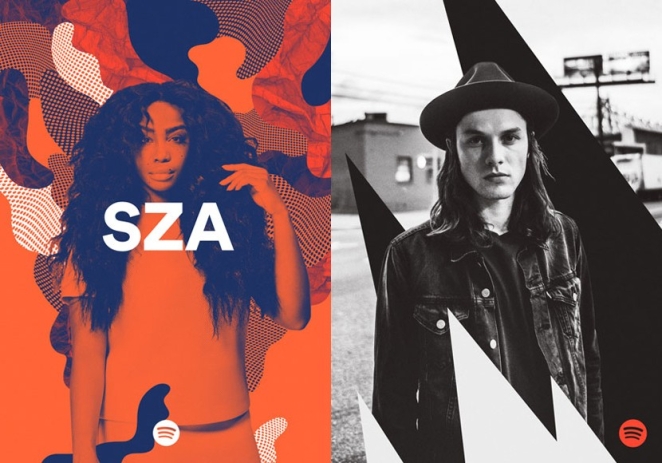
Spotify offers a different example. Its move towards duotone imagery and a much broader colour system gave the brand a visual language that could accommodate an almost limitless variety of musicians, genres, playlists and cultural moments without losing itself. The artist could change. The imagery could change. The colour could change. The underlying treatment made the work feel related. Creativepool covered that shift when Spotify introduced its more expressive visual system, noting that the flexibility of the identity was precisely what allowed it to travel from screens into print, environments and other experiences.
That is the kind of thinking social media demands. Not a template that every post is forced into, but a recognisable grammar that allows the brand to say different things without suddenly sounding as though somebody else has taken over the account.
Consistency Does Not Mean Making Every Post Look the Same
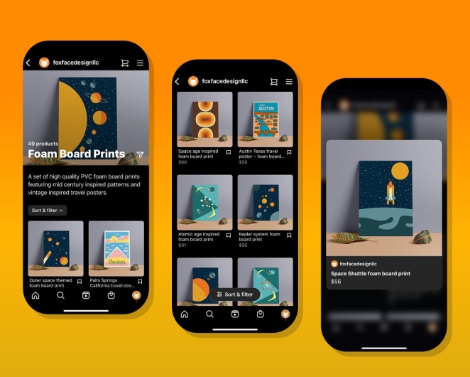
Foxface Design
This is perhaps the most common misunderstanding in brand identity on social media. A team decides consistency matters, builds six templates and then spends the next three years making every piece of content look vaguely identical. Same coloured rectangle. Same typeface. Same logo placement. Same composition. Eventually the brand becomes consistent in much the same way the wallpaper in a dentist’s waiting room is consistent.
Recognition requires repetition, but repetition does not have to mean sameness.
A good social identity separates the things that are fixed from the things that are free to move. The fixed elements might include a particular typography family, colour behaviour, treatment of photography, illustration style, motion principle, framing device, sonic cue or tone of voice. The flexible elements can then react to the content, platform and cultural moment without forcing every idea into the same box.
Think of it more like a language than a template. English has rules, structures and a recognisable vocabulary, but that doesn’t require every sentence to say the same thing. A strong social media identity works similarly. There should be enough shared DNA that the work feels related, while leaving sufficient freedom for an announcement, meme, recruitment post, product launch, reactive joke and campaign film to perform different jobs.
Creativepool’s feature on the power of brand personality captures this balance nicely. It argues for social content built around a strong strategic foundation while retaining deliberate room for reaction, experimentation and cultural participation. The exact proportion matters less than the principle: rigidity makes a brand stale, but complete flexibility destroys recognition.
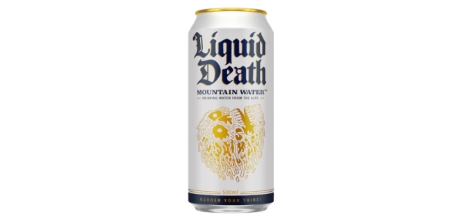
Liquid Death demonstrates how wide that flexible territory can become once the foundation is strong enough. A can of water designed like something from a heavy-metal festival, an aggressively comic tone of voice, macabre illustration, absurd products, celebrity collaborations and wilfully ridiculous social content all belong to the same universe because the brand has such a clear personality. Creativepool’s examination of how Liquid Death turned canned water into a $1.4 billion brand shows how deliberately the company built shareability into the product and communication from the beginning.
Importantly, though, the lesson is not that everyone should behave like Liquid Death. If Barclays started talking like a death-metal meme account tomorrow, people would probably have questions. The lesson is that the strongest social brands establish a character clear enough to guide thousands of small creative decisions. Once that character exists, variety becomes safer because there is something underneath holding it together.
Design the Behaviour, Not Just the Colour Palette
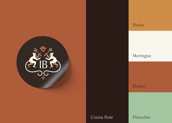
Another Colour
This is where a lot of social media branding projects remain surprisingly shallow. A brand redesign produces a beautiful set of static assets, the designers create some square Instagram mock-ups, everyone admires them in the presentation and then the social team discovers that approximately 80% of its actual output is video.
A modern social identity has to think in movement.
How does type arrive on screen? Do captions snap into place, slide, bounce or barely move at all? Are cuts aggressive or relaxed? Does the camera sit close to people or keep its distance? Is user-generated footage polished until it resembles advertising, or does the roughness belong to the brand? What happens in the first half-second of a Reel? What does an infographic look like when it needs to become a carousel? How does the identity survive a vertical video when there is nowhere convenient for the carefully positioned logo to go?
Motion itself can become distinctive. So can editing rhythm, transitions, framing and sound. Eurovision’s recent sonic identity is a good example of brands thinking beyond purely visual recognition. The brief was deliberately modular, creating audio cues that could work across broadcast and digital content so that fan-made and official material had a clearer sonic connection back to Eurovision. Creativepool’s feature on Eurovision’s audio DNA describes the goal as creating recognisability even when visual branding was absent.
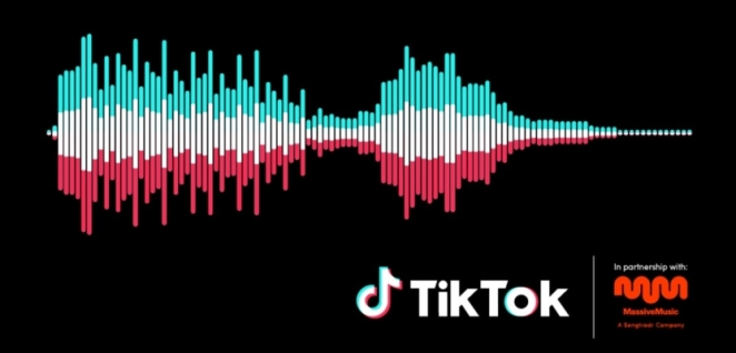
TikTok itself approached the same problem when creating a sonic identity designed partly to identify TikTok-originated content outside the platform. Creativepool’s Behind the Brand feature on TikTok’s sonic identity demonstrates why this matters: as content travels between platforms, recognisable assets need to travel with it.
The strongest social design systems are therefore increasingly multisensory. Colour matters. Typography matters. But so do movement, sound, photography, language and even the way a brand responds in comments. Your social media identity is not simply the bit a designer places inside the frame. It is the total pattern people learn to associate with you.
Build for the Feed, Not the Brand-Guideline PDF
Oh Yeah
Social media also exposes the difference between designing something that looks beautiful and designing something that works while moving past somebody’s thumb.
Those are not always the same skill.
Intricate layouts can disappear on a phone screen. Thin typography becomes illegible. Carefully arranged photography gets covered by platform interfaces. A 14-word headline that looked beautifully balanced on the designer’s monitor becomes microscopic inside a Reel. Assets created purely for a pristine presentation can collapse fairly spectacularly once Instagram, TikTok, LinkedIn or YouTube places buttons, captions and interface furniture around them.
Recognisable social design needs hierarchy. You often have a fraction of a second to establish what somebody is looking at, and the most important brand cue should not require archaeological excavation.
This does not automatically mean putting the logo at the beginning of everything. Creativepool’s feature on the best uses of memes in advertising cites research around short-form social advertising showing the importance of early distinctive brand assets. The useful principle is broader than memes: whatever makes your brand identifiable needs to arrive quickly enough to matter. That might be the product itself, a character, a colour, a line, an unusual visual behaviour or a recognisable voice.
This is why the useful question isn’t necessarily “Can people recognise the brand without seeing the logo?” as though hiding the logo were some creative party trick. It is whether the identity contains enough other distinctive material that the logo isn’t doing all the work.
Try removing it.
If the post suddenly looks as though it could belong to any of twenty competitors, that tells you something.
The Best Social Identities Leave Room for Culture

Proud Robinson + Partners
There is another tension here, because social media does not reward brands simply for repeating themselves beautifully. Platforms are living environments. Memes appear and disappear. Formats change. Creators introduce new visual languages. Audiences develop jokes, behaviours and conventions far faster than most brand-guideline review cycles were ever designed to handle.
A recognisable brand therefore needs to be able to participate without becoming indistinguishable from everybody else participating.
This is where trend-chasing frequently damages brand awareness on social media rather than improving it. A meme performs well, so twenty brands recreate it using exactly the same format, language and image. The content feels native to the platform, but increasingly native to everyone. Remove the profile name and nothing belongs uniquely to the business.
Creativepool has written about this extensively because it is one of the central challenges of modern social marketing. In Mischief Mode, Mira Kopolovic of We Are Social describes a web where brands are increasingly trying to operate inside fast-moving, fragmented communities and absurdist internet culture. The opportunity is obvious, but so is the danger of arriving late and borrowing somebody else’s joke without understanding it.
A strong social identity gives the brand a filter. Instead of asking “How do we do this trend?”, the team can ask “What would we do with this trend?” Sometimes the answer will be something distinctive. Sometimes the answer will be nothing at all.
That ability to sit something out is underrated.
Ryanair, Liquid Death, Surreal and other brands associated with distinctive social voices work because their posts generally feel like extensions of identities they already own. Copy the behaviour without the strategic foundation and it quickly becomes another marketing team pretending to be an unusually sarcastic teenager.
Recognition is built when cultural flexibility happens inside a stable brand world, not when the brand world is discarded every morning in favour of whatever appeared on TikTok overnight.
A Social Media Design System Needs More Than Templates
9inchideas
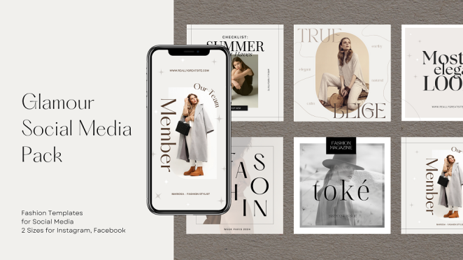
Templates are useful. They make production faster, reduce unnecessary design decisions and help larger teams maintain reasonable consistency. They are particularly valuable for repeat formats such as announcements, quotes, product information, recruitment content or recurring editorial series.
But templates are production tools, not identity strategies.
A robust social system needs a broader set of rules governing what remains recognisable even when the template changes. That might mean establishing a primary and secondary type behaviour rather than prescribing an identical layout. It might define how tightly photographs are cropped, how illustrations interact with typography or how colour proportions are handled. There may be rules for motion, titles, data visualisation, thumbnails, captions and platform-native content.
Crucially, it should also explain what not to do.
What visual trends don’t fit the brand? Which colours should never dominate? How heavily should imagery be filtered? How much text feels like us? Do we put text over faces? Do we use emojis? Do we use stock photography? What does humour sound like? How polished is too polished?
These negative rules can be just as valuable as the positive ones because they stop a recognisable identity gradually dissolving through hundreds of individually reasonable decisions.
This matters even more now that social teams can generate and version content at extraordinary speed. Creativepool’s feature on why originality is becoming more valuable in a world drowning in content makes the uncomfortable point that brands can now create more material than ever without necessarily having more worth saying. More output does not automatically generate more identity. Sometimes it simply generates more opportunities to become inconsistent.
The design system should therefore make good decisions easier, not merely make production faster.
How Do You Keep a Brand Consistent Across Different Platforms?
Discovery Networks International
The wrong answer is usually to post exactly the same thing everywhere.
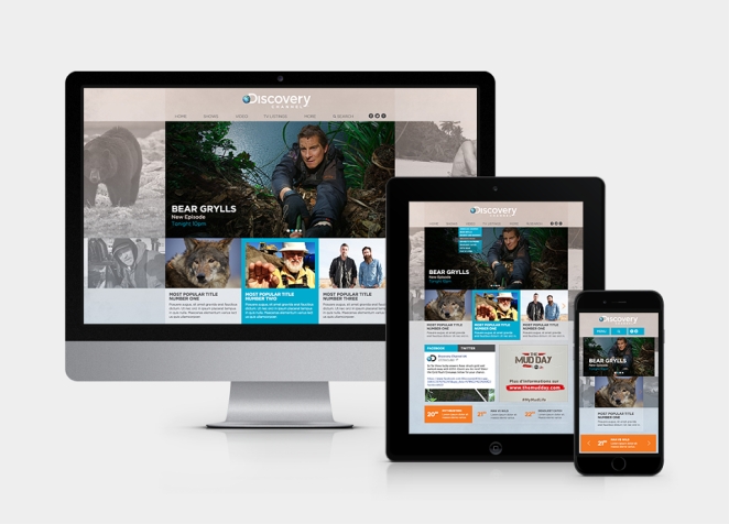
LinkedIn is not Instagram with slightly more enthusiastic use of the word “leadership”. TikTok is not a vertical version of YouTube. Instagram Stories behave differently from the main feed. A YouTube thumbnail needs to operate differently from a carousel cover. Even when the creative idea remains consistent, the execution needs to respect how people use each environment.
The trick is to adapt the format without changing the identity.
A campaign image might become a static LinkedIn post, a motion piece on Instagram, a deliberately rough creator-led interpretation on TikTok and a thumbnail-plus-film combination on YouTube. The asset changes. The point of view, distinctive cues and underlying creative thought should survive.
This is also why distribution increasingly belongs in the creative conversation rather than somewhere after the work has been finished. Creativepool’s piece on why content distribution is becoming as important as creativity itself argues that brands now have to think simultaneously about what they are making and the environments in which people will actually encounter it.
Consistency across platforms therefore shouldn’t mean identical execution. It should mean consistent recognition.
A person moving between your TikTok, LinkedIn and Instagram accounts should feel as though they’re meeting the same brand behaving appropriately in three different rooms.
How Do You Know Whether Your Social Media Branding Is Recognisable?
Zavod BBDO
You can start with a deeply unscientific but surprisingly revealing exercise: cover the logo and username.
Look at twenty pieces of recent content out of context. Does the collection still feel as though it comes from one brand? More importantly, would somebody who isn’t sitting inside the marketing team have any hope of recognising it?
Then make the test harder. Mix several assets among competitors. Reduce them to mobile size. Take away the captions. Show them briefly rather than allowing people to study them. What survives?
The strongest assets are usually the ones that still trigger recognition when other information disappears.
Proper measurement goes further. Ehrenberg-Bass measures distinctive assets according to both prevalence, how many category buyers connect an asset with the brand, and uniqueness, whether they connect it predominantly with that brand rather than competitors. That is useful because marketers are often terrible judges of their own distinctiveness. A colour might feel enormously ownable inside the brand team because everyone has stared at it for three years, while consumers associate exactly the same colour with four competitors.
Social analytics can offer supporting evidence, but likes alone don’t measure recognition. Look for repeat engagement, direct traffic, branded search, follower growth after distinctive campaigns, mentions that use brand language, organic reproduction of visual assets and audience behaviour indicating that people understand the joke or reference without needing it explained.
Perhaps the most interesting signal is when audiences start using your assets themselves.
When a colour, phrase, character, format or tone becomes something people mimic, quote or remix, the identity is beginning to live beyond the design team.
Hiring the Right Social Media Manager or Designer Through Creativepool
This is also where brands need to be quite precise about the problem they are hiring someone to solve, because “we need someone to do social” can describe approximately seventeen different jobs.
If the biggest issue is strategic, you probably need a social media manager or senior social specialist. They should be thinking about channels, audiences, content pillars, community management, scheduling, cultural opportunities, analytics and how the brand behaves over time. Creativepool has a dedicated directory of social media managers, where profiles can be explored through portfolios, reels, CVs and experience rather than relying solely on job titles. There are also social media directors for briefs requiring more senior strategic leadership and social media executives when the requirement is more executional.
If the strategy is sound but the brand doesn’t look recognisable in the feed, the problem may be design rather than management. Creativepool’s digital designer directory is a useful place to find specialists accustomed to designing for screens, while the broader graphic designer directory includes designers working across identity, campaigns and digital graphics. Creativepool itself recommends shortlisting on portfolio relevance rather than job title alone, which is particularly important here because a beautiful editorial or packaging portfolio does not automatically demonstrate an understanding of motion, mobile hierarchy or the relentless production realities of social.
Quite often, however, you need both.
A brilliant social media manager can understand exactly what the audience wants and still struggle if the identity system gives them nothing distinctive to work with. An excellent designer can create gorgeous templates that fail because nobody has worked out what the brand should actually say each week. The strongest arrangement is often a social strategist or manager working alongside a designer who understands brand systems, with motion, copywriting, creator or production support brought in where the content requires it.
When reviewing Creativepool portfolios, look for consistency across different pieces rather than twenty beautiful versions of one campaign. Can the designer make a brand recognisable through video, carousels, static graphics and reactive work? Does the social manager demonstrate more than follower counts? Can they explain the thinking behind a content system, how they responded to culture and how the work supported the wider brand rather than simply filling a calendar?
Most importantly, brief the identity problem rather than only the production requirement. “We need 20 Instagram posts a month” tells the creative almost nothing useful. “Our posts are individually competent but look interchangeable with our competitors, and we need a recognisable system that our internal team can use across Instagram, TikTok and LinkedIn” is a problem someone can actually solve.
That distinction is worth making before you hire anyone.
The Goal Is Recognition, Not Uniformity
The best social media branding creates a strange paradox. It is consistent enough to become familiar but flexible enough to remain interesting.
That takes more discipline than simply repeating a logo.
The colour needs to belong to something. The typography needs behaviour. The photography needs a point of view. The motion needs a rhythm. The tone needs boundaries. The social team needs enough freedom to respond to the world without waking up every morning and inventing a completely new brand.
People should eventually be able to recognise you through fragments:-
- A particular crop.
- A familiar phrase.
- A colour combination.
- A character.
- A sound.
- The way a caption opens.
- The way the type moves.
- Perhaps even the kind of joke you would make.
That is when a social media identity starts doing more than making a feed look tidy. It begins building memory.
And memory is ultimately the thing all that content is supposed to leave behind. The average person will never see your full content calendar. They won’t appreciate the elegant logic of your template library or admire the comprehensive brand-guideline document sitting in your shared drive. They will see a post for two seconds while doing something else.
The question is what those two seconds give them.
If the answer is merely “a nice piece of content”, you have produced something attractive.
If the answer is “I know exactly who that is”, you have built a brand.