
Design Bridge and Partners refreshes the Senseo® brand identity to support new “Feels Like Yes” creative platform
London, UK, 05th October, 2026: Today Senseo® has unveiled a new brand identity designed to make simple, everyday coffee feel more contemporary, optimistic and expressive.
The refresh was created by WPP’s global brand design agency Design Bridge and Partners, who worked on the brand strategy and developed the full visual identity system, including the logo, distinctive brand assets, typography, colour, graphic language and global guidelines across core touchpoints. Ogilvy Netherlands developed the foundational “Feels Like Yes” creative platform and campaign.
The brief was to bring a long-established coffee brand up to date and create a more uplifting brand world, while preserving the distinctive, iconic assets that democratised single-serve coffee in Western Europe. The work reconnects Senseo® with a belief that has long been at its heart: good coffee should be uncomplicated, enjoyable and for everyone. The new positioning carries this spirit forward with confidence for a new generation, celebrating the ease of the Senseo® system and the feel-good moment of simply good coffee.
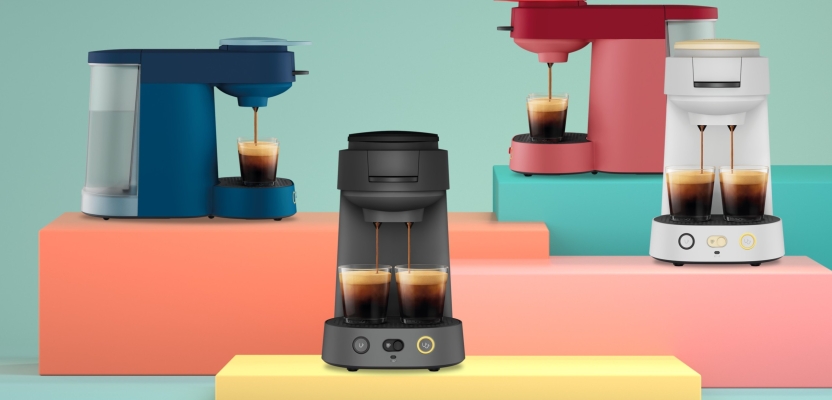
The new Senseo® Vibe machine, designed in partnership with Versuni, provided an important visual cue for the identity. Its compact proportions, rounded geometry, bold colour blocking and soft forms became a springboard for a wider brand world built from colour, shape and movement.
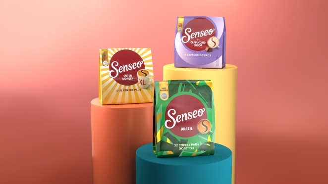
Looking to build upon the iconicity of Senseo®’s established assets rather than replacing them, the familiar logo retains its upward slant, rounded forms and small flourishes, qualities that reflect the brand’s “Uplifting Companion” personality. Meanwhile the S-in-Crema, a distinctive asset used on Senseo® packs for more than 20 years, becomes the basis for a new graphic expression. Design Bridge and Partners abstracted the S-in-Crema’s distinctive curve into a new Swirl icon, creating a simple visual shorthand that can move through layouts, divide space and bring another layer of recognition to the system.
Its new Signature Pattern is directly inspired by the Vibe machine’s controls and components alongside the feelings evoked from the “Feels like Yes” platform. Rounded geometric forms within the design can be recomposed, cropped and scaled to create a fluid and flexible graphic language, with carefully balanced colour combinations bringing different levels of energy to different applications.
A significantly expanded colour palette moves Senseo® away from its formerly darker visual expression, introducing softer pinks, greens, blues, oranges and yellows alongside the established Senseo® red. Typography is led by Senseo® Redonda, a bold variable headline typeface chosen to feel expressive without becoming inaccessible. Its rounded, condensed character gives communications a more graphic presence while retaining the simplicity and approachability at the heart of the brand.
Together, the logo, palette, pattern, Swirl, typography, photography and product assets form a flexible visual system, allowing different ingredients to be combined while maintaining a consistent Senseo® expression across markets and touchpoints. Across the system, the brand’s “Uplifting Companion” personality is translated into a visual language that is positive, playful and optimistic.
Ricard Barri Valentines, CMO at JDE Peet’s, owner of Senseo®, said: “Design has a really important role to play in the next chapter of Senseo®. We have a brand with enormous recognition and a very simple promise, but we needed to express that promise in a way that feels more contemporary and culturally relevant. The new identity gives us a much more distinctive and flexible world, one that can reach a new generation without losing the familiarity that has made Senseo® part of people’s everyday lives for more than 25 years. It creates a strong foundation for how the brand can continue to evolve across markets, products and experiences.”
Ulrike Jürgens, Creative Director, Design Bridge and Partners Amsterdam said: “We wanted to give Senseo® a visual world that felt much more in tune with how people live now, without losing the ease and familiarity that have always been central to the brand. The identity brings more energy, character and optimism into the experience, with a flexible set of assets that can shift from bold and expressive to more restrained depending on the context.
Working with JDE Peet’s over many years has created a strong level of openness and collaboration, which gave us the confidence to push the brand into new territory while respecting what people already know and trust. The system is designed to work consistently across different markets and touchpoints, while still leaving room for personality.”
Senseo® Vibe machine brews up to two cups in under a minute, with a choice of long or short coffee, and is available in blue, red, black and white. The new brand identity work will initially roll out across key Senseo® markets including France, the Netherlands and Belgium, with further markets expected to follow.