There's a peculiar cruelty to logo design. The better you are at it, the less effort it appears you've put in.
A beautifully considered logo might take months of research, experimentation, sketching, revisions and difficult conversations before it reaches the point where everyone agrees it looks rather obvious. At which point, somebody inevitably asks why it took so long.
The problem, of course, is that simplicity is deceptive. When you're attempting to communicate the personality, ambition and values of an entire business through a handful of shapes or letters, every decision matters. And unlike a campaign, which might disappear after a few months, a logo could be representing that business for decades.
As Emma Moe-Dean, Design Director at PHA, explains:
"The best logos look effortless, but after seventeen years in design, I know that effortlessness is earned. It’s the product of hours of research, countless sketches, painstaking craft, and careful client negotiation. Logos remain the work that challenges me most, because a single design carries so much weight for a brand."
It's a sentiment that should resonate with anyone who's ever spent three hours nudging a letter half a millimetre to the left, only to discover it looked better where it started.
But beyond the occasional typographic existential crisis, there's a serious point here. Good logo design is about judgement. Knowing what to include, what to remove, when to experiment and, perhaps most importantly, when to stop.
And as businesses increasingly experiment with AI-generated identities and cheap online logo makers, the distinction between something that merely looks professional and something that's genuinely designed has arguably never been more important.
So, drawing on Emma's seventeen years of experience and ten principles for professional logo design, what actually makes a good logo? And how can businesses and designers work together to create something that people will still recognise long after the latest visual trend has been consigned to the internet's overflowing aesthetic graveyard?
1. Start with the story, not the sketch
Richard Hill MCSD
Before opening Illustrator, reaching for a pencil or asking an AI tool to generate fifty variations of a vaguely geometric animal, it's worth asking a question that sounds painfully obvious.
What's the brand actually about?
Emma's first principle is that every logo should contain some connection to the business behind it. That doesn't mean it needs to communicate an entire corporate history through an elaborate collection of symbols. Sometimes, a carefully chosen typeface can suggest everything you need to know about a company's personality.
A serious financial institution might require a completely different typographic language from a rebellious independent brewery, for example. Neither approach is inherently better, but the design decisions should be rooted in the character of the business.
As Emma puts it:
"A logo should nod to a brands story. This could be as simple as using a typeface which gives the essence of your brands tone of voice, or it could be a mark that visually represents the brands core business."
Amazon's familiar arrow is an excellent example. Running from the A to the Z, it communicates both the breadth of the company's offering and a smile. It's a visual idea that feels so natural now that it's easy to forget somebody had to come up with it in the first place.
The important distinction, however, is between finding a meaningful story and inventing one to justify a design you've already decided you like.
We've all seen those elaborate logo presentations where a designer explains that the precise angle of a triangle represents innovation, the circular element represents community and the carefully selected shade of blue supposedly communicates the founder's childhood connection to the sea.
Sometimes, a triangle is just a triangle.
A convincing logo design process begins with research into the business, its audience, its competitors and its ambitions. What makes it different? What associations does it want to build? What does it need people to remember?
The answers don't necessarily have to appear literally within the logo, but they should inform the decisions behind it.
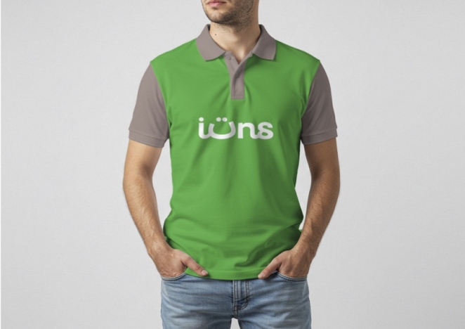
A particularly useful example from the Creativepool community is Richard's identity for IT network specialist itsn, which draws on the company's name, the cultural context of its market and the practical nature of its services. The identity demonstrates how a specific business problem can inspire a visual solution without requiring an overly complicated mark.
That's where effective logo design begins. Not with something that looks clever, but with an understanding of what the business needs that cleverness to achieve.
2. Don't be too literal

Gianfranco Fagotto
There's an understandable temptation, particularly among businesses commissioning their first logo, to insist that the design immediately communicates exactly what the company does.
A photographer needs a camera. A construction company needs a building. A technology business apparently needs some variation of a connected network of dots.
The problem is that if every business followed this approach, entire industries would become visually indistinguishable.
Emma argues that a logo doesn't necessarily need to reveal its meaning immediately. Indeed, its significance can develop as people become familiar with the business.
Consider Nike's Swoosh. It doesn't depict a trainer, an athlete or even the Greek goddess of victory from whom the company takes its name. Yet few visual marks communicate movement, confidence and athletic ambition quite as effectively.
Of course, Nike has also spent decades and considerable amounts of money building those associations. A new business can't reasonably expect the same level of recognition simply because it commissions an abstract symbol.
But the principle remains valuable. A logo doesn't need to explain the business like a diagram in an instruction manual.
In fact, excessive literalism can actively restrict a brand's ability to evolve.
Imagine a company that begins by selling bicycles and commissions a logo built entirely around a bicycle wheel. Five years later, it expands into electric scooters, accessories and urban mobility services. That once-perfectly appropriate symbol might suddenly feel unnecessarily narrow.
An identity built around freedom, movement or exploration could offer greater room to grow.
This is particularly important when considering what makes a genuinely distinctive visual identity. Recognition doesn't come exclusively from depicting what a business sells. It develops through repeated exposure to a consistent collection of visual cues.
The strongest logos often give people something to recognise rather than something to decipher.
There's also a danger in trying too hard to be clever. Hidden symbols and visual double meanings can be wonderful when they arise naturally, but they're not mandatory.
If a logo requires a five-minute explanation before anybody can appreciate it, the designer might have become more interested in the puzzle than the business.
Sometimes, the most confident thing a logo can do is simply exist.
3. Don't over-craft an idea before you know it's the right one

Vadym Aseiev
Designers are, generally speaking, rather good at finding things to obsess over.
It's one of the profession's great strengths, but it can also be a spectacular waste of time when applied at the wrong stage of a project.
Emma's third principle concerns the relationship between exploration and refinement.
During the early stages of logo development, the objective should be to establish whether the underlying idea works. There isn't much value in perfecting the spacing between two letters if the client eventually decides that the entire typographic direction is wrong.
As Emma explains:
"A perfect curve or exact kerning will go unnoticed at this point, and if the direction changes, that time is wasted. Save the fine-tuning for later."
This doesn't mean designers should present careless work. Clients need enough visual information to understand what they're evaluating, and overly rough concepts can sometimes make perfectly strong ideas appear unconvincing.
It's about applying effort where it matters.
During exploration, that might involve producing several distinct creative territories, each expressing a different aspect of the brand's positioning. One could be primarily typographic, another might introduce a distinctive symbol, while a third could investigate a more expressive visual approach.
Those territories can then be discussed in relation to the original brief.
Does this direction communicate the right personality? Is it distinctive within the category? Could it work across the environments where the brand needs to appear?
Only once the central creative direction has been agreed should the truly obsessive work begin.
And there's another advantage to maintaining this separation. Clients are much more likely to give useful feedback when they understand which decisions are being made at each stage.
If they're being asked to approve a strategic direction, the conversation shouldn't become dominated by whether a particular letter feels two per cent too wide.
Good designers know when to sweat the small stuff. Great ones know when not to.
4. Sell the thinking, not just the finished image
Fraser Adamson
One of the most overlooked aspects of professional logo design is the presentation.
A designer can create a beautiful identity, but if they can't communicate the thinking behind it, they're leaving an enormous amount of its value to chance.
Clients rarely make branding decisions in isolation. Even when one person has commissioned the work, they may still need to persuade colleagues, investors, directors or an entire executive team that the proposed direction is appropriate.
And unfortunately, saying "I think it looks really nice" isn't always enough.
Emma believes that presenting the story behind a logo is every bit as important as presenting the logo itself.
Take Airbnb's Bélo symbol, which brings together ideas of people, places, love and the letter A. Whatever your personal feelings about its appearance, the identity arrived with a clear narrative about belonging.
That narrative gave people a way to understand the design beyond its immediate visual form.
A useful logo presentation might therefore include early sketches, references, examples of the competitive landscape and a demonstration of how the chosen idea developed.
It should also show the identity working in realistic situations.
A logo floating in the centre of a white PowerPoint slide tells you relatively little about how it will function on a shopfront, packaging, a mobile interface or a branded vehicle.
Context helps clients imagine the identity becoming part of their business.
This is particularly valuable when the recommended direction challenges expectations.
A client might initially prefer a more elaborate or literal design, but seeing a simpler alternative used confidently across different applications can make its advantages immediately apparent.
As Emma observes, clients are more likely to support an identity when they can explain its rationale to somebody else.
That gives designers a useful test before every presentation.
Could the person commissioning this logo confidently explain why it works to a colleague who wasn't in the room?
If the answer is no, there may still be work to do.
5. Give clients familiar references without encouraging imitation

Coley Porter Bell
Creative professionals can sometimes forget how unfamiliar the design process feels to people outside the industry.
What seems perfectly obvious to a branding specialist might feel like an expensive leap of faith to a business owner commissioning their first identity.
This is why Emma recommends having familiar visual references available throughout the process.
Showing how established brands adapt their identities across different environments can help clients understand why certain design decisions matter.
A logo that looks unusually simple in isolation might become much more convincing when presented alongside examples of other successful identities performing a similar function.
But there's an important distinction between using references to explain design principles and using them as a template.
The objective shouldn't be to persuade a client that their business needs to look like Apple, Nike or Google. It should be to demonstrate why those identities have particular strengths and how the underlying principles could be applied differently.
For instance, a business operating across physical products, digital platforms and social media might benefit from understanding how established brands use different versions of the same identity.
A full wordmark might work beautifully on a website header but become unreadable inside a tiny social avatar.
A standalone symbol may solve that problem without abandoning the overall identity.
This is where the distinction between a logo and a complete brand identity system becomes particularly important.
The logo might be the most recognisable component, but typography, colour, imagery, graphic devices and layout principles all contribute to the overall impression.
Consider Coley Porter Bell's identity for The SCAN Foundation. Its central graphic idea uses differently sized and positioned forms to communicate equity, connecting a visual principle to the organisation's purpose.
The significance isn't simply that the mark has a story. It's that the design provides a coherent foundation for how the organisation presents itself.
For clients, references of this kind can make the difference between approving a graphic and understanding an identity.
And for designers, they're a reminder that the best work doesn't need to resemble an established brand to benefit from the principles that made it successful.
6. Make sure your logo works in one colour

Ziemowit Maj
Of Emma's ten principles, this is the one she'd prioritise above all the others.
"Your logo doesn't need to be one colour, but you must design it so it can be used in one colour."
It's an apparently straightforward rule that becomes much more important once you start thinking about the practical realities of running a business.
A logo may look wonderful in a carefully produced presentation, complete with atmospheric lighting, sophisticated gradients and a beautifully chosen background.
But what happens when somebody needs to embroider it onto a uniform?
Or cut it from vinyl for a shop window?
Or print it on a single-colour promotional product?
Suddenly, all those decorative subtleties become potential liabilities.
Emma highlights precisely this problem. A gradient that looks attractive on screen might prove difficult to reproduce in certain physical applications. Meanwhile, a multicoloured design can lose its distinction when reduced to a solid silhouette.
That doesn't mean every brand should abandon colour or complexity. It means the underlying form must be strong enough to function without relying entirely on either.
Google's familiar multicoloured wordmark offers an interesting example. Its distinctive letterforms remain recognisable when reproduced in a single colour, even though colour is a major part of the brand's usual expression.
The point is to develop an identity with enough structural integrity to survive different production requirements.
For practical purposes, every professional logo design should be tested in at least three situations: as a solid dark mark on a light background, reversed out in light on dark, and reproduced at a realistic small size.
It's also worth considering how negative space behaves when the logo is reduced.
A narrow gap between two shapes might look perfectly adequate at presentation scale but disappear when printed on a small label.
Similarly, an intricate symbol might retain its structure on a large screen while becoming completely indistinguishable on merchandise.
These aren't glamorous considerations, but they're the kind of details that prevent expensive problems later.
Because a logo that works beautifully only in its designer's preferred mock-up isn't really doing its job.
7. Avoid fine details that disappear in the real world

The Behaviours Agency
If the previous principle concerns how a logo survives changes in colour and production, this one concerns scale.
Emma recalls spending an agonising amount of time crafting two curved cut-outs into a letter, only to discover that the detail disappeared when the logo was exported for a profile picture.
It's an experience that probably deserves its own support group.
Modern design software allows us to zoom into artwork to absurd levels of magnification, refining shapes with a precision that would have been unimaginable a few decades ago.
The problem is that actual customers rarely inspect logos at 3,200 per cent magnification.
Most encounter them while scrolling through a phone, glancing at packaging or passing a sign at speed.
At those sizes, intricate details can become meaningless.
This is why testing needs to happen throughout the design process rather than being left until the end.
A mark that appears beautifully balanced on a large monitor should also be viewed at approximately the size of a social media avatar, a mobile navigation icon or a small printed label.
And the solution isn't always to simplify the primary logo until every trace of character has disappeared.
Sometimes, the better approach is to create responsive variations.
An elaborate wordmark might remain appropriate for packaging or signage, while a simplified symbol or monogram can represent the brand in more restrictive environments.
The essential requirement is that these versions retain enough shared visual DNA to feel like expressions of the same identity.
That could mean preserving a distinctive shape, characteristic letterform or recognisable proportion.
Of course, responsive logo design shouldn't become an excuse to produce a completely different identity for every possible application.
The purpose of introducing variations is to maintain consistency across different conditions, not to generate a small army of competing logos.
The strongest small business logo designs are often those that understand their practical limitations from the outset.
If the business relies heavily on Instagram, for example, its social avatar shouldn't be treated as an afterthought.
If packaging is the primary customer touchpoint, the identity should be tested on realistic packaging dimensions before the design is approved.
And if the logo will be embroidered, engraved or manufactured as signage, it's worth speaking to the people responsible for producing those materials.
A designer's job isn't finished when something looks attractive on screen.
It's finished when the idea survives contact with reality.
8. Turn it upside down and see what happens
Tahir Mughal
Of all Emma's recommendations, this might be the simplest to try.
Take your logo and turn it upside down.
That's it.
No elaborate software, psychological theory or expensive design workshop required.
The reasoning is that our brains are remarkably good at recognising familiar shapes and attaching meaning to them. Once we understand what an image represents, it becomes harder to evaluate it purely as an arrangement of forms.
By rotating a logo, designers can temporarily disrupt that recognition and concentrate on the composition itself.
Suddenly, the letterforms become abstract shapes. The familiar symbol becomes a collection of angles and curves.
And the space between those elements becomes much easier to judge.
This can reveal visual imbalances that aren't immediately obvious when the logo is viewed in its intended orientation.
Perhaps one side feels unexpectedly heavy. Perhaps the space between the symbol and the wordmark is slightly awkward. Or perhaps two elements that seemed perfectly balanced suddenly appear to be competing for attention.
Turning the design upside down doesn't automatically reveal the correct solution, of course.
But it encourages a different kind of observation.
Designers can also experiment with viewing a logo in greyscale, reducing its size or stepping away from the screen before returning with fresh eyes.
These methods remove some of the distractions that accumulate during prolonged periods of design work.
After several hours staring at the same arrangement of letters, even obvious problems can begin to look normal.
Sometimes, the most useful design tool is simply a change of perspective.
9. Find a thread of continuity throughout the design

Swerve Represents
A logo doesn't necessarily need to contain multiple elements, but when it does, those elements should feel like they belong together.
This is where Emma's ninth principle comes into play.
She suggests identifying a visual characteristic that can be carried throughout the design.
If a wordmark uses rounded letterforms, for example, introducing similar curves into the accompanying symbol can create a sense of continuity.
If the typography is particularly angular or architectural, the symbol might benefit from reflecting that same visual language.
The important word here is might.
Consistency doesn't mean making every component identical. Sometimes, contrast between elements creates a more interesting and effective composition.
The skill lies in understanding which characteristics should remain consistent and where variation adds value.
A delicate serif wordmark paired with an extremely heavy geometric symbol could look wonderfully distinctive in the right circumstances. In others, it might resemble two unrelated logos forced into an uncomfortable marriage.
That decision depends on visual judgement and the personality of the brand.
But continuity becomes even more important when the logo begins informing the wider identity.
A characteristic curve might inspire a recurring graphic element. The relationship between two shapes could influence the layout system. A distinctive typographic treatment might become recognisable across packaging, advertising and digital communications.
The objective is to develop a design language that can extend beyond the logo without constantly repeating it.
This is particularly important during a rebrand, when businesses must consider how a new identity will operate across everything from their website and social channels to physical environments and internal communications.
A successful rebranding process needs to account for that broader rollout, rather than treating the moment a logo is approved as the finish line.
One useful way to judge whether an identity possesses genuine continuity is to remove the logo from a piece of branded communication.
Does the work still feel recognisably connected to the business?
If the answer is yes, the design system is probably doing something right.
If everything becomes anonymous the moment the logo disappears, it may be worth thinking about how the identity's other elements could work harder.
10. Trust your eye over the maths

Paul Jamie Kidd
And so we arrive at the sort of advice that might make an especially technically minded designer slightly uncomfortable.
Sometimes, the measurements are wrong.
Or, more accurately, the measurements can be mathematically correct while the resulting design still looks wrong.
Emma's final principle is to trust visual judgement rather than relying exclusively on numerical precision.
A symbol with more visual weight on one side might need to be positioned slightly off-centre to appear balanced.
Similarly, the space between two letters might require optical adjustment even when the numerical measurements suggest the spacing is consistent.
This is particularly apparent in typography.
Different letterforms create different shapes of negative space. An A next to a V behaves very differently from an H next to another H, even when the mathematical distance between them is identical.
Professional typographers account for these relationships through optical spacing and kerning.
Logo designers need to develop a similar sensitivity.
Grids, guides and construction systems are valuable tools, particularly when building consistent proportions or preparing files for production.
But they shouldn't become unquestionable authorities.
There's a tendency within logo design culture to romanticise geometric precision. Elaborate construction diagrams can make relatively simple marks look like extraordinary feats of mathematical engineering.
Sometimes they reveal genuinely impressive thinking. Other times, they're little more than an attractive way of presenting a decision that was ultimately made by eye.
What matters is whether the finished result feels balanced, distinctive and appropriate.
It's also worth remembering that visual judgement develops through experience.
The more identities a designer creates, the more sensitive they become to subtle problems in spacing, proportion, weight and alignment.
Those instincts are difficult to reduce to a formula, which is one reason professional logo design still has value in the age of AI-generated identities.
Software can generate shapes, propose combinations and calculate measurements. It can even produce something that looks convincing at first glance.
But knowing which imperfections need correcting, which conventions are worth breaking and which visual decisions will strengthen a particular brand requires a different level of judgement.
That judgement is what separates technical competence from genuine craft.
What should a good logo design brief actually include?
Betim Bozkurt
Emma's principles provide a useful framework for designers, but they also highlight something businesses often underestimate.
A strong logo requires a strong brief.
Too many commissioning conversations begin with a list of preferred colours and a vague request for something modern, premium and timeless.
Those preferences might be useful, but they don't tell a designer very much about the problem they're trying to solve.
A good logo design brief should start with the business itself. What does it do? Who does it serve? What distinguishes it from competitors? How does it want to be perceived, and how might that change over the coming years?
It should also explain why the logo is being commissioned.
A completely new business has different requirements from an established company refreshing an identity that customers already recognise.
In the latter case, existing brand equity deserves careful consideration. There may be distinctive colours, symbols or typographic characteristics worth retaining, even if the wider identity needs to evolve.
The brief should also identify the environments in which the logo will actually appear.
A digital-first consultancy might prioritise website headers, presentations and social media profiles. A restaurant could need signage, menus, uniforms, packaging and delivery materials.
These applications influence the design from the beginning, particularly when considering scalability, colour reproduction and responsive variations.
Businesses should also be clear about practical expectations.
Will they need a standalone symbol alongside the main wordmark? Are horizontal and stacked versions required? Should the designer provide single-colour alternatives, vector artwork, social media assets and basic brand guidelines?
And just as importantly, who will be making the decisions?
A logo project can become remarkably difficult when six stakeholders provide contradictory feedback at different stages.
Agreeing who has final approval, what the feedback process looks like and how many revision rounds are included can prevent a surprising amount of frustration.
Budget and timescale matter too. A designer can't propose an appropriate process without understanding the resources available and when the work needs to be delivered.
The more useful information a client provides, the more time the designer can spend solving the actual problem rather than trying to work out what the problem is.
How to find the right logo designer on Creativepool

HA – interactive brand studio
Of course, understanding what makes a good logo is only half the battle.
The other half is finding somebody capable of creating one.
And while there's certainly no shortage of designers offering logo services, choosing the right creative partner requires a little more consideration than simply finding somebody whose portfolio looks attractive.
The first thing to establish is what you're actually commissioning.
If the business needs a relatively straightforward logo for an established brand, an experienced freelance graphic designer might be the ideal choice.
If the project involves positioning, brand strategy, naming, typography, packaging and a complete visual identity system, a branding specialist or design agency may be better equipped to handle the wider brief.
Creativepool offers several ways to explore both.
You can begin by browsing the community of graphic designers, looking specifically for people with relevant logo design and branding experience.
The wider creative talent directory also allows you to explore professionals by discipline and location, while the design agency directory is useful for businesses seeking a studio to develop a broader identity.
But the most important part of the selection process is evaluating the work itself.
A strong logo design portfolio should demonstrate more than an ability to create fashionable graphics.
Look for evidence that the designer understands different business contexts and can solve different kinds of problems.
Do all their identities follow exactly the same aesthetic, regardless of the client? Or can they adapt their approach while maintaining a recognisable standard of craft?
A designer who produces beautifully minimal marks might be excellent at their particular style, but that doesn't automatically mean they're right for a children's entertainment business or a highly expressive lifestyle brand.
Look beyond the polished presentation images, too.
Does the portfolio explain the thinking behind the design? Are there examples of how identities work across packaging, websites, signage or other real-world applications?
Can you see evidence of an idea developing into a complete and flexible system?
Creativepool's project portfolios can be particularly useful here because they offer an opportunity to assess the relationship between a creative brief and its execution.
For example, the identity developed for Origin Broadband illustrates how brand design can respond to a smaller company's need to distinguish itself from larger competitors through a more approachable personality.
Similarly, the brand identity and interactive website created for Entice Energy demonstrates how a central creative idea can extend into a wider digital experience.
Projects like these offer more useful insight than an isolated logo floating against a beautifully textured background.
Once you've identified a few promising candidates, the next stage should be a conversation.
Ask how they approach research, how they develop concepts and what they need from you before beginning.
Find out how many creative directions they typically present, how feedback is handled and what happens when the initial concepts don't meet the brief.
It's also worth discussing the deliverables and commercial arrangements before work begins.
In the UK, paying a freelance designer to create a logo doesn't automatically mean the client owns the copyright. The position depends on the circumstances and the agreed terms, so it's important to establish ownership and permitted uses in writing.
The agreement should clarify what artwork will be supplied, whether the business receives an assignment of copyright or a licence, and whether any third-party typefaces or other assets have separate restrictions.
Businesses should also consider appropriate trade mark searches and checks before committing to a new identity. A beautiful logo is significantly less useful if another organisation already holds conflicting rights.
For companies looking to commission a wider project, Creativepool's creative services directory provides access to agencies and studios, while its studiobriefs service offers another route for connecting a project brief with potential creative partners.
Ultimately, the best designer isn't necessarily the person with the most awards, the biggest client names or the most expensive-looking portfolio.
It's the person who understands what your business needs to communicate and has the experience to translate that understanding into something distinctive, practical and enduring.
The best logos are designed to become invisible

Iren Kolt
There's a strange contradiction at the heart of great logo design.
Designers spend enormous amounts of time thinking about every aspect of a mark, but the ultimate objective is to create something that audiences can recognise without having to think about it at all.
Nobody looks at the Nike Swoosh and consciously evaluates the spacing, geometry or optical balance. They recognise the brand.
Nobody studies the Amazon arrow every time they open a delivery. They understand what it represents.
That apparent ease is the result of accumulated decisions, consistent application and years of exposure.
Of course, no logo becomes iconic simply because it's beautifully designed. The reputation of the business, the quality of its products and the experiences associated with it all contribute to what the mark eventually means.
A logo isn't a substitute for a good business. But it can become one of the most powerful expressions of one.
And that's why Emma's ten principles matter.
They remind us that professional logo design isn't fundamentally about finding the prettiest combination of shapes or making a client feel impressed during a presentation.
It's about understanding a business deeply enough to make intelligent decisions on its behalf. Knowing when an idea is meaningful and when it's merely decorative. Knowing which details deserve hours of attention and which should be abandoned before they become an expensive distraction.
Most importantly, it's about remembering that the finished design needs to survive in a world far less accommodating than the pristine screen on which it was created.
Seventeen years into her career, Emma still finds logos among the most challenging things to design.
Given everything they're expected to achieve, perhaps that's hardly surprising.
After all, anyone can make something complicated look complicated.
Making something difficult look effortless? That's where the real craft begins.