

If your best salesperson behaved like your website, there's a reasonable chance you'd sack them before lunch.
Imagine walking into a shop, asking whether they sell something specific, and being greeted by an enormous photograph of the building's exterior. Before anybody answers your question, you're treated to a presentation about the company's values, shown several glowing testimonials from people you've never heard of and invited to discover its commitment to innovation.
Eventually, you find what you're looking for, only to discover that nobody will tell you how much it costs until you've filled in a form and agreed to a conversation with someone called Darren. You'd probably leave. Yet businesses routinely spend tens of thousands of pounds creating precisely this experience online, then wonder why their visitors aren't turning into customers.
The strange thing is that most of the people arriving at a business website have already done something rather encouraging. They've shown an interest. Perhaps they've clicked an advert, followed a recommendation, searched for a service or been sufficiently intrigued by a social post to investigate further.
Getting somebody to take that first step is no small achievement, particularly when the competition for attention is so intense. And yet the moment they arrive, far too many websites seem determined to make the next step unnecessarily difficult. The product is buried beneath the brand manifesto, the evidence is hidden in a PDF, the navigation appears to have been designed around the internal departmental structure, and the one thing the visitor actually wants to do requires navigating what feels like an unusually tedious escape room.
Of course, turning website visitors into customers isn't as simple as putting a bigger button on the homepage and hoping for the best. People arrive with different intentions, levels of knowledge and degrees of willingness to commit. Somebody researching a £100,000 engineering contract needs rather different reassurance from someone ordering a £25 birthday present, and neither should be expected to behave like a marketing department's idealised customer journey.
The real challenge of website conversion optimisation is understanding those differences and creating an experience that makes choosing your business feel easier, more convincing and more worthwhile than choosing somebody else.
That requires more creativity than the conversion-rate industry sometimes likes to admit. There's a tendency to reduce successful web design to a collection of familiar techniques involving prominent calls to action, social proof and the supposedly magical properties of certain button colours. Those things have their place, but they're unlikely to rescue a business whose website looks exactly like every competitor's, explains its services badly or gives visitors no compelling reason to care.
Sometimes the most commercially valuable decision is to remove an obstacle. Sometimes it's to communicate a complicated proposition in one beautiful piece of design. Sometimes it's to make the entire experience so distinctive that customers remember it long after they've closed the browser.
You can see that diversity in the Creativepool Annual 2026 Web winners, where projects range from technically demanding B2B platforms to luxury ecommerce and charitable giving.
The best examples demonstrate that good web design doesn't have to choose between looking exceptional and being genuinely useful. They also offer a more interesting starting point for anyone trying to improve website conversion rate than another expensive redesign based on the CEO's personal preference for larger typography.
Because attracting someone to your website is only half the job. The other half is making sure that, once they've arrived, you don't give them a dozen perfectly avoidable reasons to leave.
Why Do Website Visitors Leave Without Becoming Customers?
Poirier Agency
The uncomfortable answer is that sometimes it has nothing to do with your website.
A visitor might be researching. They may not have the budget yet. The person browsing a £20,000 product may need approval from three colleagues and somebody called Graham in procurement. An ecommerce visitor may be comparing your price with five other tabs. They might genuinely like what you sell and have absolutely no intention of buying it today.
This is worth remembering because website conversion rate optimisation can become slightly unhinged when every non-purchase is treated as a design failure. Baymard’s current ecommerce research puts average cart abandonment at around 70%, but its studies also distinguish unavoidable abandonment from friction businesses can actually influence. In its research, 42% of shoppers who had abandoned a cart said they were simply browsing or not ready to buy.
The more interesting group is the people who were willing to proceed until the experience gave them a reason not to.
39% of surveyed shoppers had abandoned checkout because of additional costs such as shipping, taxes or fees, while 19% had abandoned when forced to create an account. Its wider research also found 17% reporting a checkout that felt too long or complicated as a reason for leaving. Those aren’t failures of demand. They are moments where commercial intent collided with unnecessary effort.
B2B websites create the same problem in less measurable ways. A potential customer reaches the homepage and cannot work out what the company actually does. The Services page offers eleven vaguely overlapping capabilities. The navigation reflects the internal corporate structure rather than anything a customer would ever search for. The case studies sit three levels deep. The contact form asks for enough information to open a bank account and the main call to action says “Get Started”, without making it particularly clear what will start.
Nielsen Norman Group has found generic “Get Started” calls to action can create precisely this ambiguity, attracting clicks while failing to set useful expectations about what happens afterwards. Its current CTA guidance similarly emphasises that effective calls to action should use an actionable verb, establish what the user can expect and communicate why taking the action is worthwhile.
This is where user experience optimization becomes commercially useful rather than merely technical. The job is to remove the small moments where a visitor has to stop and decode the organisation.
- What do you sell?
- Is it for me?
- Why should I choose you?
- What does it cost?
- Can I trust you?
- What happens if I click this?
A site that answers those questions elegantly often feels simple, but simplicity is normally the result of considerable strategic work. Someone has decided what matters, created a hierarchy, removed competing messages and organised the content around the user rather than the politics of the company.
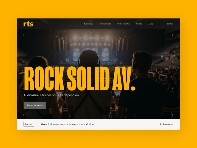
Creativepool’s Annual-winning RTS website by Novagram demonstrates this particularly neatly. RTS is an audiovisual and broadcast production specialist with a broad technical offer, but the redesign rationalised its services into four pillars so visitors could absorb the proposition quickly, move into evidence through case studies and reach contact information without unnecessary friction. The project also rewrote headlines and body copy to make them more conversational and approachable.
Nothing about that sounds like a dark pattern or clever conversion hack.
It sounds like making the business easier to buy.
That is probably the healthiest way to think about conversion in the first place.
What Conversion-Focused Websites Actually Get Right
A customer rarely arrives at a website thinking, “I hope this organisation has implemented a sophisticated CRO programme.”
They are trying to do something.
The role of the website is to help them do it with as little confusion, anxiety and avoidable effort as possible while making the company sufficiently distinctive that choosing it doesn’t feel interchangeable.
That sounds straightforward, but it creates some useful disciplines for anyone trying to improve website conversion rate:
- Start with user intent, not the homepage design. Work out the major jobs visitors arrive to complete and build obvious routes around them. Different audiences may need radically different paths.
- Make the proposition understandable before making it impressive. Beautiful language that obscures what you sell is still obscuring what you sell. Clarity is not the enemy of creativity.
- Put evidence near the point of doubt. Case studies, customer names, specifications, reviews, demonstrations, guarantees, pricing context and credentials are most useful where the corresponding question arises.
- Make calls to action describe a real next step. “Book a demo”, “Download specifications” or “Get a project estimate” creates more useful expectation than an abstract “Discover more”.
- Remove fields, steps and decisions that don’t earn their place. Every additional request should justify the effort it asks from someone who has not yet become a customer.
- Treat speed as part of the experience. A beautifully designed interaction nobody waits long enough to see is not sophisticated design. It is expensive latency.
- Measure business actions, not merely traffic. A successful redesign should improve something the organisation actually values: qualified enquiries, purchases, bookings, donations, applications, specification downloads or another meaningful behaviour.
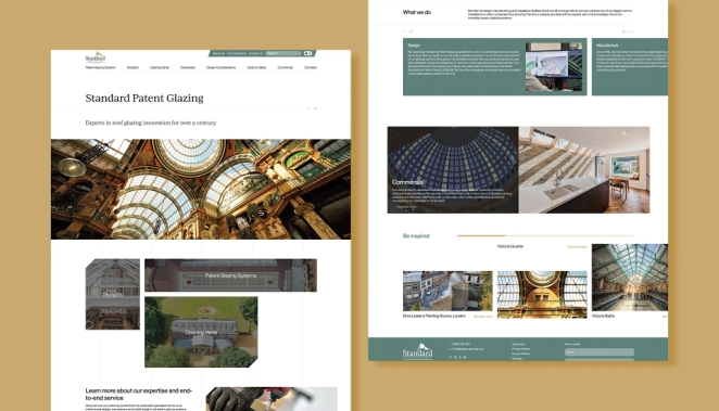
Think’s website and specification library for Standard Patent Glazing
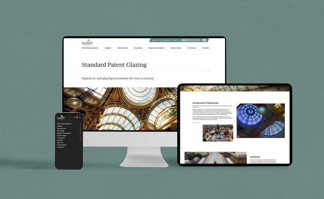
The value of starting with tasks rather than aesthetics is beautifully demonstrated by Think’s website and specification library for Standard Patent Glazing, a Bronze winner in Creativepool’s 2026 Web category. Its audience of architects and construction professionals was not arriving for a leisurely brand experience; they needed to find systems, understand technical suitability, review design considerations, access drawings and move towards quotation or support. Think explicitly structured the website around those journeys rather than making brand storytelling the primary organising principle.
One of its key features became a filter-led drawings and downloads library with a basket-style selection system, turning what the case study describes as a “scavenger hunt” for technical material into a purposeful tool. Since launch, Creativepool’s project page reports more than 3,000 high-intent interactions, including 696 PDF downloads and 1,399 specification downloads. Those figures aren’t proof that every visitor became a customer, but they are much closer to the behaviour the business values than simply celebrating homepage views.
That is the distinction worth preserving throughout any discussion of conversion. A conversion does not have to mean an ecommerce transaction. For a glazing manufacturer, downloading the right technical drawing may be a commercially meaningful step. For a university provider it could be an enquiry. For a charity, a donation. For a consultancy, a qualified lead. For a SaaS product, a trial or booked demonstration.
Google Analytics now describes these strategically important interactions as “key events”, which businesses can define around actions that matter to them rather than treating every interaction equally. Its ecommerce measurement also supports detailed purchase-journey events so businesses can see where people move through or leave a transaction.
In other words, before asking whether your website converts well, decide what “convert” actually means.
Creativepool Annual Winners: Websites Built Around Real User Jobs
The most useful thing about looking through Creativepool’s Annual Web winners is how little resemblance there is between them stylistically. That matters because website conversion optimisation is sometimes sold as though there is a single winning formula involving a large button, three testimonials and a carefully calculated shade of green.
There isn’t.
A luxury fashion customer, teacher, architect, donor and PepsiCo investor do not arrive with identical motivations. Good UX does not flatten those differences. It designs around them. Creativepool’s Web category explicitly rewards user experience, functionality and communication alongside creativity, and the 2026 winners demonstrate how differently those principles can manifest.
Huge’s PepsiCo Rebrand and Site
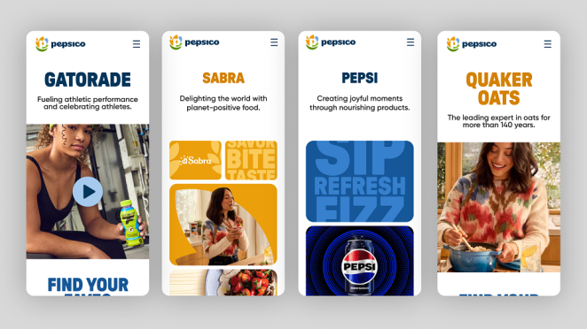
PepsiCo: complexity made coherent. Huge’s PepsiCo Rebrand and Site, which won Gold and People’s Choice in Web, had to bring more than 500 product brands into one digital experience while serving investors, partners, employees and consumers. The challenge was therefore not a shortage of content but an excess of possible stories. Huge’s stated objective was to unify that enormous brand ecosystem into one coherent experience while positioning PepsiCo around innovation and sustainability.
That is a conversion lesson in its own right. Large companies frequently mistake comprehensiveness for usefulness. The more products, divisions and audiences an organisation has, the greater the temptation to expose all of its complexity in the navigation. A good corporate site performs compression. It gives different audiences enough orientation to recognise where they belong without forcing them to understand the organisation before they can use it.
Huge’s Google App Hub redesign
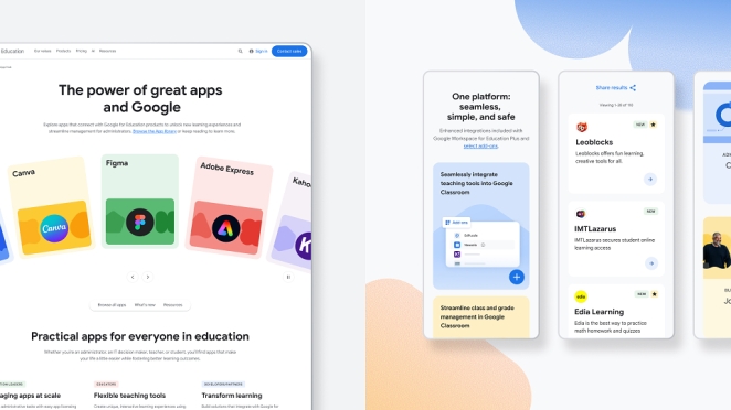
Google’s App Hub: discovery is the product. Huge’s Silver-winning Google App Hub redesign tackled an education marketplace used by school leaders, teachers and developers. Its emphasis was on making a large ecosystem of classroom applications easier to discover and integrate through clearer navigation and a more accessible interface.
That illustrates a particularly important point for marketplaces and content-heavy platforms: conversion can fail long before the CTA because users never find the right thing to act upon. Search, filtering, taxonomy and information architecture are not back-office concerns. They shape revenue because they shape discovery.
AKQA’s Lemaire ecommerce redesign
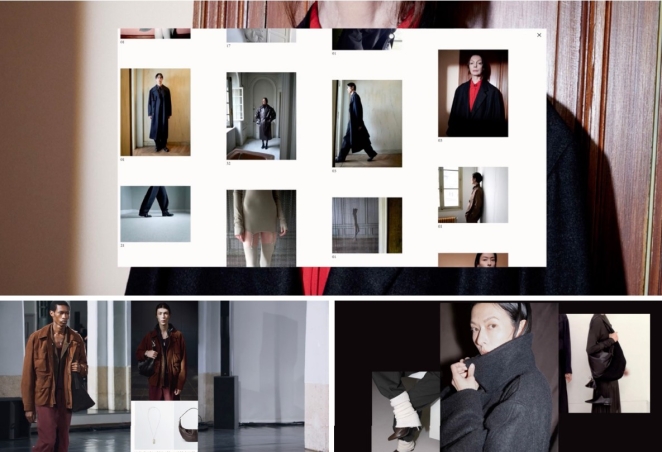
Lemaire: conversion without destroying the brand. AKQA’s Silver-winning Lemaire ecommerce redesign took almost the opposite approach. The independent Paris fashion house wanted its online store to reflect the atmosphere and philosophy of its physical boutiques. Rather than treating ecommerce as a generic transaction layer pasted beneath the branding, AKQA translated the retail environment into a refined digital experience.
That is a useful corrective to the ugliest version of CRO thinking, where every distinctive feature is treated as suspicious unless it immediately produces another click. Conversion and brand experience are not natural enemies. Particularly in luxury, hospitality, design, property and other high-consideration sectors, the experience is part of the evidence. A site that looks and behaves like every low-cost competitor may technically remove friction while simultaneously destroying the reasons someone was willing to pay more.
Mud’s Base Structures website
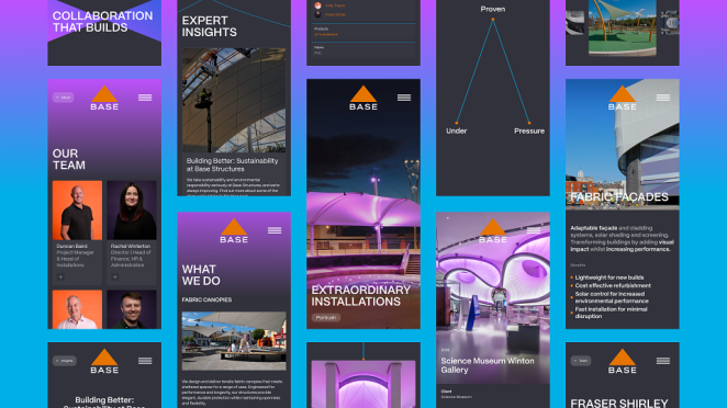
Base Structures: let the work do the persuading. Mud’s Silver-winning Base Structures website started with a company whose old site had become a comprehensive archive of projects but failed to communicate the scale and ambition behind them. The redesign developed a visual concept around “tension builds”, using movement and graphic behaviour inspired by the forces involved in tensile fabric engineering. Just as importantly, it restructured project stories and created a flexible CMS while preserving a hidden archive of more than 150 projects for the internal sales team.
The clever part is that the expressive design and the commercial job are not competing. Motion reinforces the nature of the product, while the underlying information architecture lets potential clients understand capability and lets salespeople retrieve useful proof. Great web creativity should make persuasion richer, not navigation harder.
Novagram’s Malvern platform
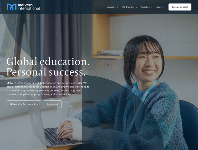
Malvern International: build for the organisation after launch. Novagram’s Bronze-winning Malvern platform needed to support a growing family of sites associated with different brands and university partners. The answer was a modular system of more than 60 reusable content blocks, multilingual functionality, mobile-first UX and CRM-integrated lead capture, alongside training that allowed Malvern’s internal team to manage the system themselves. At the time of the Creativepool case study, eleven sites had been created using the framework.
That introduces an overlooked aspect of conversion: maintainability. A website does not convert because the launch presentation looked wonderful. Prices change. courses launch, case studies need replacing, campaigns arrive and information becomes outdated. A system that requires an agency intervention every time the marketing team wants to change a page can gradually become less useful even if it launched beautifully.
Browser London’s Global Giving Platform for Muslim Hands
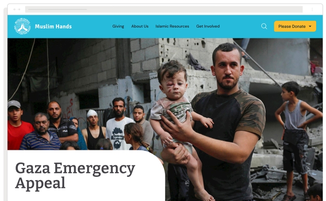
Muslim Hands: trust belongs inside the journey. Browser London’s Bronze-winning Global Giving Platform for Muslim Hands is perhaps the clearest conversion case study of the group because donation itself was central to the brief. Browser conducted user research, interviews, questionnaires and comparative analysis before reorganising the experience around donor intent. Research highlighted needs including clearer impact reporting, transparency around fund allocation, flexible donation options and easier mobile giving. The resulting platform combined trust-building content, simplified giving routes, a custom donation module and personalised content delivery.
Rather than asking “How do we make the donate button more persuasive?”, the work investigated the doubts surrounding the button. Where does the money go? What impact will it have? Can I give the way I need to? Can I do it quickly on my phone? The CTA is only the visible end of a much longer persuasion process.
Huge’s Chrome Mobile page
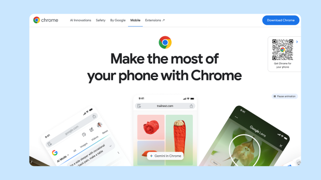
Chrome: simplify the ecosystem. Huge’s Bronze-winning Chrome Mobile page similarly focused on translating a complex product ecosystem into a simplified interface, with streamlined navigation and aesthetic cohesion intended to make engagement with the Chrome brand easier.
Across all these sites, the transferable lesson isn’t a design trend.
It is that the interface has been organised around what somebody needs to understand or accomplish.
That is the foundation on which most conversion improvement sits.
Does Redesigning a Website Increase Sales?
MRM Spain
Not necessarily.
That answer might be less exciting than the one a web agency would ideally like to print on a proposal, but it is much more useful.
A redesign changes sales when it changes something that was preventing or weakening sales: the proposition becomes clearer, relevant proof becomes easier to find, performance improves, checkout friction disappears, important products become more discoverable or the brand becomes more credible and desirable.
Changing the visual style while leaving those problems untouched may produce a nicer website and exactly the same commercial result.
This is why “our site looks old” is rarely a sufficient redesign brief.
Old compared with what?
Does it undermine credibility? Are users struggling? Is mobile performance poor? Has the proposition changed? Does the CMS prevent the team from publishing effectively? Are there journeys that end in dead ends? Is the company losing enquiries because its range is impossible to navigate?
These are problems you can design against.
Creativepool’s Annual-winning Web work repeatedly begins there. RTS had a complicated service structure and needed visitors to reach useful information more quickly. Malvern needed a scalable platform across multiple brands and languages. Muslim Hands needed a clearer and more trustworthy donation journey. Standard Patent Glazing needed time-poor architects to locate specifications and drawings. Base Structures needed its digital presence to communicate the scale of what it actually delivered.
Those are redesign reasons.
“The homepage feels a little 2021” is an aesthetic observation.
There is nothing wrong with aesthetics, of course. Lemaire demonstrates precisely why visual and experiential quality can be fundamental to the proposition. But even there, the redesign was not simply about modernising the interface. AKQA was attempting to make the ecommerce experience express the same philosophy as the fashion house’s physical stores.
Brand distinctiveness also has a commercial role that crude optimisation can accidentally damage. A website with perfectly conventional components and utterly generic copy may be wonderfully usable while doing very little to make the company preferable. The visitor understands exactly where the button is and feels no particular desire to press it.
That is why the best conversion work balances four things: clarity, desirability, credibility and ease.
Clarity tells me what you do.
Desirability makes me want it.
Credibility makes me believe you can deliver it.
Ease allows me to act.
Remove any one and the website becomes weaker. A gorgeous but baffling site lacks clarity. An ultra-efficient generic template may lack desirability. A bold startup page with no evidence lacks credibility. A convincing proposition trapped behind a dreadful checkout lacks ease.
A redesign should improve the weakest parts of that equation rather than assuming “different” automatically means “better”.
10 Steps to Turn Website Visitors into Customers
Think
There's no shortage of advice online about how to improve website conversion rates, most of it involving buttons, forms and increasingly elaborate attempts to persuade somebody that a special offer expires in the next eleven minutes. But the most useful changes tend to start with a rather less glamorous exercise: understanding why people who are interested in your business aren't taking the next step.
For some companies, that's a problem with the proposition. For others, it's trust, navigation, price, technical performance or a website that seems determined to make a perfectly straightforward transaction unnecessarily complicated. The following ten steps provide a sensible starting point for businesses that want their websites to do more than simply look impressive.
-
Work out what a conversion actually means for your business. Before redesigning anything, decide what you're trying to achieve. An ecommerce business wants purchases, a creative agency might want qualified enquiries, and a B2B manufacturer may care more about specification downloads and quotation requests. Treating every button click as a success is a wonderful way to produce impressive analytics reports without generating much additional business.
-
Make your value proposition obvious immediately. Visitors shouldn't need to read three pages of corporate philosophy to understand what you sell, who it's for and why they should choose you. Your homepage should communicate the essential proposition quickly, using language customers actually recognise. Clever writing and ambitious visual design are welcome, provided they make the message clearer rather than requiring an additional explanation.
-
Design around what visitors came to accomplish. People arriving from a product search have different intentions from those reading a case study or comparing service providers. Build clear routes for those different audiences rather than expecting everybody to begin on the homepage and follow the same journey. Think's website and specification library for Standard Patent Glazing is a useful Creativepool example, organising technical information around what architects actually need to find.
-
Give customers a convincing reason to choose you. A functional website is only half the battle if it makes your business look interchangeable with every competitor. Distinctive branding, persuasive copy, thoughtful photography and well-presented product or service benefits should communicate why your company deserves attention. The best website design combines an intuitive user experience with a recognisable personality and a genuine point of difference.
-
Put evidence where people need reassurance. Reviews, testimonials, case studies, technical certifications, client names, guarantees and examples of completed work all help reduce uncertainty, but they're most effective when placed close to the questions they answer. Someone considering an expensive service may want proof of expertise before speaking to sales, while an online shopper might need delivery and returns information before paying.
-
Make the website work beautifully on mobile. A design that looks extraordinary on a 27-inch monitor but becomes almost unusable on a phone isn't doing its job. Check whether text is readable, navigation is straightforward, forms are manageable and important actions remain accessible on smaller screens. Pay particular attention to loading performance, because visitors shouldn't have to wait for an elaborate animation before discovering what your business actually offers.
-
Make every call to action clear and worthwhile. Generic instructions such as "Get Started", "Discover More" and "Submit" can leave people unsure what will happen next. "Book a Free Consultation", "Get a Project Estimate" or "Download Technical Specifications" makes the next step much easier to understand.
-
Remove unnecessary obstacles from forms and checkout. If somebody wants to buy a product, they shouldn't have to create an account, complete an unnecessarily long form and discover unexpected delivery charges just before payment. The same applies to B2B enquiries, where asking for fifteen pieces of information before agreeing to a conversation can discourage perfectly good prospects.
-
Test the experience with people who don't already understand your business. Your internal team knows where everything is, what the terminology means and why the website works the way it does. Unfortunately, customers weren't invited to those meetings. Ask representative visitors to find a service, compare two products or complete an enquiry while you observe where they hesitate. Even a handful of carefully conducted usability sessions can uncover problems that months of internal discussion have failed to identify. Where traffic allows, controlled experiments can then help establish whether proposed changes actually improve outcomes.
-
Measure commercial outcomes and keep improving. Website conversion optimisation should be an ongoing process rather than something completed when the new site launches. Track purchases, qualified enquiries, bookings and other meaningful actions, then examine where customers drop out of the journey. Compare results across devices, traffic sources and visitor intentions, and remember that a higher conversion rate isn't automatically an improvement if the leads become less valuable. Use the evidence to decide what deserves changing next rather than commissioning another complete redesign because somebody thinks the homepage looks dated.
The interesting thing about these ten steps is how few demand an expensive reinvention. Some businesses genuinely need a new identity, better information architecture or a substantial technical rebuild, but others could make meaningful improvements by simplifying their proposition, presenting stronger evidence or deleting a few unnecessary questions from an enquiry form.
That's ultimately the principle behind effective website conversion optimisation. Your visitors have already shown enough interest to arrive. The job of good creative, intelligent UX and persuasive content is to give the right people a compelling reason to stay, trust what they're seeing and take the next step.
A website should make buying from your business feel like the obvious thing to do, rather than a test of the customer's patience.
How to Measure Website Conversion Rates and Keep Improving
Karoshi
A launch is not the end of website conversion optimisation. In some ways, it is the first moment you finally have enough real behaviour to discover whether all those beautifully reasoned design decisions survived contact with the public.
The starting point is to measure the actions that correspond with actual business value.
For ecommerce, that may include product views, additions to basket, beginning checkout, payment information and completed purchases. Google provides recommended ecommerce events specifically so organisations can analyse shopping behaviour and revenue rather than relying solely on page views.
For a B2B business, the useful hierarchy might be different: specification download, case-study engagement, pricing-page visit, completed enquiry, meeting booking and eventually a qualified opportunity. An education provider might care about course searches and applications. A charity may care about started and completed donations, repeat giving or volunteering enquiries.
The important thing is to separate micro-behaviours from outcomes. Clicking “Contact” is interesting. Submitting the form is more interesting. Becoming a qualified lead is more interesting still.
A sensible programme of website conversion rate optimisation should therefore combine several kinds of evidence rather than worshipping one dashboard.
Analytics tells you where behaviour changes. Funnel data may show that mobile users abandon disproportionately at payment. Search data might reveal people repeatedly looking for something the navigation hides. Speed monitoring can expose performance problems by device or page type. Google Analytics lets businesses designate strategically important actions as key events and measure user- or session-based key-event rates.
Qualitative research helps answer the more irritating question: why?
Watch people use the website. Ask what they thought would happen when they clicked something. Listen to sales calls. Read support tickets. Talk to customers who bought and, where possible, people who nearly did. Look at on-site search. Find the questions appearing repeatedly in live chat.
Then test changes against actual hypotheses.
“We should make the button orange” is not much of a hypothesis.
“Mobile visitors appear to miss the quotation route because the current CTA sits below a large technical block; moving a more specific ‘Get a project quote’ action closer to the decision point should increase qualified quote starts” is something you can reasonably investigate.
And perhaps most importantly, don’t optimise yourself into absurdity. A conversion rate can go up because you attracted fewer irrelevant visitors. It can fall because a campaign dramatically expanded reach to colder audiences. A lead form can generate more submissions because you removed all qualification, while the sales team quietly curses you for filling their CRM with rubbish.
Conversion rate requires context.
A commercially healthy website should be judged against the quality and value of the behaviour it creates, not simply the percentage of sessions that triggered a button.
The same applies to spending. There is no universally correct amount a business “should” invest in website conversion optimisation because the value of fixing a problem depends on the scale of the opportunity. A tiny improvement on a high-volume checkout may be worth vastly more than a complete visual redesign for a low-traffic brochure site. Conversely, a B2B business that sells a six-figure service might justify substantial UX work even with relatively modest traffic if one additional qualified customer pays for it.
Spend against the problem.
Measure against the outcome.
That is also how to brief the right creative team. Creativepool’s current Web Design Agency directory lets businesses compare agencies through portfolios, client recommendations, awards and recent project work, while its Web Designer directory and UX community give brands routes to individual specialists where the project does not require a full-service agency. Creativepool itself advises looking for live, working sites, checking mobile behaviour and judging whether the portfolio demonstrates usability and relevant outcomes rather than simply static presentation shots.
That is particularly important for a conversion brief.
Don’t just ask the prospective designer to show you their prettiest websites.
- Ask what problem the site was solving.
- Ask what they changed in the journey.
- Ask what research informed the decisions.
- Ask how success was measured.
- Ask what they deliberately didn’t redesign.
The answer to how to convert website visitors into customers is rarely one clever trick. It is normally a sequence of less glamorous but more valuable decisions: make the proposition clearer, organise information around intent, remove friction, establish trust, demonstrate the product properly, load quickly, make the next step comprehensible and then measure whether real people behave the way everyone in the workshop hoped they would.
The irony is that when all of that works, the website often feels remarkably effortless.
- You arrive.
- You understand where you are.
- You find what matters.
- You believe it.
- You know what to do next.
That experience can look deceptively simple because the complexity has been absorbed by the people who designed it rather than passed on to the customer.
Which is really the job.
A website doesn’t need to persuade every visitor to buy.
It needs to stop losing the ones who were already looking for a reason to.