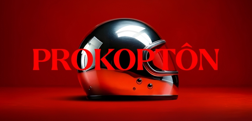

In a category known for cautious visuals and corporate speak, Prokoptôn has taken a radically different path. The global innovation consultancy has partnered with Free the Birds to launch a bold new visual identity—built from scratch to signal their fearless approach to healthcare and wellness strategy.
Centered around striking metaphors like a gleaming helmet and detonator, the new brand doesn’t whisper expertise—it announces it. Designed to cut through the noise, scale globally, and resonate with clients hungry for clarity and courage, this rebrand is more than aesthetic. It’s a call to arms and we caught up with the team at Free the Birds this week to learn more.
Describe the purpose of the brand and its target audience
Prokoptôn exists to champion boldness in a space that’s often dominated by sameness. As a consultancy and white-label product development partner, they support nutraceutical and healthcare brands in creating products that are not only market-ready but also meaningful - clean, effective, and honest. Their purpose is to help clients align strategy and execution to bring better products to market, faster.
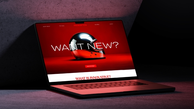
Their audience ranges from agile wellness start-ups to more traditional pharma players looking to refresh their approach. What unites them is a desire to stand out in a packed marketplace, to be different for the right reasons, and to do so with strategic insight, global perspective, and fearless energy.
What was the brief for the rebrand?
The brief was both straightforward and ambitious: to create a full visual identity and digital presence that matched the company’s trailblazing approach. Prokoptôn had built a successful business primarily through word-of-mouth and founder-led relationships, but now needed a brand that could speak on their behalf, clearly, boldly, and globally.
With no logo, website, or social presence, the task wasn’t just to refresh a brand; it was to create one from the ground up. The goal was to design an identity that reflected their disruptive mindset, helped them break into new markets (particularly the U.S.) and served as a powerful tool to communicate their value, attract new clients, and scale their impact.
What was your thinking behind the rebranding solution?
From the outset, we knew that the typical visual language of R&D and nutraceutical consulting - clinical, corporate, overly detailed - wasn’t going to cut it. Prokoptôn needed something audacious. Our thinking was to craft a brand world that expressed bravery, clarity, and a sense of visionary leadership.
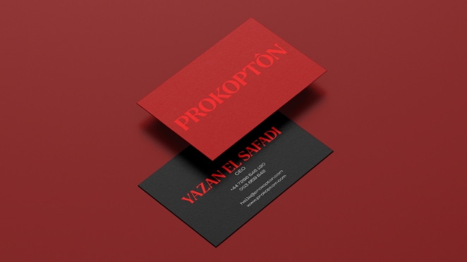
The creative solution had to be both iconic and functional, allowing the brand to tell nuanced stories without falling into the trap of over explaining. At the heart of the identity is the helmet: a striking symbol of courage and exploration, representing Prokoptôn’s role in guiding clients through uncharted territory. Around this, we built a suite of metaphoric visuals and a direct, energised tone of voice designed to simplify, excite, and invite.
What was the biggest challenge? How did you overcome it?
The biggest challenge was balancing creative audacity with strategic credibility. Prokoptôn’s offer is built on real-world expertise and technical execution, but they also wanted to communicate a bold, refreshing perspective. Many of their clients come from regulated, cautious industries, so the visual identity had to feel daring without losing trust.
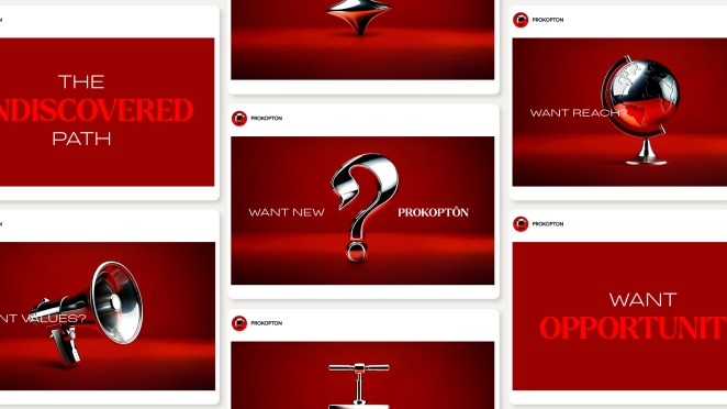
We solved this by grounding the design in powerful metaphors that spoke to purpose and value, not gimmickry. The helmet, the detonator, the compass, these are tools, not toys. The “Want +” copy structure gave us a way to deliver punchy, disruptive messaging while staying laser-focused on business outcomes. The result is a brand that looks brave but behaves responsibly.
What details are you most proud of and why?
The helmet is a defining feature of the brand. It’s not just visually arresting, it’s conceptually loaded. It embodies the duality of Prokoptôn’s role: a fearless guide and a protector in a volatile category. This is iconography with meaning and momentum. It sparks conversation, invites interpretation, and sticks in the mind.

We’re also particularly proud of the supporting visual language. Each icon in the suite serves a purpose: the TNT detonator signals explosive innovation, the compass reflects strategic direction. These elements don’t just decorate, they narrate. They make each part of Prokoptôn’s service offering visually distinctive and deeply memorable.
What visual influences fuelled your solution?
We drew inspiration from minimalism and modern disruption. The simplicity and symmetry of this iconography gave us a foundation to build something timeless yet radically different from the hyper-tech visual language common in the space. We also looked at cinematic visuals, scenes that use contrast and boldness to convey emotional intensity.
The stark red backgrounds, the metallic gleam of the helmet, and the monolithic shapes are all designed to create a visceral impact. We avoided the sterile palettes and templated grids typical of the sector, opting instead for something far more commanding and elemental.
What do you hope it achieves for the brand?
This identity is more than a facelift, it’s a launchpad. We hope it enables Prokoptôn to claim their rightful space as leaders in innovation strategy, not just product development. The goal is for the brand to become a magnet for ambitious clients - those who are ready to shake things up but need the right partner to do so.

We also see this identity as a business development tool, helping to start higher-level conversations with potential partners, investors, and collaborators. It’s already opening doors, and over time, we expect it to become synonymous with strategic bravery and intelligent disruption in the wellness and healthcare space.
How do you ensure consistency in brand messaging and visual identity across various channels and touchpoints?
Consistency was baked into the system from day one. Every asset - from digital templates to LinkedIn banners - was designed with a unified tone and visual logic. We created a comprehensive set of brand guidelines, but more importantly, we created principles: clarity over jargon, symbolism over stock, bravery over blandness.
The “Want +” narrative device gives the brand a flexible but cohesive structure for messaging across any format, while the colour palette and iconography ensure instant recognition. The idea is that wherever someone encounters Prokoptôn - whether on a pitch deck, social feed, or website - they get the same sense of intelligence, integrity, and impact.
What role did consumer research or market analysis play in shaping the direction of the rebrand?
While the rebrand wasn’t led by direct consumer research, it was grounded in extensive competitive and market analysis. We looked at dozens of competitor websites, presentations, and brand assets to understand the category codes; what felt stale, what felt safe, and what felt interchangeable.
What we found was a sea of sameness: muted palettes, overcrowded pages, overcomplicated language, and uninspiring visuals. That insight gave us permission to be bold. Rather than follow the format, we reimagined what a consultancy in this space could look like - more emotive, more strategic, and far more memorable.
Can you discuss any innovative or unconventional approaches you took in developing the rebranding solution?
Rather than lead with functional diagrams or traditional brand pyramids, we used metaphoric storytelling through iconography to communicate the essence of the business. This is rare in the space, where visuals tend to be overly literal or data-driven. We also introduced an editorial-style tone of voice - clean, declarative, and purpose-led.
“Want +” became our narrative device, allowing us to pose provocative, opportunity-focused questions that resonate with clients’ ambitions. The entire system is modular and scalable, but it doesn’t feel templated. It’s built to grow with the business while staying sharp, fresh, and distinct.
How did you ensure that the new brand identity resonated with the brand's existing audience while also attracting new ones?
We anchored everything in the truth of the business. Prokoptôn’s clients trust them because they’re knowledgeable, hands-on, and outcomes-driven. So the identity had to reflect that rigour while also hinting at something more: a mindset of innovation and an openness to risk.

By working closely with the founders and immersing ourselves in their world, we made sure the new brand felt like a natural evolution rather than a jarring departure. At the same time, the visual boldness and confident tone are designed to attract new clients. Those who may not know Prokoptôn yet but are looking for a partner that doesn’t sound or act like everyone else.
Credit list for the work?
Partner & Creative Strategy Director, Free The Birds: Paul Domenet
Co-founder & Managing Partner, Free The Birds: Nick Vaus
Account Director, Free The Birds: Lindsey Figarol
Design Director, Free The Birds: Matthew Taylor