
How do you refresh a beloved national brand without losing the emotional weight it carries? That was the task handed to the creative team at BBD Perfect Storm behind the rebrand of Pride of Britain, one of the UK’s most iconic awards events. Known for celebrating everyday heroes, the challenge was to evolve the brand visually and emotionally while staying true to its core values: Bravery, Kindness, Love, Inspiration, Strength, Community, and Empathy.
Led by Caroline Caulfield, Head of People & Clients, the team set out to create a fresh, modern identity that could resonate across generations and platforms, from television screens to social media feeds. At the heart of the redesign was a desire to keep the awards rooted in heart and humanity, while also making space for a new chapter through a high-profile partnership with P&O Cruises.
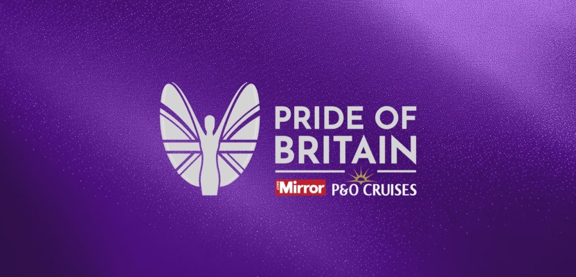
The result is a thoughtful and symbolic rebrand that honours legacy while embracing the future. With a simplified logo, motion-friendly visuals, and a flexible design system built around meaningful “strands,” the Pride of Britain brand is now more inclusive, contemporary, and emotionally powerful than ever.
What was the brief for the rebrand?
The challenge was to reflect the core values that sit at the heart of the Pride of Britain: Bravery, Kindness, Love, Inspiration, Strength, Community and Empathy. The brief called for a reimagining of the visual identity in a way that honored the event’s powerful legacy while also making it feel fresh, modern and relevant, especially in the context of their new partnership with P&O Cruises.
How did the initial pitch/brainstorming phase go?
The early stages focused on unpacking the emotional weight of the brand, what it stands for and how it connects with audiences across the UK. We brainstormed how best to visualise each of the core values as individual strands that could come together to form a cohesive and symbolic identity. Collaboration with both Reach Plc and P&O Cruises helped ensure alignment across partners.
Describe the purpose of the brand and its target audience
Pride of Britain exists to shine a light on everyday heroes. People who go above and beyond for others. It’s a celebration of the best of humanity, which resonates with a wide national audience, from local communities to public figures. The target audience spans all ages, but it especially appeals to families and those inspired by real human stories of courage, compassion and selflessness.
What was your thinking behind the rebranding solution?
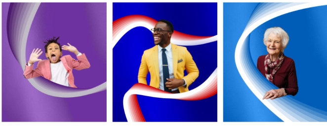
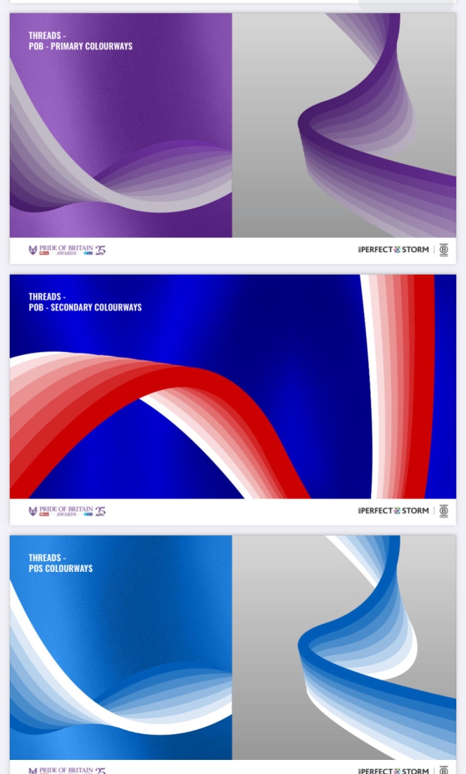
The thinking was to strip the brand back to what truly matters: the values. Each visual strand represents one of the core values that unite people through the awards. We wanted something clean, modern and a design that could carry gravitas but also feel accessible and inclusive. It was important to reflect not just prestige but heart. Integrating P&O Cruises’ logo seamlessly was also key to showing the strength of the partnership without losing pride of Britain’s identity.
Did you learn anything new during the project?
Definitely. One of the most important things to remember when working on such an iconic brand is to respect what they’ve created so your job is to refine and build rather than change.
How do you make a logo and trophy fit for the future?
We found embracing motion, more colours and adding a distinctive graphic would help ensure we elevated it from being quite a static design to something which could be used in digital environments.
What kit/tools/software were used to create it?
Adobe software, motion software and 3D.
What details are you most proud of any why?
Giving the brand another distinctive asset, which were the strands we created to symbolise each ordinary hero the awards look to celebrate.
What visual influences fuelled your solution?
Looking at how the Oscars and Baftas approach celebrating their stars. We want our ordinary heroes to feel like superstars on the day, so this provided great inspiration.
What do you hope it achieves for the brand?
We hope it confirms Pride of Britain’s position as the UK’s most loved awards event while also opening it up to new audiences. The refreshed look helps the brand feel more adaptable, whether on TV, digital platforms or in partnership with commercial sponsors. Above all, it should continue to emotionally connect with viewers and celebrate the unsung heroes in a way that feels both elevated and inclusive.
How do you ensure consistency in brand messaging and visual identity across various channels and touchpoints?
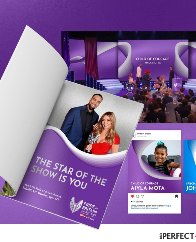
We created robust and clear brand guidelines, ensuring consistency across print, digital, broadcast and social channels. From colour palettes to font usage and logo lockups including co-branding with P&O Cruises, everything was documented to support consistent execution. Cross-team alignment, regular check-ins and ‘strand do nots’ guidelines also helped maintain clarity in messaging.
Were there any unexpected insights or discoveries about the brand that emerged during the rebranding process?
The brand that we now call the ‘Angel’ was, in fact, originally a runner with a British Flag!
Can you share any behind-the-scenes anecdotes or memorable moments from the rebranding project?
When we were briefed, the client shared some of the ‘Winners’ videos. Watching their stories was so humbling, we felt so privileged to play a small part in the Pride of Britain story. If you haven’t watched it before, you should do so now as it restores your faith in humanity.
How do you ensure consistency in brand messaging and visual identity across various channels and touchpoints?
We began by honoring the emotional legacy of Pride of Britain - a brand that has built deep trust and admiration over 26 years. It was important to us to keep the core values central to the redesign. At the same time, we modernised the identity to feel fresh, clean and more versatile, including a new, contemporary typeface and simplified logo.
This makes the brand more visually engaging for new and younger audiences. It was key that the brand messaging and visual identity felt impactful yet refined. We achieved this by integrating the strands and wings from the brandmark purposefully and elegantly by weaving them around the winners in photography to create a sense of unity and celebration.
Credit list for the work?
Seb Hill - ECD
Lou Ormerod - Head of Design
Caroline Caulfield - Head of People & Client
Jason Foo, CEO of BBD Perfect Storm.