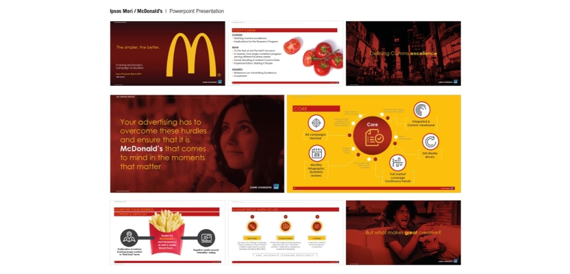

Reputations are made and lost in decks. Not because a pitch deck is some mystical object that makes people throw money and budgets at you, but because it’s often the first time a busy human decides whether you’re worth another minute. In 2026, “how to make a pitch deck” isn’t a beginner question. It’s an operating system. Agencies use a client pitch deck to win work and survive procurement. Founders use an investor pitch deck to turn polite curiosity into capital. In-house teams use a business pitch deck to get a project approved without dying in a committee meeting.
The good ones don’t feel like “slides”. They feel like a clean, confident argument: a clear pitch deck structure, a coherent pitch deck outline, and pitch deck slides that each do one job and then get out of the way. The great ones also understand a brutal truth: people don’t read decks. They skim them. So, the pitch deck design has to do cognitive heavy lifting, not decorative gymnastics.
What follows is a slide-by-slide framework for building what people keep insisting on calling “the perfect pitch deck”, even though perfection is not the point. The point is clarity. The point is momentum. The point is making the next step feel like the only sensible option.
Along the way it will deal with the stuff everyone actually searches for, like when a pitch deck template helps versus when it quietly turns you into Generic Company Number 7, what to learn from pitch deck examples without copying them like a teenager tracing anime, and the deceptively hard question of how many slides you actually need before your audience starts fantasising about a small fire alarm.
What a Pitch Deck Is (and What It Isn’t)
Kristopher Hadwin
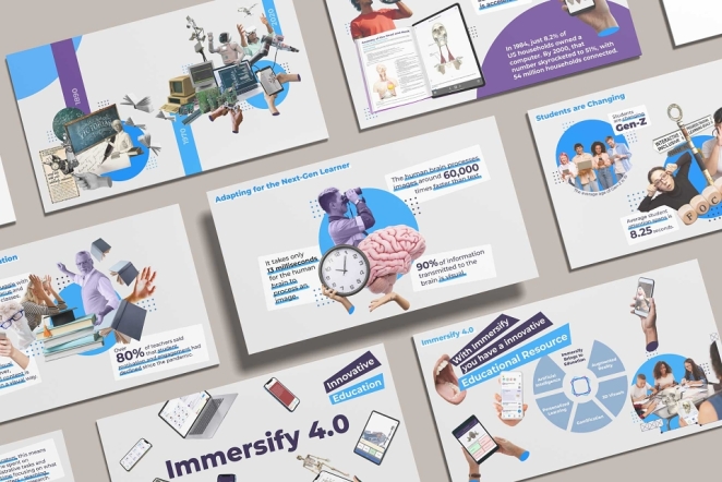
A pitch deck is a compressed argument for a decision. That decision might be “book a second meeting”, “invite us to the RFP”, “approve the budget”, or “let’s do a pilot”. But it is always a decision. If your deck doesn’t know what decision it wants, it becomes a slide-shaped shrug: lots of words, lots of vague ambition, no clear consequence. And audiences have an excellent instinct for when they’re being asked to do the thinking for you.
This is where most decks go wrong. They behave like brochures. They try to be comprehensive instead of persuasive. They cram in everything the team has ever done, as if the person on the other side will be grateful for the opportunity to read your entire origin story in 11-point type. They won’t. They’ll skim the headings, glance at the logos, and then decide what they already wanted to decide.
A pitch deck is not a record of your business. It is a story about why someone should take a specific next step with your business.
That’s also why it’s worth asking, early, the question most people only ask once it’s too late: what is the purpose of a pitch deck, and what should it achieve in one meeting? If the purpose is “get them excited”, you’re already in trouble. Excitement is not a process stage. Your deck should do something concrete: secure the follow-up, unlock the budget, get the introduction to procurement, earn the shortlist slot. “Excited” is what happens when you make those next steps feel safe and smart.
The Perfect Pitch Deck Structure (Slide-by-Slide)
Rock Candy Media
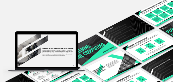
Let’s demystify “perfect”. A perfect deck is just a deck that behaves like a good conversation. It establishes context, names the problem, shows the opportunity, explains the solution, proves credibility, and then makes an ask. That is the basic architecture. Everything else is customisable depending on whether you’re building an agency pitch deck, a startup pitch deck, a product pitch deck, or a sales pitch deck.
Start with slide one
The title slide is not decoration. It is positioning. It should tell people what this is and why they should care in one breath. If the first slide is just a logo floating in whitespace like an art gallery exhibit, you are wasting your best moment. Give them a clear statement of what you do and who it’s for, expressed like a grown-up. If you have a single credible proof point (an outcome metric, a recognisable client, a sharp category claim) this is where it can earn its keep. But only if it’s real. Decks are full of performative proof that collapses under one question.
Slide two is the world you’re pitching into
This is your “why now”. It’s where you show you understand the environment your audience is operating in, and you’re not pitching in a vacuum. The trick is to be specific. “The market is changing” is meaningless. “Customer acquisition costs have risen while attention has collapsed and brand trust is increasingly fragile” is at least a statement you can build on. For brands, “why now” might be category saturation, new competitors, pricing pressure, or platform shifts. For investors, it might be a regulatory change, a technological inflection point, or a new behaviour pattern.
Slide three names the problem in the audience’s language
Not your internal jargon. Not your favourite frameworks. Their language. What is happening? Why is it painful? What does it cost them? This is where a lot of agency decks drift into polite vagueness because they’re scared of sounding accusatory. Don’t be cruel, but don’t be timid. If you can’t name the problem clearly, you don’t deserve to solve it.
Then comes the opportunity slide
This is the point where you stop talking about pain and start talking about upside. If the problem is solved, what changes? What becomes easier, faster, more profitable, less risky? You’re not just selling “better branding” or “more efficient marketing”. You’re selling an outcome: more qualified demand, clearer differentiation, higher conversion, smoother internal alignment, improved perception, reduced waste. This is where a business pitch deck earns its business credentials. It ties the work to consequences.
After that, you earn the right to show the solution
And this is where you must avoid the most common deck sin: feature soup. Nobody wants a list of everything you do. They want a clear, human explanation of what you are proposing, who it is for, what it replaces or improves, and why it’s different. This is where your pitch deck outline should feel deliberate, not accidental. One slide, one promise. If you need multiple slides to explain it, fine — but each slide should still carry a single idea.
Now we hit proof, which is where most decks go to die
Not because proof is hard, but because people confuse “work” with “impact”. They show a montage of beautiful projects like it’s a showreel, but they don’t tell you what changed because of them. A credible proof slide doesn’t just say “we did this”. It says “we did this, and here is what happened”. If you can’t share numbers, share outcomes: adoption, retention, speed, alignment, sales uplift, reduced churn, improved conversion, clearer differentiation. A proof point that reduces perceived risk is worth ten awards slides.
Once you’ve shown proof, you explain how it works
This is where you show the mechanism. For agencies, it’s often a simplified process: discovery, strategy, design, rollout, governance. For startups, it’s the product logic: onboarding, use case, value creation. Either way, your job is to make the thing feel real. The audience needs to imagine it happening, and imagine it happening without chaos.
Then comes the team slide
This should be less “meet the passionate rockstars” and more “here is why these humans are credible”. Relevant experience, domain knowledge, complementary strengths. If you’re an agency, show the people who will actually do the work. If you’re a founder, show you’ve lived close enough to the problem to understand it and solve it.
Finally, you bring it home with the offer and the ask
This is where you answer another real-world question: how does a pitch deck differ from a proposal, credentials deck, or sales deck? A deck opens the door. A proposal closes the deal. The deck should make the next step feel obvious and low-friction. That might mean outlining package options, timelines, or the shape of a pilot. It might mean stating your commercial model without playing coy. What matters is that you end with a clear ask, not a vague “thanks” slide like you’ve just finished a school presentation.
If a slide doesn’t make the decision easier, it’s probably not worth the pixels
This structure also answers the question people ask with quiet panic at 2am: what slides should every pitch deck include, and what should be cut? Every deck should include context, problem, opportunity, solution, proof, how it works, and an ask. The slides you cut are the ones that exist purely to impress, inflate, or soothe your insecurity. If a slide doesn’t make the decision easier, it’s probably not worth the pixels.
Pitch Deck Templates: When to Use One vs Build Custom
Oleg Savchuk
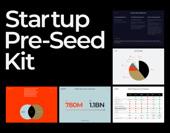
There is a reason pitch deck template searches never end. A template promises speed and certainty, which are exactly what people crave when they’re staring at an empty deck and a looming deadline. And to be fair, templates can help. They provide structure, layout discipline, and a set of components so you’re not reinventing typography under pressure.
But a template will not solve a story problem. It will only disguise it. If you haven’t decided what you stand for, what you’re actually offering, and why anyone should choose you, then a startup pitch deck template will simply help you present your uncertainty in a cleaner format. The deck will still feel generic, because the thinking is generic.
A template will not solve a story problem. It will only disguise it
The smartest way to use templates is to steal the scaffolding, not the soul. Use them for grids, spacing, hierarchy, slide components. Then build your own narrative, your own proof, your own pacing. If the deck needs to feel like it belongs to your brand, a template should be a starting point, not a final aesthetic.
And yes, there are moments where a fully custom deck is worth it. If differentiation is your lifeline, if your audience has seen a hundred decks this month, if your pitch needs to feel unmistakably “you”, then you customise. Not with gimmicks, but with clarity, voice, and evidence.
Pitch Deck Examples: What Works (and Why Most Fail)

Edelman
People hoard pitch deck examples like they’re collecting ingredients for a recipe. Then they wonder why their dish tastes like someone else’s leftovers. Examples are useful, but only if you’re studying what makes them work, not copying their layouts.
Strong examples share a few traits. Each slide carries one point. The headlines actually say something. Proof is specific, not poetic. The narrative escalates, so the next slide feels like a natural consequence of the last. The language sounds like a human wrote it, not a committee. The visuals do explanatory work (simple diagrams, timelines, before-and-after comparisons) rather than acting as mood lighting.
Most decks fail because they’re built backwards
Most decks fail because they’re built backwards. They start with what the creator wants to show, not what the audience needs to understand. They treat “telling” as the same thing as “persuading”. They mistake design for argument. They try to please everyone and end up moving no one.
If you want a brutal diagnostic, try this: remove all the nice visuals and read only the slide titles. Does the story still make sense? If not, the deck is being carried by decoration instead of logic.
Pitch Deck Design Rules: Readability, Hierarchy, and Flow
ALI YILDIRIM
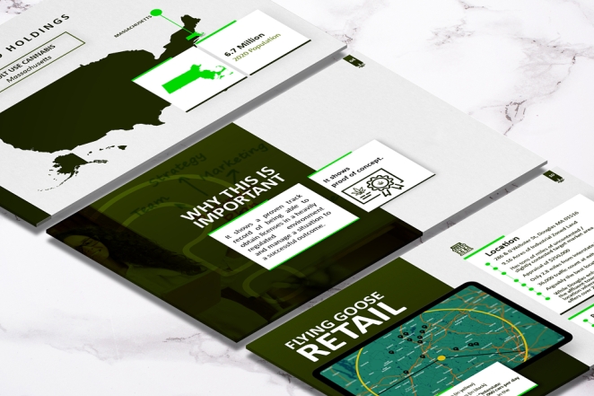
Pitch deck design is not about taste. It’s about cognition. Your audience is busy. Your deck is competing with their inbox, their meetings, their deadlines, and their own internal politics. If you make them work, they will not reward you for it. They will simply stop.
So design for the skim. Assume your deck will be read as a PDF, forwarded in an email chain, opened on a laptop, glanced at on a phone, and scanned by someone who will decide in thirty seconds whether to take it seriously. That means your slide titles must carry meaning. Your hierarchy must be obvious. Your typography must be readable. Your charts must be legible without you standing there performing interpretive dance.
This directly answers one of the most common questions: how should a pitch deck be designed so it’s readable in a skim? It should behave like a good headline system. It should tell the truth quickly. It should make the point before it makes the aesthetic.
Consistency matters more than cleverness. A deck is not the place for layout improvisation. Build a small set of slide types and repeat them. Keep the visual system tight. Let the story, the proof, and the thinking be the thing people remember.
And remember where decks go to die: export. If your deck only works in live presentation mode, you’ve built something fragile. Most decks live as PDFs. If your animations and clever transitions are your main trick, you have built a house of cards that collapses the moment someone clicks “download”.
Agency vs Investor Pitch Decks: What Changes and What Stays
Rob Yeo
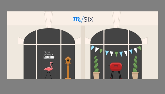
Now let’s get practical, because a deck is never built in a vacuum. An investor pitch deck is a risk underwriting tool. An agency pitch deck is a trust and delivery tool. A sales pitch deck is an objection-handling machine. A product pitch deck often sits somewhere in the middle, selling value while proving adoption logic.
The core structure stays the same: context, problem, opportunity, solution, proof, mechanism, ask. What changes is what “proof” means and what “risk” looks like.
Investors look for market size, the plausibility of growth, competitive differentiation, traction or a credible path to it, and a team that can execute. They want to know why now, why you, and why this can be big enough to matter. They’re also allergic to fluff, because they see it all day.
Brands and clients are different. They’re underwriting delivery risk and political risk. They want to know whether you can actually do what you’re claiming, whether working with you will be painful, whether your process is controlled, and whether choosing you will make the internal sponsor look smart rather than reckless. That’s why an agency deck needs to make collaboration feel safe, not just exciting.
This is also where we ask how many slides should a pitch deck be in 2026? The honest answer is “as many as it takes to make the decision easy, and no more.” But in practice, there are ranges. For a live pitch, eight to twelve slides is usually plenty. For a deck that will be forwarded and read without you, you might go twelve to eighteen, with an appendix for detail. Anything longer needs a very good reason, and “we had more things we wanted to say” is not a good reason. That’s just fear of leaving something out.
The Pitch Deck Checklist (Before It Leaves the Building)
MTV UK
This is where good decks become winning decks. Most teams build the deck, export it, send it, and then act surprised when it doesn’t land. The difference is often the final pass: narrative, proof, readability, friction removal.
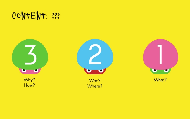
Ask yourself, honestly, whether someone can describe what you do and why it matters after the first two slides. Ask whether the problem is stated in a way that would make the audience nod, not blink. Ask whether your claims are supported by anything solid. Ask whether the deck works without you narrating it. Ask whether the ask is explicit.
And then do the edit that always hurts and always helps: cut the slides that exist purely to impress. If a slide does not establish context, clarify the offer, reduce perceived risk, prove credibility, or move the decision forward, it is probably dead weight. Dead weight doesn’t just slow the deck down. It makes you look like you don’t know what matters.
The Bridge Between Talent and Opportunity
A deck is how agencies win work, how freelancers get chosen, how studios get shortlisted, how founders get funded. It is also, quietly, how good ideas get ignored when they are poorly explained. Which is why the deck is never just a deck. It’s a moment of translation: taking what you do and turning it into something other people can confidently buy into.
The deck is never just a deck. It’s a moment of translation
That’s also where Creativepool sits, by design. Between the people who need the work done and the people who can do it. If an agency needs to strengthen a pitch with specialist talent, they can use Creativepool to search for the right collaborators fast. If a brand needs partners, the network is built for discovering proven studios and individuals with real portfolios. If a team needs to staff up for a pitch or delivery, posting a role or a Studiogig reaches people who actually do the work, not just people who claim they do.
The “Perfect” Deck Is the One That Gets a Yes
Alchemy Mill
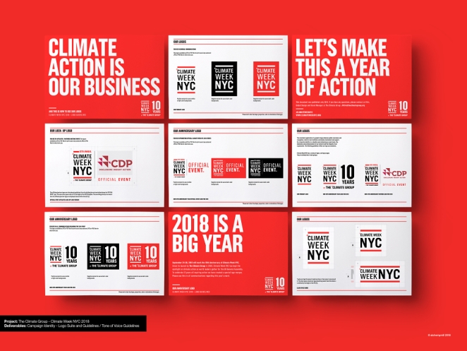
The perfect pitch deck isn’t the one with the nicest gradients or the most dramatic slide transitions. It’s the one that earns trust quickly and makes the next step feel obvious. It uses a coherent pitch deck structure and a disciplined pitch deck outline. Its pitch deck slides each carry one point. Its pitch deck design helps skimming feel like understanding. It knows whether it’s an agency pitch deck, a client pitch deck, an investor pitch deck, a sales pitch deck, or a product pitch deck, and it builds proof accordingly. It respects the audience’s time, because it respects the decision it’s asking them to make.
And if the real goal is not just building a deck but building momentum, the final move is simple: stop treating pitching like a one-off performance and start treating it like a system. Build the deck, sharpen the ask, use proof that reduces risk, and then use the network to put it in front of the right people. Because a deck no one sees is just a very expensive PDF.