
In the highly competitive sugar substitute market, rebranding can be a game-changer. We had the opportunity to sit down with Maor Ofek, Founder of SIDE ST, to discuss the recent rebranding of Resugar. SIDE ST was tasked with transforming Resugar’s identity to highlight its unique value proposition and stand out in the food-tech industry.
Through strategic and creative efforts, SIDE ST successfully positioned Resugar as an innovative and environmentally conscious leader in the market. Here, Maor shares insights into the process, challenges, and triumphs behind the rebrand.
What was the brief for the rebrand?
Resugar approached us to create a rebrand that addresses potential market scepticism and increasing competition in the sugar substitute market. We did this by focussing each brand touchpoint on Resugar's unique value proposition along with its scientific and environmental ethos.
The objective was to transform Resugar from a perceived ordinary sugar substitute into an impactful, innovative brand that leads in the food-tech industry.
How did the initial pitch/brainstorming phase go?
We conducted multiple sessions to deeply explore and articulate Resugar's current offerings, business dynamics, and visionary impact. This intensive process ultimately inspired the creation of an identity that wasn’t overly complicated but still reflected the integral components of Resugar - a healthy sugar alternative that is kind to the environment and backed up with scientific evidence conducted by Resugar themselves.
Describe the purpose of the brand and its target audience
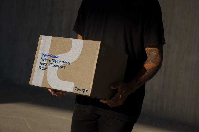
Designed for global manufacturers looking for healthy and environmentally friendly solutions, Resugar has developed a natural 1:1 sugar substitute that behaves and tastes like real sugar.
The target audience are global food manufacturers aiming to serve healthier, socially conscious products without compromising on quality or taste. The ability to replace sugar 1:1 saves their teams time and effort while providing direct health benefits to consumers.
What was your thinking behind the rebranding solution?
Sugar plays a central role in our lives, influencing the taste of foods while also having implications on our health, society and the environment it is sourced from. This is the main problem that Resugar solves and that we wanted to be central to the new brand.
Resugar is backed up by science and research, so we wanted to ensure all elements of that research and development was conveyed throughout the entire rebrand, celebrating the USP of the product in a crowded market.
Did you learn anything new during the project?
Working with Resugar was an amazing learning experience for the SIDE ST team. As part of our collaboration, we delved into the research behind Resugar and studied both the sugar industry and its ever-growing substitute market, both were new to us.
What kit/tools/software were used to create it?
Figma, Adobe After Effects, Illustrator
What details are you most proud of and why?
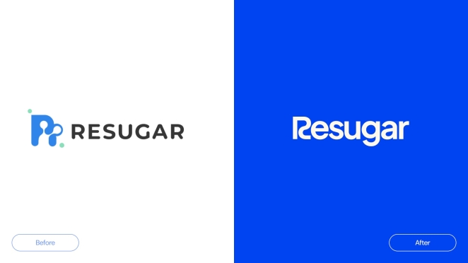
The way we balanced the visual identity of the brand to sit at the intersection of food science, innovation and impact. Despite the endless visuals of sweet foods that sugar and its products can evoke, we created a brand that looks both bold and ambitious to attract global manufacturers looking for a fresh and trusted product.
What visual influences fuelled your solution?
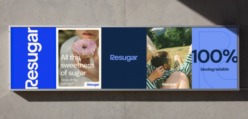
The visual identity draws inspiration from the structural essence of sugar, integrating motifs of sugar cubes and molecular structures, with imagery elements from nature, technological environments, and confectionery delights to create a sense of innovation.
This eclectic mix was designed to illustrate Resugar's comprehensive impact on the food industry, environment and daily life, portraying a holistic ecosystem centred around innovation with social and environmental responsibility.
What do you hope it achieves for the brand?
The rebrand aims to position Resugar as an innovative sugar substitute pioneering the food-tech industry, highlighting its unique characteristics as a B2B brand committed to innovation, impact, and research. The goal is also to see a significant positive response when engaging with customers and partners.
How do you ensure consistency in brand messaging and visual identity across various channels and touchpoints?
The visual identity, inspired by motifs of sugar cubes and molecular structures, as well as imagery elements from nature, everyday life, and confectionary delights, allows us to build a flexible identity with unique indicators that will be recognisable across various channels, collateral, and future marketing activities. This speaks directly to the messaging crafted by the New York-based agency, Blue Seedling.
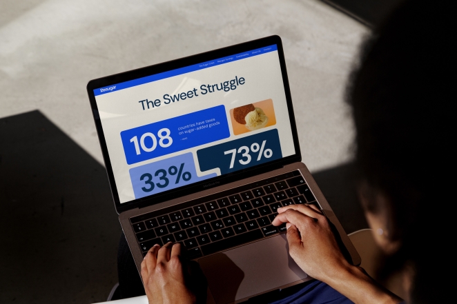
What role did consumer research or market analysis play in shaping the direction of the rebrand?
Market research was at the heart of this project and allowed us to be creative in this space. As a B2B food-tech company with a unique offering, we conducted various types of research to thoroughly understand Resugar’s unique value proposition and how to convey it visually.
This included analysing the competitive landscape, food-tech sector, and the food manufacturing industry as a whole. This analysis helped us to better understand each one of the different aspects and sectors Resugar is part of, from food-tech startups, to food manufacturer and of course, the sugar substitute market. This helped us to build a bold visual identity that resonated with the different stakeholders and give a sense of familiarity.
How did you ensure that the new brand identity resonated with the brand's existing audience while also attracting new ones?
We kept our finger on the pulse to ensure the new brand would resonate with both current and potential customers. To achieve this, we received broad feedback from various departments within their team after major milestones, including researchers and business development, each representing different stakeholders. From this, Resugar has already received positive feedback from customers and partners.
Credit list for the work?
Abi Averett, Nancy Giordano, Florencia Lorea, Maciek Kociela, Elena Saenz de la Torre Loras, and Maor Ofek