

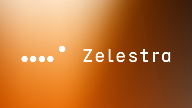
Today, we kick off the week by interviewing Fernando Ortiz Ehmann, the Global Principal at Saffron Brand Consultants. With an illustrious career in branding and a keen eye for innovative solutions, Fernando has been at the forefront of transforming brands to meet evolving market demands. Today, we delve into his recent work with Solarpack, which has undergone a significant rebranding initiative to emerge as Zelestra. This transformation is not just a change in name but a strategic shift that aligns with their new business vision and goals.
Solarpack, a well-established player in the solar energy sector, sought to diversify its offerings and expand its geographical footprint with the backing of private equity firm EQT. The rebrand to Zelestra signifies a broader focus, incorporating not only solar energy but also wine, batteries, and hydrogen technology. This strategic pivot required a brand identity that could support a deep cultural transformation and resonate with a new, diverse audience.
Fernando will share insights into the challenges and triumphs of this rebranding journey, from the initial pitch to the creation of a customer-centric brand purpose. He will discuss how Saffron leveraged tools like Keynote, Figma, and in-house AI applications to bring Zelestra’s new visual and verbal identity to life. Additionally, we’ll explore the role of consumer research, innovative approaches, and the meticulous efforts to ensure consistency across various channels.
Join us as we uncover the thought process behind this transformative rebrand and learn from Fernando's experiences in marrying clean energy with high-tech precision to position Zelestra as a trusted partner in the renewable energy space.
What was the brief for the rebrand?
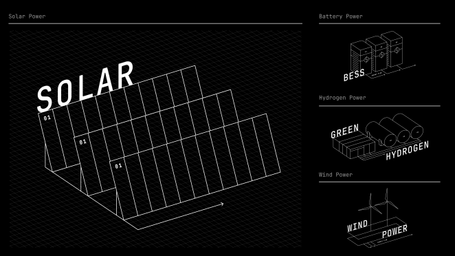
Solarpack was looking to set off on a new business strategy with a different vision. This didn’t mean abandoning its past, but leveraging its 20 years of back-to-back value chain expertise in solar, with the support of private equity firm EQT. Its new strategy involved diversifying, from a Solar only focus to Multitechnology (Solar, Wine, Batteries and Hydrogen). It also was looking to expand its geographic locations: strengthening its position in the US and building it out in Germany and India.
The previous brand was not equipped to face these new challenges. Not only was the name, Solarpack, not fit for purpose but the entire brand expression, both visual and verbal, did not capture the organisation's new ambition. The new business strategy required a deep cultural transformation and the brand needed a revamp to assist in that transformation.
How did the initial pitch/brainstorming phase go?
We initially met with the CEO and some members of the executive team and highlighted the challenges their current brand faced in the renewable energy space. We also wanted to make them aware of the vital importance of including culture as a driving force for the new brand.
Describe the purpose of the brand and its target audience
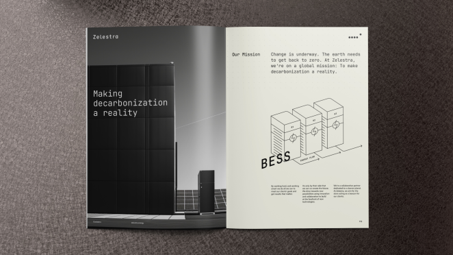
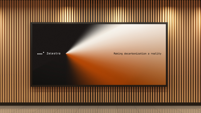
The new brand purpose is “To change the world by making decarbonization a reality for our partners”.
The re-energised Zelestra brand is absolutely customer-centric. Its reason for being is its clients - to provide them with tailor-made solutions so that they can become carbon-free.
This purpose is at the core of the company and spans the internal culture, with the updated and more inspirational, mission-led directive for employees. At the same time, the brand makes that societal vision very tangible externally.
The target audience is mainly B2B companies that are in need of renewable energy.
Given their enormous consumption, the prime targets are high-tech firms whose business models rely on hosting enormous data storage in servers to run their digital products and services. Key examples of this are Amazon, Meta, Google and Apple but there are many more globally.
What was your thinking behind the rebranding solution?
With Zelestra, we were focused on translating the business vision into a brand. This follows our principle that the brand strategy must follow the business strategy. We knew that in order to appeal to high-tech firms there needs to be a lot of trust, and for that, you need to mirror them in how you speak and look, all the way through to how you act.
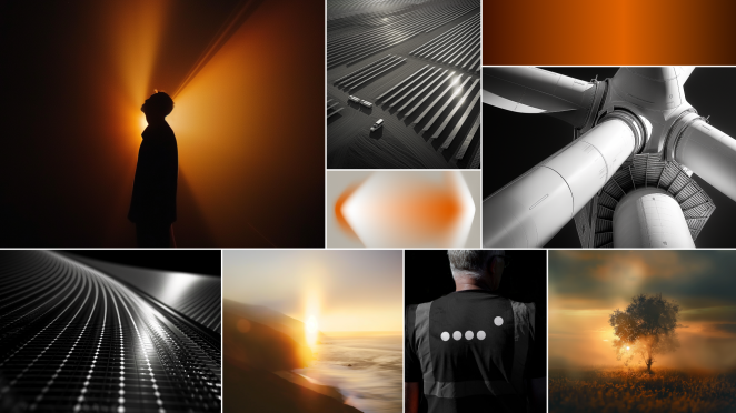
This comes through strongly in the developed visual and verbal identity. It is no longer about Solarpack’s green fields, and immaculate clouds in the blue sky. This is the sea of sameness that the energy/renewables sector has shown us over the past years. Instead, the reality of Zelestra’s value proposition is about data, servers, high tech, precision and efficiency and this is what needed to be reflected.
Did you learn anything new during the project?
Although at Saffron we have had wide exposure to the energy industry over many years, it has been fascinating to uncover how energy, and specifically renewables, is evolving and the impact it has on the global economy.
What was the biggest challenge? How did you overcome it?
How do you marry decarbonized clean energy with High Tech? It’s quite a novel combination. Deeply understanding Zelestra’s business, vision and culture as well as the design, verbal and attitudinal codes of High Tech were fundamental to finding the solution.
What kit/tools/software were used to create it?
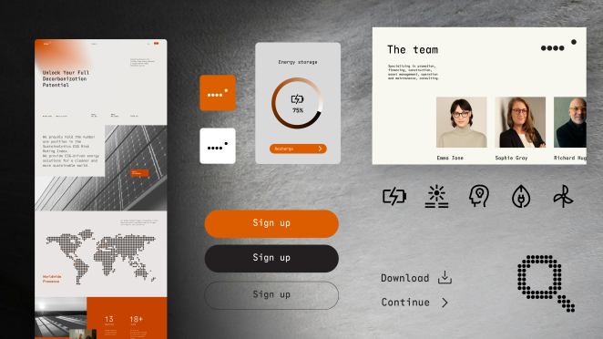
Keynote, Figma, in-house AI app, Midjourney, Illustrator, AfterEffects
What details are you most proud of and why?
Firstly the name. It’s short, with both a commercial and inspirational background.
We’re also particularly proud of the Brand Purpose and Promise. There is a good balance between concreteness and abstraction and the promise is a smart, outward-facing commercial synthesis of the purpose. We spent a lot of time doing deep-dive work with the CEO and HRO to surface current behaviours and weigh them up against the necessary cultural transformation at Zelestra. It meant we produced an EVP with beliefs to drive the business transformation and expansion.
The visual identity is such a clear change that will be noticed by anyone who comes across the brand. We feel we captured the essence of the brand platform and the business objectives in a visual system that stands out from the other players and should offer Zelestra a recognizable but flexible design language for a successful business in the years ahead.
What visual influences fuelled your solution?
We sourced inspiration from big data representation, energy flows, engineering precision and sustainability initiatives.
What do you hope it achieves for the brand?
Our belief is that the new identity will create a clear and distinct differentiation in the marketplace, and strong connection as a trusted reliable partner for High Tech.
What role did consumer research or market analysis play in shaping the direction of the rebrand?
It was key to understand the business and commercial drivers in the industry. Zelestra had done a very thorough and deep landscape analysis that helped us to crystallise the key drivers for the new brand.
Can you discuss any innovative or unconventional approaches you took in developing the rebranding solution?
Iterating & testing visual solutions, defining art direction using AI tools. We used our in-house AI Research assistant to source insight into the specific industry and competitors, explore territories and routes for the ideation phase.
We also used AI to develop an image style that was easy to understand and develop a basic content base but also give Zelestra a visual briefing for photographers as they develop more bespoke and relevant content for their communications.
How did you ensure that the new brand identity resonated with the brand's existing audience while also attracting new ones
Brand is about finding the right balance between reality and aspiration, present and future. At the verbal, visual and cultural level, we identified which elements from Solarpack we wanted to bring forward and include within the new Zelestra brand.
At the end, it is about a thorough analysis at these levels, tackling it with lots of empathy and listening to the different stakeholders to find that balance.
How do you ensure consistency in brand messaging and visual identity across various channels and touchpoints?
We have created a detailed guideline and brand portal to help employees navigate and immerse themselves in the brand and all its assets.
What would you do differently if you could do it over again?
Overall, it was a very smooth and agile process and the project structure, in hindsight, was the appropriate one.
Credit list for the work?
Strategy
Fernando Ortiz Ehmann - Global Principal
Tamara Roper - Associate Copy Director
Maria Hurtado - Strategist
Juan Quijano - Jr Strategist
Bridget Unwin - Jr Copywriter
Design
Matt Atchison - Creative Director
Matt Halls - Motion Director
Constanza Pinto - Designer
Will Chappell - Motion Designer
Joanna Paczkowska - Motion Designer
Client Services
Elena Espinosa - Client Director
Gabriela Khevenhüller- Client Manager