
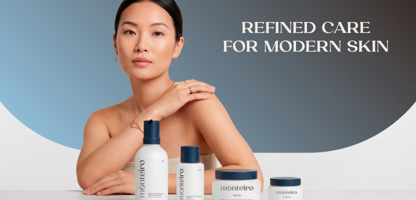

When the skincare market is saturated with soft botanicals and predictable minimalism, standing out requires more than aesthetic polish, it demands clarity, structure, and conviction. For Monteiro, Brand Identity Designer Mariia Revina set out to create a premium skincare identity that feels elevated, contemporary, and timeless, without leaning on overused beauty clichés. The result is a brand that communicates precision, trust, and quiet confidence through deliberate simplicity and strong visual structure.
Inspired by space, depth, and subtle cosmic references, the identity balances atmospheric gradients with refined restraint. Rather than relying on trend-driven visuals, Monteiro embraces a calm yet bold presence designed for a visually literate audience that values intention, quality, and modern luxury. From concept to 3D visualization, every detail was crafted to transform skincare from a product into an experience, one defined by clarity, confidence, and lasting impact.
What was the brief?
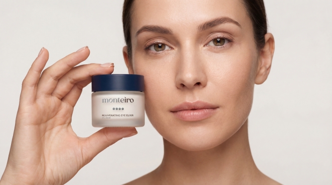 Monteiro is a premium skincare brand envisioned as a modern, confident, and visually distinctive presence within the high-end beauty market. The objective of the project was to develop a complete brand identity and packaging system that feels elevated, contemporary, and timeless — without relying on predictable skincare aesthetics or overused visual clichés.
The brand needed to communicate precision, trust, and refinement through design, positioning itself as a sophisticated choice for a modern, design-aware audience that values quality, aesthetics, and intention in everyday rituals.
Brand Goals
The primary goal was to create a strong visual identity that would stand out in a saturated skincare landscape while maintaining a sense of restraint and quiet confidence. Monteiro was not meant to feel decorative or trend-driven, but rather intentional, structured, and enduring.
The identity needed to:
Feel premium without appearing excessive or loud
Communicate confidence through simplicity and clarity
Elevate skincare into an experience rather than just a product
Be scalable and adaptable for future product extensions
Feel recognizable and memorable at a glance
Target Audience
Monteiro is designed for a modern, visually literate audience — individuals who appreciate understated luxury, thoughtful design, and refined details. The target consumer values:
Clean, modern aesthetics
High-quality formulations and experiences
Brands that feel confident but not aggressive
Design that feels intentional, calm, and considered
This audience is less interested in trends or marketing noise and more drawn to brands that communicate clarity, balance, and depth through visual language.
How did the initial pitch/brainstorming phase go?
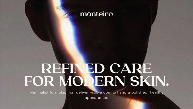 The initial phase was very exploratory. I started by researching the skincare market, premium positioning, and visual language commonly used in the category. From there, I explored different directions and asked myself how a modern skincare brand could feel distinctive without relying on obvious visual cues.
What was the process behind ideating the concept?
The concept evolved through research, experimentation, and intuition. I began with mood exploration, visual references, and structure, then gradually refined the idea into a clear direction. I focused on creating a system that feels calm yet bold, minimal but expressive, allowing the brand to feel confident and self-assured.
What was the production process like?
The production process was detailed and hands-on. It involved developing the full identity system, packaging layouts, and a large number of 3D mockups and visualizations to fully bring the concept to life. A lot of attention was given to proportions, textures, lighting, and how the products would feel in a real-world context.
What was the biggest challenge during production? How did you overcome it?
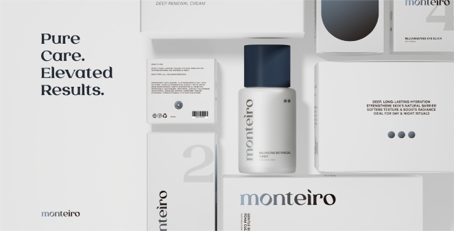 The biggest challenge was maintaining balance — making the design feel distinctive and expressive without losing its premium restraint. I overcame this by constantly refining, removing unnecessary elements, and focusing on structure, hierarchy, and consistency across all assets.
What kit/tools/software were used to create the project?
The project was created using Adobe Illustrator and Photoshop for the core identity and packaging design, along with Blender for 3D visualization and mockups.
What is one funny or notable thing that happened during production?
At one point, after preparing a large number of 3D mockups and visualizations, I accidentally deleted the entire folder by pressing the wrong keyboard shortcut. My system had an active key combination that instantly removed selected files — and they disappeared. It was stressful in the moment, but also a good reminder to always keep backups.
What’s the main message of this project and why does it matter?
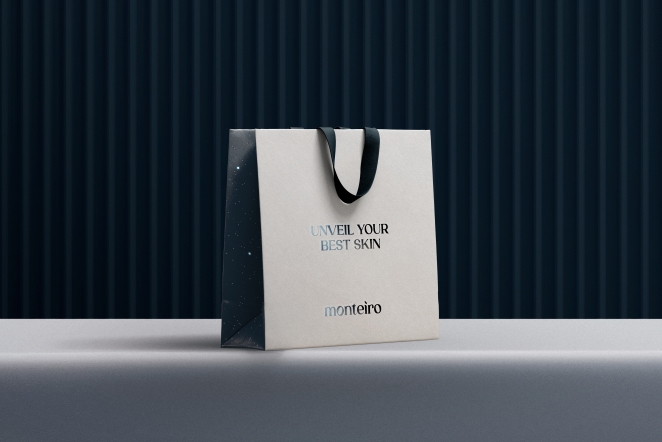 The main message of Monteiro is that premium skincare doesn’t need to be loud or over-designed to feel powerful. Thoughtful simplicity, confidence, and strong visual structure can create a lasting impression. This matters because the market is crowded, and brands need clarity to truly stand out.
How long did it take from inception to delivery?
The project took almost two months from the initial idea to the final delivery.
Can you describe the creative spark or inspiration behind the initial concept? Was there a specific moment or insight that ignited the idea?
I’ve always been inspired by space, depth, and a sense of the unknown. Subtle cosmic references, gradients, and color transitions influenced the visual language. These elements helped create a feeling of calm sophistication combined with quiet intensity — something expansive yet controlled.
How did you ensure that the concept aligned with the brand's values, goals, and target audience?
I constantly evaluated the concept through the lens of the target audience — people who value quality, modern aesthetics, and refined experiences. Every design decision was measured against the brand’s goal: to feel premium, confident, and relevant without relying on trends.
Were there any alternative concepts or ideas considered during the ideation phase? If so, what led to the selection of the final concept?
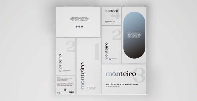 Yes, the initial concept leaned more toward softer, nature-inspired tones and calmer visual cues. During the process, I made a conscious decision to move away from that direction and fully rework the concept into a more modern, bold, and distinctive identity. The final direction felt more aligned with long-term premium positioning.
Can you discuss any collaborative or interdisciplinary aspects of the ideation process, such as working with other departments or external partners?
Yes, the project involved collaboration with a 3D designer. Working together allowed the visuals and mockups to reach a higher level of realism and polish, strengthening the overall presentation and storytelling of the brand.
What role did consumer research or market analysis play in shaping the concept and its execution?
Market analysis played an important role in understanding how saturated the skincare industry is and identifying common visual patterns. This helped define what to avoid and where the opportunity for differentiation was — especially in terms of color, structure, and mood.
Can you discuss any unique or unconventional production techniques or approaches used to bring the idea to life?
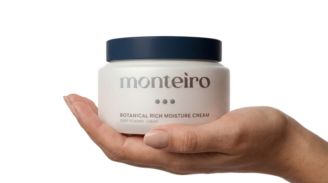 A strong focus was placed on high-quality 3D visualization as a storytelling tool, not just a presentation asset. This allowed the brand to feel real, tactile, and fully formed even without a physical production stage.
How did you ensure that the concept remained innovative and stood out in a crowded marketplace?
The concept stands out through its atmospheric, almost cosmic visual language, paired with restraint and precision. Instead of following familiar skincare aesthetics, the design creates a distinct identity that feels recognizable from a distance and emotionally engaging.
What do you hope it achieves for the brand?
I hope Monteiro is perceived as a confident, modern skincare brand that values clarity, quality, and visual integrity. The goal is for the identity to support long-term growth and create trust through consistency and refinement.
Credit list for the work?
Brand Identity & Packaging Design — Mariia Revina
3D Visualization — Collaborative partner


Mariia Revina February 24th, in the evening
Thank you for the spotlight and for the opportunity to share more about this project. I really appreciate the recognition and support!