
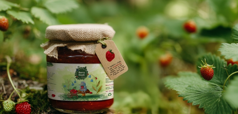

Graphic Designer Julia Nalivayko set out to create a small self-initiated project—something playful that allowed her to explore collage-style illustration, texture, and character-driven design. What began as a simple Photoshop experiment quickly grew into a charming homemade jam brand concept, complete with hand-drawn characters, watercolor textures, and warm storytelling elements. Julia combined traditional art with digital techniques to develop a cohesive visual identity that feels handcrafted, natural, and market-ready.
This project showcases how illustration can do more than decorate packaging—it can shape the entire brand narrative. By developing a family of mouse characters and connecting each one to a specific jam flavour, Julia created a consistent, memorable product line that could easily stand out in artisan markets. Her process highlights the power of character-led packaging design and how small brands can use visual storytelling to build emotional connection, authenticity, and recognisability.
What was the brief?
This was a self-initiated project. I actually just wanted to do some Photoshop art in the style of book collage. Then I was curious to see how the illustrations could work on packaging, so I decided to turn them into a concept for a homemade jam brand.
How did the initial pitch/brainstorming phase go?
Since there was no client, the “pitch” was more of a visual exploration. I tested a few directions (forest/berry/home kitchen) and chose the one that felt warm, family-oriented and illustrative. The idea was to make it look like something that could be sold at a local market or small artisan shop.
What was the process behind ideating the concept?
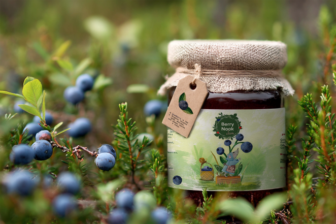
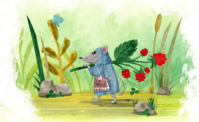
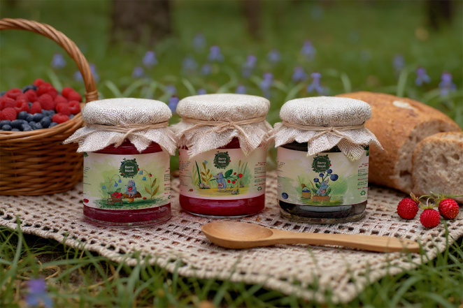
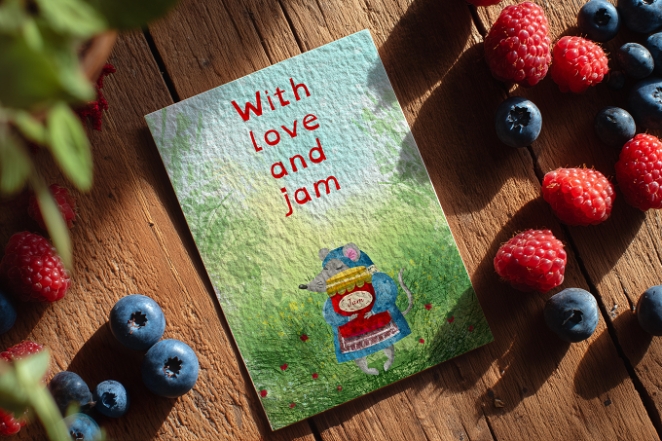
First I created the character. Then I came up with a specific action for each jam flavour: one mouse is picking blueberries, another is carrying a freshly picked raspberry branch to the cellar, and the third is resting on a mushroom enjoying a wild strawberry. That’s how a small product line in a unified design and brand style was created. After that I added supporting elements like leaves, berries and textures to make the line feel cohesive.
What was the production process like?
At the very beginning, I sketched the illustrations in pencil on paper. Then, I borrowed some paper and watercolors from my daughter and painted various patterns and textures with brushes. I scanned the ones I liked and added them to Photoshop, after which I continued working with digital tools.
In Photoshop, I traced the illustrations based on the sketches, refined the shapes, added texture and color, and then moved on to the packaging layouts. I designed the main front label and berry tags (to make the jam's flavor easier to identify). All files were print-ready, with clear margins and space for ingredients and weight.
What was the biggest challenge during production? How did you overcome it?
The main challenge was creating a logo, because the brand felt incomplete without it. I do know how to design logos, but to be honest I don’t enjoy that part as much, since it takes a lot of time and brainstorming, and in this project I wanted to focus more on the illustrations and the label. So I made it quickly - a green plate with leaves and berries around the circumference.
Another challenge was balancing the amount of illustration on the label. Too much illustration makes it look like a children’s book, and too little makes it look generic. I solved this by keeping the character as the main focal point, simplifying the background and using consistent typography for all flavours.
What kit/tools/software were used to create the project?
Hand-drawn sketches on paper using traditional media (pencil, watercolor). After that I continued working with digital tools such as: Adobe Photoshop (for the main illustrations and textures), Adobe Illustrator (for the logo, vector elements and final label layout), Midjourney (for brand visualization/mockups).
What is one funny or notable thing that happened during production?
My daughter helped me create the watercolor textures on paper, but we weren’t satisfied with the raspberry texture. So we used an AI tool for that part, and it handled it perfectly.
What’s the main message of this project and why does it matter?
That illustration can be the core of a brand, not just decoration. Even a small homemade product can have a recognizable visual story if the characters and style are consistent. This is important for small brands that compete on personality, not on budget.
How long did it take from inception to delivery?
In total, less than two weeks: 5 days for illustration and styling, 2 days for packaging layouts, 1 day for polishing and layouts. A few days to generate suitable mockups and visualization. It was faster and easier than a customer-provided project, because I was essentially the customer myself.
Can you describe the creative spark or inspiration behind the initial concept? Was there a specific moment or insight that ignited the idea?
Ulrik Kestere’s children’s book “Little Hedgehog and the Big Blackberry” was a big inspiration for this project. I wanted to explore a similar warm, cozy feeling and experiment with collage-like illustration, adding handmade textures and a small visual narrative around the characters.
How did you ensure that the concept aligned with the brand's values, goals, and target audience?
Since it was a concept brand, I defined the values myself: homemade, cozy, natural, family-friendly. Then I made sure the colours were soft, the characters were kind and the typography was readable, so it looked approachable and not luxury.
Were there any alternative concepts or ideas considered during the ideation phase? If so, what led to the selection of the final concept?
Initially I drew the mouse illustration, and that became the starting point for creating the brand and giving it its own personality.
Can you discuss any collaborative or interdisciplinary aspects of the ideation process, such as working with other departments or external partners?
This was a solo project, so no external collaborators.
What role did consumer research or market analysis play in shaping the concept and its execution?
There was no formal research. I relied on general observations from artisan food markets and small-batch packaging: people respond well to warm illustration, clear flavour naming and consistent label structure.
Can you discuss any unique or unconventional production techniques or approaches used to bring the idea to life?
Perhaps the order was unusual: first the illustration, then the branding. Usually, the packaging leads, and the illustrations support it. Here, the illustration dictated the brand.
How did you ensure that the concept remained innovative and stood out in a crowded marketplace?
I focused on packaging with distinctive characters, rather than the purely decorative labels so often used by jam brands. Three identical characters across all flavors make the line memorable.
What do you hope it achieves for the brand?
If this were a real product, it would help a small brand look more professional and “gift-like,” standing out on the shelf among generic jams whose labels often just show pretty berries. For me as a designer, the goal was to show that I can take an illustrative style and turn it into a packaging system that connects with consumers.
Credit list for the work?
All work (concept, illustration, packaging, layout): Julia Nalivaiko


Julia Nalivayko November 14th, 2025, in the evening
I’m very grateful for the recognition of my work — it’s both meaningful and encouraging!!!