
When D8 was tasked with redefining the identity of Carlton Collection, the challenge wasn’t to create something from nothing — it was to bring coherence to something already rich with personality. A family-owned portfolio of hotels across the UK, Netherlands and Belgium, the Collection lacked a unifying presence in the minds of consumers and even within its own internal ecosystem. Each property stood proudly on its own, but the overarching brand story remained untold.
In this edition of Behind the Brand, Rosie Street, Managing Director at D8 in Amsterdam, shares how the team built a strategic and creative framework rooted in the idea of ‘family’ — celebrating individuality while creating harmony. From mantra to motion graphics, and from boardroom buy-in to live-streamed hotel town halls, this was a 12-month journey to transform a collection of destinations into a connected, compelling brand.
What was the brief?
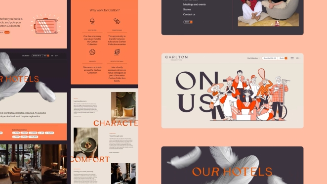 Carlton Collection (or Carlton Hotel Collection, as it was then called) is a family of hotels and hospitality destinations across the UK, Netherlands and Belgium. They came to us looking to strengthen their parent brand to bolster the profile of their overall portfolio, while celebrating the unique brands of each property.
The Carlton Collection didn’t exist as a brand in the consumer’s consciousness. Each hotel operated independently, with no visible ties between them, or to a core entity.
We were tasked to unify the portfolio under one core identity, to help the central team make the shift from selling individual rooms to nurturing the value of the collection as a whole, and the individual property teams to see themselves as part of a wider ecosystem.
How did the initial pitch/brainstorming phase go?
We had successfully delivered similar positioning and identity work for some of the individual hotels in the collection already, so already had a strong relationship with some of the teams. When the Group started looking for a collaborator for this project, it was a great opportunity to continue building on the partnership and put our pre-existing knowledge of the business to use.
We presented our process and methodology to the leadership team at the Group, who kindly trusted us to bring their overarching brand to life.
What was the process behind ideating the concept?
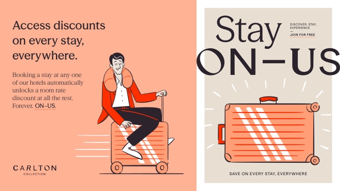 The design process was kick-started by the strategic insight from our research into the category. The output was distilled down to a mantra “Don’t duplicate, complement” – which referred to a change of mindset for the Group. Instead of focusing on selling rooms (which was better handled by the individual hotels) it would concentrate more on celebrating and promoting the diversity and individuality of all the destinations that exist within the Collection. The new brand position and framework, including tone, grew from here.
This was then fully embraced by the design team at D8 and explored through a multitude of typographic, graphic and image executions as we started to create a visual language for the brand.
In real-time, options for letter forms, image and word combinations were printed out and attached to our studio wall for comment and review. Our aim, with the logo specifically, was a wordmarque that was unique, but not challenging to view or understand. A consensus was needed – not just the view of one designer.
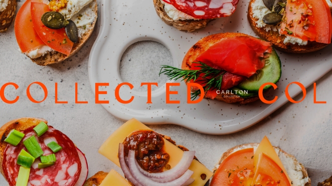
Once the direction was set, we applied the same thinking to imagery, footage and messaging – always striving to demonstrate the brand’s eclectic approach, but in harmony.
What was the biggest challenge during production? How did you overcome it?
The Group has multiple stakeholders and decision makers – from board and C-Suite level, to hotel managers and marketing specialists – so ensuring we brought everyone with us on the journey of creation and roll-out was the biggest challenge. To navigate this, we made sure to carefully structure our thinking. Everything needed to be thoroughly researched, stress tested and robust, and our presentations tailored to each different group at the business and their needs. This ranged from small group sessions with the board, to live-broadcast digital townhalls with all hotels.
What kit/tools/software were used to create the project?
All the usual Adobe Creative Suite programs – Illustrator and InDesign, with a Wacom tablet for the illustrations, were used in the creation of the brand toolkit. Figma for the majority of digital executions, with Rive for the animated elements. A blend of AfterEffects and Premier Pro for motion graphics and footage, with a little of MidJourney and Krea in the early concept/storyboard phase. We have a diverse creative team across all our studios, so we pulled and combined expertise whenever it was needed.
What is one funny or notable thing that happened during production?
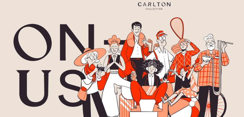
 In developing the ON–US illustrations (a fictional group of people that represent the opportunities across all the Collection) we developed personas and storylines for each character to define how they should look and behave. Without any real frame of reference for this collection of people, we inadvertently started drawing them in ways that looked similar (a little too similar at times) to members of the D8 team. Although they went through several rounds of development, it’s still pretty obvious who they’re based on – you know who you are D8ers!
What’s the main message of this project and why does it matter?
One message is hard to get to – as the project means different things to each audience (internally and externally). If we were to quantify the benefit to the C-suite and core team within Carlton it would be the strategy and clarity. We were able to provide a perspective on their business they couldn’t see – inevitably as they get caught up in the day-to-day running of something as complex as a group of hotels. They now have a strategy for growth that everyone, from the Board to Housekeeping, understands, and a creative toolkit to bring that into fruition.
How long did it take from inception to delivery?
From brief to launch, the whole process took just under 12 months. That timeline was punctuated with milestones for research and insight, design concept and development, presentations to board members and senior stakeholders, internal launch (live streamed to all hotels), and then externally.
Can you describe the creative spark or inspiration behind the initial concept? Was there a specific moment or insight that ignited the idea?
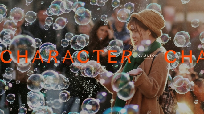
 The concept of ‘family’ became a central theme of the identity. Not only is the Carlton Collection family-owned, but the properties’ individual personalities and quirks, united as a collective, is reminiscent of the family dynamic. We looked at many famous families in media – The Royal Tenenbaums, The Addams Family, The Simpsons – who, despite their differences, are more than just the sum of their parts. This was the catalyst for making a celebration of character the centrepiece of the collection – finding unity in diversity.
This concept influenced everything from the brand’s tone of voice and visual execution to its internal culture. For example, the new wordmarque we designed is built of distinctly different characters, that form a cohesive whole.
How did you ensure that the concept aligned with the brand's values, goals, and target audience?
Our research phase involved consultation with employees from across the Collection, including workshops, interviews and destination safaris. The new brand framework defined new brand values and target audience needstates etc. The ‘family’ concept represents both the collection’s heritage and dynamic, while also tapping into the modern consumer’s craving for value, authenticity and connection in the brands they interact with.
Were there any alternative concepts or ideas considered during the ideation phase? If so, what led to the selection of the final concept?
With the research insight already shared and agreed with the client before we moved onto the more visual side of things, we only showed one, fully formed, creative solution. Elements developed based on feedback, of course, but the core principles of the visual identity remained unchanged.
Working this way, where we create mini-milestones during strategic and design development, means we build consensus as we move from one phase to the next, which gave us the confidence to show only one solution.
Can you discuss any collaborative or interdisciplinary aspects of the ideation process, such as working with other departments or external partners?
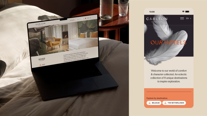 As mentioned earlier, we used a real breadth of skills and capabilities on this project from across our studio, from strategy to creative. Video and motion graphics in particular took a combination of our Amsterdam and Glasgow teams – the footage and graphics being handled by one team and the musical score being developed by another. We’re a talented and determined bunch at D8 – and on the rare occasion when we don’t have a capability of knowledge base within our team, we take it upon ourselves to gain it.
What role did consumer research or market analysis play in shaping the concept and its execution?
One of the key ‘consumers’ for the Collection is actually the individual hotels. Our research showed that there was a disconnect and overlay between their activity and that of the Group. And, because of that, they struggled to see the benefit of the wider Group and how it could help them achieve their ambitions.
We’ve now clarified and defined that, to separate the roles and get everyone pulling in the same direction. We also researched wider consumer trends in relevant industries like hospitality and travel.
Can you discuss any unique or unconventional production techniques or approaches used to bring the idea to life?
It’s not entirely ‘unique’, but Rive was a new one for us on this project. We were in search of a way to create detailed character animations online, without the typical load-time that comes with something that involved. After some testing, and some small adjustments to how we rigged the characters, the results were excellent.
How did you ensure that the concept remained innovative and stood out in a crowded marketplace?
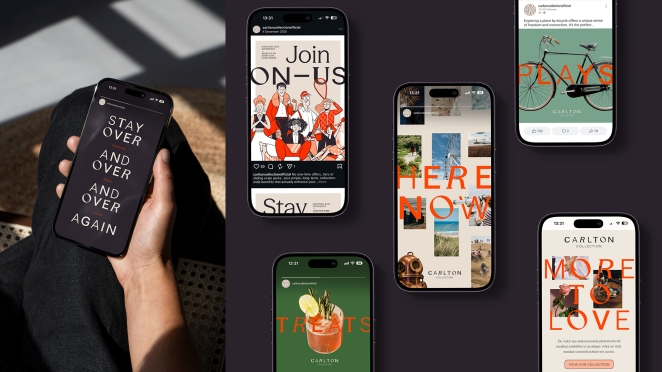 From the outset we could tell the offering from the Collection was something special and held value for customers and staff alike. So our focus wasn’t really around innovation and stand-out – we knew if we could define a compelling proposition and reflect that through design, in an authentic way, the collection would stand out all on its own.
What do you hope it achieves for the brand?
Coherence, cross-selling and commercial success
Credit list for the work?
Gordon Beveridge, Illustration
Emily Isles, Digital Design
Chloe Lambert, Digital Content
Andrew Leitch, Branding and Design
Andrew Neely, Creative Direction
David Beattie, Animation and Motion Graphics
David Shanks, Strategy and Copy
Pablo Vigil, Motion Graphics
Michael Mackay, Animation and Motion Graphics
Karlijn Pustjens, Branding and Design
Rosie Street, Account and Production Management