
In a world where safety is increasingly top of mind, particularly in high-crime regions like South Africa, the role of visual branding in the security sector cannot be underestimated. A strong brand identity does more than look good; it establishes trust, evokes confidence, and speaks directly to the emotional needs of its audience. For freelance graphic designer Rhaby K, reimagining the visual identity of a local security company became more than a design project; it became a mission to help vulnerable communities feel seen, safe, and supported. This in-depth design case study explores how thoughtful research, clear communication, and creative freedom converged to produce a brand that stands out in a saturated and often fear-driven market.
From overcoming a surprise company name change to steering the client away from a generic AI-generated logo, Rhaby took on the challenge of designing a brand that was both modern and emotionally resonant. With a deep dive into the security industry’s visual trends and a keen focus on the target market, small businesses and expatriate communities, Rhaby developed a holistic brand strategy that reflects both strength and approachability. Using tools like Adobe Illustrator, Photoshop, and even AI, she created a distinctive identity that positions the company as a calm yet bold protector in a turbulent environment. This article breaks down her process, the challenges she faced, and the values that shaped the final outcome.
What was the brief?
To create a visual identity for a security company.
How did the initial pitch/brainstorming phase go?
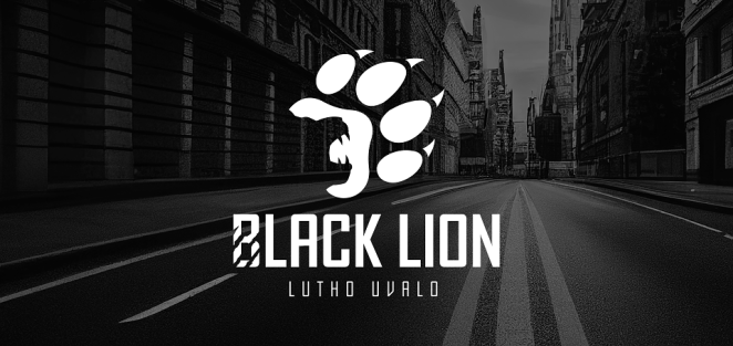
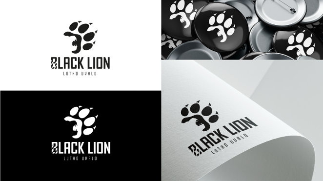
Initially, the company had a different name; unfortunately, at the registration phase the client could not use that name for the company and had to use a different one. They already had a logo they had generated from a logo-generating site. It was a bit generic and didn’t quite capture the essence of the brand. I communicated my concerns to the client, and they allowed me free rein to rework the logo. We wanted to capture the essence of the initial name while also taking into account the new name and how both communicated the organisation’s brand essence. I took the information the client provided and used it to create a brand tone and voice, which were instrumental in how the final visual identity came together.
What was the process behind ideating the concept?
Research into the security sector’s visual identities, seeing what the general feel was, and then making sure to capture the client’s brand essence in line with security but also making sure it stands apart from what is already in the market. The idea was to create something modern that could also stand the test of time. Something that could be easily recognisable and work across multiple media.
What was the production process like?
It was quite a fun process. Educational for both myself and the client. I think it’s important to educate clients about focusing on designing a brand rather than just a logo (that being only one aspect of an entire brand). Showing them a holistic approach. The process opened my mind to taking a complex idea and bringing it down to something simple yet effective.
What was the biggest challenge during production? How did you overcome it?
At first it was challenging to merge the client’s initial idea with my own, brainstorming, and then move from the previous name to the new one, but also capture the essence of both in alignment with the tone and brand voice. It took several sketches and ideas to get to a comfortable place.
What kit/tools/software were used to create the project?
Adobe Illustrator, Indesign, Photoshop, After effects and Ai.
What is one funny or notable thing that happened during production?
I think the name change was the funny part. Getting through an idea phase and then having to change the name and start on a different path. For some, this may have been frustrating, but for me, it was like Murphy saying “psych!” and keeping me on my toes.
What’s the main message of this project and why does it matter?
Crime rates in South Africa are quite high. The message was that small businesses and foreign communities do not have to feel alone and afraid in this surge. It mattered that they know that there are orgainsations that are set on making sure that their safety is just as important while they are out doing what they need to do to provide for their families.
How long did it take from inception to delivery?
It took a few weeks. This was the time between the initial name and then the new one, but also making sure to create a brand personality and voice that would resonate with the target market through the changes.
Can you describe the creative spark or inspiration behind the initial concept? Was there a specific moment or insight that ignited the idea?
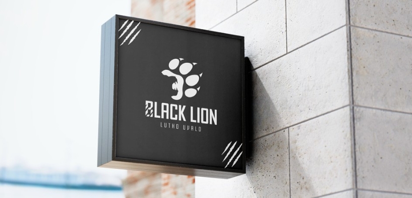
From the logo the client presented in the beginning, it was clear that they wanted a specific image on their logo. It was making sure that what it communicated was effective that made fireworks go off in my mind. It was an exciting project because it was taking this big idea and then compressing it into a brand and logo that communicate several ideas in one.
How did you ensure that the concept aligned with the brand's values, goals, and target audience?
Through research. Research into the security sector revealed a consistent lack of emotional resonance in branding, especially toward small business owners and expatriates. These audiences prioritize clarity, calm, and personal connection. Competitors tend to lean on fear-based messaging or complex logos, which can feel impersonal or unwelcoming. Our goal was to steer clear of that, combining strength with approachability, representing both fierce protection and a grounded presence.
Were there any alternative concepts or ideas considered during the ideation phase? If so, what led to the selection of the final concept?
I suppose since the client had a clear vision of what the visual had to include, the alternative was to refine the logo from the logo-generating tool to something more personal to their brand and their target market, making sure that ultimately we weren’t just designing a logo but a trusted brand.
Can you discuss any collaborative or interdisciplinary aspects of the ideation process, such as working with other departments or external partners?
Being a freelancer on this project, I’d say the most collaboration was with the client; however, I owe a lot to the resources available online that made research and ideation a smoother walk in a slightly tricky park.
What role did consumer research or market analysis play in shaping the concept and its execution?
This was very important because without it, it would be like designing blindly. It was important to understand who the service was for, what challenges they had faced in their communities, and what their needs were in order to shape a brand that spoke to resolving their challenges through the client’s services. It helped to make sure we were speaking to the target market and not speaking at them.
Can you discuss any unique or unconventional production techniques or approaches used to bring the idea to life?
It may not be unique or unconventional, but AI was a great help. It made it easier to bring to life imagery that communicated concepts that may have otherwise taken much longer with a lot more resources to produce visually.
How did you ensure that the concept remained innovative and stood out in a crowded marketplace?
By making sure that the result was a brand that felt dependable, calm, and bold, just like the organisation’s promise to its clients. Making sure that more than just easthetics, we focused on what the target market needs and how the client can show up for them. Putting the client’s clients first.
What do you hope it achieves for the brand?
I hope that it truly helps the organistaion stand out in the crowd so that the brand is able to live its ethos and serve the communities it has vowed to serve.
Credit list for the work?
Umm… I’m not sure if I should credit the client, the myriad of research resources available on the internet as well as AI? They were after all my greatest collaborators.