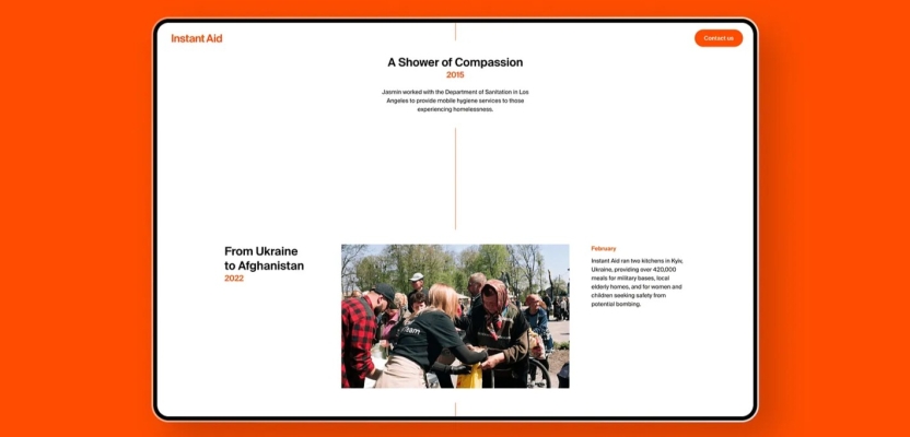
Instant Aid, a disaster relief nonprofit operating in war zones like Ukraine and Gaza, has partnered with the design and impact agency Driftime to undergo a major rebranding. This collaboration will revitalize Instant Aid’s visual identity by introducing a new logo, website, and a refreshed tone of voice. These changes are intended to reinforce Instant Aid’s position as a reliable leader in a sector often affected by external tensions.
Founded in 2022 in response to the conflict in Afghanistan, Instant Aid proactively sought Driftime’s expertise to develop a brand that mirrors the impact of their critical work.
Operating in conflict zones like Ukraine, Gaza, and Syria, Instant Aid frequently collaborates with nonprofits such as World Central Kitchen and organizations like the UN. The nonprofit aims to deliver essential resources, including hygiene kits and food, within 48 hours of a conflict’s onset. To break away from the traditional bureaucratic image associated with the industry, Instant Aid sought a new visual identity that reflects this commitment.
Before launching the complete website and branding, Driftime developed an interim site that played a crucial role in facilitating conversations and building trust with influential organizations and institutions amid global crises. Keeping accessibility in mind, Driftime crafted an identity designed to appeal to a broad range of stakeholders, including trustees, donors, volunteers, and beneficiaries.
Driftime's design choices were informed by initial conversations and an analysis of similar organizations, aiming to craft a mature and friendly brand that diverges from traditional NGO aesthetics. They chose to adopt a more contemporary approach, using a vibrant orange-red hue to convey urgency.
The new logo moves away from the classic light-blue crest commonly used by many legacy NGOs. Its design ingeniously reimagines the six-pointed 'medicinal star' by emphasizing the third spoke, symbolizing 'early response.'
This design highlights the core mission, impact, and global reach of the organization. Driftime also guided the organization in adopting a refreshed tone of voice that cultivates a youthful, pioneering language. This new approach aims to uplift and empower the voices of those caught in crisis while actively calling for awareness, attention, and vital funding for Instant Aid.
To learn more, we spoke to Abb-d Taiyo, CCO of Driftime.
What was the brief for the rebrand?
The primary goal of the redesign brief was to place Instant Aid in a position where they could secure funding, further partnerships, and establish credibility in the field all whilst actioning their vital work on the ground in global disaster zones.
Ahead of the full website and branding launch, an interim site was developed by Driftime which helped to play a crucial role in facilitating conversations and building trust with influential organisations and institutions in the context of global crises, subsequently securing a high-level partnership.
Describe the purpose of the brand and its target audience
Instant Aid are the first responders in conflict and natural disaster areas, taking vital and immediate action on emerging and continuing crises across the globe. With a remarkable impact reaching communities worldwide from Afghanistan to Syria, by way of Gaza, Ukraine, and Pakistan, Instant Aid work in partnership with government agencies, specialised NGOs and local experts to provide the most effective impact on the ground.
With a focus on mobilising immediate, targeted, and localised support to those affected by global disasters within just 48 hours, Instant Aid reaches a wide demographic, calling for support from funders, NGOs, and influential institutions, as well as empowering people on the ground with the resources they need to recover from crises.
By partnering with design and impact agency Driftime, Instant Aid opted for a comprehensive rebranding initiative, including a new logo, website, and refreshed tone of voice aimed at reinforcing Instant Aid’s reputation as a reliable leader in disaster response. To break away from the traditional bureaucratic image associated with the industry, Instant Aid sought a new visual identity that reflects this commitment.
What was your thinking behind the rebranding solution?
Driftime designed the brand in a way that creates a distinction from traditional NGOs and relief organisations that tend to use a light blue in their visual identity and often opt for a crest or wreath in their logo to signify their authority and legacy. Driftime® decided to subvert that idea, instead creating something ownable, recognisable, and, crucially, distinct from others working in the field.
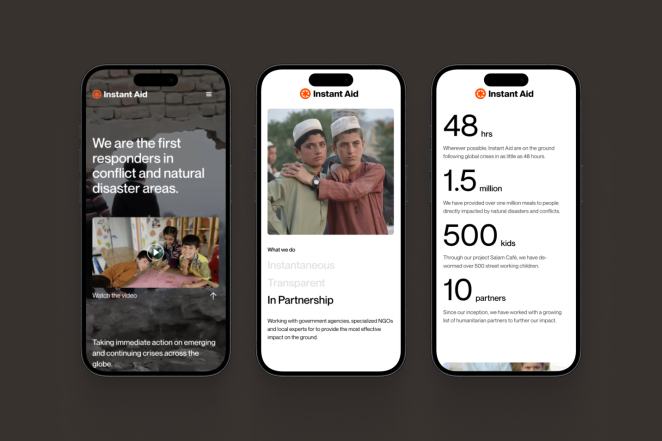
The visual identity features a vibrant orange-red hue to convey urgency, with the new logo reimagining the six-pointed medicinal star, known as the “star of life”, to emphasise the third point that signifies “early response”, the core of Instant Aid’s mission. This design sets Instant Aid apart from the conventional visual presentation of humanitarian aid organisations, instead building an ownable mark and brand identity that will feel increasingly recognisable over time.
What was the biggest challenge? How did you overcome it?
As a relatively young organisation, a challenge of the project was in how we communicate the incredible impact that Instant Aid have created since their inception in 2022, designing the brand in a way that instils credibility for their work despite only being two years old.
We overcame this challenge by taking a risk and being unconventional in our brand explorations, a credit to Jasmin and her trust in our experimentations with alternative approaches to the traditional humanitarian aid branding. Having the courage to take a bold leap into a brand identity that feels wildly different was intentional – we designed a brand that is ownable and different to give Instant Aid a recognisable visual legacy.
What details are you most proud of any why?
We are most proud of the impact that the branding can help empower, seeing beyond the micro details of the visual language into a future of Instant Aid’s brand identity that can be a beacon of hope for people across the globe. We see Instant Aid’s rebrand as a tool to help facilitate conversations with influential partners that have the potential to save lives globally, building trust, credibility, and reputation worldwide.
What visual influences fuelled your solution?
The new logo transitioned away from the classic light-blue crest commonly employed by many legacy NGOs with the design reimagining the six-pointed medicinal “star of life” by emphasising the third spoke, which symbolises “early response”.

This highlights the core mission, impact, and global reach of the organisation.
What do you hope it achieves for the brand?
This new visual identity and brand approach uplifts and empowers the voices of those caught in crisis, whilst actively calling for awareness, attention, and vital funding for Instant Aid. We see this rebrand as a way of increasing credibility for Instant Aid, supporting partnerships and funding opportunities, all whilst serving those who are in need of support in crisis zones.
Were there any unexpected insights or discoveries about the brand that emerged during the rebranding process?
Trust is hard to come by in these spaces, and so working alongside Instant Aid to understand how we can both earn and keep the trust of recipients and partners felt particularly important.
The landscape of humanitarian aid itself is challenging to get involved with as a newcomer, and whilst Jasmin’s rich heritage of understanding and extensive experience in the field has equipped her with the knowledge and network to action incredible impact, it’s no mean feat. Understanding this approach through the rebrand was an invaluable insight, and helped to inform our approach, process, and delivery.
How did you ensure that the new brand identity resonated with the brand's existing audience while also attracting new ones?
From early on, we found that we’re not creating this brand for anyone in particular, we’re instead creating a brand to help establish a recognisable identity to build trust with both partners and those in crisis.
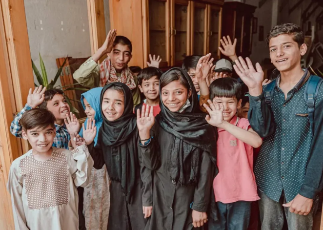
We want people to see the orange logo of Instant Aid and immediately know that they’re going to be supported by an authentically benevolent organisation that has the interests of those in crisis at heart. There needs to be less emphasis on the brand itself, and more on what the brand represents, and the inspiring impact that Instant Aid has had globally.
Credit list for the work?
Ed Marshall-Lovsey – Design and development
Elsa Monteith – Copywriting
Jo Billings – Operations
Abb-d Taiyo – CCO
Jasmin Mouflard – Founder

