
Few challenges are as exhilarating as revitalizing a legacy brand. David Thomson, Founder and Creative Director of The Space Creative, recently embarked on such a journey with Bart, a beloved purveyor of herbs and spices for over six decades. Tasked with strategically repositioning Bart in a competitive market, Thomson and his team were charged with infusing the brand with a modern appeal while honouring its rich heritage.
The goal: to capture the hearts of contemporary food enthusiasts and maintain the loyalty of existing customers. This interview delves into the intricate rebranding process, from the initial brainstorming sessions to the final, refined designs that promise to elevate Bart’s presence on kitchen shelves and beyond.
What was the brief for the rebrand?
Bart have been providing herbs and spices to cooks for 60 years. Our brief was to strategically reposition the brand into an ownable category space and redesign its packaging so that it can appeal to the modern foodie whilst retaining its heritage and existing customers.
How did the initial pitch/brainstorming phase go?
We initially embarked on a robust strategic phase of work, which included consumer insight and a collaborative workshop with the Bart management team. We identified a £10m+ opportunity for Bart to appeal to an audience of discerning passionate cooks looking to fulfil their culinary visions and create uniquely tantalising meal experiences.
Placing the consumer at the heart, we arrived at a brand proposition of “For the love of food”, which became the strategic jumping off point for the creative phase of work. The creative team conducted brainstorming sessions to explore ways to create differentiation for Bart – giving it a modern, ownable position that would appeal to our scratch cook foodies.
Describe the purpose of the brand and its target audience
We sought to focus in on discerning passionate cooks, ABC1, 35-50 years, who look for the highest quality ingredients. Bart’s brand promise is to bring chef-trusted herbs, spices and seasonings to ensure culinary creations will be truly amazing.
What was your thinking behind the rebranding solution?
We chose to position Bart as a ‘matchmaker lover’ brand archetype, helping home cooks as they explore, fuelling their creativity with a shared passion for great food. We proposed a variety of creative solutions to bring this vision to life.
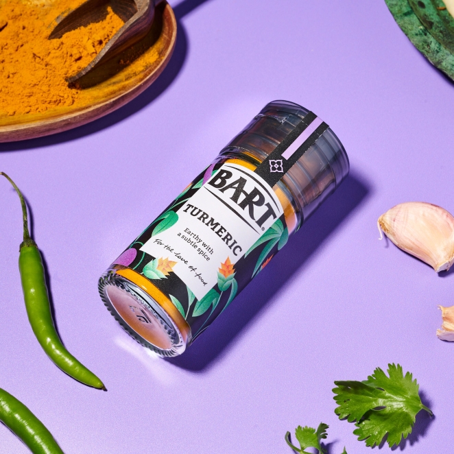
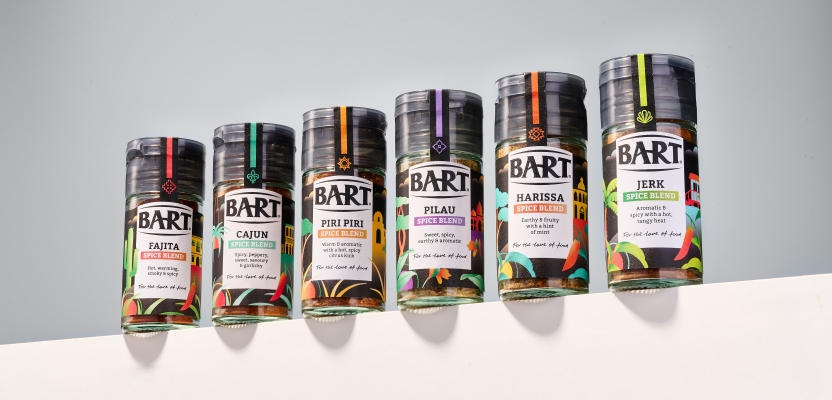
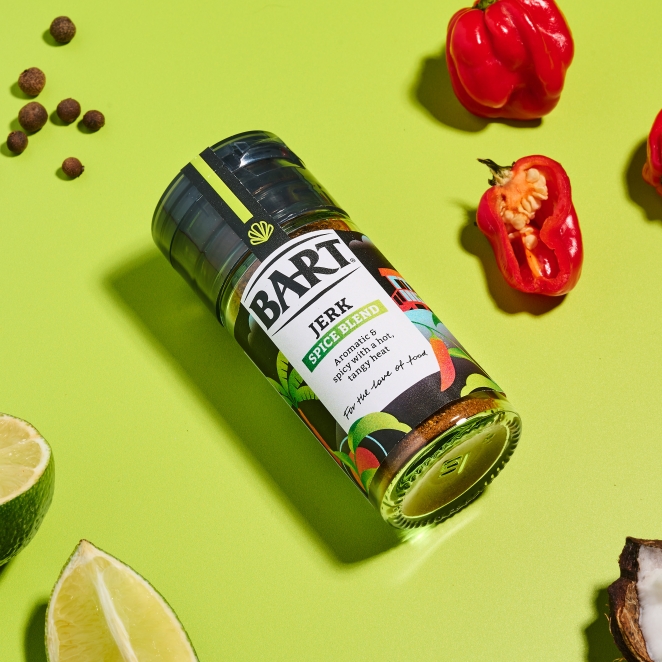
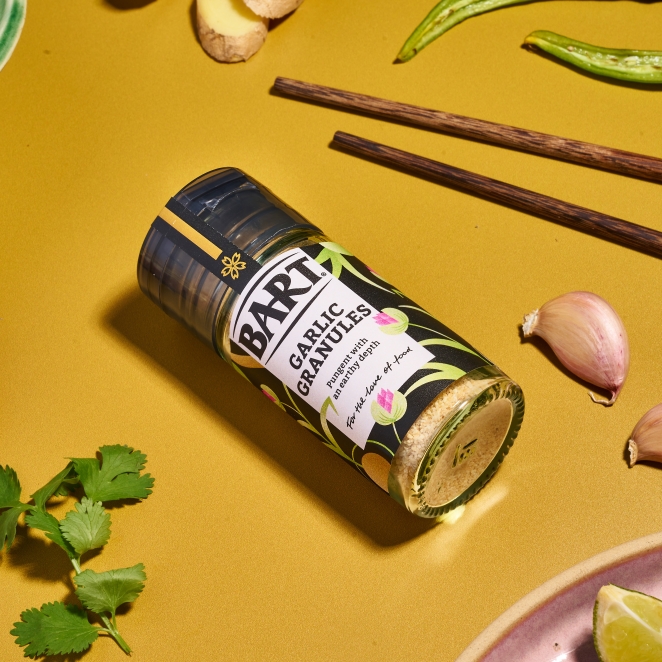
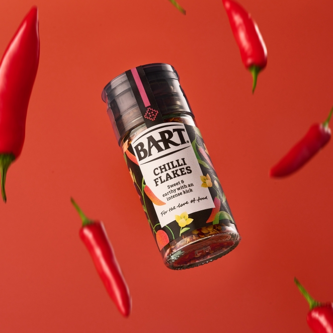
In the end Bart settled on a solution which brought beauty and refinement to the category with bespoke illustrations that depict the regionality of the various ingredients, celebrating the romance of ancient spice routes and evocative flavours.
Did you learn anything new during the project?
We discovered that most of the competition in the herb and spice category focus on ‘flavour elevation’ – placing herbs and spices as the taste hereos – we identified an opportunity for Bart to be the ‘flavour enablers’ – authentic, quality ingredients that won’t let discerning passionate cooks down in the kitchen.
What was the biggest challenge? How did you overcome it?
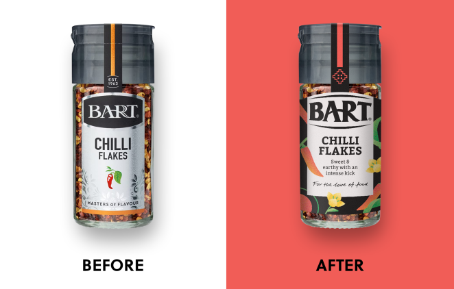
The herb and spice category is a commodity category. Within the retail environment the fixture is large, but a brand’s real estate is small jar labels, making it hard for brands to stand out against own label and the competition.
We worked hard to create an ‘accessible premium’ brand look and feel for Bart – one that stands out on fixture and justifies the price differential vs. own label - appealing to discerning home chefs seeking quality ingredients.
What kit/tools/software were used to create it?
We worked with pen and paper on our initial creative ideas before working up the final designs in Adobe Illustrator.
What details are you most proud of any why?
We created a screen printed feel to the illustrations which gives them depth and texture. The abstract nature of the ingredient illustrations helps them to be distinct and ownable. The simplified Bart logo is now much more contemporary and appropriate for digital as well as print applications.
It’s always a challenge rebranding a long-established brand like Bart - we are proud to have created a beautiful, modernised brand look & feel whilst retaining brand recognition.
What visual influences fuelled your solution?
Pop art, screen printing and airbrushing techniques played a significant part in influencing the designs. We also took inspiration from the architecture, textiles, patterns, and symbology of different foodie regions around the world, creating a distinct icon, colourway, and illustration for each of the regions that Bart’s ingredients represent.
What do you hope it achieves for the brand?
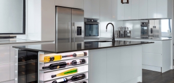
As always, we hope it will result in an increase in new listings, provide more security to current listings and an uplift in sales for the brand. Additionally, we hope the brand can expand into new categories and that consumers will want to display Bart products on their kitchen shelves rather than hide them away in the cupboard.
How do you ensure consistency in brand messaging and visual identity across various channels and touchpoints?
As part of bringing the regionality story to life, we created a set of icons and a corresponding colour palette that will be used across all touch points.
Additionally, we have written a comprehensive set of brand guidelines, guided the comms and photography and created a suite of unique and ownable brand assets, including a handwritten signoff and typography style that will set a distinctive look and feel for the brand.
What role did consumer research or market analysis play in shaping the direction of the rebrand?
Bart’s qualitative and quantitative research identified an over-index with scratch cook foodies who enjoy cooking and entertaining at home. We discovered how much they enjoy experimenting in the kitchen and value provenance and authenticity in their ingredients.
This insight was crucial in us changing the dominant category dynamics – from herbs and spices as taste heroes to hero enablers with the consumer and Bart sharing a love of good food.
How did you ensure that the new brand identity resonated with the brand's existing audience while also attracting new ones?
We were always conscious that, whilst the brand needed to be modernised, we had a job to do to retain existing loyal customers and not throw the baby out with the bathwater. But we found that everything really needed to be moved on somewhat, from the silver label which made text hard to read on shelf, to the AGA style logo and the generic looking illustrations to the existing strapline – “Masters of flavour”.
We felt that the brand was too inwardly focused and needed to behave more like a partner in the kitchen – exuding taste and expertise in equal measure. So, although the logo has been redesigned, it does retain its overall shape and the connection of the A and the R.
We emphasised the original shape by creating a die cut label which follows the curve of the top of the logo and the silver has now become a more contemporary off-white. We have also retained a fair proportion of black from the previous design so that on shelf the brand standout is not compromised and there will be no doubt in consumer’s minds that this is Bart.
Credit list for the work
David Thomson, Creative Director
Sylvia Dougan, Senior Designer
Charlotte Maiden, Senior Designer
Glenn Fielding, Senior Creative Artworker
Jo Lynn, Agency Director
Rebecca Allan, Account Lead