
When it comes to gaming, branding is everything. A great logo can instantly convey a sense of identity, personality, and quality, helping a gaming brand stand out in a crowded marketplace. This is why all of the top brands have iconic logos - it isn’t possible to be successful in the gaming industry without one.
In this article, we’ll take a closer look at four examples of gaming brand logos that have successfully captured the essence of their respective brands and resonated with gamers worldwide.

1. Nintendo
Few gaming brands are as universally recognised as Nintendo, and much of that recognition can be attributed to its iconic logo. Featuring bold, playful lettering in bright red, the Nintendo logo exudes a sense of nostalgia. The distinctive “N” symbol has become synonymous with beloved franchises like Super Mario, The Legend of Zelda, and Pokémon, making it instantly recognisable to all of us who share a passion for gaming.
What makes the Nintendo logo so effective is its ability to evoke a sense of joy and playfulness - it’s serious yet lighthearted. Whether you’re a seasoned gamer who grew up with Nintendo consoles or a newcomer exploring the latest releases, the Nintendo logo is as iconic as they come.
2. PlayStation
With its sleek, minimalist design, the PlayStation logo has become a timeless symbol in the gaming industry. Featuring a simple, monochromatic font paired with the iconic triangle, circle, cross, and square symbols, the PlayStation logo exudes a sense of progression and innovation.
But what makes the Playstation logo stand out? Well, it’s more than just the design. What sets the PlayStation logo apart is its ability to transcend the gaming world and become a cultural icon in its own right. From its humble beginnings with the original PlayStation console to its continued evolution with the PlayStation 5, the logo has remained a constant symbol of quality and innovation.
Whether you’re a die-hard PlayStation fan or a casual enjoyer of casino games, the PlayStation logo serves as a beacon of excellence in the gaming landscape.
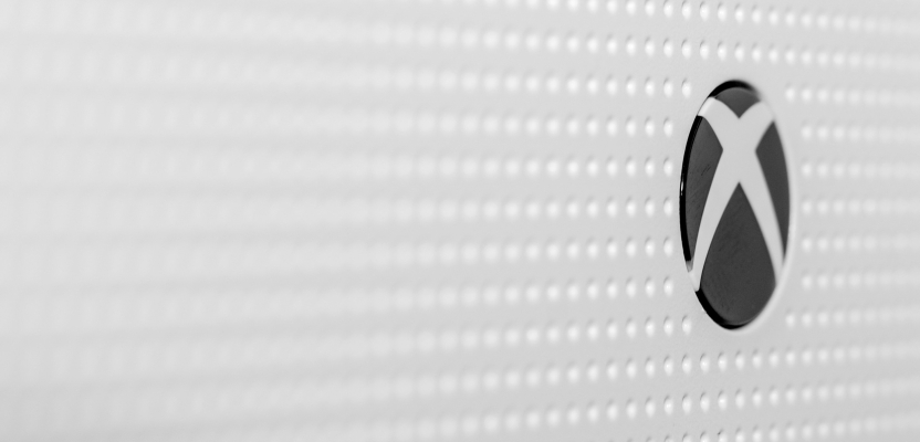
3. Xbox
As a direct competitor to PlayStation, the Xbox brand has carved out its own identity with a distinctive logo that reflects its commitment to cutting-edge technology and immersive gaming experiences. Featuring bold, blocky lettering in shades of green, the Xbox logo exudes a sense of power, energy, and excitement.
There’s just something special about the Xbox Logo. It’s not flashy or trying to blow you away - it’s just simple and consistent. From the original Xbox console to the latest Xbox Series X, the logo has remained a symbol that gamers can trust.
4. Steam
Steam may not be a gaming brand in the traditional sense, but its logo has become synonymous with PC gaming and digital distribution. Featuring a stylised "S" surrounded by swirling clouds of steam, the Steam logo gives off a sense of mystery, adventure, and exploration.
Of course, the fact that the Steam logo is associated with a vast library of games and a thriving community of gamers helps. Now, players just see the logo and get excited immediately because of the association. Regardless, with its simple yet evocative design, the Steam logo has become an essential part of the PC gaming experience.
Conclusion
Having a good logo is a necessity for gaming brands. Only the most put-together, iconic, and noteworthy companies are able to make it in an industry as competitive as the gaming industry, and great logos contribute significantly to the aforementioned requirements.
From the playful nostalgia of Nintendo to the sleek sophistication of PlayStation, each of these gaming brand logos played a vital role in the success of their respective companies.