

2025 was another banner year for adland. With brands and agencies pushing boundaries across every medium, we saw creative ads that weren’t just visually striking, but emotionally resonant, socially relevant, and technically uncanny. From AI-powered billboards saving lives to heartfelt festive films, this year’s creative campaign efforts were as innovative as they were impactful.
In this roundup, I’ll spotlight some of the best marketing campaigns of 2025 spanning digital and social activations, immersive experiences, print and packaging design, purpose-driven projects and more. Each example showcases a distinct approach: whether it’s self-initiated, purpose-built, or commercially driven, together they paint a uniquely compelling portrait of what happens when creativity meets strategy.
Spotify & The BRITs – Crafting Shareable Musical Moments
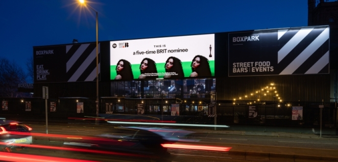
When one of the world’s biggest music streaming platforms teams up with Britain’s premier music awards show, you get a campaign that hits all the right notes. Spotify’s campaign for The BRIT Awards 2025 was all about creating shareable moments around music’s big night.
In an exclusive Creativepool interview, Jade Greene – Spotify’s Social Marketing Manager for the UK and Ireland – delved into the innovative strategy behind the streaming giant’s BRITs campaign. Rather than simply promoting the awards, Spotify turned fans into participants. They crafted interactive, social-first content that brought the BRITs buzz onto users’ feeds in real time.
Think custom graphics and short-form videos highlighting winners and performers, Instagram Stories filters letting fans “accept” a BRIT award at home, and live reactions from artists backstage turned into GIFs and clips ready to be shared. By blending real-time content with playful fan engagement tools, Spotify extended the BRIT Awards’ cultural footprint beyond the O2 Arena – onto millions of smartphones.
One of the campaign’s highlights was how it celebrated British artists in bold, eye-catching ways. For example, Spotify took to the streets with guerrilla OOH shout-outs for top UK artists, like a giant hand-painted mural of Oasis in Manchester and a blinged-out billboard for rapper Central Cee hitting 150 million streams.
Each activation was hyper-local and fandom-fueled, connecting streaming data to physical space. Meanwhile online, Spotify launched its first-ever video campaign for the year’s Wrapped, saluting the artists and cultural moments that shaped 2025. Guided by director KC Locke, this UK-only film packed in cameos from music stars (Central Cee, PinkPantheress, Lewis Capaldi and more) alongside cultural figures like Louis Theroux – a true snapshot of the year’s pop culture zeitgeist.
By mixing live BRITs highlights with year-round streaming trends, Spotify struck a chord between live event marketing and its always-on platform. The result was a campaign that not only promoted the BRIT Awards broadcast, but also gave fans everywhere ways to interact, share, and feel part of the experience. In the words of the campaign team, “each piece was designed to connect Spotify fans with their favourite artists in fun, expressive ways,” blending street-level spectacle with digital culture. It’s a great example of how an entertainment brand can amplify a tentpole event through creative social content and OOH innovation, making the music truly shareable.
UNICEF – “Choose Play Every Day”: Highlighting the Global Play Deficit
UNICEF took a purpose-driven approach in 2025 with “Choose Play Every Day,” a powerful campaign marking the International Day of Play 2025. Developed with agency Southpaw, the campaign shines a light on an urgent yet under-reported crisis: the global play deficit.
In a world where children’s playtime is diminishing due to societal pressures and excessive screen time, UNICEF reframed play as a fundamental right in peril. The centerpiece was a touching film that transforms ordinary family play moments into something extraordinary. In the film, real home video clips of children playing – kicking a football in the backyard, staging a make-believe adventure in the living room – are presented as if they were sports highlights on primetime TV.
Professional sports commentators narrate these scenes of play with the same excitement and gravity as a championship match, turning quiet childhood moments into “unforgettable highlights”. This clever device delivers a heartwarming yet pointed message: play is as crucial and celebratory as any sporting achievement.
As the film progresses, it becomes clear that this isn’t just a cute gimmick – it’s a rallying cry. On-screen text reveals statistics about declining play and its impact on child development. UNICEF’s research uncovered that many children today spend significantly less time in unstructured play than previous generations, a trend only worsened by global events and urbanization.
The campaign’s narration challenges parents and policymakers alike to recognize this deficit and take action. In one poignant scene, after a highlight-reel moment of a child conquering a playground slide, the commentary cuts out and a sober message appears: “Every child deserves to be the hero of their playtime.” UNICEF then urges viewers to help make play possible for all kids, whether by donating, reducing overscheduling, or simply making time to play with their own families.
The campaign’s call-to-action encouraged parents to “choose play every day” by prioritizing free play over gadgets or extra tutoring. According to UNICEF, the goal was not only to raise awareness but also to spark a movement – a cultural shift in how we value play.
By anchoring the issue in a relatable way and pairing it with emotional storytelling, UNICEF turned a developmental concern into a compelling narrative. The campaign earned praise for its simple yet powerful execution; as one marketing publication noted, it “cleverly pairs home videos with sports commentary” to reframe play as something heroic. In doing so, UNICEF reminded us that the sound of kids laughing and playing might just be the most important highlight of all.
Chelsea FC & Nike – “London, It’s Our House”: A Kit Launch Rewrites the Rules
Launching a new football kit is routine for sports clubs – but Chelsea FC’s 2025/26 home kit campaign proved it can be an art form. Titled “London, It’s Our House,” the campaign by agency Till Dawn (with cultural studio Iconic) blurred the lines between football, fashion, music, and city pride. Chelsea didn’t want “just another hype reel or another football ad” for this launch – “they wanted to own London.”
The central message – “London, it’s our house” – positioned the club as an inseparable part of the capital’s cultural fabric, and it stemmed from a strategic insight: represent Chelsea through the lens of London’s identity. This was more than a slogan; it became the rallying cry for a cross-medium campaign celebrating everything London and everything Chelsea.
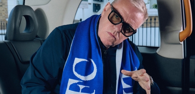
At the heart of it was a hero film like no other. Rather than focus solely on players modeling the new kit, the film is a vibrant montage of London’s cultural icons and landmarks, all unified by the classic track “Our House” by Madness (fronted by lead singer Suggs, a lifelong Chelsea fan). We see Chelsea stars like Sam Kerr and Enzo Fernández walking alongside London legends: music artists (rapper Central Cee, jazz musician Ife from Ezra Collective), fashion figures, and die-hard local fans.
The film zips through scenes – a street party in Camden, a record shop in Soho, a late-night chicken joint in Brixton – each location chosen to reflect the club’s broad cultural reach. Throughout, the Our House anthem ties generations together, bridging the club’s heritage with its contemporary fandom. “With Suggs on the track, a figure who bridges generations, it quickly became clear this embodied the pride and passion fans connect with,” explained Craig Stronach, Till Dawn’s ECD.
What truly made this campaign sing was its authenticity and attention to detail. Rather than the clichéd gritty urban aesthetic many sports ads lean on, Chelsea’s team deliberately kept the tone “joyous, positive, and deliberately distanced from the gritty, urban aesthetic” typically used to represent London.
The visuals are bright and celebratory – more block party than back alley. Easter eggs aplenty reward the keen fan’s eye: a portrait of club legend David Luiz spotted in a barber shop scene, a reference to a famous managerial moment tucked into graffiti on a wall. This layering of insider nuggets was intentional, as Stronach noted – it “establish[es] a tangible connection with the proper Chelsea fans” while still exciting neutrals.
The campaign extended to social media with behind-the-scenes content and to the physical world with street murals in West London, effectively turning the city into Chelsea’s canvas. By rewriting the rules of a kit launch to encompass culture at large, Chelsea FC and Nike created something bigger than a jersey reveal. “London, It’s Our House” felt like a love letter to the city that fuels the club – and in turn, it turned a piece of sports marketing into a full-blown cultural moment.
Penhaligon’s & Komodo – “She Built That” (AlUla Edition): A Fragrant Journey Through the Desert
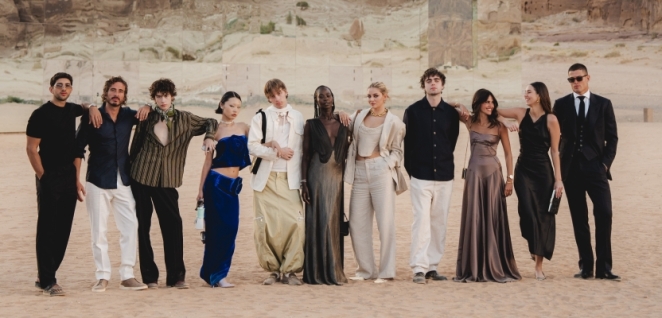
Scents and sights converged spectacularly in a campaign by British perfume house Penhaligon’s, executed in partnership with experience agency KOMODO. To promote a new luxury fragrance collection, Penhaligon’s eschewed traditional print ads or TV spots. Instead, they launched an immersive influencer experience set against the breathtaking backdrop of AlUla, an ancient desert region in Saudi Arabia.
The campaign – which could be dubbed a “fragrant journey” – drew “inspiration from the ancient Arabian incense routes”, paying homage to the heritage of perfumery and trade in the Middle East. To bring this to life, Penhaligon’s and Komodo literally took the campaign on the road: they transported around 30 influencers from eight different countries to AlUla for a multi-day sensory adventure.
Once there, the influencers (a mix of luxury lifestyle bloggers, travel photographers, and perfume connoisseurs) found themselves in a dreamlike itinerary blending culture and brand storytelling. By day, they explored the UNESCO heritage sites of AlUla – ancient carvings, echoing canyons, desert oases – with Penhaligon’s fragrances integrated into each experience.
One striking tableau had the guests following a caravan of camels laden not with goods but with giant perfume bottle replicas, harkening back to the incense caravans of old. By night, a glamorous open-air banquet under the stars awaited them, where each course was paired with a matching scent to create a synesthetic dining experience.
Throughout the journey, the campaign created photogenic moments designed for social sharing: custom perfume-themed installations amid the sand dunes, a “scent bar” in a Bedouin tent where guests could mix their own oils, and even a surprise concert by a Middle Eastern instrumental band that infused local musical traditions – a nod to blending cultures, much like blending fragrance notes.
The content that emerged was pure magic. Stunning photos and videos of influencers in flowing outfits against AlUla’s rock-hewn backdrops flooded Instagram and TikTok, all tagged with #SheBuiltThat (tying into Penhaligon’s broader campaign celebrating female creators) and #PenhaligonsAlUla. In fact, this activation dovetailed with Penhaligon’s “She Built That” initiative (which globally celebrates women in creative fields – more on that in the LEGO entry below).
Here in AlUla, it specifically honored the often-unsung women artisans in perfume and spice trade history. The campaign film shows influencers standing among local women entrepreneurs and artisans, driving home the message of cross-cultural female empowerment. According to Komodo, the activation “transported 30 influencers from eight countries to [the] mesmerizing” landscapes of AlUla, where they engaged in a once-in-a-lifetime creative journey.
By blending travel, culture, and brand heritage, Penhaligon’s didn’t just market a scent – they let audiences experience the world that inspired it. The buzz and FOMO generated online were as priceless as the trip itself. This campaign exemplified how in 2025, experiential marketing reached new heights: it wasn’t enough to tell a brand story, you had to let people live it – and in this case, breathe it in deeply.
Dr. Martens – “The New Buzz”: A Disruptive City Takeover for Gen Z
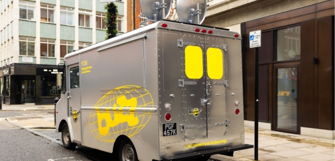
When iconic footwear brand Dr. Martens set out to launch its new shoe silhouette called “The Buzz,” a standard product drop simply wouldn’t cut it. True to their rebel spirit, Dr. Martens orchestrated a disruptive experiential campaign on the streets of London aimed squarely at Gen Z tastemakers. “When Dr. Martens set out to launch their Buzz silhouette, they weren’t looking for just another product drop; they wanted a disruptive, city-wide moment.” That’s exactly what they delivered – turning heads (and ears) across the city with a series of buzz-worthy stunts and activations.
The campaign unfolded like a guerrilla festival popping up in unexpected places. In Camden Market one weekend, morning shoppers were startled by an impromptu punk-rock marching band – all wearing the new Buzz boots, of course – blasting music as they paraded through stalls. At Brick Lane, a graffiti mural appeared overnight depicting a giant Dr. Martens boot stomping down a drab grey city street, with the tagline “Make Some Buzz.”
That mural wasn’t just for looks: passersby who scanned a QR code in the art unlocked an AR experience where the boot on their phone screen literally stomped through their surroundings amid digital graffiti – a playful use of augmented reality to engage fans.
The brand also converted a Shoreditch warehouse into a one-day pop-up rave for young creatives: the event featured DJ sets (powered by a generator shaped like a Dr. Martens shoebox), zine-making stations, and a custom “Boot-ify Yourself” workshop where attendees could customize their own footwear. Invitations were disseminated via TikTok and Snapchat, using popular London micro-influencers to spread the word in coded messages (“Have you heard the buzz?” accompanied by bee emojis and boot pics).
This integrated approach – combining live events, street art, AR, and social media virality – made “The New Buzz” campaign truly resonate with its target audience. It felt organic and earned, as if the youth themselves were co-creating the hype rather than being marketed to. By the end of launch week, Dr. Martens reported that all limited pre-order slots for the Buzz shoe had sold out, and their TikTok challenge (fans posting outfits or art inspired by the Buzz, tagged #BreakInTheBuzz) garnered millions of views.
The press coverage was equally enthusiastic, with press praising the campaign as a “disruptive experiential marketing activation for Gen Z” that went beyond a product intro to celebrate the brand’s cultural roots. In essence, Dr. Martens succeeded in turning a shoe launch into a movement – energizing a new generation around the brand’s ethos of creativity and self-expression, one buzzing stunt at a time.
Nissan – “Electrify the City”: Turning a Car Launch into a Cultural Moment
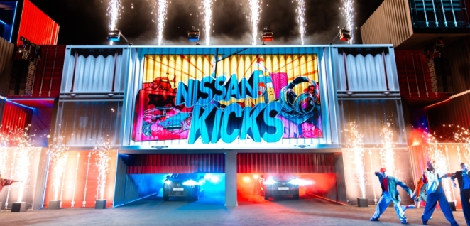
How do you unveil a new car model without doing the same old dealership launch or glossy ad campaign? If you’re Nissan, you hand the keys (metaphorically) to an inventive creative shop and ask them to create a cultural moment. That’s exactly what happened with the launch of the 2025 Nissan Kicks. Nissan briefed boutique agency The Hanging House with a bold request – “they didn’t ask for a car reveal, they asked for a cultural moment,” as one report described. The result was “Electrify the City,” an experiential campaign that transformed parts of a city into an interactive art and music festival powered by the energy of the new electric Kicks crossover.
The campaign’s hero event took place on a Friday night in downtown Los Angeles. Nissan turned an entire city block into a futuristic playground. At the center sat the new Nissan Kicks EV, but it wasn’t static on a showroom floor – it was elevated on a platform as the literal power source for the night’s activities.
The car’s battery was hooked into an electrical grid that ran the whole block party: it powered the stage lights for live performers, the neon art installations lining the street, even the food truck grills. This dramatized the Kicks’ electric capabilities in a visceral way. As daylight faded, a giant projection mapping show began on a nearby building facade: it showed a visual story of Los Angeles’s culture (skaters, street art, musicians) being “electrified” by innovation.
With a thumping soundtrack from a local DJ collective, the building lit up with animations that eventually formed the outline of the Nissan Kicks itself, towering over the crowd in neon glory. When the projection Kicks aligned with the physical car, fireworks (silent, drone-operated ones to respect noise rules) exploded overhead – marking the official “reveal” moment.
What made it a cultural moment were the collaborators. Nissan invited local artists, dancers, and entrepreneurs to be part of the show. One corner hosted a live street art battle with renowned muralists painting electric-themed artworks on large canvases. Winners, decided by crowd cheers, got a year’s lease of the new Kicks. On the music front, Nissan partnered with an indie music label to have a surprise headline performance by a well-known L.A. rapper, who arrived on stage in – what else – a Nissan Kicks. Social media lit up with posts from attendees and influencers, blending car specs with festival-like excitement.
The Hanging House team smartly framed the car not as the star, but as the enabler of experiences – aligning the vehicle with the creativity and vibrancy of urban life. In doing so, they delivered on that initial brief in spades: the Kicks launch felt less like a marketing event and more like a one-night cultural festival. The campaign reimagined a car launch by “asking for a cultural moment” and absolutely delivering one. By fusing technology, art, and community, Nissan’s “Electrify the City” made a strong case that the spirit of a car can indeed spark something electric in the culture around it.
John Lewis – “Where Love Lives”: The Heartwarming Christmas Epic
Every year the UK awaits the John Lewis Christmas ad, and 2025’s entry “Where Love Lives” did not disappoint. Created by agency Saatchi & Saatchi, this fully integrated campaign hit all the classic John Lewis notes – emotional storytelling, a nostalgic soundtrack, and a message that tugs the heartstrings – yet managed to feel fresh and profoundly touching.
The campaign is built on a “simple yet profound insight: when you can’t find the perfect words, you can still find the perfect gift.” In other words, gifts become a language of love when words fail us. John Lewis invited the nation to express what they truly feel through thoughtful gifting, encapsulated in the tagline: “If you can’t find the words, find the gift.”
The hero of the campaign is a two-minute film that aired on primetime TV and across digital channels. It tells the story of a father and teenage son who have grown a bit distant. On Christmas morning, amid the torn wrapping paper, the dad finds a gift from his son that he hadn’t opened: a vinyl record of “Where Love Lives”, the 90s dance anthem by Alison Limerick. As he places the record on the turntable, the magic truly begins. The familiar song transports Dad back in time – suddenly he’s a younger man dancing euphorically in a 1990s club, the room pulsing with strobe lights and youthful energy.
Through clever cinematography, he glimpses versions of his son at different ages in the crowd – first as a teenager mirroring him across the dance floor, then as a toddler taking his first steps, then as a newborn in his arms. These flashbacks symbolize the father’s cherished memories of his boy, all triggered by the music and the gift. In a poignant climax, the father returns to the present, tears in his eyes, just as the son comes downstairs. They share a quiet embrace – no words, just understanding. The on-screen message reinforces the emotion: sometimes a gift can say what we struggle to put into words.
The use of music was particularly powerful. Not only is the campaign named after the song “Where Love Lives,” but John Lewis actually produced a limited-edition vinyl of the track – with Alison Limerick’s original on Side A and a new cover by Labrinth on Side B – sold in-store, with profits going to charity. This intersection of music and merchandise amplified the campaign’s reach. The film itself was directed by Jonathan Alric of the acclaimed French duo The Blaze, known for their atmospheric storytelling, which lent a cinematic quality to the ad.
The campaign was truly 360-degrees: beyond the film, there were behind-the-scenes snippets for social media, extensive in-store displays themed around musical gifting, OOH billboards featuring hero products from the story (like the record and a pair of headphones), and even experiential pop-ups where people could record messages on vinyl to gift to loved ones.
The reception was stellar – many called it John Lewis’s best Christmas ad in years. It was praised for its authenticity and emotional heft. “The campaign poignantly explores the power of a gift to communicate something we might not be able to put into words,” said Saatchi CCO Franki Goodwin.
Indeed, it tapped into a universal feeling: the difficulty of expressing love, especially between parents and teenagers, and the beautiful ways we bridge that gap. By the end of the film, when the father and son hug with the lyric “where love lives” in the background, there wasn’t a dry eye in many a British household. John Lewis once again proved that creative storytelling – set to the right song – lives at the heart of effective advertising, reminding everyone of the true spirit of the season.
Boots – “Gift Happily Ever After”: A Fairytale Spin on Holiday Gifting
UK retailer Boots went full fairytale for its 2025 Christmas campaign, and the result was pure enchantment. Titled “Gift Happily Ever After,” the campaign brilliantly reimagined a classic storybook character – none other than Puss in Boots – as the hero of a modern holiday shopping adventure. It seems obvious in hindsight (Puss in Boots for Boots the store, a match made in pun heaven), but the execution made it truly magical.
Developed by The Pharm (WPP’s dedicated team for Boots) and led by creatives at VML, the campaign follows Puss as he embarks on a quest to find perfect presents for his famous fairytale friends. As Boots’ Director of Marketing, Laura Gooday, explained, they wanted a “fresh creative approach that puts meaningful gifting at the center of the story,” and Puss provided the “distinctive and playful” vehicle for that message.
The hero film plays like a mini-movie. It opens in a snowy storybook village where Puss – rendered in high-quality CGI amidst live-action settings – realizes all his fairytale friends have specific needs. Cinderella has cold feet (lost her glass slippers), the Snow Queen feels chilly, etc. Donning a red Santa-esque cape, Puss darts into a Boots store (much to the surprise of real shoppers) and enlists a helpful Boots Beauty Specialist to find the ideal gifts for each friend.
The film becomes a whirlwind tour of Boots’ offerings: Puss picks up a No7 skincare set for “Snowy” (Snow White), hot hand warmers for the Snow Queen, a grooming kit for the Beast, and so on – each item cleverly tied to the recipient’s story. These scenes are set to the 1980s hit “Girls On Film” by Duran Duran, giving a cheeky, upbeat tempo as Puss checks off his list.
The climax sees Puss arriving at the grand royal ball, arms full of Boots gift bags, distributing the presents. Joy ensues; the characters celebrate; a dragon even sheds a tear at getting a thoughtful gift (a fireproof sweater, naturally). The tagline appears: #GiftHappilyEverAfter, positioning Boots as the place where holiday gifting dreams come true.
Beyond the charming narrative, the campaign was thoroughly omni-channel. It ran for eight weeks across TV, cinema, social, online video, print, OOH and even audio ads. Each channel was tailored – e.g., in cinema trailers, a longer cut of the film played; on TikTok, shorter character-centric clips (like a makeup tutorial with Cinderella’s Fairy Godmother using Boots products) engaged younger audiences.
In-store, Boots embraced the theme with “Beauty and the Beast” window displays and signage like “Open Sesame” above the automatic doors. They also hosted an immersive pop-up event in London where families could step into Puss in Boots’ world, meet costumed characters, and get personalized gift recommendations (tying into Boots’ real-life personal shopper service).
What’s notable is how Boots balanced whimsy with strategy. The campaign wasn’t just a cute story – it was carefully designed to showcase Boots’ range of products and expertise. As Gooday noted, “it positions Boots as the go-to destination for thoughtful presents,” reinforced by the Boots specialist character who helps Puss find the perfect gifts.
The inclusion of that helpful employee in the story was a smart nod to Boots’ real staff and their customer service. The campaign also integrated modern touches: there was a Snapchat AR lens where users could try on Puss’s signature hat and boots with a backdrop of the Boots gift-laden ball, blending digital play with the campaign’s theme.
By all accounts, “Gift Happily Ever After” succeeded in casting a spell on audiences. It was whimsical and nostalgic enough for families and resonated strongly with Boots’ core under-35 customer segment, building on the previous year’s success. And importantly, it made the act of gift-giving – not just buying – feel truly magical, ensuring that Boots (and Puss) would live happily ever after in shoppers’ minds this Christmas.
Gap – “Better in Denim”: Bridging Generations with a Global Groove
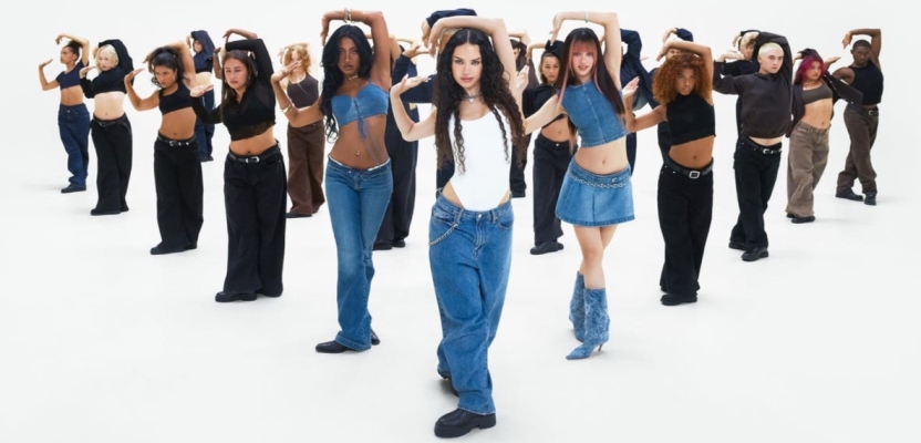
In Autumn 2025, Gap turned up the volume on its brand heritage with “Better in Denim,” a campaign that combined nostalgia, pop culture, and inclusive style in one high-energy package. The campaign starred KATSEYE, a global girl group sensation, and smartly tapped into Y2K nostalgia by spotlighting the return of low-rise jeans – all set to the irresistible beat of Kelis’s 2003 hit “Milkshake.”
Gap has long used music and dance to keep itself culturally relevant, and Better in Denim continued that legacy with flair. As Gap Inc.’s own press release put it, the campaign “builds on [Gap’s] legacy of bridging generations through music, dance, and self-expression.” Indeed, it positioned denim as a timeless canvas that unites ages and styles.
The hero ad is a vibrant dance film directed by Bethany Vargas and choreographed by Robbie Blue, featuring the six members of KATSEYE in an explosion of movement and fashion. It opens with a throwback nod: a lone dancer stands in a 2000s-esque neon room as the Milkshake bass line kicks in, immediately grabbing the viewer with that iconic track. One by one, more dancers join – each sporting different cuts of Gap denim, from the resurrected Long & Lean bootcut jean (a Gap staple from 2001, modernized for this campaign) to baggy and cropped styles.
The choreography cleverly blends genres and eras: a bit of Fosse jazz here, some hip-hop pops there, even ballet twirls – reflecting how Gap’s clothing, like the dance, spans influences and generations. The dancers eventually form a circular formation, symbolizing unity and community across ages. In the center, the KATSEYE members each have a moment to shine, their outfits styled to their personal flair. One member might pair a denim jacket with a hijab, another rocks a bedazzled jean skirt with punky fishnets – showcasing how denim adapts to individual identities.
KATSEYE themselves are a story of diversity and global youth culture. With six members hailing from different countries and over 22 million followers between them, they bring a “multicultural point of view” that aligns with Gap’s inclusive ethos. “Gap didn’t ask us to fit in – they invited us to show up as we are,” the members of KATSEYE said, emphasizing how each could express her style in the campaign.
This authenticity comes through on screen: you see real chemistry and joy as they dance, making the clothes feel lived-in and full of personality. The visual centerpiece is a custom-built set in Los Angeles shaped as a “circle of love” stage, where people from all walks of life join the dance one after another. By the climax, it’s a jubilant crowd – young, old, all colors and creeds – grooving together in denim, as the words Better in Denim flash on screen.
The campaign extended beyond the video into a broader cultural conversation. On social media, Gap launched the #DenimMoves challenge, inviting fans to share their own dance moves in Gap jeans to the Milkshake remix – effectively turning TikTok into a dance floor for the brand. Gap stores worldwide hosted “denim remix” events where customers could bring in old jeans to be tailored or embellished, reinforcing the idea of making denim one’s own.
Mark Breitbard, President and CEO of Gap, highlighted that “‘Better in Denim’ is the best expression of who the brand is today – fresh, relevant, original, and undeniably Gap.” The campaign’s savvy combination of retro revival (Y2K low-rise and music) with right-now pop influence (KATSEYE) paid off. It resonated with Gen Z and millennial shoppers who crave authenticity and nostalgia, while also reminding older fans of Gap’s heyday. By bridging eras and emphasizing self-expression, Gap indeed showed that everything – style, dance, culture – is better when you mix it up in denim.
IKEA – “DIY by IKEA”: Clever Fixes for Life’s Little Eyesores
Sometimes the most creative campaigns aren’t about introducing a new product, but about reframing the ones you already have. Enter IKEA’s witty 2025 campaign “DIY by IKEA,” which turned the home improvement narrative on its head. Developed by VML UK for the Middle East market, this campaign offered a “creative and cost-effective approach to common household imperfections,” showing that a little IKEA ingenuity can save the day (and your wallet). At a time of rising living costs and pricey home repairs, IKEA cleverly positioned its affordable products as ingenious DIY fixes for everyday problems – a fresh twist on the classic “Have you tried this?” life-hack formula.
The print and OOH visuals were immediate head-turners. Each execution was a striking before-and-after image: on the left, you’d see a familiar household eyesore – a child’s crayon scribbles all over the wall, a mysterious hole in a cabinet door, a badly stained bit of carpet. On the right, that problem had magically vanished under a stylish IKEA product. Crayon on the wall? Cover it with a large framed BJÖRKSTA art print – problem solved (and you have art on your wall).
Hole in the cabinet? Mount a KNIPPELIG rattan placemat over it as a decorative panel. Stained carpet? Put a vibrant IKEA rug on top. Each image was tagged with a cheeky caption like “Don’t fix it – frame it” or “Stains? Cover story.” This before/after series perfectly embodied the campaign’s insight: why spend hundreds on repairs when IKEA offers a fix for next to nothing? The campaign rolled out across the UAE, Qatar, Egypt, and Oman in April 2025, markets where the cost of building materials had been rising 10-15% and consumers were looking for thrifty solutions.
Beyond static ads, IKEA extended the idea into short online videos and social media content. In one humorous video, a couple frets over a crack in their ceiling – until one of them cheerily installs a decorative ceiling medallion (from IKEA’s lighting section) right over it. In another, a college student hosts a party and uses IKEA’s colorful FRAKTA shopping bags as makeshift slipcovers to protect a threadbare sofa, turning an eyesore into a statement.
The tagline across all media was some variation of “Don’t DIY – let IKEA DIY for you.” It suggested that IKEA has already done the design work; you just need to get creative in repurposing it. Juliana Paracencio, Executive Creative Director at VML UK, highlighted that the campaign “is based in such a true insight. With rising living costs, people are getting more creative with home repairs. It’s simple, yet unmistakably IKEA.”[46] By tapping into real consumer behavior (improvising fixes when money’s tight) and giving it a fun IKEA spin, the campaign hit home – literally.
To engage people directly, IKEA even placed a few “DIY Repair Kits” in stores: these were curated bundles of items like a frame, a rug, some fake plant vines, etc., with a tongue-in-cheek label “Break in Case of Home Emergency.” While mostly for display (and Instagram fodder), it drove home the message that IKEA’s solutions are as good as a toolbox. The campaign not only got laughs but also delivered business results, boosting sales of featured products.
More importantly, it reinforced IKEA’s core promise of democratizing design – making beautiful living accessible to everyone, even when life isn’t picture-perfect. As one headline declared, “IKEA’s latest work shows how it can subtly conceal all-too-common household imperfections”. In a world of lofty ad campaigns, this one stood out by dealing with the scuffs, scrapes, and scribbles of real life – and doing so with a wink and a smile.
Starbucks China – “Blending Cultures”: Tea + Coffee = Design Innovation
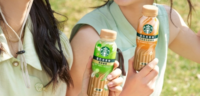
In 2025, Starbucks China brewed up something truly unexpected: a ready-to-drink beverage that blends tea and coffee, two of the country’s favorite drinks. To launch this new product line, Starbucks didn’t just mix flavors – it mixed design traditions in a bold way. Rather than a typical ad campaign, this was a design-led marketing effort, proving that packaging itself can be the hero of a creative story.
The concept: take the iconic visual cues of Chinese tea culture and the global coffeehouse vibe of Starbucks, and mash them up on the can. The result was packaging that was as much a conversation piece as the drink inside. One can design featured a traditional Chinese ink painting of mountain tea terraces, but upon closer look, the terraces morphed into the rippling crema of a coffee espresso shot – a beautiful optical illusion marrying the two worlds. Another design riffed on the familiar Starbucks mermaid logo, reimagining her with an Asian art twist: she held a tea leaf in one hand and a coffee bean in the other, surrounded by swirling waves that also resembled latte art.
The color palette across the line was a harmonious blend of earthy tea tones (jade green, oolong brown) and bold coffee hues (rich black, mocha), immediately signaling the fusion. This thoughtful design earned praise for “setting a new standard” in the category. It wasn’t just attractive; it encapsulated the product’s very essence – East meets West, old meets new.
To promote the launch, Starbucks leaned heavily on visual storytelling. Instead of typical commercials, they produced short documentary-style videos featuring the Starbucks design team and Chinese artisans working together. In one, a local ceramicist who crafts traditional tea pots is shown collaborating with Starbucks on limited-edition cup designs inspired by the tea-coffee blend – underscoring the cultural exchange. In another, a calligrapher creates a special character that combines the Chinese words for “tea” and “coffee” into one beautiful glyph, which Starbucks then used in its advertising.
This character became a motif across in-store posters and digital ads, a literal symbol of fusion. The campaign also included experiential pop-ups in major Chinese cities: “blend bars” where customers could taste the new beverages while an artist live-painted large canvases in the hybrid ink-and-coffee style used on the cans.
The attention to cultural detail paid off. Young consumers in China, who are proud of their heritage but also globally minded, loved the narrative of this drink bridging worlds. Sales were strong, but beyond that, Starbucks gained a bump in brand esteem for respecting and spotlighting Chinese culture in a genuine way. Reviews in the design community were glowing; many noted that Starbucks didn’t just slap a dragon or a Great Wall on the can (common tropes in Western branding for China) but instead dug deeper to find authentic design elements and integrate them.
By treating packaging design as content – something to be shared and appreciated – Starbucks turned a simple product launch into a creative celebration of cross-cultural pollination. This campaign serves as a reminder that design thinking can elevate even a can of iced latte-tea into a storytelling canvas, engaging consumers not only through taste but through artistry and cultural resonance.
“The Hidden Eye Test” – AI Billboards That Saved Sight
One of the year’s most ingenious – and impactful – campaigns came from an unlikely intersection of optometry, outdoor advertising, and AI art. “The Hidden Eye Test,” developed by VML for 1001 Optometry in Australia, was a world-first initiative that turned billboards into life-saving eye exams. On the surface, the campaign’s billboards looked like vibrant, abstract artwork – beautifully weird images you might pause to admire. But hidden within these AI-generated visuals were messages that only certain people could read.
In fact, the messages would change depending on the viewer’s vision health. As Little Black Book described, “‘The Hidden Eye Test’ uses AI-generated visuals to reveal hidden messages in OOH ads.” Here’s how it worked: if you had healthy eyesight, you’d see one message; if you had a common vision issue (like myopia or astigmatism), the image would blur or distort in a way that revealed a different message urging you to get your eyes checked.
For example, one billboard showed a colorful pattern of geometric shapes. Those with normal vision simply saw a pleasing design with maybe a subtle tagline. But if a passerby had undiagnosed astigmatism, the shapes would line up (due to how astigmatism blurs lines) to spell out “Time to see an optometrist.” In another execution, a painterly swirl of colors concealed the word “HELP” – visible only to people with certain color-blindness who couldn’t distinguish the hues, thereby making the letters stand out.
In essence, the ads were self-diagnosing eye exams. It’s no wonder the campaign was hailed as “a revolutionary direct-response campaign that spoke directly to viewers in need of eye care”. Importantly, it did so in a respectful, even uplifting manner – there was no shame or scare tactics, just a gentle reveal that something might be up with your vision.
The backend of this creativity was just as fascinating. VML collaborated with an AI artist (Prospex Park) to generate the images using machine learning models trained on ophthalmology charts and optical illusions. They essentially told the AI, “create a beautiful image that contains message X for people with condition Y.”
The resulting visuals were then tweaked by designers and tested with groups of people with known vision conditions to ensure the effect worked. The campaign ran in bus shelters and shopping centers – places where people typically have a moment to stare at an ad. Beside each poster was a short URL and QR code for 1001 Optometry’s site, so if someone did see a hidden message, they could easily find a nearby clinic or book an eye test online.
The impact was tangible: within the first month, hundreds of people reported for eye exams citing the billboards, and a significant number discovered issues they hadn’t realized (like early-stage glaucoma or cataracts). The campaign also swept up awards, winning Gold in the Health and Outdoor categories at Cannes Lions 2025. Beyond accolades, “The Hidden Eye Test” captured the public’s imagination – news articles and social media posts praised how it “can detect deteriorating eye health simply by looking at it”.
It turned a standard awareness message (“get your eyes checked regularly”) into an engaging, personal experience. In a year where AI was often in headlines for the wrong reasons, here it was applied in a brilliantly human-centered way. This campaign exemplified the best of creative advertising: innovative technology in service of real human needs, delivered with elegance and surprise.
Monash University – “Meet Younger You”: Time-Traveling with AI for Student Recruitment
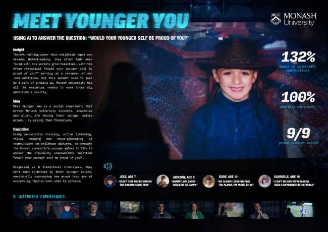
How do you convince prospective students that a university education will fulfill their dreams? Monash University in Australia did it by orchestrating a heart-to-heart chat across time. Their campaign “Meet Younger You” flipped the typical alumni testimonial on its head and turned it into a surprise social experiment. Using deepfake AI technology, Monash allowed current students and recent graduates to “meet” their childhood selves – and the emotional results spoke volumes about personal growth and the Monash experience.
As one of the creative leads, Charlie Dejean, explained: “We used AI to bring their community’s childhood selves to life to find out whether they’re making their younger selves proud.” The sheer concept of this is goosebump-inducing and was executed with sincerity and warmth.
In the campaign’s hero video, a handful of Monash students think they’re participating in a generic interview about their uni life. They talk about why they chose Monash, their challenges, their aspirations. Then comes the twist: each student is shown a video message on a screen – and it’s from 8-year-old them.
Using archived home video footage and photos, the campaign’s team created ultra-realistic AI-generated videos of the participants as children, seemingly speaking to them in real-time. A young girl (played by the AI version of the now-student) might ask, “Did we become an inventor like we always wanted?” or “Are you happy doing what you’re doing now?” Instantly, you see the student’s face light up in astonishment – and often, tears.
They then answer their “younger self,” explaining how Monash helped them find their path. One engineering student smiles and says, “Well, little me, we didn’t become an astronaut, but we are designing rockets – close enough, huh?” Another student, who struggled with confidence, tells her pig-tailed self, “You won’t believe it, but we speak at conferences now. We found our voice at uni.”
It’s incredibly touching, essentially a conversation across time. By the end, each student asks their younger self a question in return – the clever part being that this allowed the editors to cut together a two-way dialogue that feels eerily real.
The campaign struck a chord because it tapped into a universal truth: we all carry the dreams of our childhood, and a great education can help bridge the gap between those dreams and reality. By literally staging that bridge through “meetings” of younger and current selves, Monash showed – rather than told – the impact of its education. On a technical level, it was groundbreaking.
The AI deepfake work was done with extreme care for authenticity and ethics (all participants and their families consented, and the AI was used only with provided footage, not generating faces from scratch). The visual effects team even added slight grain and distortion to the “younger you” videos so they appeared to be old recordings magically answering present-day questions.
Monash rolled out the videos on social media with the hashtag #MeetYoungerYou, prompting current students and alumni to comment on what their younger selves would say. The engagement was huge – people were sharing their own childhood pictures and reflecting on their journeys, essentially creating organic testimonial content in response.
The campaign site also invited prospective students to write a letter to their future selves, reinforcing the forward-looking theme. It’s no surprise that this campaign helped Monash stand out in a competitive higher-ed market. Industry observers praised it for emotional resonance and technical innovation.
The Creativepool community highlighted it when awarding Creative Team of the Year 2025 to its creators (Andrew Bao and Charlie Dejean), noting how their campaigns “challenge conventions, blending emotional storytelling [with] clever media”. In the end, “Meet Younger You” succeeded because it wasn’t really about the university – it was about the students, their dreams, and the poignant realization that they are indeed becoming the people their childhood selves hoped to be. And what better endorsement for a university than that?
Guinness – “Transfer. That. Pint.” (Stop the Glassphemy!)
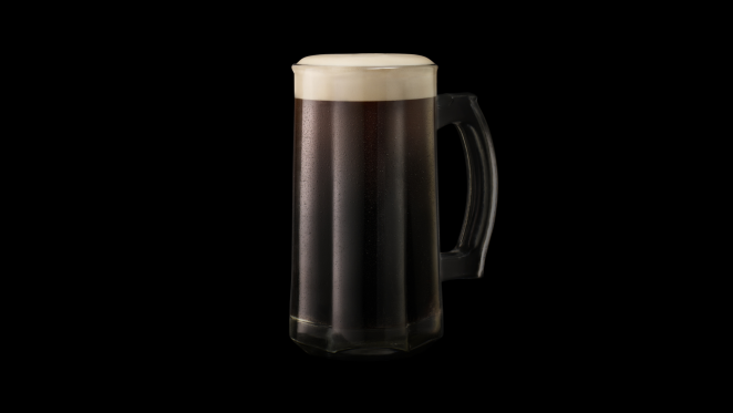
Leave it to Guinness – a beer brand steeped in ritual and legend – to create a cheeky campaign that connects football fandom with the sanctity of a perfect pint. In early 2025, Guinness Ireland rolled out the brilliantly titled “Transfer That Pint” campaign, which one creative site dubbed “Glassphemy” – as in glass blasphemy.
The insight? With Guinness introducing its Nitrosurge device (allowing you to pour bar-quality Guinness from a can at home), they discovered a horrifying sight: people were pouring Guinness at home into all sorts of wrong glasses. In pubs, Guinness is always served in the iconic tulip-shaped pint glass designed to create the right head and aroma. But at home, folks might use a mug, a mason jar, or – gasp – a Heineken glass. This improper glassware usage was deemed a sin – literally, “total Glassphemy” as Guinness playfully called it.
So, how to rectify this? By trading up those bad glasses like a football team trades players. The campaign, launched just before the January transfer window (a key time when soccer teams swap players mid-season), personified mismatched pint glasses as underperforming players needing a transfer.
Guinness offered fans in Ireland a chance to “transfer out” their subpar glass and “sign” a proper, limited-edition Guinness x Waterford Crystal pint glass for their home lineup. This wasn’t just any glass, but a beautiful crystal one made by Ireland’s famed Waterford – truly the Lionel Messi of pint glasses.
To participate, fans could go on TransferThatPint.com and submit a “transfer request” by uploading a photo of their sad pint in a wrong glass, or they could post it on social media with the hashtag #TransferThatPint.
The campaign plastered OOH billboards around Dublin in the style of sports deadline-day alerts: “Breaking: Pint Glass Seeks Transfer!” with images of wonky pub glasses and a call to action to make the switch. Guinness’ marketing director Alan McAleenan quipped in the press release, “As Official Beer of the Premier League, we believe the beautiful game deserves a beautiful pint. This transfer window, we’re offering fans the chance to upgrade their at-home setup.” It was a perfect soundbite connecting two of Ireland’s loves – football and stout.
Meanwhile, VML’s CCO Ryan McManus added color by calling out the “out-of-shape glassware” he’d seen – stout in a red wine glass? A travesty! – and explained that the campaign “draws attention to this in a fun way and encourage people to make the transfer to the drink’s true home – a Guinness pint glass!”.
The tone was spot on: part tongue-in-cheek, part genuine rallying cry for proper pouring standards. It galvanized beer aficionados who pride themselves on the perfect serve. The campaign culminated on transfer deadline day (Feb 3, 2025) with a live event at the Guinness Storehouse in Dublin.
Fans were invited to bring their oddball glasses to “retire” them (like a jersey going to the rafters) and in exchange receive the special Waterford crystal Guinness glass on the spot. Even Premier League legend Theo Walcott got in on the fun, appearing as a spokesperson. “Upgrading your matchday with a quality glass is like signing a star player for your at-home viewing,” he joked, seamlessly blending the metaphors.
The results? Within days, social media was flooded with the hashtag – some posts were earnest, others hilarious (one person tried to pour Guinness into a teapot to get attention – definitely a yellow card offense). The limited-edition crystal glasses became coveted trophies, with only a lucky few hundred fans getting them. But even those who didn’t win learned the lesson: stop the glassphemy! Use the right glass.
In terms of creative impact, the campaign scored two Golds at The Drum Awards (for Advertising Integrated Campaign and CPG/Food), proving that a smart pun and cultural insight can go a long way. Guinness managed to celebrate its product’s heritage in a fresh way, engage sports fans, and gently educate consumers – all while having a laugh. Now that’s a hat-trick.
Legacy Lager – “Buy a Veteran a Beer”: Honoring Heroes with a Tap and a Tech Twist
When it comes to purpose-driven campaigns, sometimes a simple gesture can speak volumes. Legacy Lager is a shining example from 2025 that combined Aussie ingenuity, respect for fallen heroes, and a dash of tech to create a moving new tradition. Legacy is an Australian charity supporting the families of deceased and injured veterans.
To raise awareness and funds, they partnered with VML Sydney to create Legacy Lager – not just a beer, but a symbolic experience. The idea: let everyday Aussies “buy a beer” for fallen veterans by pouring one out, literally, in their honor. How to do that? Through cleverly modified beer taps and a bit of RFID magic.
Across select pubs and sporting venues in New South Wales, VML installed special “dry taps” – beer taps that look and feel real but don’t actually pour liquid. Each Legacy Lager dry tap was equipped with RFID technology and linked to a donation terminal. Patrons could walk up, tap their phone or card, and the handle would light up as if a beer were being poured, even producing the sound of a lager filling a glass.
A screen above the bar would then display a message like, “You just bought a beer for a fallen hero. Thank you.” The donation (the price of a pint) would go directly to Legacy Australia’s fund for veterans’ families. Essentially, these taps turned the age-old tradition of “raising a glass” for the departed into a direct act of giving. As VML described, “Legacy Lager dry taps, equipped with RFID technology, allow patrons to buy a fallen veteran a symbolic beer with a simple tap.”
The campaign launched around ANZAC Day 2025 (Australia’s major day of remembrance), maximizing relevance. It spread to legacy clubs (veteran organizations) and even footy stadiums – at one rugby match, an entire bar was converted so that fans could only “buy” Legacy Lager (i.e., donate) during halftime, a powerful moment as the crowd observed a minute of silence for troops and then literally queued to honor them with a pint.
The brilliance of Legacy Lager lies in how tangible it made an abstract sacrifice. Buying a soldier a beer – something you’d do to thank a mate – became a metaphor anyone could grasp. Many patrons reported feeling a genuine emotional connection as they pulled the tap. Some even left messages or signed a memory book at the pub for families of veterans, creating a community tribute aspect.
Legacy Lager wasn’t sold in stores; it existed purely as this interactive installation and concept. However, the campaign’s storytelling extended to digital and print. Striking posters showed an empty beer glass with only a military dog tag at the bottom, captioned: “Fill this glass with gratitude. Buy a Legacy Lager.” Short video ads depicted an old Digger (Aussie veteran) in a pub seeing a young man pour a Legacy Lager and giving him a nod of deep appreciation. On social media, the hashtag #LegacyLager picked up steam, with people sharing toasts and stories of family who served.
The initiative saw a surge of donations to Legacy Australia and won a Silver Lion at Cannes 2025 in the Media category for its innovative use of on-site activation technology. It also captured hearts, showing how creative thinking can invigorate charitable giving. By turning a donation into an experience – one that resonates with cultural habits (shouting a round at the pub) – Legacy Lager lowered the barrier to empathy.
As one awards jury noted, it wasn’t about the beer at all; it was about the simple human act of saying cheers to those who can’t be here to drink it. And thanks to VML’s execution, thousands of Australians did just that, one symbolic pint at a time.
LEGO – “She Built That”: Remixing an Anthem to Empower Girls
LEGO has long championed creativity and play for all, but in 2025 the brand made a particularly bold statement with its “She Built That” campaign. In an industry often plagued by gender stereotypes (how many times have we heard “LEGOs are for boys”?), LEGO flipped the script by celebrating female builders and creators in a way that demanded everyone’s attention – through the universal language of music.
The campaign’s centerpiece was a remix of Run-DMC’s classic hip-hop anthem “It’s Like That” – transformed into “She Built That” – coupled with high-profile stunts across London. As Famous Campaigns quipped in their headline, “See you later stereotypes!” LEGO was busting myths because “building isn’t just for boys!”.
The music video for “She Built That” is pure empowerment. It opens with the thumping beat of the original Run-DMC track, but instead of the famous line “It’s like that, and that’s the way it is,” we hear a chorus of girls’ voices proclaiming “She built that, and that’s the way it is!” The video features young girls and women constructing all manner of things: a girl in overalls uses LEGO bricks to create a bridge, which then morphs into a real bridge with a female engineer overseeing construction. Cut to a classroom where a girl builds a rocket from LEGO, smash-cut to a real rocket launch with a female scientist at mission control.
Interspersed are shots of little girls jamming out to the music, DJing with LEGO turntables, and breakdancing (one girl even does the robot next to a life-sized LEGO robot she built). The energy is infectious, and the lyrics call out stereotype after stereotype only to knock them down. The original Run-DMC members, Joseph “Rev Run” Simmons and Darryl “DMC” McDaniels, lent their voices and full support – they appear in the video’s climax, cheering on a crowd of girls, and said they were “excited to see our classic anthem reimagined as ‘She Built That’, celebrating the creativity and innovation of girls everywhere.”
But LEGO didn’t stop at a song. They literally took over parts of London to drive the message home. In a brilliant move, LEGO identified iconic landmarks and structures around the city that were designed or engineered by women, and adorned them with commemorative plaques – as if those women were historical figures (which, indeed, they are).
For instance, the London Eye got a plaque honoring Julia Barfield, one of its architects, proclaiming “She Built That”. Waterloo Bridge – known colloquially as the “Ladies Bridge” because it was largely built by women during WWII – also received a special plaque highlighting the women who constructed it. These guerrilla-style installations earned major media coverage and public applause, effectively rewriting visible history to include women’s contributions. The timing was perfect, as June 2025 marked the anniversary of women’s suffrage in the UK – a nice tie-in to female empowerment narratives citywide.
LEGO also hosted a two-day immersive pop-up on London’s Southbank (appropriately, near Waterloo Bridge). It was like a creative playground with a purpose. There were dance workshops led by female hip-hop artists, music creation stations with female DJs teaching kids how to scratch and mix (using LEGO-inspired controllers), and of course, building zones where everyone, regardless of gender, could build whatever they imagined.
The idea was to show girls engaged in all forms of creativity – construction, music, art – because it’s all connected. As the campaign’s intro highlighted, a staggering 80% of adults still believed boys are better builders than girls. LEGO set out to demolish that outdated notion.
By the end of the campaign, “She Built That” had become a rallying cry. Social media filled with parents sharing photos of their daughters’ LEGO creations tagged #SheBuiltThat. The music video racked up millions of views and was praised for its earworm hook and empowering visuals.
Even beyond marketing, LEGO committed to tangible change: they announced funding for girls’ STEM programs and showcased new sets designed with input from girls around the world. “She Built That” exemplified the best of brand activism – authentic to LEGO’s mission and truly inspirational. In the words of one little girl dancing in the video: “We can build anything. Anything.” And that’s the way it is.
Apple – “Your Tree, Your City”: Lighting Up London with Community Creativity
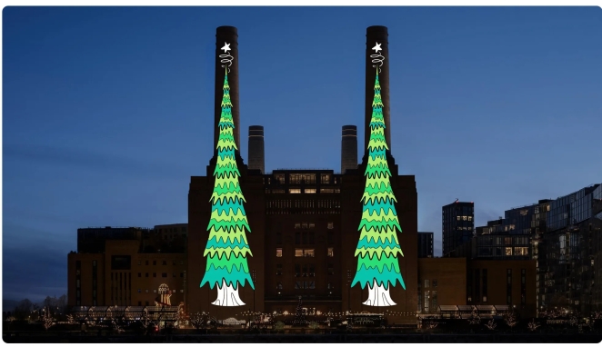
To cap off 2025, Apple delivered a festive campaign that literally lit up the London skyline – and it wasn’t an ad for a new device, but a celebration of creativity using Apple technology. Dubbed “Your Tree on Battersea”, the initiative turned the newly opened Apple Battersea (Apple’s UK headquarters and store at the iconic Battersea Power Station) into the canvas for a public-designed Christmas light show.
In what was Apple’s “first public creativity competition”, Londoners were invited to design digital Christmas trees using an iPad, with the winning designs projected onto Battersea’s massive art deco chimneys each night. The result was a dazzling display of 24 unique, community-created Christmas trees towering above the city – a marriage of personal expression and high-tech spectacle.
The campaign kicked off in early December with a call to action hosted by comedian (and social media star) Munya Chawawa, who Apple tapped as the cheerful MC for the contest. Munya put out a quirky video on his channels: “Alright Britain, time to get your Bob Ross on – design a Christmas tree on an iPad and we might just shine it on Battersea Power Station for all of London to see!” Using the free drawing app Procreate (featured on iPad), thousands of entries poured in from pros and amateurs alike.
People sketched trees made of musical notes, trees shaped like the London skyline, abstract trees, traditional ones – you name it. Apple retail employees and a panel of local artists helped pick the winners, emphasizing diversity of style and background. The winners ranged from a 7-year-old girl’s crayon-esque drawing of a rainbow tree to a digital artist’s sleek AR-inspired neon tree. Even a few celebrities participated for fun: Kylie Minogue drew a tree decked with music notes, Stephen Fry submitted one with witty little ornaments representing Shakespeare and science, etc., and their designs were showcased alongside the public winners.
Each evening from Dec 1 to Dec 24, as dusk fell, a small crowd would gather by the Thames to watch the Tree of the Day get illuminated onto Battersea Power Station’s chimneys. The projection was huge, vibrant, and accompanied by a short narration or audio snippet from the designer explaining their inspiration (accessible via an app or QR code on site).
For instance, one winner, Varsha from Canterbury, incorporated elements of her Indian heritage with British Christmas market vibes in her tree; she said “I haven’t celebrated Christmas as part of my culture before, but this was a way to join in” – and her tree of spiced orange colors and twinkling lights reflected that fusion beautifully. These personal stories gave the campaign heart, showing how technology can amplify individual voices and bring them into a shared public space.
During the day, Apple’s store at Battersea hosted workshops for kids to come draw their own trees on iPad, effectively turning marketing into a community art project. Local schools took field trips to see the projections and then went to the Apple store to try drawing themselves. It was as much educational as promotional, highlighting iPad’s creative capabilities. Importantly, the campaign was not overtly salesy – it quietly underscored Apple’s brand values of creativity and community. The only “ad” part was possibly a line in communications like “Designed on iPad. By London.” to credit the tool, but it felt natural.
London’s press adored it. In a season typically dominated by retail ads and competing light displays, Apple’s approach stood out for its inclusivity and innovation. Social media buzzed with photos and videos of the nightly tree, effectively crowdsourcing promotion of the iPad’s prowess. By Christmas Eve, 24 unique trees had shone, and many hoped this would become an annual tradition. In one elegant stroke, Apple combined holiday cheer with user-generated art and cutting-edge projection technology, proving that even in advertising, it can “Think Different” and let the people do the creating. This time, the brightest star on the tree was every creator who took part.
Save the Children – “The Delivery That Matters”: A Christmas Ad with a Purposeful Twist
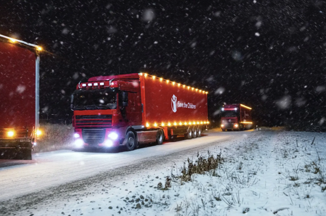
It’s not often an ad can make you misty-eyed and then spur you to rethink your holiday spending but Save the Children UK achieved just that with their poignant 2025 Christmas campaign. In a masterstroke of creative subversion, they took one of the most iconic Christmas commercials – the Coca-Cola “Holidays Are Coming” red truck ad – and turned it on its head to deliver a powerful message about generosity. The campaign’s film starts out deceivingly familiar: a convoy of big, shiny red trucks trucking through snowy landscapes, festooned with lights, while excited kids chase and point from afar.
The nod to Coke’s beloved ad is unmistakable, down to the jingly soundtrack. But as the convoy reaches its destination, viewers realize something’s different. Instead of Santa or soda, the trucks carry pallets of humanitarian aid – warm blankets, food crates, medicine – and the crowd of onlookers aren’t in a quaint suburb, but in a refugee camp or impoverished village.
A young boy who had been watching wide-eyed isn’t holding a Coke, but rather is handed a blanket by an aid worker. Suddenly, the soundtrack halts. On the screen appears stark text: “This Christmas, there’s one delivery that matters more than any.” Cue the emotional gut-punch.
The ad then shifts to real footage of Save the Children’s work: volunteers distributing supplies, children smiling with relief and warmth, families embracing. It contrasts sharply yet purposefully with the fantasy build-up. Essentially, Save the Children “reimagined one of the most iconic Christmas ads to deliver a heartfelt reminder of what really matters this season.”
By borrowing Coke’s visual language of Christmas excess and turning it into a story of humanitarian need, the campaign brilliantly challenges viewers to rethink their priorities. Those Coca-Cola trucks famously symbolize the commercial kick-off of Christmas; Save the Children repurposed them to symbolize giving rather than consuming.
This bold creative move was supported by compelling data. Alongside the ad, Save the Children released research highlighting the contrast between parent and child perspectives on Christmas. They found that 88% of parents feel pressured to buy more and more to make Christmas “magical,” yet 92% of children said they’ve received gifts they didn’t want or use.
In fact, a remarkable 73% of kids said they would give up a present to help another child in need. Those statistics appear after the film in some versions, reinforcing the idea that maybe the kids have it right – the true magic of Christmas is in caring for others. Save the Children’s CEO, Moazzam Malik, summed it up: “We’re asking everyone to play their part so children everywhere can have the right to childhood — not just at Christmas, but every day.”
The integrated campaign invited people to channel some of their holiday spending towards “the one delivery that matters.” For example, they suggested that if you have gifts you know might end up unused, consider donating the equivalent cash to provide essentials for children in crisis. They set up a pop-up “reverse grotto” in a shopping mall – instead of receiving, visitors could symbolically “give” a gift by buying an item from Save the Children’s charity gift catalog (like a vaccine pack or school kit) to be delivered to a child in need. The pop-up even featured a red truck installation where people could load a box (representing their donated item) onto the truck.
The campaign’s resonance was deep. It captured media attention for cleverly tugging at Coke’s cape, and many called it the “Christmas ad of the year” for its emotional weight. Viewers moved by the ad often said it made them stop and think amidst the season’s consumerism. And that’s exactly what Save the Children aimed for: a moment of reflection, a gentle guilt trip perhaps, but ultimately an inspiring appeal to our better angels.
By remixing a symbol of holiday joy into a message of real-world compassion, they created an ad that not only competes with the big Christmas commercials, but in many ways outshines them in meaning. In 2025, with so many challenges around the globe, this campaign reminded us that the true spirit of Christmas isn’t in the cola or the gifts under the tree – it’s in the giving.
BRLO & AKQA – “The Democracy Discount”: Fighting Populism, One Beer at a Time
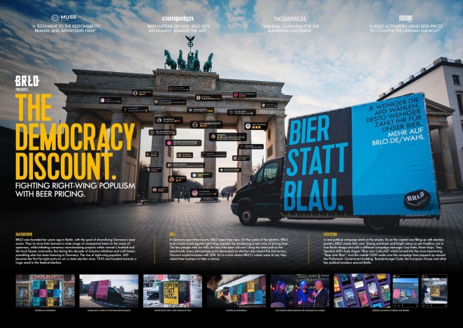
When politics grows bitter, sometimes the answer is… beer? That’s the idea behind “The Democracy Discount,” a brilliantly subversive campaign by AKQA Berlin for craft brewery BRLO, designed to counter rising right-wing populism in Germany with a clever pricing twist. In the words of Kai Heuser, Executive Creative Director at AKQA: “The Democracy Discount – fighting right-wing populism with beer pricing.” It’s not just a tagline — it’s exactly what they did.
Here’s how it worked: BRLO offered beer discounts based on voter behavior. In areas where more people voted for democratic parties, customers received cheaper pints. Conversely, in areas with high percentages of far-right votes, beer got more expensive. The data-driven pricing was displayed live on The Democracy Discount website, which tracked election results by district and applied a real-time pricing algorithm to BRLO beer in participating bars. This playful yet potent mechanic flipped populist rhetoric on its head and turned civic engagement into a literal reward.
Launched during Germany’s 2024 state elections and continuing into 2025, the campaign tapped into public discourse around voter apathy and political polarization. Rather than preach, it invited people to reflect — and act — through a medium they already engage with socially: the beer glass. By tying electoral turnout to everyday pleasure, AKQA and BRLO gave people a tangible reason to care about democracy, all while sparking conversations in pubs across Berlin and beyond.
The campaign earned widespread acclaim, being shortlisted at D&AD and winning multiple honors at the Lovie Awards, including Gold, Silver, and two People’s Lovie Awards in 2025. It resonated not just as a marketing stunt but as a new genre of creative civic activism, blending humor, data, design, and public participation. “We wanted to engage citizens in democracy in a way that’s human, local, and hard to ignore,” said Heuser — and it worked.
“The Democracy Discount” stands out as one of the year’s most inspired uses of brand influence for social good, proving that even the humble act of buying a beer can be a catalyst for dialogue and, perhaps, democratic change.
Zohran Mamdani – “A Mayor for All of Us”: Grassroots Design Meets Political Power
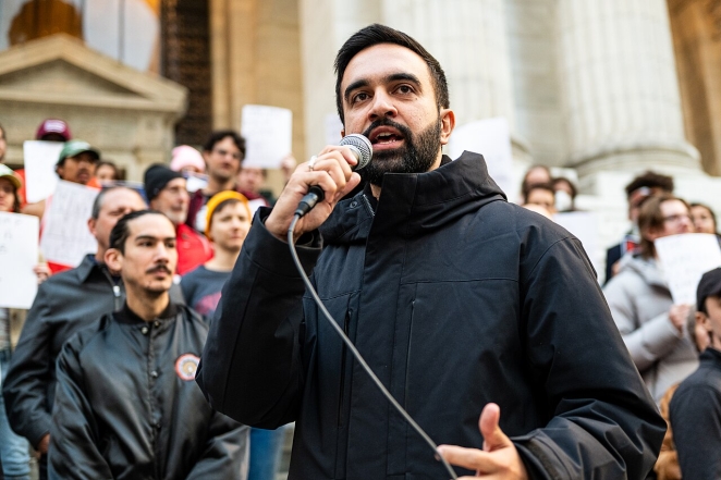
Finally, political campaigns rarely make it onto lists of the most creative advertising work of the year. But in 2025, Zohran Mamdani’s run for mayor of New York City broke that mold. As Betsy Ralston, Creative Director at Avoq, puts it: “Zohran Mamdani has to go down in history as not only running a creative political campaign, but one of the best creative campaigns, period.” It was more than a campaign — it was a case study in progressive branding done right.
From the start, Mamdani’s campaign rejected the aesthetics and strategies of establishment politics. There were no vague slogans, corporate-style yard signs, or washed-out red-white-and-blue color palettes. Instead, his team crafted a visually bold, multilingual, and culturally resonant identity grounded in the textures of the city he aimed to lead. Materials were printed in up to a dozen languages, and each was styled to reflect the communities it addressed — from Bangla typefaces in Jackson Heights to Amharic flyers in Harlem. This wasn’t just about optics — it was about showing up with true accessibility and respect.
Social posts featured clean, confident typography and vibrant photography that felt more like a modern cultural magazine than a political operation. Merchandise (especially the Mamdani tote bags) became coveted items among NYC youth. Campaign videos combined handheld documentary energy with powerful, pointed messaging — always circling back to Mamdani’s signature “RTBs” (Reasons to Believe), which he referenced with clarity and discipline across interviews, events, and speeches. As Ralston emphasized, “he was an absolute masterclass in always bringing the conversation back to his ‘RTBs.’” That consistency made the message stick, even as Mamdani tackled complex urban issues like housing, policing, and public transit.
Rather than chase elite endorsements or big-name consultants, the Mamdani campaign invested in community partnerships, volunteer-powered media, and deeply local organizing. Graphics for subway takeovers and neighborhood posters were designed in collaboration with borough-based artists and cultural workers. His digital content was distributed via WhatsApp groups, barbershop screens, and small-business storefronts — showing how creativity plus proximity can outmatch big spending.
By the time election day arrived, Mamdani had built not just a campaign, but a movement aesthetic — one that was joyful, sharp, and unapologetically inclusive. His performance in the race — going head-to-head with establishment-backed candidates and coming within striking distance — proved the approach worked. If 2008 was the year politics embraced design, 2025 was the year design redefined politics from the grassroots up.
As Ralston summed it up: “Everything about the campaign was so thoughtful and inclusive… a grassroots-centered, multilingual, culturally sensitive, and visually bold campaign that can succeed — even against establishment favorites.”It’s a landmark moment not just in political communication, but in creative strategy as a whole.
Working With Rather Than Against AI
These campaigns prove that the most successful projects in 2025 were bold cultural statements, inventive experiments, and human stories. If there’s one common denominator running through most of these campaigns, however, it’s in the use of AI to supplement creativity. The takeaway? It’s not going anywhere so we need to learn how to embrace it.
Generally speaking, however, whether it’s through thoughtful creative display ads, immersive brand experiences or socially conscious storytelling, the year wasn’t about AI. It was about the industry discovering how to run a truly effective creative marketing campaign within this new paradigm. Looking ahead to 2026, these creative marketing campaign examples 2025 stand as benchmarks for what’s possible and question what “just another ad” even means anymore.
If you’re wondering how to use AI for creative marketing campaigns or are simply looking at using the most creative campaigns 2025 to inform your own work, these cases (and the principles behind them) offer both inspiration and strategy.