
A flyer has one of the shortest performance reviews. It comes through the letterbox, lands on the doormat and is promoted, demoted or fired within seconds. Keep. Kitchen counter. Give it to someone else. Maybe later. Recycling.
There is no autoplay, no retargeting pixel hovering hopefully in the background and no algorithm waiting to give the work another chance because engagement looked promising. A piece of paper turns up in somebody’s physical environment and has to justify its continued existence almost immediately.
Perhaps that brutality explains why so much flyer designing and printing looks so nervous and sketchy.
Open almost any pile of local promotional material and you can see businesses trying to insure themselves against being overlooked by putting absolutely everything on the page. Three special offers. Six photographs. Eight services. A phone number, email address, URL, Instagram handle and QR code. Five bursts saying things like “FREE QUOTE!” and “CALL TODAY!”. Possibly some stars. Almost certainly several typefaces behaving as though they have never previously met.
The result is often the visual equivalent of somebody grabbing you by both shoulders outside a supermarket.
And yet print itself is not the problem.
In fact, physical marketing is enjoying a slightly unexpected moment precisely because so much communication has moved elsewhere. The latest DMA Door Drop Report says UK door-drop ROI reached £5.40 for every £1 spent in 2025, while door-drop volumes grew 3%. JICMAIL’s measurement of how households actually behave with mail found that an average door drop generated around 60 seconds of attention across a six-day lifespan in Q2 2025, with people interacting with it an average of 3.1 times.
That doesn’t mean every badly designed takeaway menu is secretly a media powerhouse. It means paper still possesses something digital communication increasingly struggles to manufacture: physical presence.
The real question is what you do with it.
Why Flyers Still Have a Job in a Digital World

Strut and Fibre
For years, print marketing has been talked about as though it were a slightly eccentric relative everybody assumes will eventually disappear. Email arrived. Then social. Then paid social. Then marketing automation, programmatic, influencers and approximately nine thousand varieties of content.
The flyer stubbornly remained.
One reason is that physical and digital media don’t necessarily compete in the way marketers sometimes imagine. JICMAIL reported in Q1 2026 that 9.4% of mail items prompted a website visit, a first-quarter record in its tracking, while 56% of purchases driven by mail were ultimately completed online. Paper can therefore act as the beginning of a digital journey rather than an alternative to one.
That makes intuitive sense. A local restaurant menu lands on the kitchen table and eventually produces an online order. An estate agent’s leaflet generates a valuation request through a website. An event flyer creates a QR scan. A beautifully designed piece of B2B direct mail sits beside somebody’s monitor for three days before generating an enquiry.
The interesting thing is not that print somehow defeats digital. It is that it appears somewhere digital cannot: physically inside somebody’s life.
The DMA’s 2025 Door Drop Report also found that 8,564 advertisers used door drops during 2024, representing 16% of UK advertisers tracked by Nielsen Ad Intel, and reported an average door-drop response rate of 0.5% across its 2021–2024 dataset. Perhaps more surprisingly, younger audiences recorded particularly strong interaction levels, challenging the assumption that anything printed automatically belongs to an audience who remembers dial-up internet.
But the medium only buys you an opportunity. It doesn’t buy you interest.
A terrible flyer may spend considerably more time in somebody’s house than a social ad simply because it takes three days before the recycling goes out. That is not the same thing as being effective.
What matters is whether the object earns another look.
What makes a Flyer Look Like Junk Mail?
“Junk mail” is a wonderfully revealing phrase because it describes perceived value rather than format.
Nobody calls a handwritten birthday card junk mail because it arrived through the letterbox. Nobody throws away a concert ticket because it is printed. We keep menus we genuinely intend to use, exhibition programmes we like looking at and beautifully produced catalogues we may never actually purchase from.
The object becomes junk when the recipient decides there is no reason to keep engaging with it.
This is why starting a flyer project by asking whether it should be A5 or DL is a little like beginning a restaurant by choosing the napkins. The first question should be: what is the reason somebody will care that this has arrived?
Sometimes the answer is functional. A genuinely useful offer, local service or event is inherently relevant. Sometimes it is creative. The object itself becomes an idea. Sometimes the value comes from the design, photography, writing or production making the piece feel unexpectedly desirable.
The strongest flyer design tips tend to have one thing in common: they understand that the recipient is under absolutely no obligation to read.
Visual hierarchy becomes crucial here. This means organising elements so the eye encounters information in its intended order; scale, contrast, colour and grouping are among the tools designers can use to establish that order. The underlying principle is that, if everything on the page demands equal attention, nothing successfully leads the eye.
That sounds painfully obvious until you look at how many flyers contain four competing headlines.
A good flyer design should allow somebody to understand the broad proposition from surprisingly far away. Then the next layer of information rewards closer attention. Then, if they are interested, the detail is available.
Think headline, reason, action rather than everything we have ever wanted customers to know.
If you run a bakery and the reason for the flyer is that every loaf is half-price after 4pm, that information should not be hiding underneath a paragraph about your passion for artisanal craftsmanship.
If you are opening a gym, perhaps “JOIN NOW” is less useful than the specific reason this gym deserves consideration.
If you are promoting an exhibition, the work should probably feel more like a piece of the exhibition than a discount voucher for carpet cleaning.
The design should reveal priority.
The interesting mistake businesses make is assuming “professional” means including more. Often it means having the confidence to remove.
Creativepool Examples That Treat Print as Creative Material
There are useful lessons scattered throughout Creativepool’s Annual because the strongest print and direct-marketing projects rarely treat physical media as a neutral surface waiting for information. They make the format, product or object participate in the idea.

Take Wickes Tradesman’s Suncream, created by iris, which won Gold and People’s Choice in Direct Marketing at Creativepool’s Annual 2018. The challenge was serious: research behind the campaign identified tradespeople as a group particularly exposed to skin-cancer risk while many resisted ordinary suncream. Instead of producing a worthy leaflet reminding builders to protect themselves, the campaign repackaged sun protection in miniature paint tins with names including “Brickie’s Bronze”, “Plasterer’s Pink” and “Apprentice White”. The Creativepool case study reports that the pots were distributed free nationwide, disappeared from shelves and generated more than eight million organic impressions.
The lesson for somebody wondering how to design leaflets is not, obviously, to put everything inside a paint tin. It is to understand the audience’s world well enough that the physical execution belongs there.
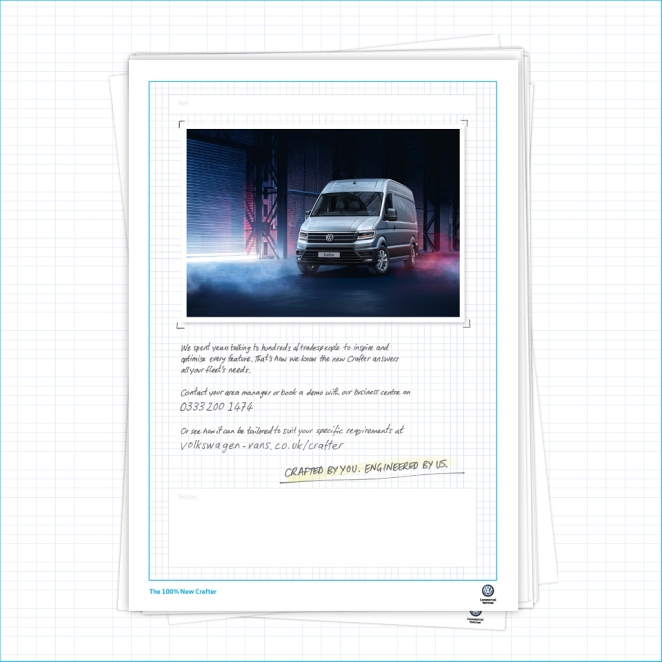
Creativepool Annual 2018 Bronze winner The New Crafter, from Proximity London for Volkswagen, similarly began from real customer behaviour. Volkswagen had spent years developing the new Crafter van around detailed input from couriers, construction workers and long-distance drivers. The direct work therefore had a much richer product truth to work with than “our new van is now available”.

Then there’s Hawkeye/Publicis’ Spring in a Tin, shortlisted in Direct Marketing at the Annual 2018. The agency turned a piece of self-promotion into a miniature desktop-growing kit, complete with the materials required to create a small office garden. The piece reportedly sparked growing competitions among recipients’ teams. Again, the communication survived because the recipient had something to do with it.
More recent print winners demonstrate the same thinking in different ways.
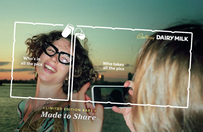
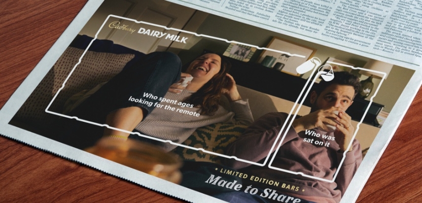
VCCP’s Made to Share 2.0 for Cadbury, Silver in Print at the Creativepool Annual 2026, takes an existing physical property of Dairy Milk—the bar’s 36 chunks—and turns it into the advertising device. The outlines of those chunks are laid over photographs of families, friends or colleagues to decide who deserves which portion based on recognisable acts of generosity. The product structure is not merely shown; it becomes the visual language.

Thought Boxes’ Sex Education for Parents, Bronze in Print in the same Annual, demonstrates the other end of the spectrum. Its strength lies not in an elaborate physical gimmick but in a brutally clear insight: parents may delay uncomfortable conversations, but children are already learning about sex, relationships and online influence elsewhere. The campaign turns that tension into direct, immediate communication rather than drowning it beneath a worthy information campaign.
These are not conventional local-business flyers, but that is precisely why they are useful flyer examples. They demonstrate principles that survive when the budget gets dramatically smaller.
You do not need expensive production to give a piece of print a point of view.
You need an idea strong enough that the paper has a reason to exist.
Make the Paper Part of the Idea


Mike Chivers, ECD at The PHA Group, describes that opportunity neatly:
“A flyer can earn attention where another email or social post gets overlooked. It’s tangible, direct and gives you a physical format to play with - but it still needs an idea worth picking up. KitKat Chunky’s ‘Chunky Mail’ turned a familiar missed-delivery card into a product demonstration, claiming the bar was ‘too chunky for your letterbox’ and inviting recipients to collect a free one from their local newsagent. The format delivered the joke, reinforced the product benefit and gave people a reason to act. That’s the opportunity with flyers: make the paper part of the idea. Keep the message sharp, the next step obvious and give people a reason to pause before putting it in the bin.”
The KitKat example remains such a good piece of direct marketing because almost nothing in it is decorative.
To promote KitKat Chunky, the campaign copied the familiar structure of the card left when a parcel cannot be delivered. Except this time the explanation was that the KitKat had been “too chunky” for the recipient’s letterbox. The card directed people to collect a free bar locally. D&AD’s archive confirms both the execution and the intention: communicate the product’s chunkiness and stimulate trial by turning the delivery format itself into the joke.
Industry case-study reporting has put redemption at 87%, an extraordinary response for a physical mail piece, although that figure comes from subsequent campaign reporting rather than D&AD’s award entry itself.
The result is interesting, but the mechanism is more useful.
The headline could not easily be separated from the media format. Put “too chunky for your letterbox” on an Instagram Story and most of the idea disappears. The physical delivery card is simultaneously the advertising medium, setup and punchline.
That is what “make the paper part of the idea” really means.
For a restaurant, perhaps the flyer folds into something connected to the food or occasion. For a removal company, perhaps scale, packing or labels become part of the design language. A gardener might turn a flyer into something plantable. An architect might use folds to reveal space. A language school could require the reader to decode something. A local running club might design the piece like a race number.
Not every flyer needs origami, seeds or an expensive die-cut, obviously. Gimmickry becomes irritating remarkably quickly.
Sometimes the medium participates simply because the front and back work together intelligently, because the fold reveals something, because the stock reinforces the proposition, or because the piece is designed to be pinned up rather than immediately discarded.
The principle is not “make it complicated”.
It is “make the physicality useful”.
A cheap piece of paper with a genuinely clever idea can outperform a beautifully foiled object whose principal message is that somebody discovered the printer’s finishing menu.
How to Design a Flyer That Grabs Attention for the Right Reasons

WINGS The Agency
There is no single formula for how to design a flyer, because a nightclub launch, plumbing service, charity appeal and B2B conference have very different jobs to perform. But there are a handful of decisions that separate intentional communication from the sort of leaflet people instinctively classify as clutter.
Give the flyer one primary job. Decide what success means before touching the layout. Book the table. Attend the event. Request the valuation. Visit the shop. Scan for a sample. Keep this number for when the boiler inevitably chooses Christmas Eve to die. One piece can contain supporting information, but it should not contain six competing objectives.
Make the proposition visible before the explanation. Someone should be able to glance at the piece and broadly understand why it matters. That does not mean every headline has to scream an offer. It does mean the most valuable idea needs visual priority. Clear hierarchy helps guide attention in the intended sequence rather than forcing people to work out where to begin.
Write like a human being. “Your trusted local partner for all your comprehensive plumbing solutions” is the sort of sentence nobody has ever actuaklly said to another person. “Boiler broken? We can usually be there today” contains a situation, benefit and reason to act. The best copy often becomes simpler as the understanding behind it becomes more sophisticated.
Use imagery because it communicates something. The photograph of a smiling person in a headset has committed enough crimes. If the product is beautiful, show it properly. If the service creates an outcome, show the outcome. If illustration gives the brand more personality, commission it. If the flyer works better with no image whatsoever, allow typography to do the job.
Make the next step unmistakable. A flyer that generates interest and then leaves people wondering what to do has performed only half its function. One strong URL, phone number, location, offer code or QR route is normally more useful than presenting every contact channel the business has accumulated since 2007. Where possible, make the action match the promise: “Book your free tasting”, “Get an instant valuation” or “See the full programme” tells people what happens next.
Design the physical object, not a screenshot destined for paper. Check the scale in your hand. Print a rough version on an office printer. Put it on a table and walk away. Look at it beside other mail. Is the headline still visible? Does the reverse earn its space? Does the fold destroy an important sentence? Does the QR code actually scan when printed at the intended size?
That last point is routinely overlooked because designers increasingly work in environments dominated by screens. Print has dimensions, texture and viewing conditions. The object can be turned over, folded, passed to someone else, pinned to a board or left beneath a fruit bowl for four days.
Design for those behaviours.
Accessibility matters here too. UK government accessibility guidance for documents recommends legible typography, good contrast, simple structures and avoiding unnecessarily small type; guidance aimed specifically at people with sight loss recommends significantly larger print where appropriate. The broader lesson for commercial flyer design is not that every promotional headline must resemble a motorway sign, but that pale-grey eight-point copy on a pale-yellow background does nobody any favours simply because it looked tasteful on a backlit Retina display.
And please resist the belief that making something “stand out” requires turning every dial to eleven.
Three colours can stand out.
One enormous sentence can stand out.
A tiny unexpected object in the centre of otherwise empty paper can stand out.
If every element is bold, coloured, outlined, starred and shouting, you have not created emphasis.
You have created an argument.
Targeting, Printing and the Bits Creativity Cannot Rescue
Ars Thanea
There is an uncomfortable truth creative people occasionally prefer not to hear: a beautifully designed flyer sent to the wrong audience is still waste.
A Michelin-starred pizza leaflet is unlikely to transform the fortunes of a takeaway if it is distributed fifty miles from the restaurant.
The DMA says effective door-drop campaigns depend on a combination of targeting, creative quality and a clear role within the wider marketing plan, rather than treating distribution as the uninteresting administrative step that happens after the design has been approved.
This should influence the creative too.
A flyer aimed at an entire neighbourhood probably needs immediate, broad relevance. A B2B piece going to 50 carefully selected prospects can afford to be considerably more specific. A flyer placed inside an order for existing customers can assume familiarity that a cold door drop cannot.
The audience changes what you can say.
It should also change what you spend.
If you are printing 100 highly targeted invitations to people capable of commissioning a £50,000 project, premium stock, variable printing or unusual production may be entirely rational. If you are delivering 80,000 leaflets advertising a £6 lunch offer, the economics are rather different.
The clever part is knowing when expensive print is carrying the concept and when it is merely making the recycling bin slightly more luxurious.
Measurement should be designed in from the start. Unique URLs, QR codes, phone numbers, redemption codes or geographic distribution cells can help establish what happened after the flyer landed. JICMAIL’s broader research is particularly interesting here because physical mail increasingly prompts digital behaviour, including website visits, searches and app interactions.
That means judging the campaign solely by people physically presenting the flyer may miss a large part of the journey.
Make Your FLyer Look Credible, Not Mass-Produced

Fontsmith
There is a point at which Canva, a printer template and admirable entrepreneurial optimism stop being the right creative team.
Not because every flyer needs an agency. Plenty don't. A straightforward opening-hours leaflet or regularly updated price list can be created perfectly well from a thoughtfully designed template once the visual system has been established.
But if the flyer is part of a launch, customer-acquisition campaign, repositioning exercise or significant local push, the cost of poor communication can quickly exceed the cost of professional design.
Creativepool’s directories distinguish between general graphic designers and print specialists. Its current guidance recommends evaluating graphic designers on portfolio relevance, typographic craft and consistency rather than simply choosing the person with the most impressive job title; the platform’s print-designer directory similarly advises shortlisting people whose previous work resembles your brief in format and ambition and confirming that they can produce technically correct print-ready artwork.
That portfolio point matters enormously.
A brilliant UI designer is not automatically a brilliant print designer. A designer who creates beautiful luxury editorial work may not be the best person for response-driven retail leaflets. And somebody who knows how to make a piece look attractive may still need a copywriter or creative partner if the underlying message itself is the problem.
Before commissioning anyone, give them the audience, purpose, distribution method, offer, required action, quantity, format constraints, budget and brand assets. Crucially, explain what the flyer is competing with.
Not simply competing businesses.
Competing attention.
A local flyer may land underneath a supermarket leaflet, takeaway menu, council letter and something from an estate agent containing yet another optimistic estimate of the value of your house.
The creative task is not merely to look nicer than those things.
It is to give the recipient a different reason to care.
Creativepool’s own archive is useful here because it demonstrates the breadth of what print can become. The Annual 2026 included winners across Print and Direct Marketing, from VCCP’s product-led Cadbury work to TMW’s Silver-winning McDonald’s x Minecraft direct campaign, which used highly tailored communications and audience segmentation to turn fandom into measurable sales activity.
The thing worth borrowing from these projects is not their production budget.
It is the refusal to treat the medium as a blank rectangle.
The Flyer Doesn’t Need to Look Expensive. It Needs to Look Intentional

WMH&I
Perhaps this is the distinction that matters most.
“Don’t make it look like junk mail” can easily become “make it look premium”, which then becomes thick stock, tasteful minimalism, embossing and the sort of sans serif typeface normally found beside photographs of Scandinavian furniture.
There is nothing wrong with any of that.
But expensive-looking and effective are not synonyms.
A deliberately scrappy gig flyer can be brilliant. A photocopied takeaway menu can possess enormous character. A fluorescent sheet of paper with one devastatingly good line may be more compelling than a beautifully art-directed six-page brochure.
What makes something feel disposable is usually not the production value.
It is the absence of thought.
Junk mail feels generic because it behaves as though the recipient is interchangeable. The headline could belong to anybody. The photographs came from the same library as everyone else’s. The offer has no particular relevance. The design is attempting to manufacture urgency because the underlying proposition failed to create any.
A good flyer feels like somebody made a decision.
They chose this audience.
This message.
This image.
This piece of paper.
This reason to respond.
That is why Chivers’ KitKat example still works so well years after the campaign itself. The idea is almost absurdly small. It is one card. One product attribute. One joke. One next step.
But everything agrees.
And that is probably the simplest rule for better flyer design.
Before you add another photograph, badge, exclamation mark, QR code or “LIMITED TIME ONLY” starburst, ask whether the piece already contains one thing worth noticing.
If it doesn’t, more design will not rescue it.
Find the idea first. Then print it.