
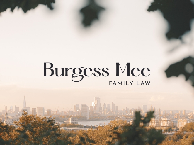
Run For the Hills, the award-winning design house specializing in interiors and branding, is now the go-to for edgy and cool branding. This month, they’re unveiling their branding work for a family law company, Burgess Mee. Typically, branding in the legal industry can be corporate and stuffy, often using blue to appear trustworthy and conservative.
Run For the Hills aimed for something less cynical and more thoughtful for Burgess Mee, introducing a stylish logotype, a calming muted colour palette with a pop of orange, and warmer, more human imagery. This new brand identity showcases both Burgess Mee's serious, established nature and their approachable, human side.
To learn more, I spoke with Chris Trotman, RFTH co-founder and creative lead on the project.
Can you walk us through the history of Run For The Hills, including what inspired its founding and how the company's focus on edgy and cool branding has evolved over the years?
I have had many hats over the years, but always as a graphic designer of sorts; working in advertising, branding agencies, and film production. When I met interior designer Anna Burles, we quickly discovered that we shared a similar aesthetic and had very complementary skill sets. We started collaborating on projects, and thus Run For The Hills was born - in the space where branding and interiors meet.
Anna has also had many hats over the years, from journalism to guerrilla marketing, and our combined experience means we like to come at things from a different perspective, always seeking originality and to disrupt. One thing that always frustrated me in advertising was I always wanted everything to be art, and didn’t care how many Unilever products the campaign sold – I just wanted it to be cool, creative and look good.
In our work now, I have the same attitude, but thankfully, in hospitality at least, we find people appreciate things being cool and creative and looking good for the sake of it. Beyond designing a restaurant, we are designing an experience, and everyone responds to good design. And we’ve had some amazing clients who’ve held the faith and gone with the beautifully illustrated 40-page drinks booklet, or the life-size infinity mirror that added so much charm and atmosphere to their respective venues.
We increasingly see interior design studios expand their offer to incorporate branding design. Why do these two services need to go hand in hand?
So that you can ensure the brand and the interior space are perfectly aligned. When we start a new project, we concept the brand identity and interiors simultaneously to ensure they work harmoniously. Sharing a studio fosters interaction, with our two teams regularly checking in on each other’s work and brainstorming together. This allows either team to pivot and change track slightly, depending on the influence of the other.
Brand inspiration can stem from interior decor, while brand imagery can be broken down and used in custom fabric patterns, shapes from the brand can inspire bespoke joinery pieces. Most guests will be oblivious to this attention to detail, but as I mentioned earlier, people respond to good design, even if it’s on a subconscious level, and they can’t tell you exactly why they love it.
Positive client relationships are imperative to delivering successful interiors and branding. How do you work with your clients and nurture that important relationship?
Our projects are always a collaboration, a journey we go on with our clients. We both want the same thing – for it to be awesome. Regular meetings throughout the design process, we’ll embrace their suggestions or influence slight changes all for the good of the project.
We never try to impose a ‘house style’ - each project is unique and needs to be designed for its audience. We have a number of long-standing clients for whom we’ve worked with on multiple projects and sometimes multiple brands. Over time, you develop more of a shorthand; they trust us more, and we quickly know what they mean and what they want.
Can you describe your studio's branding process, including the specific considerations for the commercial sector? Are there any unique steps in your process when designing for a law firm?
Our process is roughly the same regardless of what we are branding. It’s easier to get work when you have a niche, and our niche is food & drink, so people find us through that and that is one of our absolute specialisms. It’s funny - prospective clients want to see an example of something you’ve done in their sector to know that you can do the project. But branding is branding. We don’t get many enquiries from Finance start-ups, but that’s not to say we couldn’t create a supercool, trailblazing identity for one, since our process is the loosely same:
- The first step is Familiarisation & Research. We immerse ourselves in our client's world and examine their sector and competitive set. We look for trends (to avoid) and get them to answer our branding questionnaire (which is slightly tailored for each client). We ask them to put together Pinterest moodboards or reference images for things they like (and don’t like). We’ll arrange a kick-off meeting to hear about the history of the brand, their ambitions and perceived problems, talk through their references. Sometimes we’ll put together some rough moodboards as talking points. After the meeting we’ll write up our notes and our Creative Brief which will outline our plan of attack from what’s been discussed. Once they sign off the brief, and agree deliverables (the Scope Of Work) and a schedule, we can dive into the project.
- Depending on the brief, the next step would be Brand Strategy. Where we dive into Naming, developing the Tone Of Voice, Brand Values and Positioning. But often for us the Name is already in place and the client may already have a good idea of their brand values so we can move on to the next step, which is Moodboards. Moodboards are an easy way to quickly explore different potential directions, and once a moodboard direction is chosen we know the subsequent design work is more likely to be on target. Very occasionally, when we have a long-standing client who we have a great working relationship and are very familiar with, or when the budget is very tight or we are super clear from Step One what the direction is, we can forgo the moodboard phase.
- Concept design is next. We work up 2 or 3 distinct branding ‘routes’. These will be presented across a number of brand touch points as proof of concept. Things like business cards, website home page, menus, uniforms and in-venue graphics or other deliverables from the Scope of Work. Seeing the brand ‘in action’ like this helps our clients visualise and make decisions with confidence. Once a route is chosen we move into developed design. Working through the deliverables.
Of course, there are other stages that differ between projects and commercial sectors, such as an install phase for a physical project. And our process is constantly evolving and changes slightly depending on the initial meetings with the client and our instincts.
How did you determine the brand pillars for this project, and how did you realize those through your branding designs?
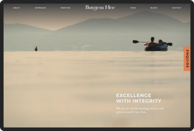
Burgess Mee originally came to us for a new website. We told them we couldn’t create a new website without evolving their brand, and that we’d have to start with the brand. There was limited budget to dive into a full strategic piece, so the brand pillars were teased out of them by way of insightful questions in our Branding Questionnaire. Burgess Mee wanted a quietly confident brand, modern and innovative, but also compassionate and supportive.
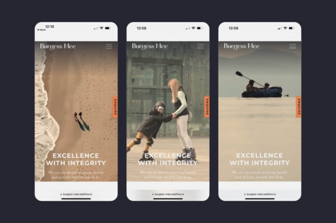
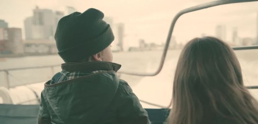
Our research into Family Law found that it would be a pretty easy sector to disrupt since many other law firms rely on their heritage, using old-fashioned serif typefaces, conservative blues, and cliched stock imagery of law court steps, scales, and cityscape skylines. So, Burgess Mee’s new brand confidently ditches all of the law tropes. It has a calming, neutral colour palette that perfectly complements the series of nostalgic and atmospheric images and videos we introduced to add some warmth and humanity. We think this answers the brief for a contemporary and compassionate Family Law practice.
In an industry where blue is often overused to signify trust and conservatism, what made you choose a muted colour palette with a pop of orange for Burgess Mee, and how has it been received?
Being aware of trends is so important. Mostly so that you can avoid them. Following trends can lead to your project looking dated, and by bucking trends the brand is more likely to stand out (from the sea of blue). There was no specific conceptual reason for the colour orange other than an aesthetic one.
Without the pop, the muted palette would be a bit dull, and the colour worked so nicely with the grade we gave the photos. How has it been received? I go back to my original comment – people respond to good design. We’ve had an uplift in inquiries specifically about rebranding other Family Law firms.
2023 saw significant rebranding efforts across multiple industries, including the controversial rebrand of Twitter. Why did we see a rise in businesses reviewing their branding? Can you share some of the successful corporate branding projects from Run for The Hills this year?
In 2023, there were some terrible rebrands, right? The legibility issues of Nokia's new logo and HBO losing its name are just two examples. Over the last decade, there has been a massive trend towards minimalism, ditching any perceived unnecessary flourishes, streamlining, and simplifying. The danger is that everything starts to look the same, becoming homogenous and stripped of personality.
Most brands evolve over time, and maybe in 2023, a lot of brands felt like it was their time. Another successful rebranding project we did this year was for Hammersmith’s Kindred. Our interiors team has collaborated with Kindred for years, and this year, our branding team was invited to refresh their brand.
Kindred, a hospitality venue in West London’s grade II listed Bradmore House, is dedicated to building community and genuine human connections, inspired by the warmth and unity of gathering around a campfire. In rebranding, it was essential to maintain Kindred’s playful yet professional tone, sense of togetherness, and the campfire concept. Just as our interiors team enhanced the venue’s styling, the brand identity required a similarly creative evolution.
We modernised Kindred’s logotype with a refined serif and simplified the campfire logomark. We introduced a darker, richer colour palette that reflects the updated interior: deep burgundy from the Salon Bar, luxurious blue from the banquette seating, and soft green from the library shelves. An orange accent ties the palette together, echoing interior pops of orange in armchairs and accessories.