
It's been ten years since Channel 4's last major brand refresh, so when it came time to shake off the cobwebs and give the brand a shot in the arm, it was never going to be a simple lick of paint. The rebrand, which was a collaboration between DBLG, SQUA and Channel 4's in-house creative agency 4Creative, aims to reflect the channel’s focus on innovation, diversity, and taking creative risks. The new system was designed to be playful, surprising, colourful and ever-changing and, takes an innovative new direction that was the foundation for the channel’s new bespoke typefaces created by globally renowned graphic designer Neville Brody and his agency Brody Associates.
DBLG, SQUA and 4Creative have created a drastic rebrand for Channel 4 that reflects its focus on innovation, diversity, and taking creative risks
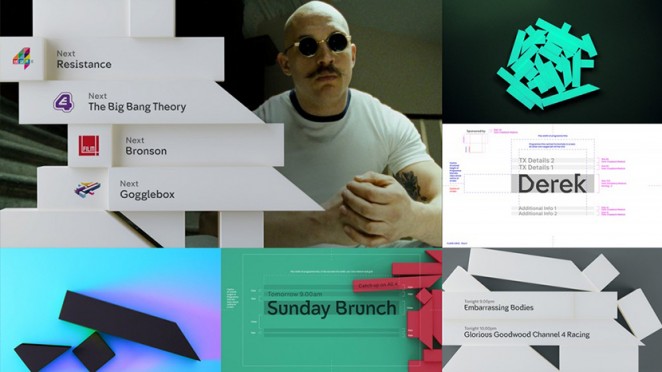
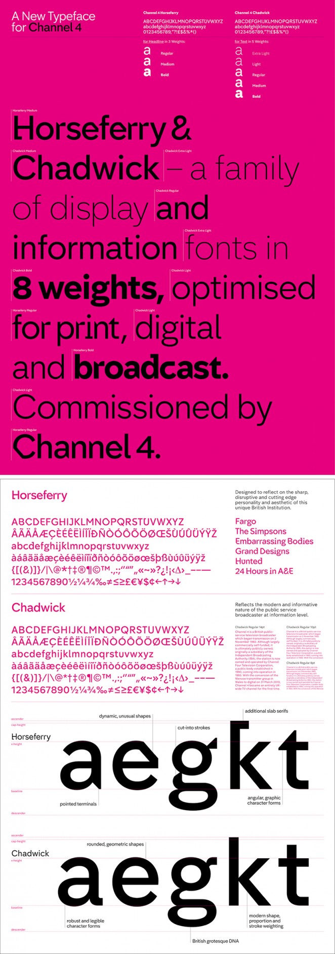
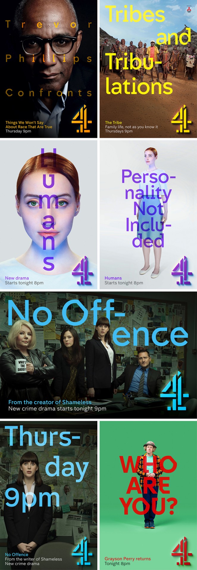
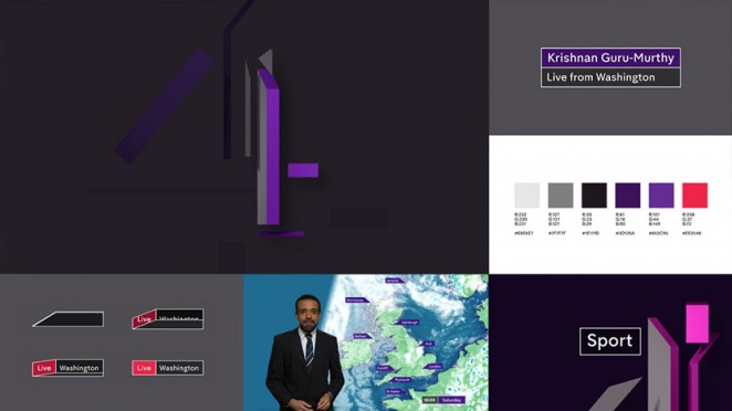
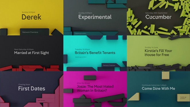
These new fonts are called Horseferry (for display) and Chadwick (for information), and can be seen as part of the channel's refreshed on-screen graphics as well as its new off-air branding and poster art direction. According to Brody, Chadwick takes its reference from “The dependable language of our motorways, railways and information systems,” while Horseferry is “A corruption of this into a more unpredictable form.” In other words, the angled cuts of Horseferry echo the Channel 4 logo, while Chadwick's rounded, geometric shapes are more robust and legible.
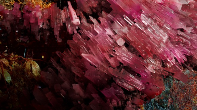
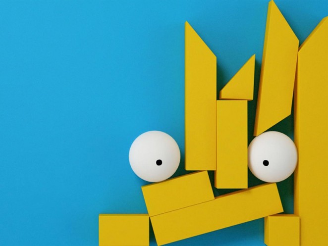
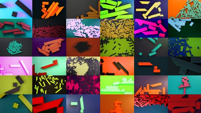
The channel's original “4” logo, meanwhile (originally designed by Lambie Nairn in the 1980s), has been divided into nine separate “Blocks,” which represent Channel 4's diverse, eclectic qualities. According to 4Creative joint heads Chris Bovill and John Allison: “The blocks are free to demonstrate our remit; to be irreverent, innovative, alternative and challenging. The idents present the blocks as kryptonite-like. They tell the story of their origin and how they have a powerful impact on the world around them. Just as Channel 4 does. It is a story that we shall build on.”
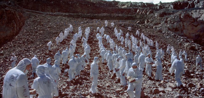
The rebrand is also being accompanied by a series of four bold films from acclaimed director (of Sexy Beast and Under the Skin fame) Jonathan Glazer
The rebrand is also being accompanied by a series of four films from acclaimed director (of Sexy Beast and Under the Skin fame) Jonathan Glazer, which are typically brave, bizarre and beautiful. These new shorts will be shown before at the beginning and ends of ad breaks, and while they might be somewhat baffling in their subject matter, it seems that was a deliberate decision. Glazer both wrote and directed the four shorts (as is the case with all of his films), with composer Mica Levi of “Micachu and The Shapes,” (who also composed the score for Under the Skin) composing the music. All four have a noticeably cinematic feel, with subject matter ranging from a dazzling waterfall to a bizarre dance routine, a mysterious quarry scene and a futuristic sequence including a microscopic close-up of an insect.
Of the rebrand, Bovill said: “We went back to the iconic Lambie Nairn 4 and broke it apart. It was incredibly liberating. From the very start, we wanted whatever we did to be real and to be tactile, because if you look at a lot of other branding out there, it's very shiny and CGI-led. Allison, meanwhile, added: “As a channel and a brand, we have a real impact on the world around us, and so we wanted our brand identity to be very real and tactile. The blocks run through all the on-screen identity and into the idents that Jonathan Glazer's filmed for us.” DBLG founder Grant Gilbert, added: “It's been 10 years since the last rebrand and in that time the landscape and fabric of television has completely changed. We don't just watch TV on our TVs anymore and we don't need the brand logo constantly shoved in your face.”
The channel's original “4” logo, meanwhile, has been divided into nine separate “Blocks,” which represent Channel 4's diverse, eclectic qualities
So the channel appears to have gone with a more subtle approach to branding, but has so with a more heavily stylistic approach, and in my opinion, it works, very well indeed. There's a real defiant attitude to this branding that sets it apart from the safer likes of BBC and ITV (with their branding that feels like watching wallpaper by comparison) and reflects the channels more confrontational programming. It's also incredibly flexible and eclectic, with a level of abstraction that defies easy categorisation. It's likely to divide viewers, but then that's true of the best art. And this is definitely art. I can't possibly think of any higher praise than that!
Benjamin Hiorns is a freelance writer and musician from Kidderminster in the UK. In case you hadn't realised, he's quite fond of the new Channel, but that doesn't mean he's about to suddenly start watching Countdown anytime soon.