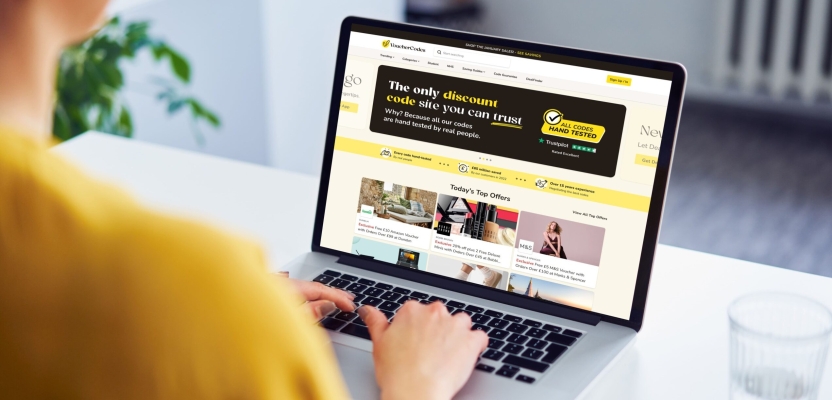

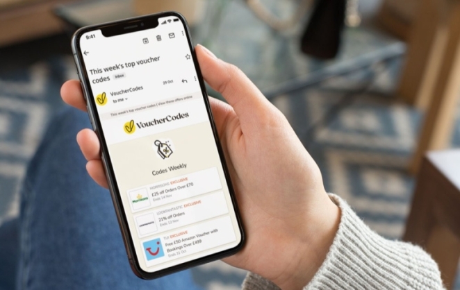
The UK’s most trusted savings site has announced the first step in its wider growth strategy for 2024, a new visual identity by Naked Ideas. The bolder look is designed to connect with consumers on a deeper level, putting the brand and the message that codes are hand checked and guaranteed to work front and center.
This isn’t just a visual refresh for the brand; this is the culmination of a wider project incorporating its growth strategy, internal values, and visual identity, allowing the brand to cement themselves as the most trusted discount site.
To learn more, we spoke to Senior Marketing Director at VoucherCodes, Armelle Guillet.
What was the brief for the rebrand?
VoucherCodes’ old branding was looking a little tired as it hadn’t been reviewed in several years. As a brand we have over 15 years of experience saving our customers money and are the market leader in our space, but our branding wasn’t distinctive enough to reflect this.
We had to cut through in a crowded market and knew we needed a bold new look to help us to do this. Led by our new customer-centric strategy, we wanted a brand identity that shows our customers are at the heart of our business and adds a more human feel to the brand.
How did the initial pitch/brainstorming phase go?
Once we had a brand agency on board, we started with an internal brainstorm involving a representative from every department. Our first step was to work on the strategy, asking ourselves, what does VoucherCodes stand for, what’s our mission and purpose, what is our onlyness, what makes us unique to our customers.
We completed a two-day workshop with our brand agency partner (Naked Ideas) to refine this further. Ultimately we knew we wanted our branding to stand out from our competitors and that a bolder approach was needed. It was actually a really easy process. Our internal values remained the same and while there is a strong attachment to these, all of us within the business were ready and excited for a change in our creative expression and to ‘refresh’ our identity.
Describe the purpose of the brand and its target audience
At VoucherCodes we pride ourselves on saving people money. Our mission is to make everyday life more affordable for everyone and last year alone we saved our customers £62m. We are committed to securing the best discount codes and ensuring trust is front of mind with the confidence our codes work and are hand checked by our team. We talk to a broad audience of savvy shoppers, from all demographics and shopping preferences.
What was your thinking behind the rebranding solution?
As part of our growth strategy for 2024, we want to put customers at the front and centre of everything we do. When developing our brand strategy, we coined the phrase ‘people-powered savings’ as our brand essence. It felt the right term to reflect both the importance of our customers and also the strong internal ethos, our focus on trust and the fact that we hand-check and validate codes.
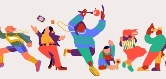
As part of our rebrand our aim is to cut through the noise and connect with our customers on a deeper level. We’ve gone bold with our colour palette and have introduced diverse visuals and hand-drawn illustrations to bring a more human element to our identity, reinforcing the importance of our customers and our brand ethos.
Did you learn anything new during the project?
I learnt that we could push boundaries internally a lot more than we thought. The way in which the team effortlessly collaborated with one another, as well as the cross-functional teamwork, I think talks to our leadership.
Whilst we’ve learnt a lot during this project, our new visual identity is only the start of us expressing ourselves as a brand. Over the next 12 months, we aim to continue testing and further expand our media mix, learning what messages resonate most with savvy shoppers across the UK.
What was the biggest challenge? How did you overcome it?
Testing was one of our biggest challenges. As excited as we were about making the changes there is also the pressure to make sure that we’re not breaking anything, that none of these changes are affecting performance while making a drastic visual change. With any visual change like a rebrand, there is also a concern that it may have a negative impact. This is where AB testing was key for us.
What kit/tools/software were used to create it?
The main tool we used was Figma for the design process. Our creative team use this as their main design system and it was the perfect way for us to collaborate; allowing everyone to review designs, feedback and amend these in real time. Other than this, no other real kits were needed.
What details are you most proud of and why?
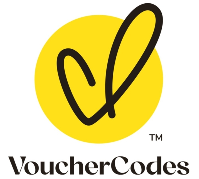
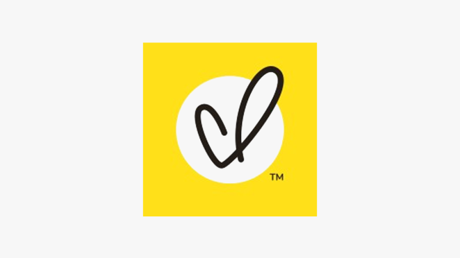
The fact that we chose a very bold colour palette and had no fear in doing so. It was such a big change for us and we fully embraced it. I’m also hugely proud that we now have a logo icon.
Our new logo blends a mixture of a V for VoucherCodes.co.uk, a heart depicting that customers are at the heart of everything the brand stands for and a tick to signify the brand's unique Codes Guarantee. Not only that but we now have a logo with a more human feel, that we can animate.
What visual influences fuelled your solution?
The essence of our visuals and creative direction ultimately came from our strategy. We didn’t want to adopt a new photography style, as we work with over 5000 brands, which is what took us into illustrations. For the colour palette we spent time reviewing our current colour scheme alongside competitors, as we knew we wanted a bold colour that would stand out and differentiate us from the competition.
What do you hope it achieves for the brand?
Ultimately connection with our customers. Our customers are at the heart of what we do and by taking a customer-centric approach, we want to stand out in their eyes and connect with them on a more human level.
We’ve been saving people money for over 15 years and while we know our customers look to us as the most trusted discount site, our creative wasn’t following that rhetoric. We recognised a need to refresh our visuals to resonate more with our customers and, with our new joyous colour and hand-drawn illustrations, we hope to add a more human touch to the brand and really solidify that trust messaging.
What would you do differently if you could do it over again?
In an ideal world I would have loved for us to have done some more testing. More time to test helps to ease nerves and apprehensions around the unknown and transitioning across to something new. We were restrained by time but also the desire to keep a certain element of surprise and not showing all of our cards to customers before the launch.
Credit list for the work?
Naked Ideas was the creative agency behind our rebrand that helped us from strategy through to visual identity guidelines. They helped with the rebrand strategy and building our brand pyramid, down to the moodboards and creative direction. Our inhouse design team developed the concepts and illustrations further based on our new guidelines and implemented all new assets with the support of our product and engineering teams.
Throughout the entire process it was two-way street between the agency and us. The team worked very closely with not just our in-house marketing team, but also across design, product and our engineers - everyone was involved. That’s what made it so special, it was a cross-collaborative effort from inception to implementation to go live.