
In the ever-evolving world of craft beer, Brooklyn Brewery has established itself as a dynamic and iconic brand. With nearly four decades of history and a portfolio of characterful sub-brands, the time had come to unify its brand identity globally. Enter Thirst, the creative powerhouse tasked with this ambitious project. We had the opportunity to sit down with Matt Burns, the Executive Creative Director at Thirst, to discuss the masterbrand identity creation for Brooklyn Brewery.

In this interview, Matt shares insights into the creative process, the challenges faced, and the vision behind this bold and iconic rebranding effort. Join us as we delve into the fascinating journey of capturing the essence of the "Brooklyn State of Mind" and translating it into a cohesive and versatile brand identity.
What was the brief for the masterbrand identity creation?
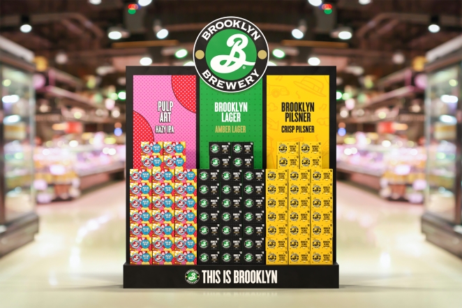
We’ve been working with Brooklyn Brewery for years now, partnering with them across a range of their sub-brands including creating the positioning and identities for Brooklyn Pilsner and Pulp Art: Hazy IPA.
Having developed a suite of characterful sub-brands, each with its own distinct personality, it was time for Brooklyn Brewery to consolidate its assets and unify its brand identity globally.
We were briefed to build on the existing identity with a bold, iconic and flexible masterbrand that would enable consistency in every market and at every touchpoint – communicating the offering and narrative of the overall brewery.
Describe the purpose of the brand and its target audience?
Brooklyn is a place that's always moving, always changing, always creating. Brooklyn Brewery as a brand looks to capture that energy and idea of progress – whether through people and occasion and place, or the individual sub brands. So, Brooklyn Brewery has something of an intangible brand purpose – broadcasting the ‘Brooklyn State of Mind’ everywhere that people feel it.
The masterbrand is there to celebrate a mindset – you can’t draw that with a pen and paper. It’s about an attitude, which is something that reveals itself through time, and through the way the brand acts and shows up and connects with its consumers. The masterbrand acts like a vessel to capture that state of mind and attitude.
It's also a super creative brand that’s been around for nearly 40 years now, so it truly has licence to bring its creative flair and unique essence to the beer world. Audience wise, it’s a market-by-market challenge as the brand has different awareness levels and ways of showing up globally.
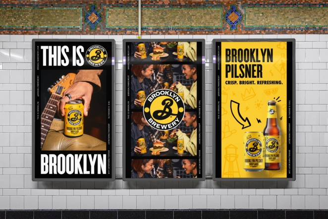
With the new masterbrand, we worked closely with the brand team to define the different taglines for global use (“This is Brooklyn” globally) and in the U.S. (“Always in the Making”).
Brooklyn Brewery appeals to a wide range of consumers at various stages along the craft beer journey. As a challenger to established global lagers, Brooklyn Brewery offers a more creative, attitudinal alternative. In the U.S., it has more craft-led products that appeal to the more advanced craft beer drinker.
Some other products in the portfolio appeal to a completely different type of consumer. It has some purpose-led propositions like the Stonewall Inn IPA, which partners with the Stonewall Inn Gives Back Initiative to help fund grassroots organisations committed to LGBTQ+ advocacy and support. Purpose and community are a big part of the Brooklyn Brewery brand: it’s something that's important to them as a team.
Age wise, Brooklyn’s consumers range all the way from 18 in the UK and 21 in the US, all the way through to older folks - with something truly for everyone!
What was your thinking behind the masterbrand solution?
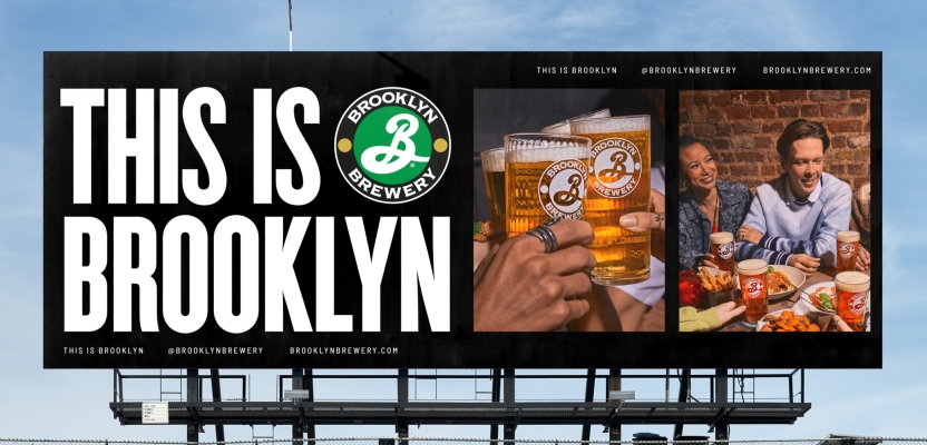
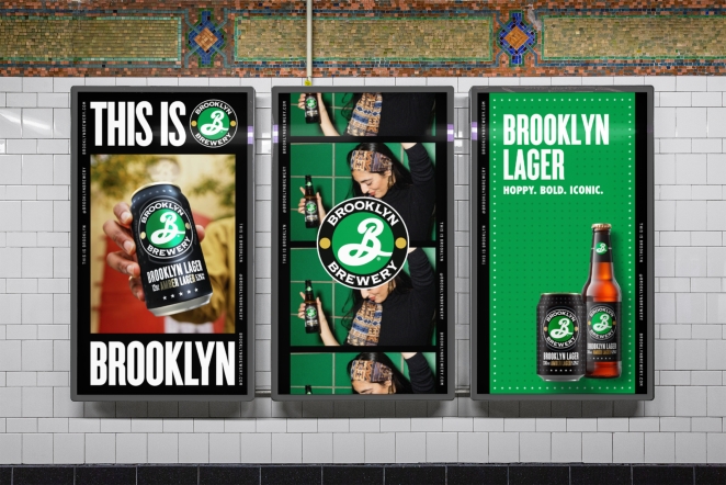
Our solution was to create a window into the world of Brooklyn Brewery: the masterbrand would be a strong, consistent thread throughout everything, but we’d have a window into the sub brands and the Brooklyn lifestyle.
We created a black frame as the unifying backdrop that captures and shares ‘Brooklyn State of Mind’ moments. The frame, or window, grounds everything else and ensures consistency, offering a flexible layout system which gives the master brand versatility, energy and cohesion.
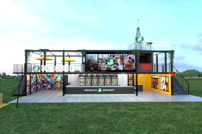
The frame can showcase brand campaigns, a single sub-brand, or endless combinations of multiple sub-brands as needed, while maintaining a grounded visual consistency.
We retained the iconic Brooklyn Brewery primary logo, which was originally designed by ‘I Love NY’ graphic designer Milton Glaser when the brand was founded in 1988, and then updated as part of a 2022 brand refresh. We did make a slight adjustment to the secondary logo, the horizontal wordmark, to add impact while retaining strong visual links with the primary logo.
Did you learn anything new during the project?
We realised that sometimes you shouldn't try too hard – too much ‘designing’ was forming a disconnect and causing friction between existing brand assets in the brand. We found a lot more success when we just let the assets do their thing and led with simplicity and clarity, through the creation of the framework of the masterbrand identity.
What was the biggest challenge? How did you overcome it?
It’s such an iconic brand with so much heritage; the challenge was to create a system without changing its direction or muddying its legacy.
If we’d gone wild with creative flair on the masterbrand it would have competed with the energy of the photography, content, or sub brands. We had to design with restraint, understanding that the creativity was going to be brought in from the content itself, and the masterbrand was just there to connect it all together.
The design strategy played a really important part in the process: it was about understanding that the creativity was going to come from the content itself. There was a lot of time invested into the creation of the guidelines to make sure they actually empowered each market. It was crucial that this framework was simple to use and implement.
What visual influences fuelled your solution?
The concept that we eventually landed on was Brooklyn as a constantly moving work in progress. Our visual expression of this was inspired by photographic contact sheets capturing moments as they happen.
Visually referencing contact sheets also reinforces the authenticity of the brand, since one of the co-founders, Steve Hindy, was a journalist and war correspondent. He was out capturing stories as they happened, so the concept also ties back into his narrative and passion.
What do you hope it achieves for the brand?
The main goal is to bring consistency to the brand assets through a proud masterbrand that forms part of an expansive creative ecosystem. Simultaneously showing up as one unified brand – the Brooklyn Brewery brand – while at the same time celebrating the sub-brands and empowering them to flourish.
How did you ensure that the new brand identity resonated with the brand's existing audience while also attracting new ones?
There’s a lot of brands out there that are fictional: this is an actual brewery in Brooklyn that's been there since 1988. I was always concerned that people who didn't know the amazing stories behind the brand – they might assume that its story is made up, trading on Brooklyn’s inherent ‘coolness’. It’s not like that at all.
We now have a great platform for Brooklyn Brewery to communicate who and what it is as a brand. The new masterbrand offers a feeling of authenticity, history and substance that wasn’t as exposed before. Now, when the brand shows up on, say, out of home touchpoints it feels punchy and iconic, so people know ‘ok, this is Brooklyn Brewery’.
What would you do differently if you could do it over again?
It took us a good few months to crack the concept, but we wouldn’t do anything differently. The process is the process. Everybody involved in the project was unbelievably committed and passionate about it. We kept iterating, answered every question that was asked of us, and really grafted away at it – all of which led us to the solution.
That was the beautiful thing about the process: it made us realise what was right for the brand and what was wrong, and how good our assets were already. Eventually that led to something we're incredibly proud of.