
In a world where architecture can be weaponized against the most vulnerable, Gary Fawcett, Executive Creative Director at TBWAMCR, and his team decided it was time to take a stand. What began as a passion project turned into a powerful campaign highlighting the cruel reality of "hostile architecture"—design elements intended to deter homeless people from finding refuge in public spaces.
With creativity, determination, and a little guerrilla-style execution, Gary and his team have transformed anti-homeless spikes into a striking visual statement that demands attention. Here's how they did it.
What was the brief?
We work in a city centre, and anyone can see that there are so many people forced to live on the streets. This is shocking in and of itself, but when you then realise that there are bodies from councils to developers who actively embrace ‘hostile design’ on benches, seats and public areas to make it even worse for the homeless, we felt we had to do something.
So, there wasn’t really an initial brief. My ECD partner Lisa Nichols and I had decided to take on a few pro bono projects for issues that were close to our hearts, and this became one of them.
How did the initial pitch/brainstorming phase go?
We both read about hostile architecture, in particular anti-homeless spikes and were horrified. These barbaric and cruel spikes have been around for quite a few years but mostly go unnoticed.
We felt compelled to do something to raise awareness. We noticed that homeless figures in the UK were spiking so put the two things together and came up with the theme.
What was the process behind ideating the concept?
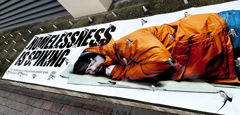
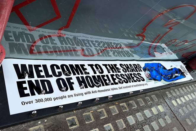
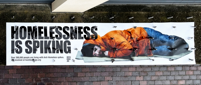
It happened very quickly after we read about the spikes. The spikes exist in cities all over the country. Our first thought was to place posters on them to make them visible along with the headline, ‘HOMELESSNESS IS SPIKING’.
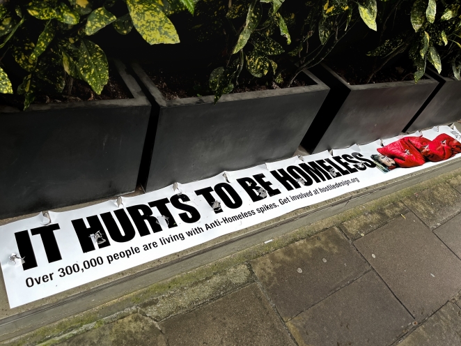
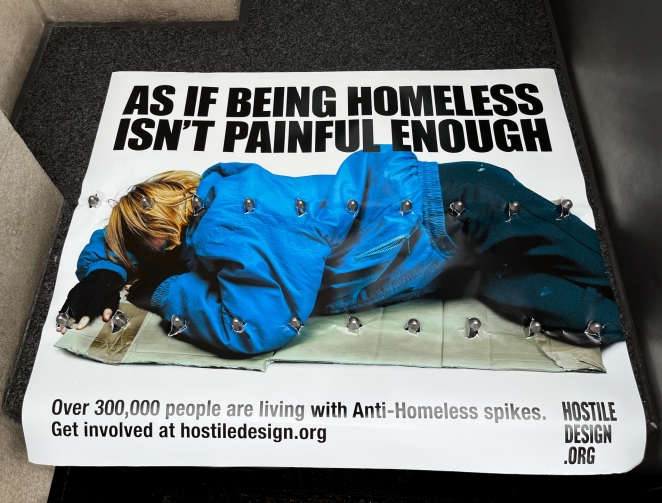
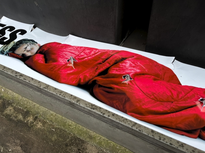
This alone would have been powerful, but we really wanted to create a much bigger impact. To do this we included shots of homeless people on the posters to show them literally impaled by the real spikes. A dramatic representation of how they were being treated.
What was the production process like?
There were a few stages to production. First, we found somebody to partner with. We’d seen Stuart Semple’s site and read news stories around his fight against hostile architecture, so we approached him with initial concepts.
Once Stuart was on board we began the production process. This was a real passion project for us all, so we had to research and find locations of homeless spikes online, it took a while! Lots of looking on blogs, Insta accounts and news reports.
Then we had to recce the London locations and measure up the spikes (a lot of legwork in one day). We then created layouts to fit the dimensions and did a photo shoot of the people. An amazing photographer, Duncan Elliott, kindly donated his time for free.
We were advised by homeless charities that we wouldn’t be able to photograph real homeless people, so we used colleagues as models to represent them. The final stage was to revisit the sites in London with printed, made to measure posters and place them on the spikes.
What was the biggest challenge during production? How did you overcome it?
Finding the sites and visiting them was the hardest part of the process. We had no budget, no production team and nobody in London to check the locations (we are based in Manchester). We tracked down as many sites as we could find online which wasn’t easy.
While there are plenty of these spikes that exist, there are no guidebooks to find them. We spent lots of our own time looking for them online in the evenings, pinpointing their locations and planning a route for a recce. The sites were all over London, so it was a very busy day visiting and measuring them all.
What kit/tools/software were used to create the project?
A good old fashioned measuring tape, a Fuji GFX 100s camera, Fujinon GF 80mm and Profoto lighting, Adobe Photoshop for grade and retouch, Adobe InDesign for layout design and then a large format printer to output the posters themselves.
What is one funny or notable thing that happened during production?
Most of the spikes were on private property and to avoid suspicion, we had to measure and place the posters on the sites very early in the morning. We were moved on by security guards, intimidated by a gang of drug dealers (that’s a whole other story) but we still managed to pull it off without getting arrested or beaten up. An achievement!
What’s the main message of this project and why does it matter?
The main aim was to make people aware of how the homeless are treated on our streets. Hostile architecture is stealthily appearing in our towns and cities and anti-homeless spikes are the very worst example of this, which is why we focused on them specifically. We think people need to know that this sort of cynical design is happening.
We knew that we weren’t producing a piece of work that would help solve homelessness, but thought it was important to help fight for how they were being treated.
How long did it take from inception to delivery?
It took just over six months in total, but this was purely because everyone involved had donated their time for free and we all had to work around other commitments. Quite a lot of our time on the project was spent in work hours, but we do have paying clients to consider so these hours were whenever we could grab them.
During busy periods, passion projects naturally have to take a backseat, but you have to keep them ticking over when you can.
Can you describe the creative spark or inspiration behind the initial concept? Was there a specific moment or insight that ignited the idea?
We had the article about anti-homeless spikes open on our screen. We thought it would be a good idea to turn each set of spikes into posters. We then noticed that homeless numbers had recently spiked, this gave us our first headline and the rest followed.
How did you ensure that the concept aligned with the brand's values, goals, and target audience?
We had our idea but then needed to find somebody who could use it. We first approached homeless charities who applauded the concept but weren’t able to get on board due to their already established campaign messaging. Next, we searched for a charity that was purely about hostile architecture.
This issue is very specific, so that type of charity doesn’t exist. When we read about Stuart’s work to raise awareness of this subject, it just felt like the right fit. As an artist, he obviously had strong links to design, and he believed that city planners and designers should be using their talents to include, nurture and support communities. So did his audience too. Our concept felt like the right fit and gladly he agreed.
Were there any alternative concepts or ideas considered during the ideation phase? If so, what led to the selection of the final concept?
This was the only concept for hostile architecture. I guess we thought we’d found an idea that made the problem visible in a really shocking way. Plus, we could actually make it ourselves, with a little help from Photographer Duncan Elliott.
Can you discuss any collaborative or interdisciplinary aspects of the ideation process, such as working with other departments or external partners?
We worked with photographer Duncan Elliott and shot the people. As we had measured the posters to fit the spikes, we already knew the exact spaces that the shots had to fit into. Then it was just a case of making sure that they matched this and looked natural too. Also, they had to be lying down in order to create the right effect when the spikes pierced the image.
Can you discuss any unique or unconventional production techniques or approaches used to bring the idea to life?
The core creative is a poster, but not one to fit your standard OOH sites. We had to be exact on where the spikes were going to be, so measuring the distance between them was important, and each poster was site-specific.
How did you ensure that the concept remained innovative and stood out in a crowded marketplace?
As the posters were placed on the ground, it was disruptive media. The spikes also really helped the campaign have that extra point of difference (no pun intended).
What do you hope it achieves for the brand?
We hope that it’s helped make the subject of hostile architecture more visible and that the website will get lots of visits.
It feels like early days in terms of hostile architecture entering people’s minds, so hopefully we’ve help cement that a little with this first piece of awareness.
Credit list for the work?
EXECUTIVE CREATIVE DIRECTORS - Gary Fawcett, Lisa Nichols.
ART DIRECTOR - Gary Fawcett
COPYWRITER - Lisa Nichols
HEAD OF DESIGN - Daniel Bickerton
PHOTOGRAPHER - Duncan Elliott
PRODUCTION - John Allen
EDITOR - ROSE ALDER
CLIENT - STUART SEMPLE
CD CULTURE HUSTLE/STUART SEMPLE PRODUCTIONS - Ben Friend