
This week, we sat down with two talented service designers from global innovation company Designit, Mimi Fuentes and Linn Cowie-Sailer, to delve into their pivotal role in the impactful ‘Silence Hurts’ campaign.
This initiative, a collaboration between Amnesty International, the Norwegian Human Rights Institution, and the inclusion and mentoring experts Catalysts, aims to empower bystanders to effectively intervene in incidents of hate speech.
What was the brief?
Amnesty International, the Norwegian Human Rights Institution and inclusion & mentoring experts Catalysts, had been working on the ‘Silence Hurts’ campaign, aimed at helping bystanders intervene when they encounter incidents of hate speech.
Designit’s role in the project was to distil the complex findings from the research informing the campaign, on a very sensitive topic, and make them palatable for a broad audience. Specifically, we sought to provide simple, clear instructions that could empower bystanders to speak up when encountering hate speech.
It was also crucial to us that we tailored the most appropriate course of action to specific situations, and that the instructions accounted for differences in personality, extroversion and person intervening’s own discomfort.
How did the initial pitch/brainstorming phase go?
The main part of the brainstorming phase involved an in-person workshop with the other three parties involved in the project (Catalysts, NIM, Amnesty). In it, we explored what the objective of the artefact would be, the target group, inspiration from other projects etc.
Together, we defined the scope and objective with the budget and time in mind.
To properly establish what this artefact ought to achieve, we put ourselves in the shoes of the potential users - busy people, concerned primarily with their own stressors and problems. The research team had pages and pages, as you’d imagine, on the bystander effect (when individuals are less likely to offer help to a victim in the presence of other people); but were struggling with a way of making it digestible and clear for a broad audience.
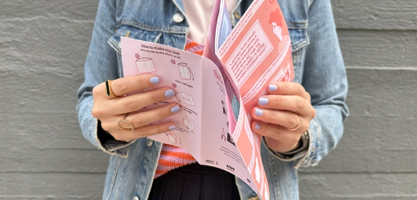
With the target group being anyone sixteen plus, we agreed that a universally appealing format was crucial in order to engage as many people as possible. In this case - a comic book style booklet.
We wanted a medium that would enable us to convey the ‘Silence Hurts’ message, and specifically the ‘SOS method’ - Say something, Observe, Seek help, in a concise, pretty, and practical way. Importantly, we needed to also include a way for people to delve into the topic in more detail should they wish to.
What was the process behind ideating the concept?
Once the objectives were agreed on with the clients, the Designit team did an internal ideation session where we bounced around some options and developed a quick prototype which we would later validate with the clients.
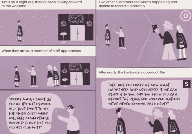
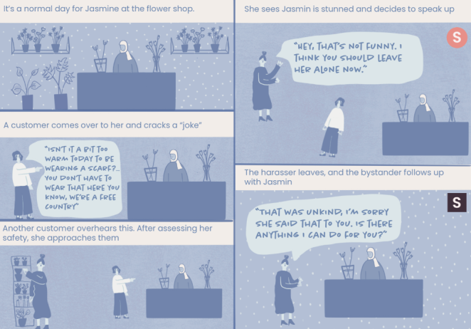
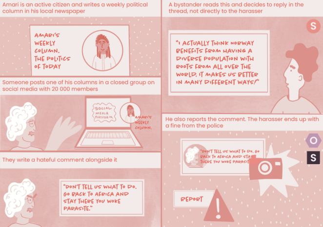
We settled on using a booklet, containing three stories, loosely based on real-life situations, each with illustrations. This was a simple way to engage the broad audience we were targeting, but also the perfect way to bring specific scenarios to life, to give the instructions a practical focus, and a real-life context.
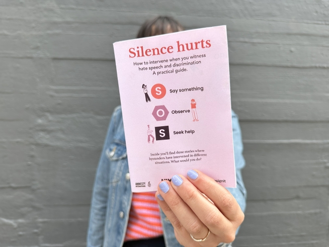
It was multi-purpose - the artefact could be handed to people like a leaflet, but could, in a school for example, be used as a poster. With the use of a QR code, we had a way of linking to the Silence Hurts website, easily providing access to more details.
As designers, we know the power of visual language and how it can quickly engage a wider audience than one might with text alone.
What was the production process like?
We developed “quick and dirty” prototypes to show the client what we had in mind. They were low fidelity sketches, but we were able to get across a strong sense of what we thought would work and an opportunity to get feedback from the relevant stakeholders. From there we created the three different stories in a comic format, wrote a full script and produced the illustrations.
All through this process, we had multiple check-ins with the clients to make sure we were heading in the right direction - which, luckily for us, we were! They were very supportive of how we were working and so the production process went smoothly.
What was the biggest challenge during production? How did you overcome it?
The biggest challenge we faced was establishing what exactly the clients wanted from us. The brief of creating something practical that allows people to take action is quite open ended. It could have been a video, a training programme of some sort - it could have taken any shape. We had to contend with the fact that whatever we came up with had to be cost-effective, which narrowed down our options.
This is why we settled on the A3 format - economical, versatile and accessible. Its large size also meant we could put everything on one page, but ensure that it could be easily printed in a government building or a school. Dark and clear colours were used, so that it would still stand out if printed black and white.
We were also against the clock, with the project only spanning the course of a month.
Due to time and budgetary constraints, the messaging and the strategy for engaging with people remained the same, regardless of the setting. With more time, this is something we’d have done differently; it would have been ideal to adapt the language to make something specifically suited to the private sector, or for schools, for example.
The clients were keen on this too - but after deliberation, we pushed back on this way of doing things. With the time we had, and the budget available, the product would’ve been sub-par.
Despite these challenges, what we created was incredibly successful. The clients were so happy with our work that they asked us to come back and animate the stories we created, with a greater budget. We’re also working on a renewed training programme in tandem with the clients, which should be ready for the beginning of October.
What kit/tools/software were used to create the project?
The tools we used were fairly simple - Miro to develop the prototypes, Procreate to refine the graphics and of course, A3 paper!
What is one funny or notable thing that happened during production?
I think in design we have a very different idea of what ‘short’ means compared with researchers! In the client workshop, we all agreed the product had to be concise - but in some of their minds, that meant a 25 page pdf!
As academics and researchers, they deal with documents far longer than that on a day-to-day basis, so this was an understandable view. But the sad reality is, people on the street might not care that much - or have the time, unfortunately, to read a report that long. The clients were very understanding when we explained this - but the initial discrepancy in our definitions was amusing!
What’s the main message of this project and why does it matter?
That you CAN take action when you witness hate speech in public in a way that feels safe for you and the people involved. It’s easier than you think.
How long did it take from inception to delivery?
It was a quick turnaround. Amnesty, The Norwegian Human Rights Institution and Catalysts had already created the campaign and the website. Including the client workshop, and the internal brainstorm we had afterwards, we spent around 80 hours in total on this project.
Can you describe the creative spark or inspiration behind the initial concept? Was there a specific moment or insight that ignited the idea?
The research material was very text heavy and sometimes people need a “lighter” way to interact with new information. We thought the comic style could do that.
It was an interesting concept - to connect such a serious and important topic with a relatively simple, fun medium. But as designers, we truly believe in the power of visualisation, of visual storytelling. Images can be the perfect way of distilling tricky and complicated concepts in a way people can understand and find easily digestible.
The stories made for a good format because they proved to be a good way of dispelling the warped idea that people have of what these kinds of confrontations look like. There’s this idea, perhaps from what we’ve seen in movies, that we have to make a great ‘superhero’ type of gesture to intervene in a meaningful way.
As a result, we have a tendency to freeze in these situations. We decided as a result that there should be stories where an aggressor is confronted and others where they aren’t directly. The purpose of each of these approaches was simply to illustrate the different ways these situations play out in reality.
How did you ensure that the concept aligned with the brand's values, goals, and target audience?
We collaborated with the clients constantly. From the outset, we knew it was vital to involve the relevant people as much as possible to make sure they feel part of the end delivery as much as we do. This way of working automatically aligns the end result with the clients’ values and goals.
Were there any alternative concepts or ideas considered during the ideation phase? If so, what led to the selection of the final concept?
Before the client workshop we didn’t have a fixed idea of what we were going to make. As I alluded to earlier, we had to really refine the objectives. Once we’d done that, the comic book/story format emerged as the best option, after around 4 hours. It took that long because initially, the clients’ goal was to be able ‘to get all the info’.
It was our suggestion that actually the crux of this project wasn’t to just inform people, it was to enable them to take action. So when it came to developing the concept, this clarification of the goal helped us eliminate formats like long documents.
We drew inspiration as well from the fact that Designit already has a poster for ‘handling offensive remarks’ that hangs in our Oslo studio. Once we were clear on a medium that was short on text, visually striking and accessible, comics became the natural choice.
Can you discuss any collaborative or interdisciplinary aspects of the ideation process, such as working with other departments or external partners?
We approached this challenge with our expertise in Service Design and our internal knowledge in Diversity Equity and Inclusion, our clients brought in their research work in the bystander effect and the SOS method they developed for bystander intervention.
What role did consumer research or market analysis play in shaping the concept and its execution?
In this instance, the research had already been done by the clients; how people react in different situations. A lot of the research that had been done showed that people who had been the victims of harassment and abuse were much more hurt by the fact people around them did nothing to intervene, than they were by the abuser; it’s much easier for them to rationalise and dismiss the aggressor, whereas it’s much harder to realise that help isn’t available when you previously thought it would be
Can you discuss any unique or unconventional production techniques or approaches used to bring the idea to life?
This project was about making the complex very accessible, so that it would be engaging to a wide audience. As such, we kept simplicity as the focus - unconventional in that it meant forgoing the usual, more elaborate and polished-looking design we might have otherwise settled on.
How did you ensure that the concept remained innovative and stood out in a crowded marketplace?
The concept was the differentiating factor that made this project innovative. It’s somewhat counterintuitive to tackle a topic this politically and culturally sensitive in such an approachable way. We balanced the need to make the research accessible, without compromising the gravitas of the message through our choice to use a simple format.
What do you hope it achieves for the brand?
We hope that people feel they now have the proper tools to act when witnessing hate speech and show up for one another. It was a vitally important campaign for us to be involved in, because it complemented the Designit ethos of seeing design as a transformative force for good in people’s lives. Humanity and DEI are at the core of what we do.
Credit list for the work:
Linn Cowie-Sailer - Project lead & Design
Mimi Fuentes - Design & Illustrations
Carolyn Wegner - Photography
Clients:
Catalysts
NIM - The Norwegian Institute of Human Rights
Amnesty International Norge