
Creative agency SEA is pleased to announce that it has collaborated with Rathbones Group Plc (Rathbones), the wealth management group, to execute the next phase of Rathbones’ brand evolution. Embracing a blend of timeless heritage and contemporary transformation, this revitalisation showcases Rathbones' commitment to existing clients and future generations.
The brand builds upon the foundations of the Rathbone family's guiding principle, "Gently in manner, firmly in action". The creative strategy behind Rathbones' brand evolution was crafted to reflect its core values and history, which have guided the company for generations. SEA embarked on a visionary journey, weaving together design elements that showcase sophistication, authority and a touch of timeless elegance.
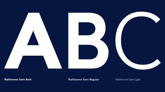
Every design element, from the bespoke typeface to its symbol, pays homage to Rathbones' heritage and values. The typographic expression draws inspiration from the classic Grotesk Sans, crafted to capture a sense of authority and confidence without overwhelming subtlety.
Central to the brand evolution is the symbol that pays homage to Rathbones' maritime heritage and ethical approach to business. The design team, inspired by the legacy compass symbol, distilled the essence of both a navigational compass and a moral compass, resulting in a simplified yet potent symbol that will resonate across digital platforms.
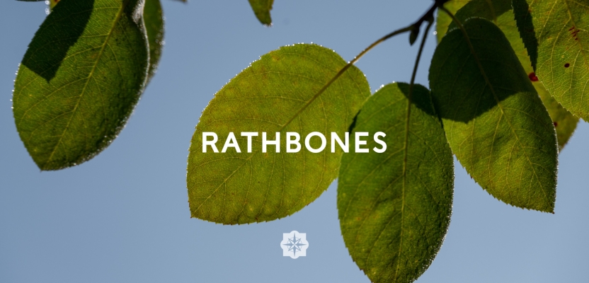
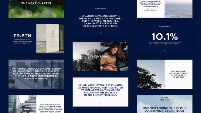
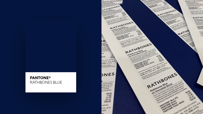
A distinct and bespoke colour palette lies at the heart of Rathbones' brand transformation. Honouring the brand's enduring association with a particular shade of blue, SEA sought the assistance of Pantone to craft an exclusive hue that exudes both vibrancy and depth. Named Rathbones Blue, this colour strikes a balance between heritage and modernity. Additionally, SEA introduced a secondary colour palette, featuring warm and cool tones, to convey supporting information, such as graphs, charts, and graphics, with clarity and sophistication.
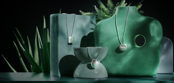
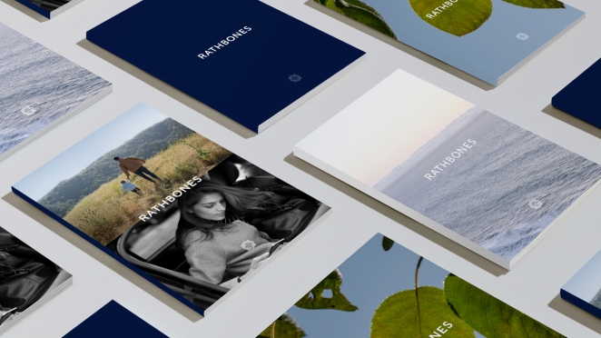
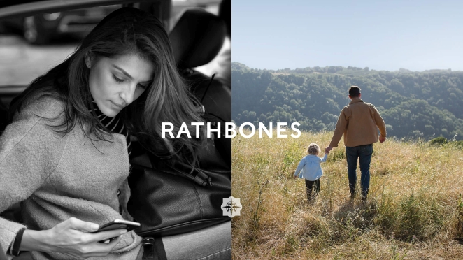
Complementing the visual elements, the art direction weaves together the stories of the people behind the business and the clients they serve through emotive portraiture, coupled with abstract images of nature and the environment, as well as contemporary and classic architecture. These visual compositions, whether in vibrant colour or the interplay of colour and black and white, paint a compelling narrative across digital platforms.
To learn more, we caught up with SEA Creative Director, Bryan Edmondson.
What was the brief for the rebrand?
Redefine the Rathbones brand, strategically and visually, in a way that celebrates its remarkable heritage, reaffirms its values and principles, and positions it as the UK’s leading discretionary wealth manager, showcasing its commitment to existing clients and future generations.
How did the initial pitch/brainstorming phase go?
This stage was very exciting and formed the strong foundation that the project was built upon.
Our first step was to engage with the diverse teams at Rathbones, taking time to outline the motivation and purpose for a brand refresh, and gather their views on the organisation and its vision. This extensive period of consultation and immersion created a platform on which the brand strategy and platform could be built.
Describe the purpose of the brand and its target audience
Rathbones Group has a history dating back to the 1740s, with a reputation founded on generations of exceptional people, working to strong guiding principles that were established by its founding family. Rathbones target audience includes private individuals, charities and intermediaries.
What was your thinking behind the rebranding solution?
The brand builds upon the foundations of the Rathbone family's guiding principle, "Gently in manner, firmly in action". The creative strategy behind Rathbones' brand evolution was crafted to reflect its core values and history, which have guided the company for generations. We embarked on an evolutionary journey, weaving together design elements that showcase sophistication, authority and a touch of timeless elegance.
Did you learn anything new during the project?
The financial industry has a perception based upon old values and visual cues. What became very interesting was how you balance and leverage the heritage with a contemporary forward looking brand that is forever evolving and remaining relevant to each new generation.
What was the biggest challenge? How did you overcome it?
The biggest challenge was finding that balance between heritage and modern in a unique way, that didn’t focus on the heritage and ignore the now.
What details are you most proud of any why?
Visually, the symbol we created, and which now represents Rathbones is an echo of past iconography presented as part of a contemporary identity system. The compass represents Rathbones’ moral and commercial sense of direction. Inspired by the legacy compass symbol, we distilled the essence of both a navigational compass and a moral compass, resulting in a simplified yet potent symbol that will resonate across digital platforms.
What visual influences fueled your solution?
Brands that have been able to maintain a nod to the past whilst feeling relevant and contemporary for the next generation. There are lots of brands out there that have achieved this balance, but very few in the financial sector world.
What do you hope it achieves for the brand?
Delivered across key channels, including digital and experiential, the refreshed brand identity presents Rathbones’ heritage with a modern expression. The system put in place allows a growing internal team to quickly deliver assets that will help capitalise on new opportunities for growth. Ultimately, our work unifies a proud past with the company’s position as the leading modern wealth management group in the UK.