
Fintech brand Wise launched its rebrand in partnership with London-based branding agency Ragged Edge earlier this year. The identity is built from the single creative idea: The World’s Money, reflecting Wise’s vision to change the system, making it work for more people, in more places. The brand strategy, visual and verbal identity, sits right at the heart of that.
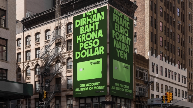
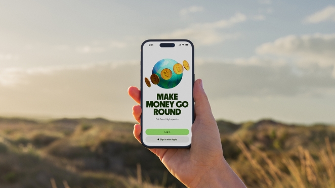
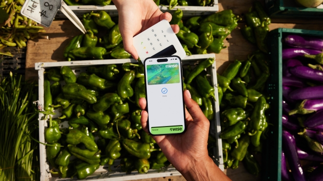
The brand moves harmoniously and at speed to feel fluid, communicative and accessible across every interaction. The new Wise vibrant green, a universal symbol of movement and progress, replaces fintech’s conventional blue.
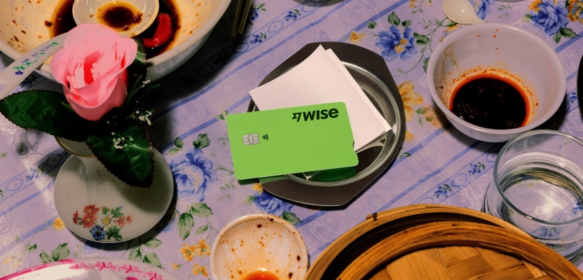
The wordmark and Fast Flag Icon have been updated to amplify the boldness of the new identity, and recrafted for legibility. A distinct set of assets called ‘tapestries’ represents money around the world, fusing colour imagery and texture to create its own story of global experience and culture.
To learn more, we spoke to Max Ottignon, Co-founder at Ragged Edge.
What was the brief for the rebrand?
Since their launch 12 years ago, Wise have changed how the world moves its money - making it faster, cheaper and fairer than the banks ever would. Over 16 million people and businesses now use Wise, saving them £1.5bn in 2022 alone, compared to bank fees, globally.
But this was only the first step. Wise’s vision is much bigger. The brief was to help rebrand Wise to take them beyond transfers. And to help them fundamentally change the system behind the world’s money, making it work for more people, in more places.
How did the initial pitch/brainstorming phase go?
Wise were very clear from the beginning. They wanted a bold approach to mirror their ambition. This was no incremental refresh, they wanted a brand to drive to drive change. Every conversation focused on how to make that change. They pushed us. We pushed them.
Describe the purpose of the brand and its target audience
Wise is building a new money system to take on the old one. A system for everyone who uses money, everywhere they use it. So the audience was pretty universal, from individuals to businesses everywhere.
What was your thinking behind the rebranding solution?
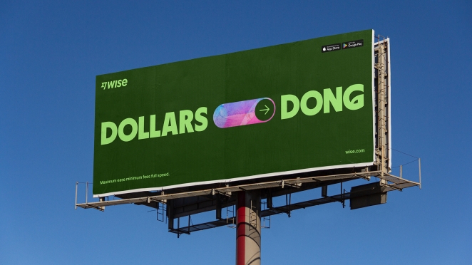
The identity is built from a single, universal idea: The World’s Money. An idea that’s expressed through every element of the brand, and delivered through every part of the Wise experience, from button to billboard.
Did you learn anything new during the project?
The biggest thing was how to deliver the project at scale – across 170 countries, every touchpoint and platform all at once. It was an epic collaboration between the teams at Ragged Edge and Wise. And it required us both to fundamentally reshape the typical agency-client relationship.
What was the biggest challenge? How did you overcome it?
Beyond the sheer scale, creating a brand that was meaningful to such a breadth of audiences, in so many different languages. It meant building a system that was incredibly robust, and being tough on ourselves to ensure every element could be used, and understood in 146 different languages.
In addition, we set ourselves the challenge of exceeding the standard requirements of WCAG 3.0 across every design decision. We worked with Wise to test everything rigourously, including over 200 different colour options.
What kit/tools/software were used to create it?
The bulk of the work was delivered in Figma to maximise the collaboration between the Wise and Ragged Edge teams.
What details are you most proud of any why?
Creating a distinctive illustration style that could be scaled globally felt like a challenge. We were determined to create something that felt utterly unique, and uniquely Wise. Using the ‘tapestries’ as texture for the 3D shapes means everything feels coherent, communicative and like nothing else we’d seen.
What visual influences fuelled your solution?
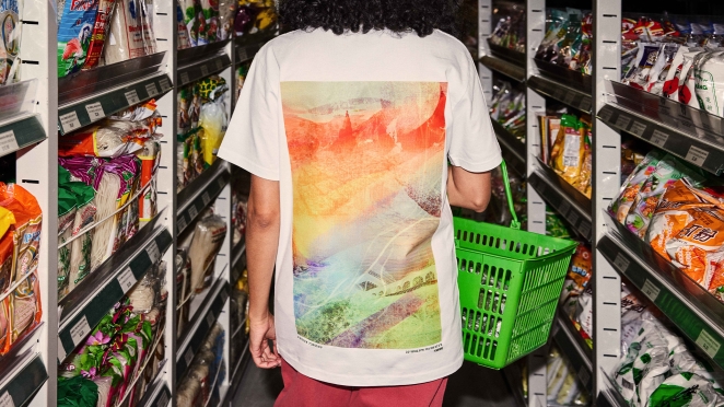
Everything was inspired by the idea at the heart of the brand, ‘The World’s Money’. The headline typeface takes inspiration from scripts from around the world, while a set of graphic tapestries represent money around the world.
Fusing colour, imagery and texture, each weaves together its own story of global experience and culture. The tapestries are used as striking backgrounds on and offline, and are applied to the 3D illustrations to create an immediately recognisable, ownable aesthetic.
What do you hope it achieves for the brand?
Wise have big ambitions. This is about helping them serve more people, in more places. And creating a truly universal brand.
What would you do differently if you could do it over again?
Honestly not that much. Creativity doesn’t happen in a straight line, so the challenges throughout the project just helped make the end result better.