
The Official Charts Company – the producers of the UK’s Official Singles Chart as heard on BBC Radio 1 – is unveiling a new brand identity and consumer digital platform, where brands will be able to connect safely with an engaged and loyal audience.
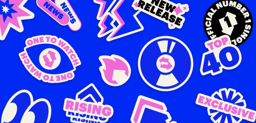
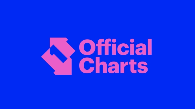
Revamped for 2023 with a keen eye on Gen Z, the rebrand features digital-first colours and a bolder. The brand now boasts an updated colour palette of cobalt blue, pink and off-white. The new logo hollows out the Number 1 – as not everyone previously spotted it – and it has been rotated to align with the now-iconic Number 1 Award.
The launch coincides with the publication of an independent cultural research study, ‘The Official Chart – The ‘People’s Algorithm’ by CultureStudio, on the enduring role of the Official Charts.
To learn more, we spoke to Lauren Kreisler, Director Of Brand & Digital at Official Charts.

What was the brief for the rebrand?
Official Charts is a multi-faceted organisation at the heart of the music industry, chronicling British culture since 1952. It’s both a consumer brand, b2b data business, digital publisher, as well as a British institution in its own right.
Following 70 years of the Official Singles Chart celebrations in 2022, Official Charts were looking to the future with plans for an identity refresh and new digital platform. It was time to welcome new life into the brand to reflect our place and relevancy in the entertainment space today, particularly to a young consumer audience.
Official Charts’ now-famous icon with its upward arrow, downward arrow and “secret” Number 1 at its heart was well-received as clever design upon its introduction back in 2011 so was here to stay. However, recent consumer insight suggested that in order to drive appeal to a younger Gen Z audience and potential brand partners, Official Charts needed to feel less “man in suit” and should evolve its aesthetic to fit seamlessly alongside leading music brands such as Spotify, MTV and Radio 1.
While the icon was a keeper, the font, layout and color palettes were up for review, along with a new set of social templates, playlist covers, stationery, motion graphics, and a revamp of the specialist chart Number 1 Award.
The Official Charts brand team were also looking to move from Photoshop to Canva to manage day-to-day in-house creative tasks, a refreshed set of templates was needed to equip them.
A key challenge of the brief was the consideration of two distinct audiences - consumer v trade. For consumers, The Official Chart is an institution and a content outlet with verified information on their favourite pop stars. For trade, they are the Number 1 data provider for the British music and home entertainment industry. It required an identity and structure that felt modern and fun to Gen Z, without undermining the Official Charts Company’s authority and alienating the b2b side of the business.
How did the initial pitch/brainstorming phase go?
Official Charts were clear in the goal of the project and came armed with a detailed brief, consumer insight and initial moodboards to support the strategic direction and ambition. We were open to working with new creatives, and to breaking out the graphics and motion work across specialist suppliers.
Timeframe was also key, we needed to move relatively quickly to then feed art direction into the forthcoming platform rebuild.
Electric Mustard developed the initial client moodboards further, exploring a number of strategic routes. One of the main aspects they wanted to evolve was the color palette and typography. While the old primary colors of cyan and magenta were great for print, in a digital world they felt dated. The existing secondary colors also felt somewhat muted and not representative of the brand or its target audience.
Furthermore, regarding the typography, the compressed typography felt too business-like and stuffy, Electric Mustard recommended for the brand to feel more open, characterful, and inviting.
Describe the purpose of the brand and its target audience
The Official Chart is the most trusted measure of popularity in music and home entertainment. The most comprehensive research panel of its kind, the Official Chart is a full market count of the UK’s music consumption, the census of pop music if you like, counting sales and streams from 8,000 data sources every day to compile the weekly Official Singles and Albums Chart Top 100, as heard on BBC Radio 1, along with 50+ charts spanning different genres and formats.
The Official Singles Chart is driven primarily by Gen Z, while the brand’s heritage remains also adored by older pop nostalgia lovers. Everybody loves to find out the Number 1 when they were born, or the Number 1 on their 14th birthday – these are the songs that soundtrack our life and the times we live in.
Today’s biggest artists care deeply about their chart success too, a Number 1 record still remains the pinnacle of an artist’s career today.
What was your thinking behind the rebranding solution?
A key insight and desire from Official Charts was to reflect the combination of discovery and nostalgia that comes with the brand. While the reposition needed to feel fresh and reflect what’s trending now in the current music scene, a nod to the chart’s heritage, the resilience of physical music and the joy of nostalgia also felt essential to truly capture the brand’s unique place in British culture.
Official Charts’ audience insights shows nostalgia to be something that unites all generations of their audience too, with the digital platform experiencing universal engagement around stories like Kate Bush breaking chart records after finding a new generation of fans through Stranger Things.
Such a concept needed to be executed thoughtfully however so as to not feel dated; nostalgia, but through a 2023 lens.
What was the biggest challenge? How did you overcome it?
One of the most significant challenges was to develop that versatile aesthetic that appeals to Gen-Z but also allows for a more minimalistic and professional appearance. The use of flat graphics, block colors, and sticker elements has established an interchangeable design that can be easily scaled up or down to meet the audience's requirements.
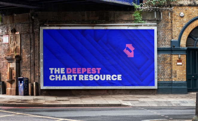
From a technical standpoint, we consciously decided to utilise two bold colors – cobalt blue and pink - that “pop” unapologetically on digital screens – the brand’s primary environment today. However, these digital-first colours are inherently more difficult to replicate with precision in a print environment when limited to CMYK print processes.
Logos were supplied in RGB, plus pantone matches and CMYK equivalents. For applications such as the specialist chart Number 1 Award, there was a greater emphasis on print testing to find the ideal tones for the physical 3D embodiment of the icon. While in other more formal print environments such as trade press titles, the decision was taken to default to black as the primary logo.
What kit/tools/software were used to create it?
The main logo evolution and brand elements were created by Electric Mustard using Adobe Illustrator and then converted into editable templates within Canva, allowing the in-house brand team to easily customise the asset.
On the motion graphics leg of the project, Tom Huxley modelled and textured the famous Number 1 Award in Blender, before compositing it within Adobe After Effects to bring the full stings to life with flares, gloss and sheen. It required experimentation to get the brushed aluminium textures as accurate as possible.
The other idents and motion graphics by James Mobbs and Callum Jackson were built natively in After Effects, allowing easy workflows for the Official Charts team to drop into Adobe Premiere, with the ability to change the text captions and update chart positions with a click of a button.
What details are you most proud of and why?
Nailing the sweet spot of both the “now” and the “nostalgia” side of the brand in one identity. The visual positioning tells a clear story of both the brand’s target audience today, and its heritage.
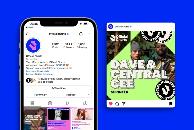
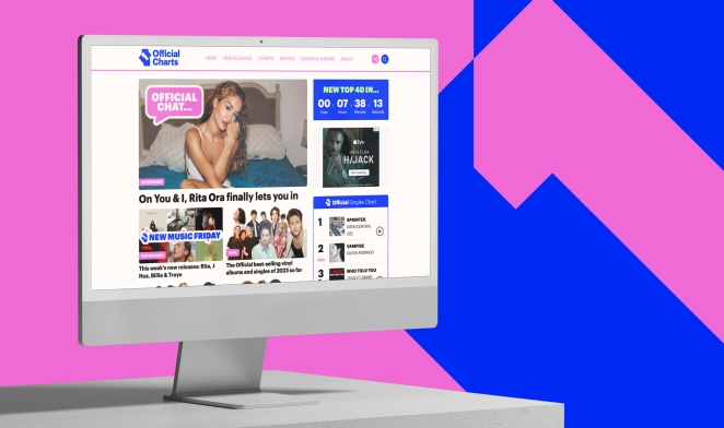
We also knew from brand insight that 69% of chart followers (higher still among under 25s at 72%) use the Official Charts as a vital gateway for music discovery. The new digital platform drives that capability even harder, bridging the gap between chart website and contemporary streaming platform, allowing users to vertically scroll through any chart in history, play audio clips, watch videos and explore chart stats.
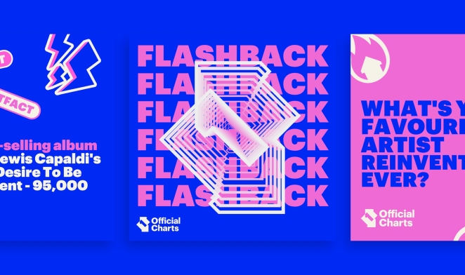
Running with the discovery theme further, Electric Mustard developed a superb collection of logos to support Official Charts’ new music-related editorial franchises including ‘First Listen’ and ‘One To Watch’, as well as an excellent identity for the much-loved Official Chart Flashback nostalgia series. These are all brilliant executions individually, and hang together beautifully as a collection too, they bounce our homepage and social channels to life.
What visual influences fuelled your solution?
The new Official Charts brand draws inspiration from social media and internet culture, infusing its identity with playful emoji-like graphics. The zingy colours chosen for the brand were guided by Gen Z's undeniable affinity for energetic and vibrant hues, reflecting their expressive nature.
What do you hope it achieves for the brand?
A refreshed and versatile brand identity that is both authoritative and characterful. A coherent, consistent aesthetic from the website to social channels, to video content, playlists and trade communications.
It should project a confident and contemporary brand that speaks to Gen Z, we also want advertisers and media agencies to take notice and see the Official Chart for what it is - a consumer entertainment brand not to be confused with a b2b publication such as Music Week.
One of the next steps on our roadmap is brand licensing and consumer products, we’re now represented by licensing agency The Point 1888 and look forward getting the new style guide underway to showcase the retail potential of the brand. We want to build relationships with licensing partners to create ranges of imaginative products and have some fun with our brand history.
What would you do differently if you could do it over again?
There was a disconnect at first between the rebrand work and the first draft of the website’s front-end designs as they were delivered by two different partners. We resolved this by commissioning some guide sketches from Electric Mustard that better pulled together the aesthetic cross-platform. Next time we would simply commission website sketches as part of the core rebrand brief.
Credit list for the work?
- Identity & Graphic design – Todd Sayer, Electric Mustard
- Motion – James Mobbs & Callum Jackson
- 3D Design - Tom Huxley
- Client-side creative direction – Lauren Kreisler, Director of Brand & Digital, Official Charts
- Marketing support - Helen Ainsley, Senior Marketing & Comms Coordinator, Official Charts