
A new player in the Italian fast food space, Nudi have discovered a way to strip down the calories in a delicious Italian meal, to the bare minimum.
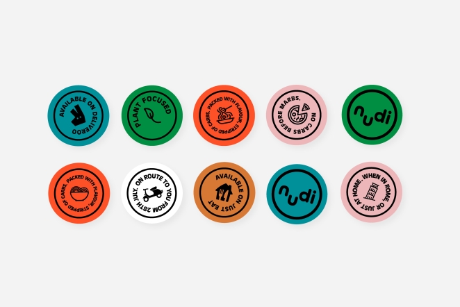
Good Habit developed a distinctive identity that is characterized by a playful and cheeky tone. Implemented across both the takeaway food packaging and a social media kit, accompanied by a series animated stickers.
To learn more, we spoke to Good Habit Co-Founder, Josh Hailes.
What was the brief for the rebrand?
Shirin and Damian from Nudi approached us to create a fun brand for their launch. They wanted to create a fun, cheeky food brand for people who wanted to eat really good-tasting food, but without unhealthy side-effects.
This is effectively takeaway food you can eat daily without being unhealthy. They had a name (Nudi), but needed a logo, colourway, messaging and an overall look & feel for the brand.
How did the initial pitch/brainstorming phase go?
We presented an idea and it resonated with the team. The first idea was very close to the brand that launched, but some development was needed.
Describe the purpose of the brand and its target audience
A large part of the target audience is ‘Kensington Working Mums’ who would order food through Deliveroo every day. In practise, Nudi’s audience is much wider.
What was your thinking behind the rebranding solution?
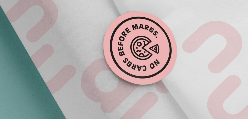
Naked Pasta. We brought together the cheekiness of the brand and the product itself to create a big idea that carries through the brand.
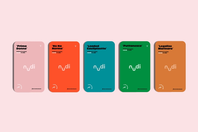
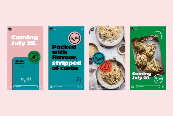
A ‘naked pink’ leads the colourway, the logo ‘winks,’ and the messaging is full of innuendo. Playful stickers are dotted around to add character and depth.
Did you learn anything new during the project?
We learnt to always push the brand’s visual language a step further. The stickers concept came from a moment in the project when things were mostly locked in, but socials content wasn’t cutting through. We developed these stickers which eventually became a core part of the brand identity throughout the whole experience, and into the physical product itself.
What was the biggest challenge? How did you overcome it?
The biggest challenge was understanding exactly how far to take the brand into the ‘cheekiness’ tone of voice, and striking the right balance between playful and professional. Our target audience needed to know that this is high quality food, but that we also don’t take ourselves too seriously.
What kit/tools/software were used to create it?
Illustrator, After Effects, Photoshop
What details are you most proud of any why?
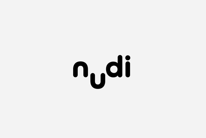
The winking animated logo is a wonderful brand moment.
What visual influences fuelled your solution?
We try to approach every project with fresh eyes, and we shy away from project-specific reference boards whenever possible. They tend to taint any objectivity people have towards a specific brand solution.
We didn’t mood board anything, we just had a conversation about the brand’s objectives, and started iterating on work together in the studio. Every project is different, though. We do use mood boards when they’re needed, but this project really came together without needing too much research. We knew what we wanted to do and we did it.
What do you hope it achieves for the brand?
Well since launch, the brand has taken off on Deliveroo. They have been #1 in the ‘healthy’ food category on Deliveroo for the areas they launched in, and they’re continuing to grow. There have been lots of wonderful bits of positive feedback on the brand — it’s been a really successful launch
What would you do differently if you could do it over again?
Wow, what a question! We wouldn’t change a thing. We’re really proud of the project, and we’re happy to see it doing well for Nudi. Maybe we would’ve spent more time in research ordering takeaway?
Credit list for the work?
Josh Hailes — Co-Founder & Creative Director
Chris Smyth — Co-Founder & Creative Director
Good Habit October 27th, 2023, around noon
Thanks for having us! Really enjoyed chatting about this project, appreciate the write-up.- Josh