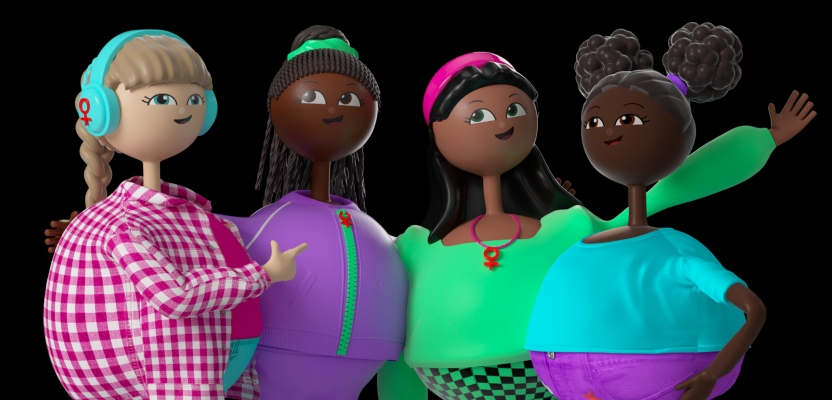

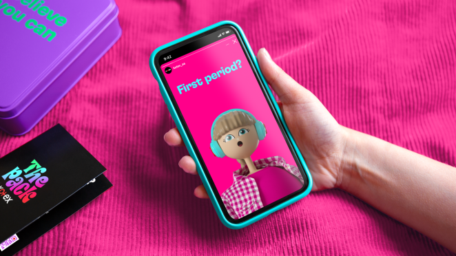
Pearlfisher, the brand design agency, has unveiled its design for The Pack by KOTEX for tween girls at school in South Africa. The kit goes beyond the traditional functionality of fem-care to transform menstrual education into an engaging, empowering experience for girls navigating puberty. It features a gamified aesthetic and four distinctive, optimistic characters who guide girls through their journey.
To learn more, we spoke to Jess Phillips, Creative Director at Pearlfisher.
What was the brief for the brand creation?
It’s been an exciting journey working with the team at Kotex and the wider Kimberly-Clark team to bring their vision for The Pack by Kotex to fruition.
What started as a packaging design brief shifted completely, as we wanted to push the boundaries to extend their idea and education for tween girls about their periods, creating this uniquely designed kit to manage periods with pride, but most importantly, an entire brand world for The Pack by Kotex – to live across print and digital, for tween girls to feel part of a community and empowered.
How did the initial pitch/brainstorming phase go?
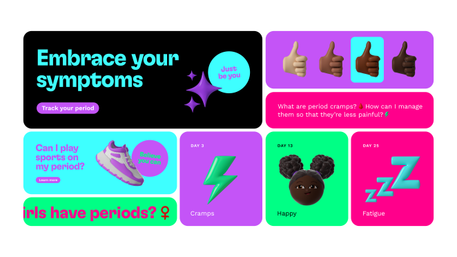
We presented the Kotex team with three proposed territories and conceptual approaches, and they selected the most advanced and digitally focused option. Internally, as we delved into the project, we recognised that we were engaging with a new generation of tween girls who are very much digitally native.
With a world of information at their fingertips, we understood the necessity of providing them with a brand that offers easy, essential, and relevant education. Entertainment can serve as a fun and engaging method of learning, hence the gamified look and feel for The Pack by Kotex. We prioritised the mindset of 'entertain me', placing it at the forefront of our strategy.
This phase truly highlighted our core expertise and collaborative approach at Pearlfisher - from the initial insights and innovation gathered by our Futures team to the development of the strategy and design.
Describe the purpose of the brand and its target audience
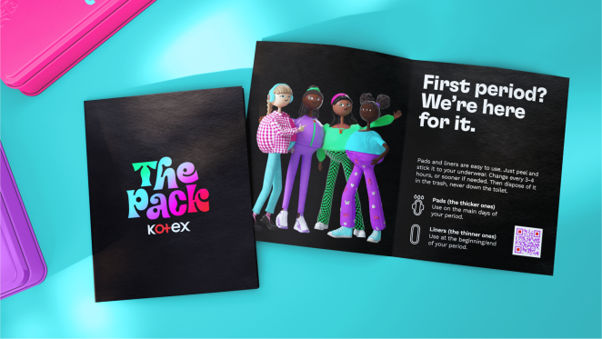
The target audience consists of tween girls in South Africa who are navigating puberty. The Pack brand name holds both metaphorical and literal significance. It’s about inviting young girls to feel like they’re part of something bigger – a pack and a community of girls who support each other and can help empower one another.
But it’s also about the physical pack: a practical first-period kit containing the tools and knowledge these girls need to confidently manage their periods.
What was your thinking behind the brand creation?
This brand creation aimed to completely shake up what already existed in this space for tween girls. There was
a significant amount of research undertaken – both by the client and ourselves – to immerse ourselves in the perspective of a 12-year-old South African girl and truly understand how we wanted the girls in ‘The Pack’ to look, behave, and inhabit their world.

Alongside this, we had to carefully consider how we were integrating the physical and digital elements in a fresh context – creating a physical pack for a digitally native audience.
Did you learn anything new during the project?
We aimed to steer clear of the stereotypes often seen in this category for tween girls, which typically involve design choices like cutesy pinks and a naive look and feel, especially regarding mascots and characters. It was a delicate balance to ensure everything felt right and relatable without inadvertently falling back into different types of stereotyping.
To bring our vision to life, we utilised a green screen in the studio, where our team acted out the movements in real life (it was a lot of fun!) – as we envisioned for The Pack by Kotex's characters digitally. Then, we collaborated closely with our fantastic design and visualisation team to breathe life into this diverse group of girls.
Our goal was to showcase every personality, vibe, and style with a positive attitude.
What was the biggest challenge? How did you overcome it?
The greatest challenge wasn’t simply creating appealing characters that girls could relate to or aspire to, but rather crafting characters that girls could genuinely believe in – characters that are truly authentic.
To tackle this challenge, we delved deep into our research, seeking to understand the experiences, aspirations, and perspectives of tween girls – we engaged in extensive discussions and feedback sessions, ensuring that our characters resonated with the brand’s target audience.
What details are you most proud of any why?
It's challenging to pinpoint one specific detail: rather, I'm immensely proud of the project as a whole. Reflecting on my own experiences at the age of 12, I believe this initiative would have greatly resonated with me. Having a kit that I could understand and access would have been invaluable.
And, on a broader scale, I hope this project contributes to driving a significant shift in the design, education and language surrounding tweens and puberty. By offering a more inclusive and empowering approach, we aspire to foster positive change in how society perceives the education of menstrual health and wellbeing.
What do you hope it achieves for the brand?
I see The Pack by Kotex as a vehicle to showcase Kotex’s expertise within its category in a dynamic way, resonating with this audience. It's about creating a modern brand that not only engages and interacts with young women but also reflects their identity and empowers them to take pride in using it.
I see it as an opportunity to propel Kotex forward as a trailblazing leader in menstrual health awareness and support. While the project initially focuses on a specific territory, I hope the project experiences early success and eventually expands globally. This way, it can reach and positively impact even more tweens and young women worldwide.
Credit list for the work:
Mike Branson, Founding Partner & Group Chairman
Jonathan Ford, Founding Partner & Group Creative Director
Jess Phillips, Creative Director
Jack Sheehan, Client Director
Kat Mellor, Designer
Rosalind Michaluk, Strategy Director
Hannah Francis, Junior Designer
Jody Gibbs, Visualisation Director