
Font design has never been so competitive, so technically advanced, so multi-platformed. These days just about anything can be formed into an eye catching font, aesthetically enticing enough to be snapped up by graphic designers, all you need is enough Photoshop know-how and a little imagination.
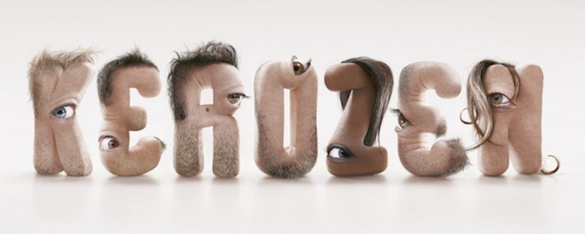
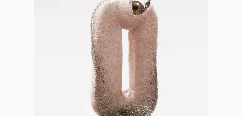
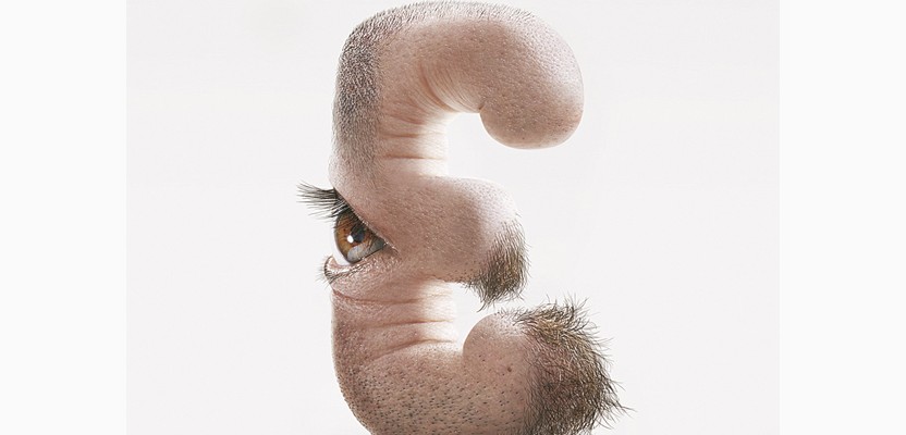
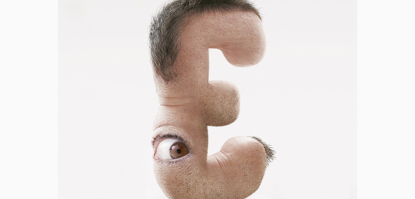
Imagination is not short in supply at French design house Kerozen who somehow had the idea of turning each member of their design team into a fleshy letter to spell out their company name.
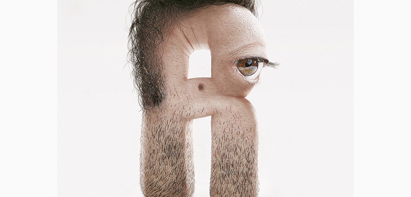
The hairy details are so realistic they will confuse your instincts, in truth if you bumped into this letter K down a dark alley you wouldn't know whether to run, squash it or strike up a conversation.
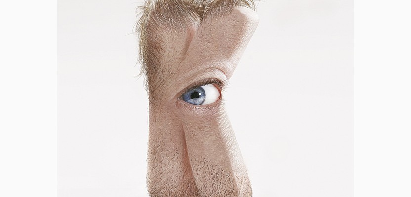
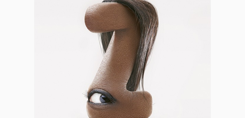
Kerozen artist JC Debroize is the brains behind these critters, who look like they are fresh out of Dr Jekyll's laboratory.
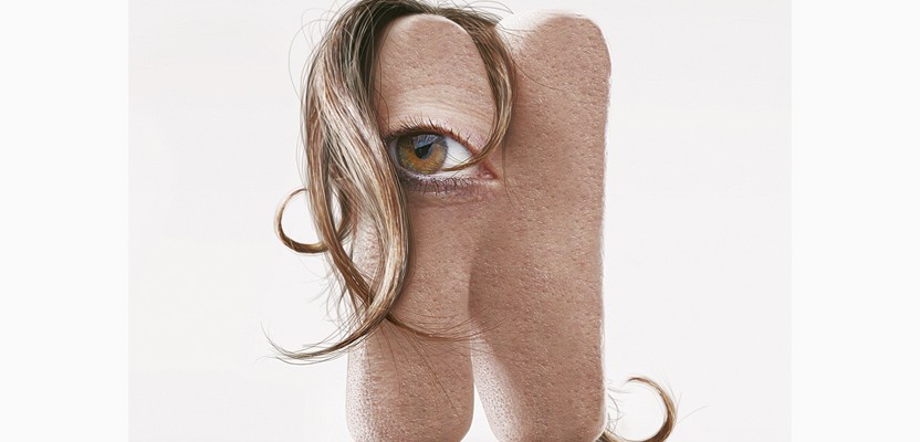
The horrors are frighteningly humanistic... The 'E's are my personal favourite, with their finger-like protrusions.
What would your colleagues look like when alphabeticalised?