

When designing Miller’s Quay, in collaboration with award-winning architects Howells, Peel set out to create a new iconic landmark for Wirral, integrating urban living with natural surroundings. The result is a contemporary interpretation of the historic Birkenhead Docks, drawing inspiration from the vibrant colours, metalwork, and warehouses that define the area’s industrial past.
These outstanding new homes now have a distinctive new brand that pays homage to the area’s rich 19th Century industrial heritage. The brand identity for Miller’s Quay features a bold word-mark inspired by the docks’ industrial legacy, complemented by a distinctive marque that aims to leave a lasting impression.
To learn more, we spoke to Simon Rhodes, Director at Smiling Wolf, the award-winning Liverpool agency that developed the new brand.
What was the brief for the rebrand?
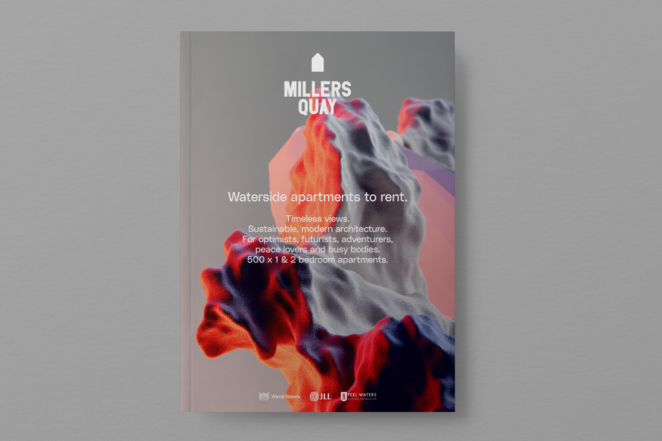
To create a new brand for Millers Quay, a transformational residential development at Wirral Waters, (designed by Howells) featuring 500 highly sustainable one-and two-bedroom waterfront apartments.
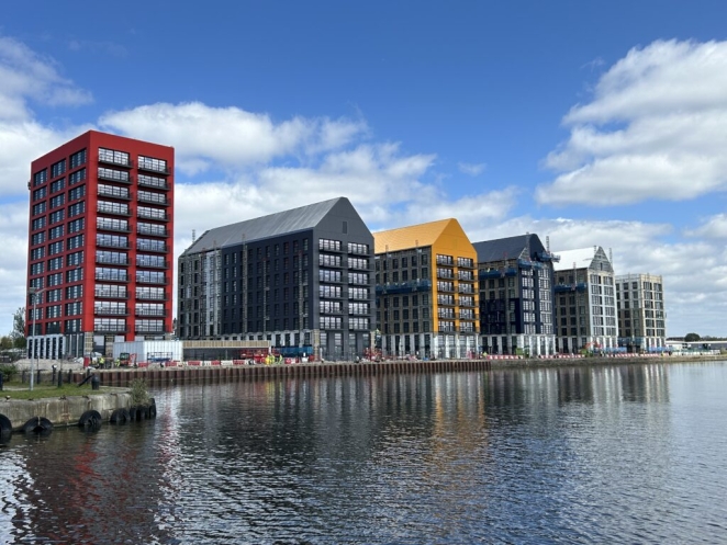
Integrating urban living with natural surroundings, the scheme is a contemporary interpretation of the historic Birkenhead Docks, drawing inspiration from the vibrant colours, metalwork, and warehouses that define the area's industrial past.
Peel wanted a real sense of place and purpose to cut through.
How did the initial pitch/brainstorming phase go?
It went fantastically well! Ideas flowed quickly with this (just as well because timescales were tight!) and Peel were delighted with the concepts – very little refinement to make before we moved into production. In this instance our first ideas were the bravest and strongest. We were delighted that Peel went for brave.
Describe the purpose of the brand and its target audience
To appeal to urban professionals (24 – 35) looking to rent, traditionally those who would have opted for City centre Liverpool.
What was your thinking behind the branding solution?
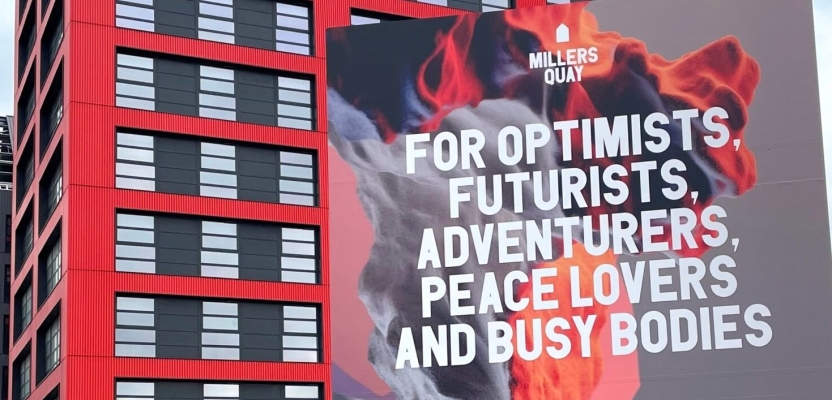
Throughout the 19th century and into the next, the quayside was full of activity, fabrication and innovation – a place of exciting reactions and interactions. We developed a striking visual approach to reflect that ethos and referenced the site's industrial heritage and elemental waterside location; drawing on the drama of Turner's Atlantic seascapes and the notion of the steam powered smelting plants and foundries that fed the manufacturing boom with iron, copper and cobalt.
We wanted to demonstrate that Millers Quay is a place for optimists, futurists, adventurers, peace lovers and busy bodies – outdoorsy yet urban, both active and passive., so we created a visual language to reinforce the mood and message.
Did you learn anything new during the project?
I suppose learning more about Wirral itself – Birkenhead Park predates and inspired New York’s Central Park. And Wirral has the longest promenade in Britain (New Brighton promenade is just over two miles long).
It’s a really vibrant place with a real focus on quality of life, there’s lots happening culturally that makes us want to get involved more from our base across the water in Liverpool.
What was the biggest challenge? How did you overcome it?
Timescale was tight – so we worked hard to front-load our thinking to get the concept right from the get-go. At Smiling Wolf we have a great culture of collaboration – everybody contributes at some point – and that can help focus minds and speed things along.
What kit/tools/software were used to create it?
Milanote for discovery, moodboarding and collaboration, Tome for presentations, then the full gamut of Adobe Creative Suite for development, the website is bespoke built Wordpress.
What details are you most proud of any why?
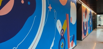
Hard to pick (we’re proud of how it works as a cohesive whole) but I think everyone enjoys working with the colour palette that ranges to be both earthy and vibrant – it’s been inspired by the dockside architecture (old and new) and the fairly rugged surroundings.
What visual influences fuelled your solution?
As mentioned – Turner’s dramatic seascapes but also 3D CGI landscapes, local textural photography – the quayside has a lovely patina. Typographically – inspiration from the industrial past (shipping, manufacturing) for our robust headline typeface (PDU Pro) and something more contemporary and human for body copy (poly Sans) to contrast with that.
What do you hope it achieves for the brand?
Of course we hope that the the approach turns heads, informs and fills apartments – but more than that the beginning of creating a real sense of place and community – something that grows and people want to be part of.
How do you ensure consistency in brand messaging and visual identity across various channels and touchpoints?
Everything is well documented on our brand guidelines hub https://standards.site – we love the way the platform helps you bring everything to life and can grow with the project.
What role did consumer research or market analysis play in shaping the direction of the rebrand?
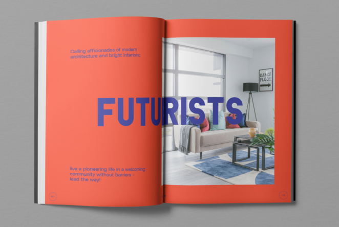
We considered personality archetypes within our demographic and what would benefits would appeal to their character, with a nice play on words: Optimists – those with a sunny outlook with an upbeat perspective. Futurists – aficionados of modern architecture & ready to live a pioneering life.
Adventurers – those who embrace the elements and get immersed in a more natural and wild environment. Peace Lovers – for seekers of calm and a slice of urban village life. Busy Bodies – people with things to do, places to be, lots to fit in – who are actively looking to build routines for healthy lifestyles.
Can you discuss any innovative or unconventional approaches you took in developing the branding solution?
The hero imagery is quite striking – abstract and a bit weird (weird is good!) but catches the eye and the imagination.
Were there any unexpected insights or discoveries about the brand that emerged during the rebranding process?
Hmm – probably understanding more about the place, Wirral and how much there is to do / quality of life.
What would you do differently if you could do it over again?
Apart from better weather for the photography (which will be an ongoing endeavour) nothing really! Everybody was onboard, collaborative and excited from the outset.
Credit list for the work?
Photography by Matt at Bellboy Studio


Chantelle Kelly today, in the morning
I think you done amazing x