
Team GB is the external facing brand owned and managed by the British Olympic Association. 100% commercially funded, its primary role is to unite, organise and prepare athletes from all Olympic sports, disciplines, and governing bodies as they compete together under the Union Flag.
Ahead of Paris 2024 and beyond, the BOA were looking to maintain and grow the brand’s profile amongst fans of all ages and backgrounds, strengthen its relationship with sponsors and commercial partners, and make sure it would be fit for today’s modern, digital-first communication landscape.
The brand needed to evolve strategically and visually. To develop a clear and compelling purpose and promise that could maintain the DNA of what has made it so successful, but also resonate deeper, across multiple channels, with athletes and audiences alike. It also needed to facilitate content that would engage and inspire the nation, not just during the Games, but every single day.
So, they hooked up with the talented team at thisaway to find that perfect tonal balance and we spoke to the team this week to learn a little more about this massive rebranding project.
There’s a deep emotional connection with Team GB in the UK as it represents optimism and hope at a time when things seem unremittingly bleak. Did you feel a responsibility to tap into that emotion?
Yes definitely. Team GB has ranked second, just behind the NHS, in a survey of 'what makes people proud of Britain'. It's also one of the few brands that brings Britain together without any political baggage , so we definitely wanted to reflect that pride and give the brand a feeling of energy and optimism.
I think we're all in need of a lift at the moment, and the Olympics is a great event to pull people and the country together, and the relatable nature of the athletes really seems to resonate with the general public.
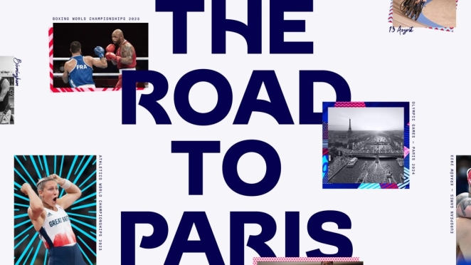
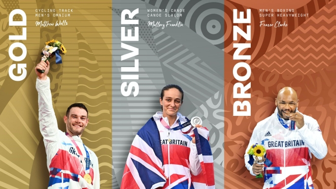
The athletes are more accessible than other elite sports like football, and they aren't put on a pedestal. They are ordinary people like you and I, but they achieve extraordinary things, which makes them special. It was this insight that led to the brand idea 'Everyday Extraordinary'.
Can you talk us through your diverse design system and how it works?
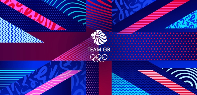
Team GB is a melting pot of diversity. It represents England, Scotland, Wales and Northern Ireland, and within that there are many different cultures, languages and customs. Then within the team of athletes itself, you have people from all walks of life, different ages and backgrounds.
You might have a middle aged person from the countryside competing in equestrian, next to a teenager from a city competing in skateboarding. With all this in mind, we wanted ensure the identity system felt diverse and reflective of modern Britain, whilst appealing to a wide variety of audiences.
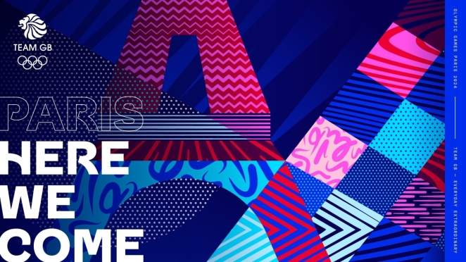
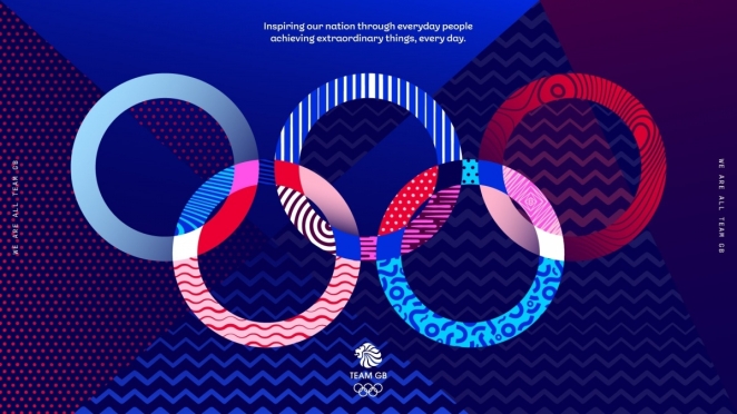
To do this we created a simple but flexible design system all based around a core set of patterns. These were inspired by some of the key qualities and attributes that make up a successful athlete, the patterns are intentionally expressive and abstract, meaning they can be applied freely across the brand without being nailed down to one particular sport.
We then use the patterns in different ways depending on the application. They are used more simply and subtly on the more everyday applications, and can then be switched to full colour, event themed pattern illustrations on the extraordinary end of applications around Games time.
In a post-Brexit world, there’s something of a pushback against blatantly patriotic iconography. Did you try to strike a balance between really going all-in on the patriotism and holding back?
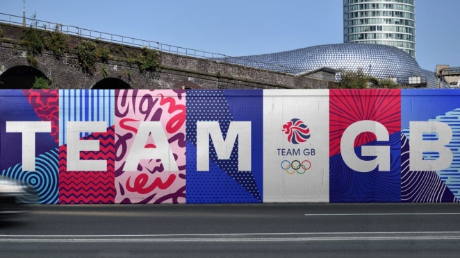
We were conscious of the connotations around the union flag, but at the same time you can't hide that it's part of the brand. The context around its use is also important. For us, Team GB is one of a few brands where the use of the flag isn't divisive. You don't really question seeing an athlete doing a lap of honour with the union flag draped over them.
So while the union flag is obviously referenced in the logo, the wider brand doesn't really rely on it. Yes, there is an illustration of it that uses the patterns, but it's small element of the wider identity system.
The games seem to strike a particular chord with young people. Did this have any impact on the branding decisions you made?
Well funnily enough, the audience segmentation we looked in at early in the process, showed that the average Team GB fan was in their forties.
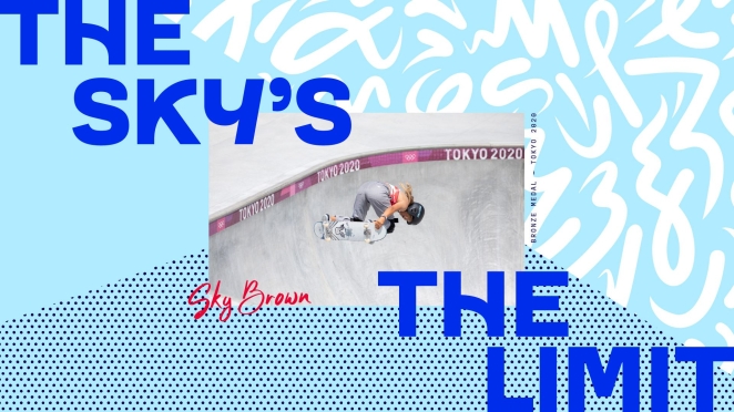
So a big requirement of the rebrand was to attract younger audiences, especially with more younger, urban sports like break-dancing, BMX and skateboarding being introduced to the Games.
We could have gone down a route of giving the brand a feeling of epic gravitas, but it doesn't feel right for this brand. Instead, we wanted it to feel accessible, energetic and vibrant.
What was the thought process behind the colour scheme (aside from the obvious, of course)? Did you want to reclaim the concept of red, white, and blue or go in a different direction?
The previous identity used a lot of dark blue, which made a lot of the comms feel dense and even a little bit corporate. Our idea was to give the colour palette more flexibility and breadth.
We knew red, white and blue had to be in the mix for obvious reasons, but we wanted to push the tonal boundaries of these colours to give the brand more energy and a contemporary feel.
This led us to adding more vibrant blues and pinks which can give the comms more punch. We also added rich maroons and deeps blue which can give more of a premium and considered feel.
Are there any athlete’s you specifically look towards for inspiration?
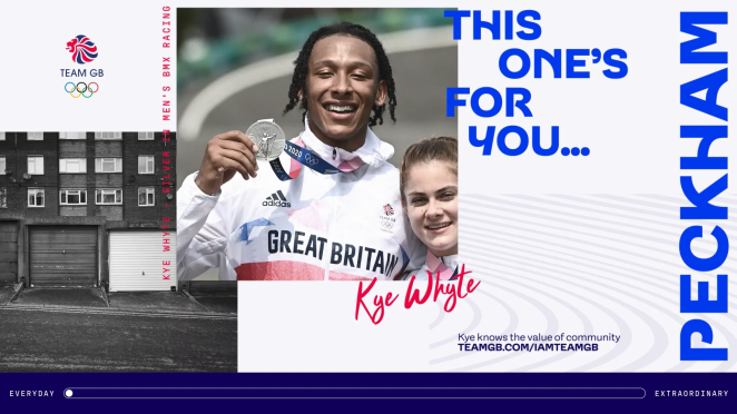
There aren't any specific individuals, but we did take inspiration from the discussions we had with a number of Team GB athletes as part of the strategic discovery phase. What struck us most during these conversations were the back-stories everyone had, and the journey they have been on to get where they are. It was really inspiring stuff.
We wanted the brand to tell these athlete stories not just in the build-up and during Games time, but over the course of the four year Olympic cycle. People want to know about how they got into their sports, their parents involvement, the highs and lows of qualifying or getting an injury and then recovering from it.
These are all compelling stories that we want the brand to tell in the build up to Paris 2024 and beyond.
Can you tell us about working with Lewis McGuffie to create the iconic new typeface?
We've worked with Lewis previously, and we thought he'd be a great collaborator for us on this project.
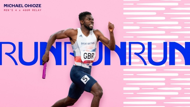
When you look at the world of sports branding, you see a lot of heavy, condensed typefaces. We wanted to create a more accessible typeface that almost reflects the approachable nature of the athletes.
Stylistically, we wanted the typeface to have a feeling of movement and energy to reflect the attributes of the sports, but also nod to classic British typefaces.
We worked with the Lewis and the design team at Team GB to define the characteristics of classic British typefaces. We explored typefaces such as Gill Sans and identified the characterful letter 'Rs' and 'Ps', and tried to weave these into our typeface, Team GB Sans.
The typeface also embodies the 'Everyday Extraordinary' positioning with its set of stylistic alternates that can be used on more 'extraordinary' applications.
What do you hope the rebrand achieves?
I think there's a few objectives.
We hope our visual approach to the brand gets all audiences, but particularly younger audiences, interested in the Olympics and the wide range of sports that compete under the Team GB brand.
Our broader aim is that the rebrand will give Team GB more relevance outside of Games time. 'Everyday Extraordinary' gives the brand permission to talk about lots of subjects beyond sport. Wellness, mental health and healthy eating are all subjects that a brand like Team GB can credibly talk about with authority.
Team GB is one of the few brands that can speak to the nation, so if our work on the brand helps everyday people find their extraordinary, then we'll be delighted to have played a small part in that.