
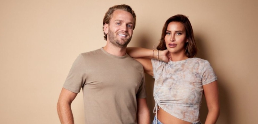

When founders TV personality Ferne McCann (The Only Way is Essex, I’m a Celebrity… Get me out of here, This Morning) and partner Lorri Haines found themselves in the middle of a tabloid-fuelled mental health crisis, they reached out for support.
The tools and guidance they found became the inspiration to build Shoorah — an emotional health app 'for people who don't do any of that stuff.'
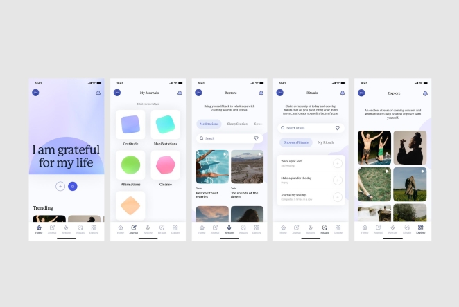
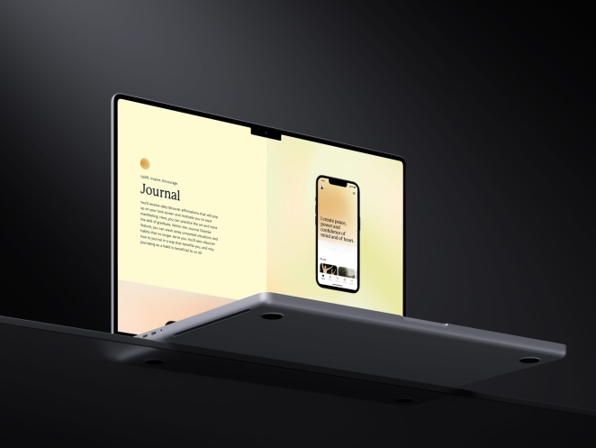
Shoorah aims to help its users prioritise their mental health by placing their tried and tested tools right in their pockets and with them all the time. Their app is designed to help keep you present, abundant, and in control of your mental health.
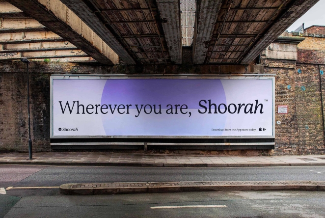
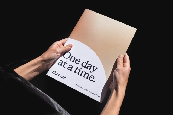
The idea for the Shoorah branding by agency Good Habit is centred on the grace-powered new day and the feeling of a new beginning each time a user interacts with Shoorah — a fresh start. A sunrise and sunset sit at the heart of the identity, capturing this daily ritual.
To learn more, we spoke to Josh Hailes, Brand Strategy Director at Good Habit.
What was the brief for the rebrand?
Thanks for having us on this feature, it’s a pleasure to be asked about our work. The brief for the 'Shoorah' brand was all about making mental health apps accessible for everyone.
Shoorah is meant to have everything you need, and nothing you don’t. Simple, down-to-earth mental health tools. Helping you look after you. Giving you a happy place and making it easier than ever to look after yourself.
How did the initial pitch/brainstorming phase go?
There was no pitch. They came to us off the back of a bad experience with a previous brand agency and needed some guidance on what to do next. We started discussing the essence of a fresh start and infusing it into the brand, along with their own experiences.
We wanted to ensure that each encounter with 'Shoorah' felt like the beginning of a new day, powered by positivity and grace. We knew we wanted to focus on celebrating each day as a new opportunity, and that's where the concept of sunrise and sunset as the heart of the identity emerged.
Describe the purpose of the brand and its target audience
'Shoorah' is all about helping users prioritise their mental health and well-being. Our target audience is anyone seeking a personalised and positive experience, a toolkit for staying present and abundant, all conveniently accessible through their app.
What was your thinking behind the rebranding solution?
Our thinking revolved around creating an identity that mirrors the daily ritual of a fresh start. We integrated sunrises and sunsets into the core of the brand to symbolise this. We also wanted the brand to be an enabler of positivity, offering sharable content and customisation, making mental health tools easily accessible.
Did you learn anything new during the project?
Absolutely, every project brings its lessons. With 'Shoorah', I relearned the power of simplicity and how visual elements like sunrises and sunsets can evoke such strong emotions, aligning beautifully with the brand's mission.
What was the biggest challenge? How did you overcome it?
One of the main challenges was ensuring the balance between positivity and not being overly idealistic. This needed to land in a down-to-earth way for people. We wanted to help people feel positive through colour, while retaining simplicity.
What kit/tools/software were used to create it?
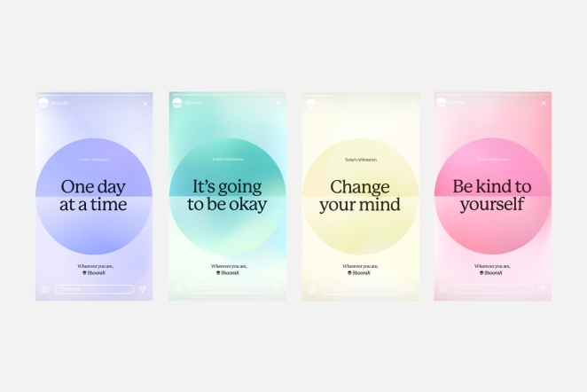
We started in Illustrator and keynote for presentations, then moved over to Figma once the brand elements were locked. There are some things that Illustrator does that Figma just can’t quite match. Seamless teamwork was crucial, but so were mesh gradients!
What details are you most proud of and why?
The icon holds a special place in my heart. It encapsulates the brand's essence beautifully, reminding us that each day is a fresh canvas. We also iterated on the colour palette a lot, so there’s a lot of great detail in those colours and the ways they subtly link with nature.
What visual influences fuelled your solution?
Nature's beauty, especially the tranquil beauty of sunrises and sunsets, served as a key inspiration. The idea of constant renewal and the sense of awe they evoke played a significant role.
What do you hope it achieves for the brand?
Our aim is for 'Shoorah' to become a reliable companion for users, facilitating a positive shift in their approach to mental health. Our goal is to guide them towards a more present, abundant, and mentally healthy life.
Ferne & Lorri strive to empower individuals towards their own well-being, sharing their positive experiences, and creating a community focused on personal growth. The 'Shoorah' rebrand aims to assist users in navigating their journey towards better mental health and a brighter future. Our contribution to their mission is our way of making a positive impact in the world.
What would you do differently if you could do it over again?
I think we would spend longer with them on taking the brand further. While the implementation process can be challenging, it's crucial for the success of any brand project. Despite this, we're pleased with how the brand has evolved, and we're optimistic that it will continue to grow and be implemented with enthusiasm and creativity.
Credit list for the work?
Concept, Design & Delivery — Josh Hailes & Chris Smyth

Good Habit December 5th, 2023, around noon
Was great to talk, thanks again for having us on the article!