
We spoke to Richard Debenham, Design Director at Designhouse this week, about his agency’s job creating a new brand name and visual identity for a former subsidiary brand of the district energy business, Equans, set to lead the UK market in a rapidly growing sector.
What was the brief for the rebrand?
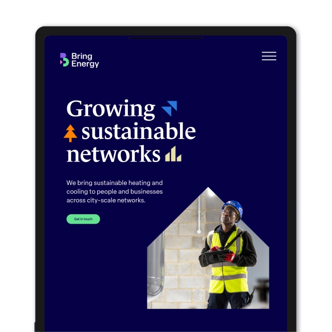
The new businesses’ mission is to positively shape the transformation of the UK energy landscape through a new generation of scaled urban energy generation and distribution networks, accelerating energy efficiency, decarbonisation and inclusive community energy.
Until September 2023, EQUANS Urban Energy was part of the global EQUANS Group, who provide low-carbon energy solutions, Facilities Management and regenerative services across the UK and Ireland. On 15 September 2023, the Group announced the sale of its district heating and cooling networks in the UK for approximately £260 million.
We worked to create three distinctive creative concepts inspired by the feedback and insights of the team. The client wanted to demonstrate their market-leading position and status. They aimed to evolve the brand as part of a larger global group and to lose a faceless engineering image.
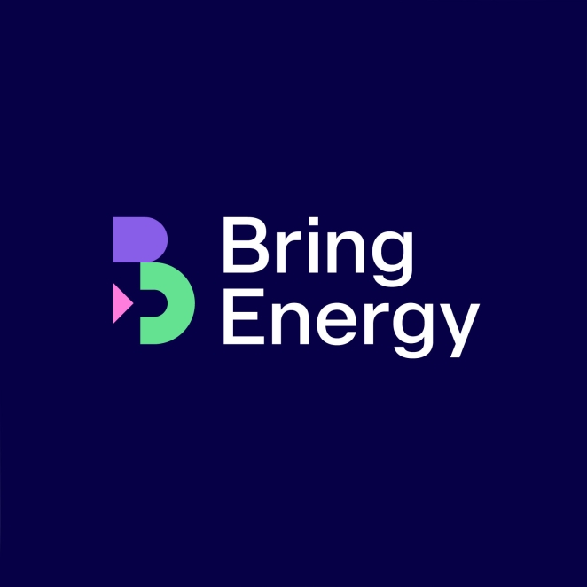
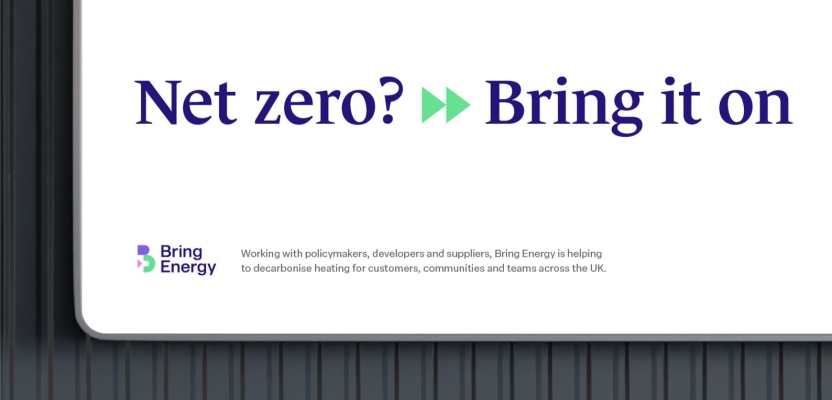
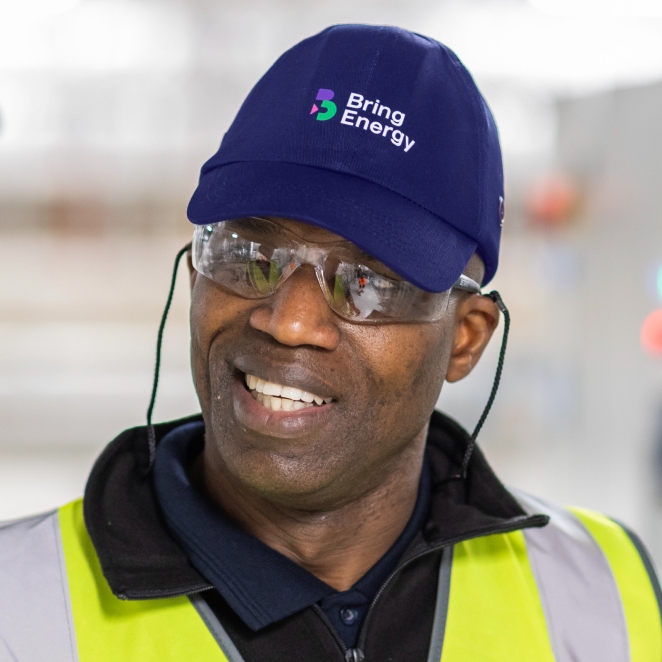
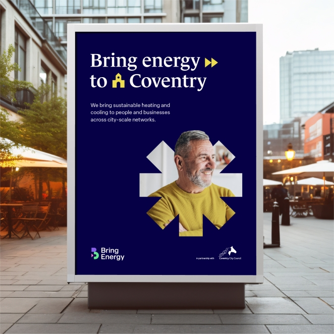
A new name and brand, Bring had the ambition of becoming a household name in relation to a strategic energy authoritative voice, sharing the current narrative from experts, driving purpose, use and conservation.
How did the initial pitch/brainstorming phase go?
The first stage was establishing the brand model and company values. As part of the process, our team carried out two workshops, within which we interviewed several internal stakeholders, external customers and ambassadors of the Equans brand.
We explored different territories for naming, from descriptive to evocative and abstract. Within these themes, the names reflected authority, technical expertise, long-term commitment and customer delivery. Once the name was in place, the tone was set to Bring the brand to life.
Describe the purpose of the brand and its target audience
The brand’s mission is to lead the sustainable transformation of the UK energy landscape. Audiences range from industry regulators to estate managers, property developers and consumers.
Bring wish to be perceived to be pushing the boundaries as a ‘go-to’ business for customers as a trusted leader in the UK transition to Net Zero, with the most robust and efficient network energy solutions for every city, organisation and community.
What was your thinking behind the rebranding solution?
We wanted to create a visually and verbally dynamic brand that would stand apart from competitors within the sector. Our approach was to buck industry trends of flowing energy motifs and graduated colour, instead juxtaposing striking flat colour with sophisticated typography to explore and create an authoritative yet engaging look and feel.
Did you learn anything new during the project?
Whilst these learnings were nothing new to our team, it was beneficial to re-affirm the power of creative collaboration and making bold moves for a high reward, working to be ambitious and push the boundaries as requested by the client.
Multiple influences informed different aspects of the process, leading to an outcome that all could be proud of. We were also fortunate to have a fabulous client whose ambitions for the business supported our vision for a brand, giving us license to explore different creative avenues.
What was the biggest challenge? How did you overcome it?
Designing a brand for multiple stakeholders is always challenging. Throughout the creative process, we engaged with these audiences and created a bold and diverse design language with broad appeal.
This identity resonated with all stakeholders, remaining coherent across all communications. Given the sale of a part of Equans, the new brand needed to be released promptly. Our team rose to the challenge in a time-pressure environment, delivering a bespoke offering.
What details are you most proud of and why?
We are most proud of delivering a brand name that creates a dialogue. The opportunities to embed the word Bring throughout messaging provides the brand with a powerful asset that will continue to drive the conversation in the energy sector and serve future campaigns.
What visual influences fuelled your solution?
The overriding theme was one of simplicity. We wanted to create a solution that felt engaging without being overly complex.
It had to resonate with external audiences and be easy to adopt and roll out internally for the team at Bring Energy.
What do you hope it achieves for the brand?
We hope the power of the brand solution continues to play a prominent role for Bring Energy and its ambitions for the UK economy, supporting its net zero goals and encouraging sustainable practises nationwide.
Credit list for the work?
- Richard Debenham, Design Lead
- Sam Mayhew, Senior Designer
- Jonti Davies, Account Director
- Tom Christie Miller, Strategic Lead
- Aamina Chaudhry, Account Executive