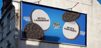

According to research, the dairy alternatives market is worth $24 billion USD globally. With more and more brands to compete with, Alpro – a veteran of the category – has unveiled a global brand refresh from Elmwood London, which places a greater emphasis on flavour, which has become an increasingly important factor as the category improves.
To learn more, we spoke to Kyle Whybrow, Executive Creative Director at Elmwood London.
What was the brief for the rebrand?
The Alpro team enlisted our help to deliver a global brand refresh that reasserted the brand’s fresh, flavour-packed appeal amid soaring industry demand. As the plant-based pioneer, we recognised the need for Alpro to have a confident new look that was still authentic and credible to the brand. The plant-based market has seen significant growth over the last decade, with challenger brands showing up and bringing their challenger aesthetics with them.
In this rapidly evolving category, Alpro wanted to take their brand to the next level in order to stay relevant and reaffirm their position as the market leader. There was a collective ambition to make Alpro more bold and celebratory, cementing its leading position in the noisy category with a focus on big flavours.
How did the initial pitch/brainstorming phase go?
We have been partnering with the Alpro team as their design partners for almost a decade now, when our help was initially enlisted for the previous rebrand – so, it felt right for us to lead this refresh as well. Back in 2019, the conversation was still very much about educating consumers with a simple, subtle design ethos about all things plant-based.
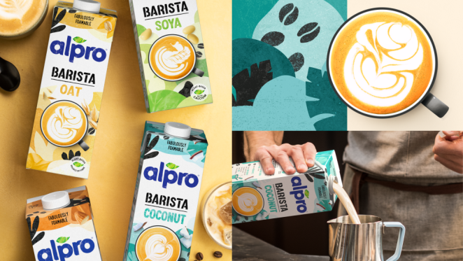
Since then and with a huge boom in awareness, we now had the space to consider where Alpro goes next, and this was where the idea to focus on the products’ flavours came from. The team were looking to bring flavour and impact to the forefront of the Alpro brand to highlight the incredible taste and smooth, moreish texture of their products – from drinks to yogurts, mousses and more.
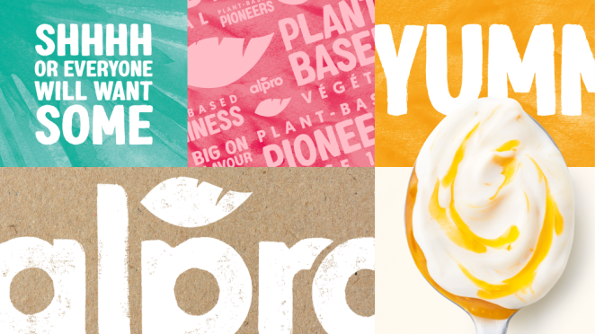
It was also important for us to show across the rebrand that plant-based products are no longer ‘just’ alternatives or supplements – they’re aspirational purchases in their own right. This evolutionary narrative provided us with the inspiration and awareness we needed to agree on how to address the ‘Big on Flavour’ brief across all brand touchpoints.
Describe the purpose of the brand and its target audience
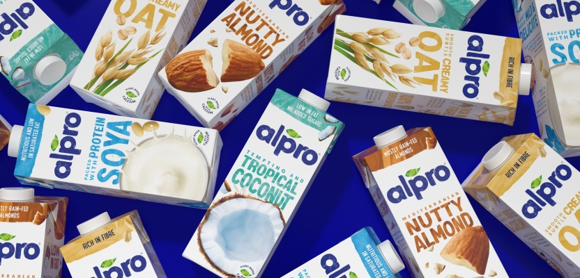
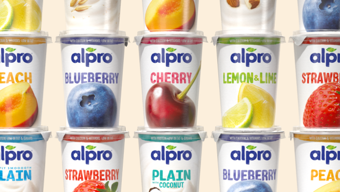
Bringing over 40 years of plant-based expertise, Alpro are the plant-based pioneers. The brand’s huge range of flavours and products, consisting of a portfolio of over 130 SKUs across more than a dozen different ranges, sets them apart. Alpro’s products focus on great-tasting ingredients, health and benefits, all of which we looked to better emphasise across the updated identity and packaging design.
The Alpro team were also looking to better communicate the wonders of plants to a wide consumer demographic, signalling that these products are for everyone – not just plant-based or health-conscious consumers. It was also important to acknowledge that the plant-based consumer sector is increasingly consisting of flexitarians or consumers looking to reduce their meat and/or dairy intake, as opposed to being fully vegan, so we had to ensure the updated identity reflected the wide variety of consumers in the category.
What was your thinking behind the rebranding solution?
Our challenge was to finesse and refresh Alpro’s signature assets and inject more flavour across every aspect of the brand, enabling them to continue as a market leader without losing their sense of authenticity and credibility.
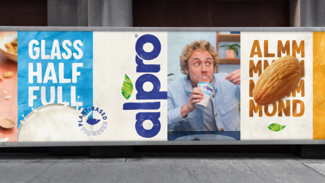
We focused on Alpro’s wider brand story and packaging touchpoints, where the updated design ramps up on championing delicious flavours through the visuals, language, brand voice and packaging design. This ‘Big on Flavour’ idea had to be translated across every possible aspect of the brand, so we ensured the evolved design focused on just that.
For example, the photography style on pack heroes’ individual ingredients with a rebalanced palette that combines vibrant whites with pops of colour to ensure the creative remains authentic to Alpro. In terms of copy, evolving the brand voice with descriptive language to help consumers navigate the variety on offer with ease was essential to deliver on the brief.
We also created a bold new typeface, ‘Alprolicious’, with Rachel Joy and Monotype, which paired with Alpro’s unique textures and delicious photography creates an exciting and tasty brand world that also packs a punch at shelf in the busy category.
Did you learn anything new during the project?
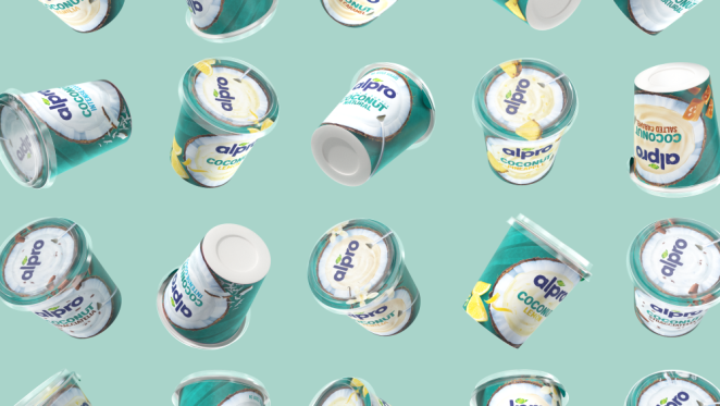
Beyond the core rebrand, we also had to consider how Alpro’s sub-ranges worked consistently with the updated identity. It was interesting to work on tweaked strategies for these ranges but simultaneously ensure they still worked well with the core portfolio. For example, when it came to Alpro’s premium coconut-based yogurts, we tweaked the big on flavour strategy to big ‘Big on Benefit’.
We dialled up the luxurious thick texture of the creamy yogurt in a coconut bowl, on a rich teal background texture, to remain in line with the overarching big idea of focusing on great-tasting ingredients and heroing the individual flavours of each product.
What was the biggest challenge? How did you overcome it?
It ties in together with the learnings we took in being able to navigate such a global portfolio to ensure there was consistency at the heart of the rebrand in Alpro’s vast offering.
We also had to ensure that the language and brand voice remained fairly simple given the many regions that the products are available in, meaning we had to ensure that all translations worked well across each language and market.
What details are you most proud of and why?
The continued and long-lasting partnership we’ve developed with the Alpro team. It feels really special to be able to continually evolve and develop the brand organically in line with our studio's Darwinian Branding style of thinking.
Having also been involved in the previous rebrand project of Alpro, I’m very proud of the decade-long partnership that we’ve built in this time and to have the client’s full trust to work closely on the brand to elevate it with time and consumer demands. It’s not something many people get to actually do.
What visual influences fuelled your solution?
The ingredients! The consumer insight brought to the brief was that Alpro’s target audience was not looking for a compromise on taste. In our previous rebrand, we ensured photography conveyed this sense of nature and purity, in line with Alpro’s perfect imperfections narrative. It was our ambition to retain that recognition and health credentials with this rebrand but looking at it against composition and scale.
We looked to hyper emphasise singular ingredients and hero them on-pack, celebrating the unique textures and flavours of Alpro’s products to deliver on the taste factor. Dialling up the focus of each ingredient in order to maximise taste also allowed us to highlight the tastiest part of the product.
What do you hope it achieves for the brand?
At the heart of the rebrand we wanted it to reaffirm Alpro as a category leader in a very saturated and competitive sector, developing a new sense of confidence with a clear focus on heroing big flavours – all whilst placing its consumers at the heart of the brand.
We wanted to strike the right balance between keeping it recognisable and timeless as core values, ensuring we respect Alpro’s authenticity and credibility, but also recognise how we could leverage consumers' emotional triggers and achieve great storytelling through doing so – whether that was the photography, brand voice, copy, and packaging touchpoints. I believe we’ve delivered on that ambition.
Credit list for the work?
Elmwood London Team
Executive Creative Director: Kyle Whybrow
Account Director: Amy Elliot
Design Director: Tim Wood
Design Director: Paolo Orazietti
Account Manager: Hannah Griffiths
Senior Designer: Francesca Birch
Midweight Designer: Alice Letten
Midweight Designer: Lauren Ahm
Head of Animation: Oli Minchin
Strategy & Provocation Director: Esther Hastings
Alpro Brand Team
Global Head of Brand: Charlotte Catteuw
Senior Global Brand Manager: Dot Moortgat
Global Brand Manager, Plant-Based: Kira Döring
Global Brand Manager: Martina Cucco
Senior Global Brand Manager: Joke Waelput
Freelancer/Other
Freelance Brand Designer: Arran Murphy
Photographer: Andy Grimshaw
Photographer: FoodPhoto
Lettering Artist: Rachel Joy Price
Lettering Artist: Monotype