
Welcome to our “Behind the Brand” series, where we delve into the stories behind the most compelling brand transformations. Today, we have the pleasure of speaking with David Thompson, the Creative Director at Turner Duckworth’s London office.
David's recent project was the rebranding of Vocation Brewery, a task fuelled by the team’s shared enthusiasm for crafting exemplary beer. We’ll explore how David and his team have redefined the brewery’s visual identity while capturing the essence of their relentless focus on brewing bold and beautiful beer for all.
What was the brief for the rebrand?
Vocation Brewery approached us directly to work on the project and let’s just say, being a team of beer lovers they didn’t have to twist our arm to get us on board.
How did the initial pitch/brainstorming phase go?
The beginning of the project was quality time well spent, forging a relationship with the client while gaining a greater understanding of the challenge ahead. Before pen was put to paper, workshops and interviews helped inspire and underline the brand’s story and positioning, a brand with so much potential waiting to be tapped.
Describe the purpose of the brand and its target audience
The brand is summed up by the newly-defined essence: ‘The single-minded pursuit of crafting exemplary beer’. Simply put… an obsessively relentless focus on brewing bold and beautiful beer, brewed for the many.
What was your thinking behind the rebranding solution?
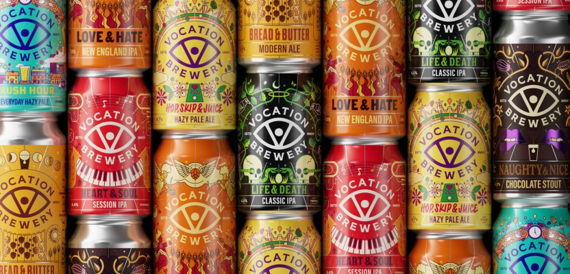
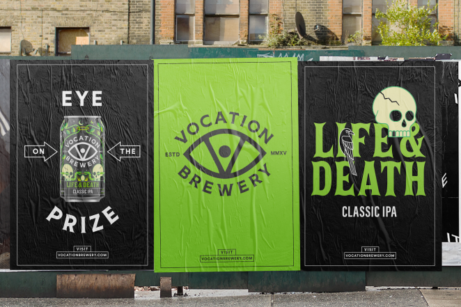
An eye has been part of Vocation since its inception but used inconsistently, disappearing from time to time. It was still loved by consumers, who continued to recognise the mark as the brand.
We saw the eye as being emblematic of the brand’s unwavering focus and visionary outlook on brewing. In a new central role, it keeps watch over the brewery, creating cohesion across media and providing an unmistakable visual asset that unites the brand.
Did you learn anything new during the project?
We are always learning something new – no two projects are the same. From a design point of view, given how much drinks can printing has progressed, the accuracy in application gave us the confidence to push for such eclectic designs.
From a client POV, just the importance of working openly and directly with the people who make the decisions. Building strong relationships and trust was key to gaining the backing of our vision, a true sense of togetherness and inclusiveness, building something great together as a team.
What kit/tools/software were used to create it?
The usual, from a trusty pencil and paper through to Adobe Creative Suite and ProCreate. Programs such as Miro helped with the challenge of working with US based Brian Steely on can illustrations from London, allowing us to share scamps in an instant, working agile, inputting and sharing no matter the time of day.
What details are you most proud of and why?
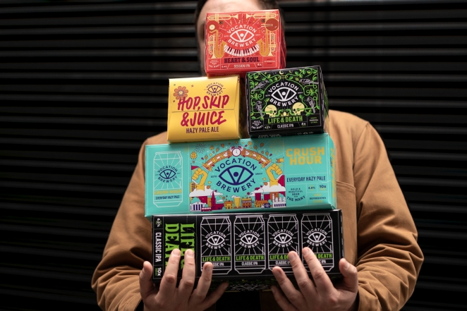
As we’ve seen on the craft beer shelf, any brand can create visual stand-out – that part is easy. With every can we designed, we wanted the visuals to match the bold and flavourful experience encountered with every sip. Each can was given a characterful and discoverable personality, a suggestion of occasion – from uplifting alfresco summer vibes to a smooth and soulful sessionable tipple to fuel your evening.
Truly successful brands have the patience and discipline to create brand stand-out. They tap into relevance and authenticity, standing for something important and leading consistently with a brand-first approach. When you start there the rest takes care of itself.
What visual influences fuelled your solution?
With equal parts precision and passion, Brian Steely’s approach to illustration is similar to Vocation’s approach to brewing.
At the very first stage of the project, a singular ref clipping drew our attention. From that point on we wanted to partner with Brian to develop the illustrations for all seven of Vocation Brewery’s core and most well-known beers. Brian’s attention to detail is phenomenal, offering something new to discover sip after sip.
What do you hope it achieves for the brand?
Introducing a partnership, a relationship to build a brand upon, a true visual style that can become synonymous with Vocation Brewery and a style that gives the brand the ability and agility to grow and continue to express themselves in creative and playful ways.
How do you ensure consistency in brand messaging and visual identity across various channels and touchpoints?
Continuing what the identity has been built on: teamwork, relationships, embracing collaboration. We hope to continue our relationship with the brand team, along with Brian Steely, on developing the packaging look and feel.
Our responsibilities as brand guardians doesn’t end with a guideline and an initial roll-out – we’re here to help find new creative partners as the brand looks to expand into channels beyond our means, ensuring the level and quality of creative is consistent for years to come.
Were there any unexpected insights or discoveries about the brand that emerged during the rebranding process?
This project was more than a visual identity. It was as much about the spirit of the brewery, as it was the people who work there. It was a 'return to roots', and our journey to strengthen the brand saw us strip back and reaffirm Vocation’s foundational principles: their commitment to brewing, and their belief that great craft beer should be for the many.
How did you ensure that the new brand identity resonated with the brand's existing audience while also attracting new ones?
As mentioned earlier, the project was very much a journey revisiting the roots of the brand; roots we learnt were very important to the diehard Vocation fans. We’ve brought back iconography that was loved by consumers and embraced old stories whilst rewriting new chapters.
But of course, Vocation Brewery isn’t a brand that looks backwards – the eye is emblematic of the brand’s unwavering focus and visionary outlook, the update had to continue to look forwards, stay relevant and exciting for new and existing customers alike.
What would you do differently if you could do it over again?
Too soon to say, in hindsight you always look back and say ‘what if’, but it's so freshly brewed we’re very much happy how it turned out and look forward to seeing it grow.