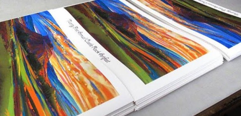

For many artists, illustrators, photographers and designers, a piece does not feel truly finished when it is exported, uploaded or added to a portfolio. It becomes finished when it exists as a physical print, with scale, paper, colour and texture working together.
That is where giclée printing has become such a useful option for creative professionals. It is not just a way to reproduce an image. It is a way to turn artwork, photography or digital design into a finished physical piece that can be sold, exhibited, handled and remembered.
For creatives producing editions, preparing portfolios or planning exhibitions, print quality matters. The final piece needs to reflect the intention of the work, not simply copy what appears on screen.
What Is Giclée Printing?
Giclée printing is a high-quality digital printing process used for fine art reproduction, illustration and photography. It is usually associated with high-resolution inkjet printing, pigment-based inks and specialist papers designed for detailed, long-lasting results.
The term helps separate professional fine art prints from everyday digital prints or mass-produced posters. For creatives, that distinction matters. A giclée print should preserve the tone, colour, detail and atmosphere of the piece, rather than making it feel like a generic reproduction.
Understanding what makes a print helps place giclée within a wider creative tradition. It is not only a technical output. It is part of how an image becomes a physical object.
When the aim is to reproduce artwork with accurate colour, strong detail and a paper choice that suits the piece, professional giclée printing becomes part of how the finished work is experienced.
Why Creatives Choose Giclée for Fine Art Prints
Artists often choose giclée because it offers control. The process is especially useful when reproducing paintings, drawings, digital illustrations, mixed-media pieces and photography where tone, texture and detail matter.
Giclée printing is commonly used for:
-
Limited edition prints: Artists can create sellable editions of original work while maintaining a professional standard.
-
Portfolio work: A physical print shows scale, paper texture and finish in a way a screen cannot.
-
Exhibition pieces: A consistent print process helps a body of work feel coherent when displayed together.
-
Client presentation: Designers, illustrators and photographers can make pitches or concepts feel more considered.
-
Art sales: A well-produced print can give buyers more confidence in the quality and longevity of the piece.
For artists selling their work, giclée can also make original artwork more accessible. A buyer may not be able to purchase the original, but they may still want a carefully produced print that carries the character of the piece.
For many creatives, giclée is one part of a broader fine art printing for artists approach, especially when work is being prepared for sale, portfolios or display.
Giclée Printing vs Standard Photo Printing
Standard photo printing can be suitable for everyday photographs, quick display prints or personal images. Giclée printing is usually chosen when the print needs to meet a more considered creative or archival standard.
As a form of digital print, giclée sits between creative image-making and physical production. It allows artists and photographers to think carefully about how a file or original artwork becomes a finished object.
The key differences are usually found in:
-
Paper choice: Giclée prints are often produced on fine art papers, including smooth, textured, matte and archival stocks.
-
Ink quality: Pigment-based inks are commonly used because they support colour depth and long-term stability.
-
Creative control: The artist can choose a paper and finish that supports the mood of the work.
-
Detail: Subtle gradients, fine lines, brush marks and surface textures can be preserved more carefully.
-
Purpose: Standard prints may suit casual display, while giclée is often used for editions, exhibitions and professional presentation.
This does not mean standard photo printing has no place. It simply means giclée is usually the better choice when the final piece needs to feel considered, collectible or suitable for professional display.
Preparing Artwork for Professional Printing
Strong print results begin before the file is sent to the printer. A piece that looks sharp and vibrant on screen may not automatically translate well to paper.
Before ordering a print, creatives should check:
-
Resolution: The file needs enough detail for the intended print size.
-
Dimensions: Artwork should be prepared with the final physical size in mind.
-
Cropping and borders: These should be decided before printing, especially for editions or framed pieces.
-
Colour profile: Colour settings can affect how accurately tones are reproduced.
-
File format: High-quality files are usually better suited to professional printing than compressed images.
-
Proofing: A test print can reveal colour, contrast or paper issues before a full run is produced.
Screens use light to display colour, while prints rely on ink and paper. This means the same image can appear differently depending on the screen, printer, paper and lighting conditions.
A proof or test print is often worth the extra step. It gives the artist a chance to judge colour, contrast, detail and paper choice physically, rather than relying only on a monitor.
Paper, Colour and Finish: What Affects Print Quality?
Paper choice can change the character of a print completely. The same artwork can feel crisp, soft, textured, muted or vivid depending on the surface it is printed on.
Important print quality factors include:
-
Texture: Textured papers can add depth to painterly, hand-drawn or mixed-media work.
-
Surface finish: Matte finishes reduce glare and often suit fine art, illustration and gallery display.
-
Paper tone: A warm paper can soften an image, while a brighter white paper can create a cleaner look.
-
Weight: Heavier papers can make a print feel more substantial and collectible.
-
Detail retention: Fine lines, brush marks, grain and texture need to be preserved clearly.
These choices are not only technical. They affect how the work feels. A paper that suits a photographic portrait may not be right for a detailed architectural illustration or a delicate pencil drawing. The material decision should support the creative intention behind the piece.
Creating Exhibition-Ready Prints
When work is being prepared for an exhibition, the print needs to do more than look good on its own. It has to work within a physical space, often alongside other pieces.
Artists and photographers should think about:
-
Scale: A print that feels strong on a desk may look too small on a gallery wall.
-
Viewing distance: Larger work may be viewed from further away, while smaller pieces invite close inspection.
-
Series consistency: Paper, borders, colour treatment and finish should feel coherent across a body of work.
-
Mounting and framing: Presentation choices can change how complete and professional the work feels.
-
Deadlines: Proofing, printing, drying, mounting, framing and delivery all need time.
For creative professionals preparing work for public display, exhibition-ready prints need to be planned around scale, viewing distance, paper choice and final presentation, not treated as a last-minute export.
Choosing a Fine Art Printing Service
Choosing a fine art printing service is not only about cost. The quality of the finished print depends on materials, equipment, colour knowledge and experience with creative work.
A good fine art printing service should offer paper choice, file preparation guidance, proofing options, consistent colour reproduction and support with sizing, borders and finishing. The best results often come from working with a printer that can advise on paper choice, colour output and finishing, not simply output the file as supplied.
For creatives selling editions, preparing portfolios or getting ready for an exhibition, giclée printing can turn a digital file or artwork into something with presence. A strong giclée print should feel like the finished form of the work, with colour, paper, scale and presentation supporting the original idea.