
Every designer knows the uncomfortable truth about beauty: it gets the download, and then it's done. In a crowded digital market, aesthetic appeal is the entry ticket, not the retention strategy. The apps that keep users for years are the ones that treat visual design as the surface of something deeper, a deliberate psychology of hierarchy, micro-interaction and friction removal that moves people from casual browsing into sustained engagement without them ever noticing the mechanism.
Entertainment platforms are where this craft is most visible, because the stakes are unusually honest. Nobody needs an entertainment app. If the experience grates for even a session, the user is gone, which is why the category has become a running masterclass in engagement design.
The Visual Psychology of Engagement
The foundation is cognitive load, the mental effort an interface demands of its user. Nielsen Norman Group's guidance on minimising cognitive load remains the sharpest articulation of the principle: every element a screen displays competes for a finite budget of attention, and anything that isn't helping is actively costing. Top-tier entertainment products apply this ruthlessly. Dark-mode environments reduce visual fatigue in long sessions and make content glow. Contrasting colour is rationed to core action items so the eye is guided, not lectured. Transition animations carry the user between states smoothly enough that the interface feels physical rather than paged. This is choreography more than decoration, and it builds the sense of premium quality that keeps a product on the home screen. The industry has argued for a decade over how far interfaces should mimic the physical world versus abstract away from it, an argument running through every serious piece on UI trends since flat design won its first round. Entertainment design is where that argument gets settled, because there the stakes are retention rather than taste.
Case Study: Translating Physical Suspense to a 2D Screen
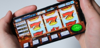
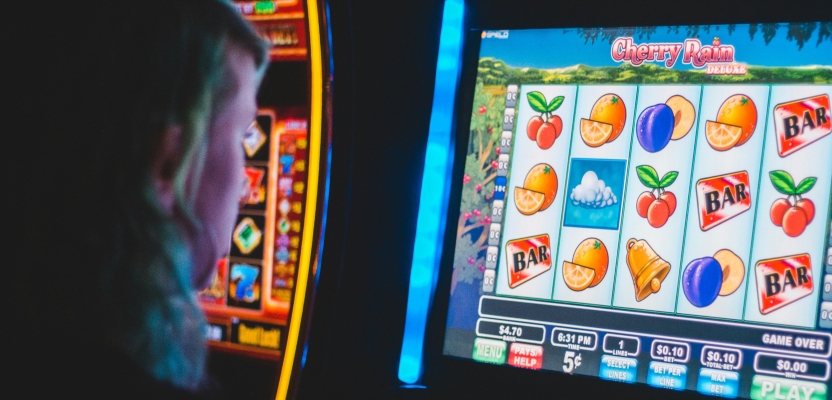
The ultimate stress test of that argument is skeuomorphism's hardest job: taking a tactile, real-world experience and compressing it onto a pocket-sized display without losing the tension that makes it worth having. Slot machines digitise relatively easily; the loop is already screen-shaped. Roulette is a different order of problem, because the real thing is an event: a physical wheel, a ball obeying real physics, a table of bets placed by human hands, all happening live.
The design triumph happens when an application replicates that physical tension on a mobile display, which demands an orchestra of elements: high-definition video streaming balanced against real-time, low-latency interactivity. The experience delivered by a premium-level roulette game shows how much of the job is spatial hierarchy. The screen has to split focus between a crystal-clear live stream and an intuitive betting grid without tipping the user into cognitive overload, and the margin for error is a few pixels either way. The stream carries the drama, the grid carries the interaction, and the layout's job is to let attention move between them in a single glance. Get the hierarchy wrong and the user is managing the interface instead of experiencing the event, which is precisely the failure the whole discipline exists to prevent.
The Interface That Disappears
The lesson generalises well beyond any one category. Exceptional application design builds an environment so coherent that the interface fades from conscious attention, leaving only the experience it delivers. Good aesthetics persuade users to open an app; whether they keep it comes down to execution they never have to think about, which is a much harder brief, and a much quieter one.