
In this candid conversation, Tim Noble and Graeme Haig from Design Bridge and Partners London pull back the curtain on a campaign that dared to celebrate authenticity in its rawest form. Challenged by Laphroaig to transform genuine, offbeat fan quotes into a bold, visual narrative, the duo harnessed everything from “sideways kicks from a sea-soaked donkey” to the passionate intensity of whisky aficionados.
With a rapid turnaround that took the project from brief to breakthrough in under three months, their creative journey became a masterclass in turning unconventional insights into an unforgettable, iconoclastic story of Laphroaig.
What was the brief?
Graeme Haig: Laphroaig is an icon in the single malt whisky category and envisions being the undisputed icon of Islay by 2040. It already has quite the following… The Friends of Laphroaig is the largest whisky appreciation community in the world. A community that is all too keen to offer up their opinions on the drink they love. Their words of appreciation reflect the unforgettable impact of the whisky’s intense flavour and the wonderfully weird beauty of its Islay home. Laphroaig’s brief to us was to take the established brand proposition and celebrate these real words of real fans as one visually compelling creative platform.
How did the initial pitch/brainstorming phase go?
Graeme Haig: Design Bridge and Partners created the Brand Identity for the whisky, so we already knew the brand inside and out, but this was our first opportunity to create an advertising campaign for them. We brought in people from inside the business with experience in comms campaigns and gave them the challenge of taking these authentic descriptions of a whisky people love and bringing them to life. Our creative hook was in the very words themselves. At first glance they come across as the words of people that dislike (even hate) the thing they are describing. But actually, they all come from a place of love. Their experience of Laphroaig paints pictures in the drinker’s minds. And we wanted to bring them to life in ways that are as individual as they are. We saw an opportunity to elevate them into something visually compelling. If experiencing Laphroaig is ‘something you never forget’, then we should create something unforgettable.
Obviously, that’s easier said than done, but using this as the foundation for our initial concept, we created a larger campaign that included the brand’s first TV series in years.". This added momentum and allowed us to create a cohesive narrative that tied the visual design to the broader storytelling efforts. The goal was to celebrate the words of Laphroaig’s most loyal advocates while presenting them in a way that felt modern, artistic, and unmistakably Laphroaig.
What was the process behind ideating the concept?
Tim Noble: To say the process was quick would be an understatement.
We went from briefing to delivering all the campaign assets and a TVC in under three months.
From the original phone call to commissioning a director and entering preproduction, it all came together at breakneck speed. In fact, within three days of our first creative sprint, we were already presenting a tissue session to the client. That pace isn’t typical, but we weren’t starting from scratch; the quotes were already there, forming the backbone of the idea. Our challenge was to bring them to life in a way that did them justice.
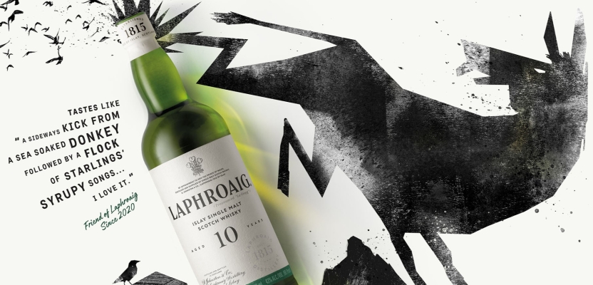
The quotes themselves are amazing. It’s quite intimidating as a writer to be confronted by some of them. And naturally you’re drawn to the more extreme ends of the spectrum. And there are some really ‘out there’ ones. Half the battle was deciding on ones we all agreed upon, for every “sideways kick from a sea-soaked donkey”, there was a “sweating pig standing next to a trawler” just prodding you to be brought to life. The most challenging part was articulating the concept of “some things you never forget”. There’s lots of things you don’t forget, but what tied it to Laphroaig. At one point Graeme held up his laptop and he had replaced the ‘f’ in unforgettable with the ‘ph’ from Laphroaig. Again as a writer, somewhat annoying, but that was it. Unphorgettable. Something so uniquely and distinctively Laphroaig. Something no one else could claim. We were off…
It was a very experimental process, with an incredible level of creative freedom, thanks in large part to our existing relationship Suntory Global Spirits. The client was very receptive, embracing bold, artistic ideas, which allowed us to push boundaries. There were moments of playful exploration - a member of the Laphroaig team even suggested they loved a “ransom murder pig” idea we’d played with, “too far for this, but maybe one for the real Friends”
What was the biggest challenge during production? How did you overcome it?
Graeme Haig: The tight time frame. That was the biggest challenge. But it just poured petrol on the fire. The pressure pushed everyone to experiment with bold, innovative ideas. Rather than feeling restricted, the condensed timeline created a sense of urgency and focus that led to some of the most exciting and unexpected concepts of the entire project.
What kit/tools/software were used to create the project?
Graeme Haig: The brand is rooted in authenticity, it’s fundamentally human, and relies on a genuine connection to its heritage and its community. For that reason, we ruled out any shortcuts using technology and focused on tools and processes that reflected the real, human quality of the quotes and the brand itself.
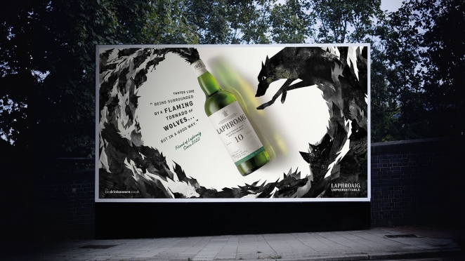
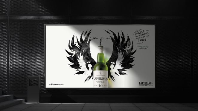
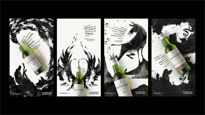
By combining innovative illustrative and film techniques, we’ve brought to life experiences powered by the evocative power of the quotes. For our sea-soaked donkey the illustration’s bluntness is exaggerated by the delicate murmuration of starlings, the intensity of the flaming tornado of wolves is brought to life through the fiery ripples and smoky treatment that runs through their fur… all the illustrative executions are routed in the building blocks of the quotes. For ‘Ocean’ for example, the illustration medium is water-based to reflect the basis of the Friend’s words. Our director embraced this fundamental in his approach to the visual storytelling. We experimented with viewing the story from unique perspectives, such as practically shooting scenes of the protagonist emerging from the bottle rather than relying solely on post-production. The unique yet believable world inside the bottle was created through physically building a glass container filled with 12 bottles of Laphroaig and shooting through it to achieve a beautifully distorted effect. It was all about merging the physical and animated worlds in a way that felt authentic and tactile.
The production was full of these playful, inventive moments that truly captured the spirit of Laphroaig. The execution wasn’t just about creating another product ad; the product itself became integral to the storytelling. Whether through print or film, the ads captured the essence of Laphroaig—not just as a whisky, but as a transformative experience. From the moment you encounter it in the smell alone.
What is one funny or notable thing that happened during production?
Tim Noble: One of the most memorable parts of the production was shooting at The George in Whitechapel, a historic music pub brimming with character.
We were working against the clock, knowing we had to wrap everything up by 6pm because a gig was scheduled that evening. It created this brilliant mix of pressure and creativity as we worked in such an atmospheric location. Adding to the quirkiness, we recorded voiceover snippets in the attic of the pub. It was such a strange setting. (Definitely haunted).
What’s the main message of this project and why does it matter?
Tim Noble: The main message of this project is that there’s nothing more authentic than a brand using the power of real words from real people to create something truly unforgettable. By celebrating the Friends of Laphroaig we hope to capture the unique character of the brand but also reinforce its deep connection to those who love it.
This campaign isn’t just a one-off idea; it’s designed to be a platform with longevity. It provides the brand with a foundation to build upon in the future, exploring new ways to tell its story while staying true to its essence. It opens the door to a range of possibilities, showcasing the passion and personality of the people who make Laphroaig what it is. By grounding everything in authenticity, we’ve created something timeless, ensuring the campaign can resonate across different formats and evolve alongside the brand.
Can you describe the creative spark or inspiration behind the initial concept? Was there a specific moment or insight that ignited the idea?
Graeme Haig: The creative spark? The initial phone call. When our clients, Chris and Fleur, both used some frankly unbelievable descriptions of Laphroaig. We all left the call with the same buzz of excitement. The more we looked at them the more amazing they became, the descriptions are unbelievable and so eloquent. What stood out was how many of these words weren’t traditionally positive; in fact, some were divisive or even harsh at first glance. But that was the beauty of it. These seemingly negative descriptions were actually a reflection of pure love for Laphroaig, celebrating its bold, unapologetic character.
Instead of trying to soften the edges, we highlighted them, using these words to tell a story that’s as distinctive as the whisky itself. It was this unapologetic honesty that shaped the entire campaign, making it a true celebration of Laphroaig’s character and the people who love it..
Were there any alternative concepts or ideas considered during the ideation phase? If so, what led to the selection of the final concept?
Tim Noble: Yes, we explored a variety of alternative concepts during the ideation phase, as the condensed timeline encouraged us to go bold and experiment widely. In just three days, we developed a range of “out there” ideas.
Ultimately, the decision came down to clarity and authenticity. While these ideas were creatively exciting, they didn’t feel as direct or impactful as the illustration-led approach. The beauty of the quotes lies in their honesty and immediacy - they are raw and evocative, and the illustrations allowed us to amplify that without overcomplicating the message.
The illustration concept stood out because it felt true to the brand’s essence: human, unpretentious, and deeply connected to the sensory experience of Laphroaig. It allowed us to craft a visual language that not only told the story of the whisky but also reflected the bold and divisive character that Laphroaig is known for.
What role did consumer research or market analysis play in shaping the concept and its execution?
Graeme Haig: Consumer research played a pivotal role in refining the concept and ensuring its resonance across different markets. The quotes themselves were a form of organic consumer insight, capturing authentic reactions to the Laphroaig experience from its passionate community. These provided a strong foundation, but we took it further by testing the imagery and creative elements to gauge their impact.
The results were fascinating and revealed intriguing cultural nuances. For instance, the wolf imagery had universal appeal in the UK, striking a chord with its bold, untamed character. In Germany, however, it was the donkey - a more unexpected and playful visual - that resonated deeply, particularly the idea of the "sideways kick" metaphor.
These insights shaped how we tailored the campaign to different markets. While the overarching concept remained bold and unapologetic, we recognised the importance of nuance in how the story was told. It reinforced the idea that even within an intentionally divisive campaign, there’s room for creative subtlety to engage audiences in ways that feel authentic to their cultural context.
Can you discuss any unique or unconventional production techniques or approaches used to bring the idea to life?
Tim Noble: Authenticity was at the heart of every decision in this campaign, and that focus shaped some truly unique approaches to production. The concept was built around the voices of Laphroaig fans speaking directly to their peers, which is quite unusual for a whisky campaign. It wasn’t about overly polished storytelling but rather capturing something real, human, and relatable.
To bring this idea to life our director, Ludovi Gontrand, framed the entire narrative as a conversation around a fire. In this case, the fire symbolically became the bottle of Laphroaig, serving as the central element that brought people together. Casting was absolutely crucial here. We needed individuals who genuinely connected with each other, people who felt like real friends sharing stories and laughter. This camaraderie was vital to creating a natural and believable atmosphere on screen.
The result was something that felt intimate and authentic, with a genuine chemistry among the cast that viewers could instantly sense. By grounding the production in authenticity and focusing on the human connections that Laphroaig inspires, we created a campaign that not only captured attention but also resonated deeply with its audience.
How did you ensure that the concept remained innovative and stood out in a crowded marketplace?
Graeme Haig: The whisky world often leans into traditional imagery - solo appreciation in wood-panelled rooms with crackling fireplaces. We consciously broke away from that. Our campaign was stark, clean, and entirely focused on embracing the bold and unusual experiences that set Laphroaig apart.
Rather than dictating what people should think or taste, the campaign leaned into the idea of interpretation. It wasn’t about telling people what they should find in the whisky or whether they were “right” about the tasting notes. Instead, it embraced the divisive nature of Laphroaig, allowing the voices of others to share their unfiltered, sometimes unexpected, experiences. This honest, unapologetic approach was a refreshing departure in a category that often prioritises tradition over individuality.
By acknowledging and celebrating the fact that Laphroaig isn’t for everyone - and leaning into that divisiveness - we created a campaign that felt authentic and daring. It stood out by inviting audiences to form their own opinions, rather than prescribing how they should feel, think, or taste. This made it not just a whisky ad, but a statement about the brand’s unique place in the market.
What do you hope it achieves for the brand?
Graeme Haig: We hope this campaign sets the foundation for the longevity of the platform. This is just one chapter in a broader story about what makes Laphroaig unforgettable. It’s not a one-off, flash-in-the-pan idea but part of a deliberate effort to redefine how the brand communicates and resonates with its audience.
By clearly articulating and celebrating what it means to be “Unphorgettable,” we aim to position Laphroaig as a bold, uncompromising challenger in a traditionally conservative whisky space. The campaign seeks to inspire a new attitude around whisky - one that’s more dynamic, expressive, and open to interpretation, while still honouring the brand’s deep heritage and distinctive character.
Tim Noble: As the brand grows, the goal is to push boundaries further, using this bold platform to connect with audiences in a way that feels fresh and unapologetically true to Laphroaig’s identity. It’s about building a lasting legacy, challenging conventions, and ensuring Laphroaig continues to stand out as a whisky like no other.
Credit list for the work?
Brand: Laphroaig
Agency: Design Bridge and Partners
Executive Creative Director: Stuart Radford
Creative Partner: Adrian Burton
Senior Creative Director: Graeme Haig
Creative Director: Tim Noble
Senior Designer: Ruby Douglas
Senior Designer: Dan Cramer
Executive Producer: Christine Richter
Executive Producer: Jane Rattle
Client Partner: Jon Sloneem
Client Partner: Jemma Akister
Strategy Partner: Adam Sefton
Senior Client Manager: Monica Yogaretnam
Global Brand Director: Fleur Maguet
Global Marketing Manager: Belén Silva
Managing Director, Scotch & Irish: Chris Richardson
Director: Ludovic Gontrand
Production Company: Pulse
Sound Designer: Munzie Thind
Post production: Welcome to Love
Producer: Irina Liechti
Photography and Retouching: Nathan Jordan
Designer: Ben Warner
Lewis Son: Senior Motion Designer
Freeland Senior Designer: Scarlet Shillingford
Freelance Senior Motion Designer: Same Harvey