
Each month, a member of the Whistlejacket team picks a piece of work they have seen that's nothing to do with either themselves or the agency, but they really wish it did. Because they love it so much. This month, Designer Caitlin McIntosh has picked the Pohoda Music Festival identity created by Andrej & Andrej.
Pohoda Festival
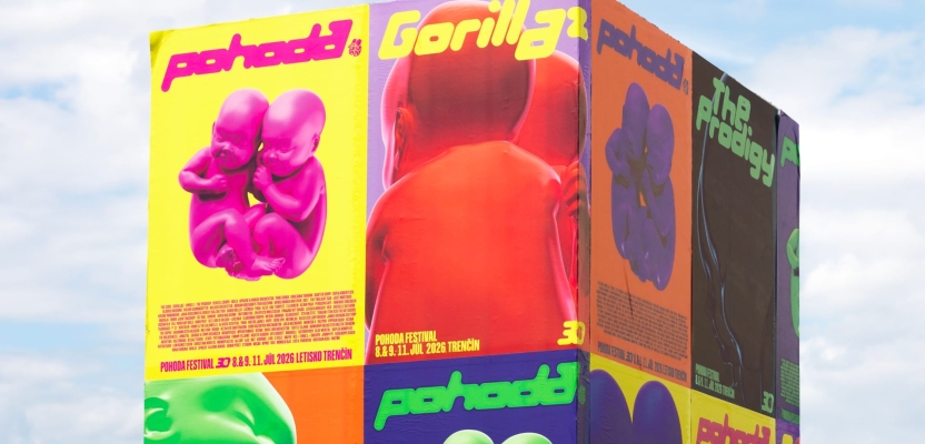
For its 30th anniversary, Slovak music and arts festival Pohoda has had a rebrand by Andrej & Andrej – a Bratislava based design studio. They’ve managed to make it feel completely new, while retaining its history and identity.

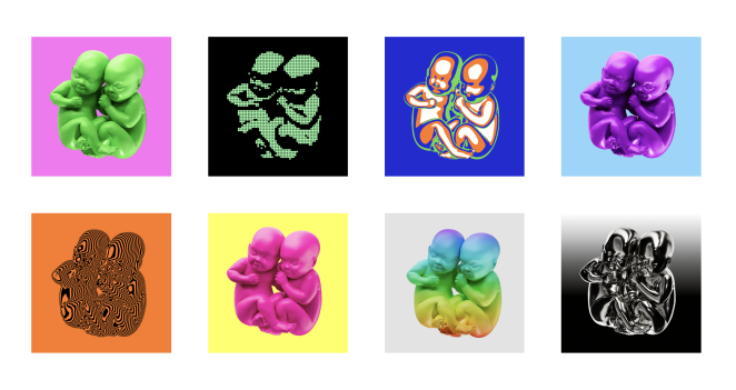
The babies logo has been part of Pohoda’s identity since 1997, so rather than ditching a recognisable symbol just for the sake of a brand refresh, the studio took it back to its original, three-dimensional form. Using CGI, they’ve turned the pair of babies into a flexible asset that can shift between different materials, textures, colours and levels of abstraction. One minute they’re shiny, sculptural objects, and the next, they’re reduced to lines, halftone dots, or almost heatmap-like visuals. It gives the identity a lot more variety without losing the thing that makes it recognisably Pohoda.
The standout element for us is the custom typeface. Inspired by the festival’s own lettering from before 2010, they took those original forms and developed them into a full display typeface. The rounded, geometric letterforms have a playful, futuristic feel – somewhere between retro rave graphics and something you might see on a sci-fi poster.
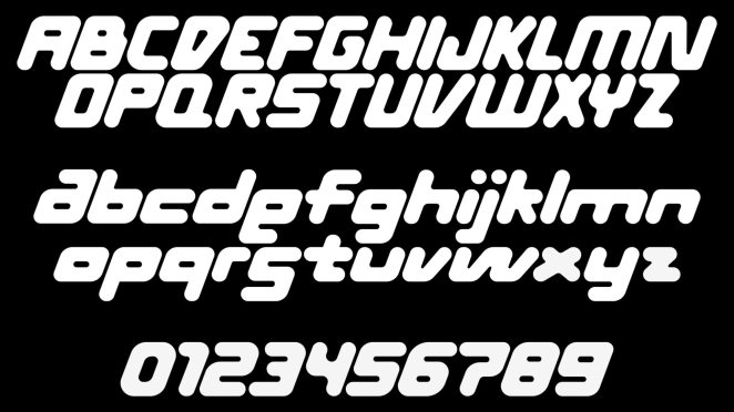
The most interesting bit is how the typeface handles the lowercase ‘a’, ‘e’ and ‘s’. These letters share the same cap height as the uppercase letters and can sit either on the top or bottom of a line, giving the words personality and an element of unpredictability. This means artist names aren’t just typed and dropped into a layout. They become compositions in their own right, with different rhythms and shapes depending on the name. It’s a small detail that opens up so many possibilities.
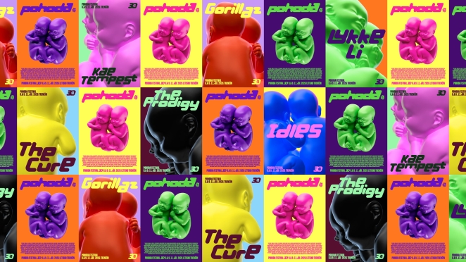
The typography is good at holding everything together. Because it has such a distinctive character, the artist's names become part of the visual identity rather than information that needs to be squeezed into a line-up. By drawing from the festival’s own visual history, the identity feels new without feeling disconnected from what came before.
At first, the combination of 3D babies, oversized lettering and bold, contrasting colours feels like a lot. There’s something quite surreal about turning an already unusual logo into these big, 3D, shiny objects, and then pairing them with typography that seems to ignore every rule we were taught about typesetting.
But we think that’s exactly why it works. This festival isn’t static, so why would it have a static identity? It’s energetic, experimental and erratic, which makes sense for an event like this – one that brings together music, art and multiple generations of people.
What we love most is how far Andrej & Andrej have pushed two already existing elements instead of just starting from scratch. The typeface feels genuinely designed for the festival, rather than chosen just because it fits well, and it gives the festival so much room and freedom to play across posters, merch, stage visuals, and all assets.
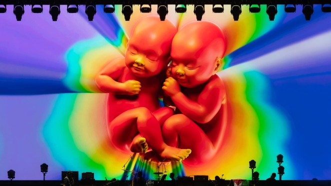
It’s a project that makes us envious because every decision feels intentional, but the end result still feels playful and free. It’s a reminder that a strong identity doesn’t have to look the same all the time, and sometimes it’s good to break the rules and be a bit weird.



Richard Morris Thursday this week, around noon
Lovely.