
Consumer Behavior
There is a lot that goes into advertising, promotion, and the selling of products. When a company has something that they want the rest of the world to invest in, they must utilize several different tools across multiple sectors in order to attract an audience. This, of course, involves tantalizing product descriptions, leveraging social media to appeal to a wider audience, catchy jingles, stellar reviews, and the overall quality of the product or service, but one thing that is often overlooked is color.
We use colors to make sense of the world around us, to differentiate between the things we are seeing, but they also have a much deeper role in the human psyche that effective designers know how to manipulate. Different colors suggest different moods and emotions, which makes all of them a tool at the designer's disposal. In this article, we’ll take a look at how designers use color psychology to influence consumer behaviour on a massive scale.
Flashing Lights
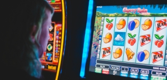
Before we delve into the associations of particular colors, let's first address how multiple brands and companies use flashing lights, in all manner of colors, to attract customers. This is a technique that has proven highly effective for entertainment companies as a way to attract footfall. Think theme parks, arcades, and casinos, all of which make use of flashing lights to attract and, almost mesmerise, their users.
Flashing lights in all kinds of colors uniquely speak to us. They suggest fun, excitement, and a sense of timelessness. Nowadays, many online casino platforms make use of flashing lights on their slots and crash games because of the way they not only help ease players into an excited mindset, but also create a sense of urgency in the player, which is likely to help compel them to keep playing. As eSportInsiders insights reveal, there are several other tactics, such as the promise of anonymous play, impressive bonuses, and cryptocurrency integration, that these gambling companies use alongside flashing lights to ensure customer retention. A similar thing happens in arcades and theme parks, where, when surrounded by flashing lights, we tend to lose all sense of the world outside our own experience and are happy to spend hours immersed in the fun we are having.
Calming Colors
Various designers use what we consider calming colours as a way to market the products of the companies they work for, and this has proven highly effective. Among calming colors, we have turquoise and blue. Although each can be grouped together, they all do different things, and designers know which colors to use in order to evoke specific emotions.
Turquoise- Out of all the ‘calming colors’, it is turquoise that evokes the greatest sense of peace. Popular brands that have made use of this color in their marketing include Pampers and Happy Skin. This makes sense as both are baby related brands. Although being a parent might not always be the most calming thing, both brands are known to advertise the beautiful and quiet moments of parenting.
Blue- The colour blue in psychology is heavily connected to the mind. It is a colour that not only connotes a sense of calm, but also clarity and communication. These are all things brands are likely to want to be known for, which could be why 33% of brands use blue as their primary color. Blue tends to be utilized by companies that value security and privacy, such as Dropbox and PayPal, due to its role as a ‘trustworthy’ and cerebral color.
Exciting Colors
Some brand designers will also use color psychology to induce feelings of excitement and elation in consumers. Red and yellow are at the forefront of exciting colors in marketing, and both play crucial roles when it comes to attracting and retaining customers on a massive scale.
Red- Where blue is often considered the color of the mind, red takes the role as the color of the body. This is a color that evokes passion and excitement and has proven highly effective in marketing. There is a reason that all sale signs are often displayed against red backgrounds, like flashing lights; they suggest a sense of urgency, prompting customers to take immediate action. Several brands, such as Netflix and Coca-Cola, expertly use the color red in their logo designs to fuel both excitement and desire in their customers. Red is a color with a statement, and the statement is, ‘We have something you want.’
Yellow-Yellow is not as popular as some of the other colors in brand logos, but where it is found, it really shines. Like red, yellow is considered a positive and vibrant color, but it is a little more muted than the high-energy impact that red delivers. Instead, yellow in branding can induce a sense of joy, creativity, and playfulness, which is why it is the perfect match for both Bic and McDonald's. On the other hand, yellow is also a warning color that indicates danger and thrill seeking, which is why it is used by sports car makers such as Ferrari and construction manufacturer CAT.
Dark Colors
Graphic designers for brands often also regularly make use of darker colors, especially if they want to stand out amongst other, more vibrant retailers. Darker colors, such as brown and black, often convey an air of sophistication and luxury. They are serious colors, often adopted by brands that want to appear refined to their customers.
Brown- As a darker color, brown has that serious tone that brands want to make use of, but with the added benefit of seeming a little warmer and welcoming than black. As a color, brown connotes a sense of sturdiness and reliability, with a grounded, earthy manner. An excellent presentation that works well for brands such as Henry’s Tavern and the University of Wyoming.
Black-Black is the darkest of all colors. In fact, black is not really a color itself but simply the absence of all color, which becomes quite a statement for some brands. Brands adopt the color black when they want to appear dignified, serious, and at the top of their game. It is often a color favored by computer-driven brands such as Sony or television-related companies such as ABC and BBC.