

As one of the world’s most luxurious car brands unveils a refreshed logo, our Client Relationship Director, Paul, looks at why many in the automotive industry are opting for a pared-back identity.
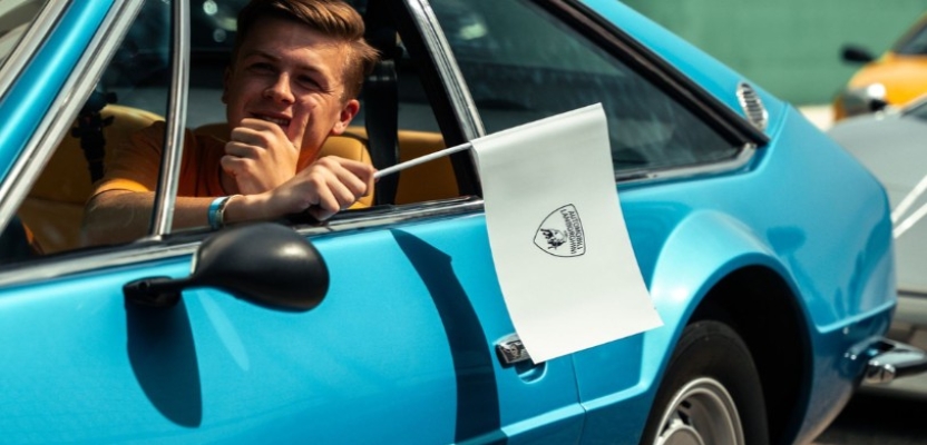
Lamborghini. A brand that’s synonymous with luxury, performance and unmistakable design. The ‘Raging Bull’ has adorned the walls of teenage bedrooms for decades. But for the first time in nearly 25 years, its logo has changed. And while it’s not a radical redesign, the subtle evolution is enough to raise the eyebrows of car lovers and designers alike.
It’s part of a consistent recent theme we’ve seen across the sector, with car manufacturers flattening and stripping back their identities. Some of this can be pinned to modern digital demands, but it also signifies a wider industry trend to simplify and sharpen at every opportunity.
Less isn't always more
In a rapidly evolving landscape, digital integration and innovation is driving a small but significant shift in brand strategy for automotive’s leading firms. Its intention is largely aimed at better adapting to digital platforms, but this raises questions about the risk that brands face in changing their unique assets and long established codes.
And that’s because perhaps even more so than other industries, a car brand’s logo is a distillation of their essence, heritage, and the dreams they sell to drivers. These symbols, historically luxurious and often three-dimensional, stand as a testament to the brands’ craftsmanship and attention to detail, evoking emotions, aspirations, and a sense of belonging. But as we delve further into the digital age, the rich tapestry of colour and intricate design that once defined the most iconic brands is being replaced by a flat, modern, monochromatic look. This transition, while streamlined for the digital realm, risks sidelining the deep emotional connections created by more established logos.
Rev down to Electric Avenue
Lamborghini’s redesign perfectly illustrates this trend towards minimalism, sacrificing the bull’s detail for a simplified vector silhouette. While this tweak undoubtedly works better online and onscreen, it seems to overlook the essence of what makes a brand like Lamborghini distinctive: its boldness and somewhat lavish character.
As our Creative Director, John, pointed out in a previous blog, distinctiveness is not just about being different but about being memorable and easily recognisable. Moves to flatten and simplify logos must tread carefully to avoid undermining the unique iconicity and heritage that sets these brands apart.
The pivot to electric vehicles (EV) is commonly cited as a catalyst for this brand evolution. And while embracing the future is crucial, it shouldn’t come at the expense of the distinctiveness that’s long defined the brands.
In the race to electrify, many established car brands are facing increased competition from start-up brands based in China. With no heritage to call upon, these new brands are putting digital connectivity and cost at the heart of their offering. Backed by strong government support and low labour costs, some analysts estimate legacy brands are up to three years behind their Chinese EV counterparts. This means that the established brands will need to draw on other brand codes to win the attention of buyers. In a recent interview with Autocar Magazine, Porsche design boss Michael Mauer said that heritage will be a key differentiator that gives European car makers the edge over new startups from the Far East and elsewhere.
Preserving soul in a digital age
Turning to flat design might be perceived as an effort to remain relevant, but it risks neglecting the power of a brand’s history and emotional resonance. After all, distinctiveness and differentiation are pivotal for a brand’s survival and success. In a digital world prone to homogenisation, brands that maintain their unique identity and character will continue to captivate and inspire.
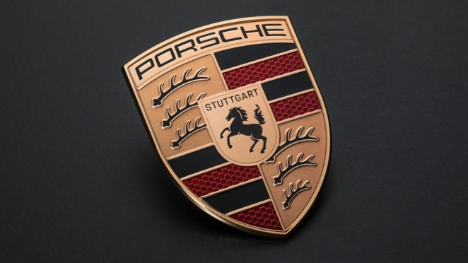
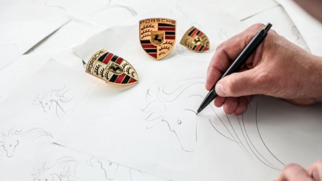
Porsche is one brand that has managed the transition well. As part of their 75th anniversary year, the German manufacturer subtly reshaped each element of their logo to keep it current in the age of electrification. While commonly associated with Ferrari, Porsche’s rampant horse is adopted from the city of Stuttgart. Their first badge bore the name of the company, as well as its home city, with the black and red colouring and deer-antler motif lifted directly from the state shield. And the refreshed crest maintains the form and dimensions of the original but tightens up every element.
Every facet is different, including a softer coloured gold, a finely tapered bevel around the edge, the application of clear brushed metal surfaces behind the antlers and a new 3D honeycomb pattern for the red stripes. The word ‘Stuttgart’ now uses Porsche’s own typeface and the horse itself has been redrawn to be bolder and less stylised. By preserving 75 years of history, the brand is preparing and positioning for future decades and beyond.
So, as automotive brands change lanes from petrol to electric and accelerate into a digital landscape, striking a balance between modernity and heritage should remain a priority. A logo should work in digital mediums but not at the expense of losing a brand’s soul – something that minimalist designs, for all their appeal, can sometimes overlook. Surely, car manufacturers can find a way to adapt their identities to the digital age without sacrificing what makes each brand unique.
Ultimately, when digitalisation encourages everyone to take the same pre-programmed route, the brands that turn off the GPS will preserve their individuality, appeal and character.
Article by Client Relationship Director at Better, Paul Bell.