
In a crowded marketplace where consumers are bombarded with thousands of visual messages every day, standing out begins the moment people see a brand. Visual identity design isn’t just decoration; it’s a strategic tool that defines how a brand is recognised, remembered, and trusted.
From the subtle power of a logo and curated colour palette to thoughtfully chosen typography, imagery and graphic elements, the strongest brand visual identity transforms a fleeting glance into lasting recognition. In other words: while many brands chase trends, those with the most compelling visual identities build legacies.
In this article, I’ll unpack what makes a top-tier brand identity, touching on everything from logo design to branding strategy and asking not only what makes a good logo but the vast potential of smart visual identity design.

Simon Waloszek
From the classic golden arches to the swoosh, a logo is often the most immediately visible element of a brand identity. Indeed, you probably know exactly what brands I’m talking about by simply describing their logos. It’s rarely the whole story though. The logo might be the face of the brand but there’s so much more behind the eyes.
According to branding expert Tifu Kelison, “brand identity design is about creating an emotional and experiential connection with an audience, not slapping visuals on a brand.” In other words, an identity is a system and a promise, not just an isolated graphic.
As Paul Aitkenhead, head of Communications at Gamma, observes, the best visual identities “do more than look good. They mean something and they help people understand who you are and what you stand for before you even speak.”
What is Visual Identity?
At the heart of every great brand identity system is a clear sense of why the brand actually exists in the first place. Effective brands begin with a strong purpose, not style. Every design choice (from logo shape to colour palette) should echo that core story. Identity is literally “built from a clear purpose, not decoration,” as Aitkenhead puts it. When the purpose is clear, every element has a job: to tell part of the brand’s narrative.
Research shows that when a brand’s internal culture and values align with its identity, the message feels more grounded and authentic. For example, brands like Patagonia or Innocent Drinks have built their look around environmental and ethical values. Patagonia’s simple geometric logo and raw type evoke its outdoors mission, while Innocent’s playful white-and-green palette and handwritten type reflect its emphasis on natural, honest ingredients. In both cases, the visual style wouldn’t work if it were detached from the mission behind it.
Simplicity That Recognises, Confidence That Stands Out

Might and Matter
The very best logos and identity marks share a balance of simplicity and distinction. They can be recognised instantly, yet they still stand out with confidence. As Aitkenhead notes, top identities “are simple enough to recognise instantly and confident enough to stand out without trying too hard.” In design terms, this means stripping a logo down to its essence while still giving it character.
Renowned logo designer David Airey puts it quite plainly: “The simplest solution is often the most effective,” because a simple mark will work everywhere and endure over time. Simplicity makes a logo versatile so it can shrink to a tiny app icon or stretch to a giant billboard without losing impact. It also makes a logo memorable. Viewers can notice and remember a clean, uncluttered shape in a split second. Think of the Apple logo. It’s just one simple shape, but it’s instantly identifiable globally.
That said, simplicity doesn’t need to mean boring. The magic is in finding a clear, disciplined form that still feels confident. Many iconic logos thrive on one strong idea. Designing in black and white first, forces the designer to focus on basic form before introducing colour or detail. This way, the logo’s silhouette or outline stands on its own. Overly decorative or trend-chasing designs often fail this test: they become cluttered or look dated once the trend passes.
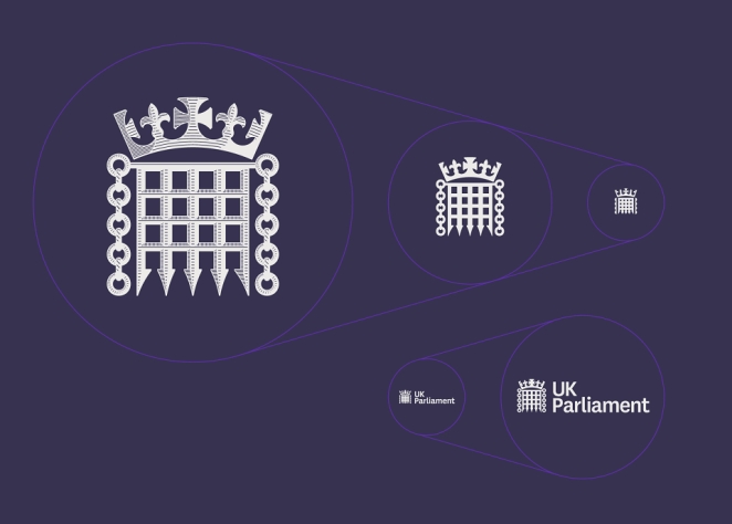
Make sure your mark works in every critical scenario and ask: Does it retain its essence at very small sizes? Is it legible in black-and-white or low contrast? Does it still read clearly on mobile screens, or on fabric and signage?
Icons and social avatars should look crisp, and the logo should remain distinct when blown up large. If anything looks fuzzy or loses meaning, the design needs refining. Simplification and consistency are the cure: a bold, confident shape or type choice (strong contrast and clean lines) will carry through these tests smoothly.
A System That Works Everywhere
Tasmin Otter-Lunn
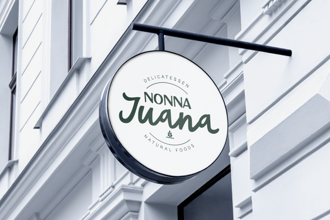
Great identities operate more like brand identity systems that work across all touchpoints. From tiny app icons to TV ads to storefront signs, the elements of a visual identity must scale and adapt while feeling consistent. As Aitkenhead puts it, an identity must “work everywhere… creating a feeling of consistency and trust every time someone sees them.”
Building such a system means defining a cohesive visual language beyond the logo alone. It includes colour palettes, typography, layout principles, photography style, icons and graphic motifs, all with a shared logic. These components combine to form a brand style guide or design system. When done right, the system ties every piece of communication together.
In fact, the Edelman Trust Baramoter indicates that brand consistency directly builds trust: 71% of consumers say inconsistent branding causes confusion in the market. In contrast, consistent use of logos, colour schemes, and typography makes people feel confident in what your brand stands for.
To ensure your identity works everywhere, invest in flexibility and governance:
Flexible components
Build variations of your logo (icon-only, wordmark, monochrome, etc.) so it always fits the format. For example, Google’s multicoloured “G” icon is used on small screens, while the full wordmark appears on the website; yet both feel like the same brand. IBM’s famous “stripe” motif too appears on everything from its website to event stages, proving how a modular element can tie multiple applications together.
Comprehensive guidelines
Document every rule in a complete style guide or brand portal. These guidelines should outline exactly how to use the logo, which colours to use, permitted fonts, imagery styles, spacing and tone of voice.
Asset management
Use digital asset libraries or portals so the team always grabs the latest approved logos, fonts, and templates. This prevents rogue or outdated versions from circulating.
Training and governance
Treat your employees and partners as brand ambassadors. Train them on the identity guidelines and the brand’s story. Regular reviews and a clear process for approving any new creative work (a “brand governance” team) keep the brand identity consistent over time.
Building this infrastructure (flexible assets plus clear rules) pays off in trust and efficiency. Every time customers, staff or partners see a touchpoint, it should immediately feel like it’s part of the same brand family. That seamless experience reinforces credibility and recognition.
Connection with People and Building Legacy

JSR Agency
The best identities resonate emotionally and become symbols of meaning for everyone who encounters them. They inspire pride in employees, confidence in customers, and a sense of shared purpose. In the words of Aitkenhead, at their best, brand identities “connect with people. They make employees proud, customers confident and partners feel part of something bigger… They become symbols of shared belief and long-term value, not just logos on a page.”
Consider how a well-designed brand can boost trust and loyalty. Consistent branding across visuals, tone of voice, messaging and experience signals professionalism and reliability, reassuring customers that they know what to expect. Over time, as a brand repeatedly delivers on its promise, customers form an emotional bond. “Good branding speaks to the heart, not just the head,” the study emphasizes.
When people feel an emotional connection (for example, Apple fans identify with innovation and “cool”, or Rolex buyers feel heritage and “luxury”) they become loyal advocates. Iconic ad campaigns (think the John Lewis Christmas ads) also show how associations like family and tradition get attached to a logo through storytelling.
Internally, a strong identity fosters belonging. A purpose-driven brand clarifies why the company exists and what it values. When employees know what the brand stands for, and feel proud to represent it, they’re more engaged, motivated, and aligned.
This alignment of culture and visuals makes everyone (from new hires to long-term staff) feel part of something meaningful. That consistent internal experience “shows up in every customer interaction” too. Over time, the identity becomes shorthand for the brand itself: you see a logo or colour and instantly feel you know what the brand is about and what it means to you.
Of course, building a legacy takes time and brands must be able to evolve without losing their core. As companies grow or markets shift, the identity should adapt wisely and managing brand evolution requires a delicate balance between innovation and consistency. In other words, successful legacies come from steady reinforcement of purpose and values even as the look gets refreshed.
“Most importantly, they connect with people… At their best, visual identities become symbols of shared belief and long-term value,” observes Paul Aitkenhead. Indeed, an identity that genuinely reflects a brand’s mission will, over years, become etched into the public consciousness as a badge of trust and belonging.
For a brand aiming for longevity, the visual identity must evolve carefully so that every tweak honors the founding purpose. This is the best way for recognition and meaning to endure.
Five Key Traits of Top Visual Identities

PepsiCo Design & Innovation
When you look across the world’s most successful brands, five traits consistently stand out:
1. Purpose-anchored
The identity is grounded in the organization’s mission and values. For example, Patagonia’s logo and earthy colour palette reinforce its environmental mission, while its campaigns highlight activism. Similarly, Innocent Drinks uses simple, friendly graphics to reflect its commitment to healthy, sustainable products. In short, every design choice answers “why do we exist?”.
2. Clear, simple and confident form
Leading brands have marks that are instantly legible and bold. Think again of Nike’s swoosh or Apple’s apple: one clean form with personality. These logos convey confidence without fuss. By contrast, overly busy logos dilute the impact.
3. Flexible across applications
A top identity scales and adapts elegantly. Take Google’s branding: its simple letterforms and colour motifs work on tiny smartphone screens and huge billboards, from search results to self-driving cars. Or IBM: its striped motif applies across stationery, websites and office interiors. Each element can be rearranged (horizontal/stacked logos, black-and-white variants, icons, etc.) without losing coherence.
4. Consistent and governed
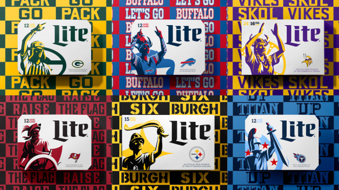
The brand uses a well-maintained system of guidelines. All assets (logo files, colour codes, fonts) are documented and centralized. Coca-Cola’s unmistakable red-and-white treatments, for example, appear uniformly from vending machines to social posts. Having clear rules (and a team to enforce them) ensures no rogue fonts or colours creep in. Consistency fosters trust: consumers recognise your product and company when the visual message never wavers.
5. Emotionally connected and enduring
Beyond immediate recognition, top identities tap into feelings and culture. Disney’s logo and wordmark evoke nostalgia and magic, BMW’s roundel signals performance heritage, and Vodafone’s speech-mark swoosh conveys communication and approachability. These symbols become emotionally loaded as mean fans feel loyal to the Mercedes star. Over decades, such connections turn logos into icons of shared identity and value.
Together, these traits create a complete package: an identity born of purpose, distilled to essentials, applied everywhere with care, and invested with meaning that lasts.
Common Pitfalls and How to Avoid Them
Design Bridge and Partners
Even smart organizations stumble in the identity game. Here are some common traps and how to steer clear of them:
Redesign without strategy
Simply updating a logo without clarifying brand goals is a recipe for disappointment. Instead, start with strategy, not style. Ask: What’s our purpose, values and audience? As branding consultants note, successful rebrands begin by understanding “a company’s history, values, and future goals. Avoid jumping straight into aesthetics; get the brief nailed down first.
Chasing trendy looks
Trends date quickly. Bright gradients, complex illustrations or gimmicky fonts might seem hip now, but they can make an identity look tired in a few years. Instead, favour timeless principles: simple shapes, classic type, and meaningful symbols. Trendy details can be layered on later, but the core mark should stand on its own.
Failing to build a system
Some brands treat a logo redesign as a one-off. Without a comprehensive system and guidelines, the new logo will be misused. To avoid inconsistency, always develop an identity system, not just a logo. Document all colours, fonts, imagery styles and usage rules. Many brands now create online brand portals where anyone can download the correct assets.
Neglecting internal stakeholders
A visual identity lives on internally as much as externally. If employees don’t understand or buy into the new identity, the brand can feel hollow. Involve your people early, educate them on the brand story and new style. Encourage internal pride (e.g. brand swag, launch events) so they become ambassadors. When teams understand the company’s mission, values and direction and feel proud of them, the brand comes alive from within.
Scaling failures
Forgetting to test real-world use is a common mistake. Always check how the identity works at every size, on every medium. Print some stationery, preview it on mobile apps, mock up an outdoor sign. If anything falters (blurry lines at small scale, illegible text), iterate the design. Remember that a solid logo should ideally work at a minimum size of around one inch, without loss of detail.” Always compromise on flair if necessary to keep clarity intact.
Effectively it all boils down to doing your homework on why the brand exists, then building the brand identity system from there. Collaborate closely with designers, set up clear rules for deployment, and involve both the C-suite and frontline teams in understanding the change. With a strategic, disciplined approach, you’ll avoid the pitfalls that dissolve brand value.
The Path from Sketch to Symbol
SomeOne
In the journey from logo to legacy, every stage matters. It typically goes like this:-
strategy → design system → rollout → experience → legacy
You begin with mission and values, then translate them into a versatile visual system. You roll out that system thoughtfully (with training and checks). Over time, as every marketing piece, every packaging, and every social post reflects the same identity, the brand lives through people’s experiences. Eventually the mark comes to mean something on its own – shorthand for all the memories and trust it’s built.
As Paul Aitkenhead sums up: when done right, a logo and its identity become “symbols of shared belief and long-term value”. Think of any enduring brand symbol that stands not just for a product, but for an idea or community. The Nike swoosh has become a symbol of athletic aspiration and excellence, and the Golden Arches stand for a quick, familiar meal experience around the world. In each case, the symbol conveys meaning far beyond its graphic form.
To fellow creatives and brand leads reading this: always remember that your design work will outlive the current campaign. An identity is an evolving asset. Invest in its lifecycle. Start with the right foundations, ensure consistency in execution, and stay true to the core story through every tweak. Over years, this is what turns a simple logo into a powerful legacy.
Logo Alone Isn’t Enough
Design Bridge and Partners
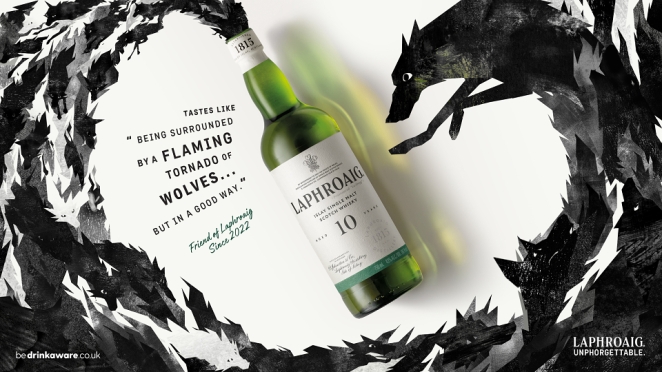
In a crowded marketplace, logos scream but the strongest identities speak. When visual identity is built on purpose, executed with simplicity and confidence, applied consistently everywhere, and imbued with emotion, it transcends being mere decoration. It stands the test of time and becomes part of culture.
Ask yourself: Is your brand identity telling the story you want? Does every element work together? If not, it’s time to dig deeper. Remember, your logo alone won’t do the job. The real power lies in the narrative and system behind it. Treat your visual identity as an evolving legacy, not a final product. By aligning design with meaning today, you set the stage for trust, recognition and loyalty tomorrow.
Ultimately, what the best visual identities have in common is not complexity but cohesion, clarity and purpose. A successful brand visual identity unifies every touchpoint with consistent logo use, colour palettes, typography, imagery and graphics, creating a memorable visual language that reflects the brand’s personality and values.
Over time, this consistency fosters trust, strengthens recognition and builds emotional connection. Whether a fledgling startup or an established powerhouse, investing in visual identity design is a long-term commitment to defining how a brand looks, feels and endures.
How Creativepool Can Help You Find Your Visual Identity
Just as great branding takes more than a logo, finding the right creative partners takes more than a single hire. Creativepool is here to connect you with the talent and agencies who can bring your brand identity to life on every level. Whether you need a visionary designer or a full-service studio, our platform makes it easy to find the right fit for your purpose-driven project.
Hiring an Individual Through Creativepool
Design Bridge and Partners
Know what you’re looking for? Use Creativepool’s talent network to browse portfolios of brand designers, visual strategists and brand architects.
Search and contact
You can filter by industry, style, or expertise (for example, someone skilled in corporate rebrands, packaging design or digital-first branding). Rich profiles and showreels make it easy to spot designers whose aesthetic and experience match your needs.
Post a Studiogig
Need identity work fast, and want fresh ideas from multiple creatives? Post a detailed brief (logo redesign, identity system, brand refresh) on our Studiogig platform. Qualified designers and studios will come to you with proposals (often within hours) pitching how they’d tackle your project.
Post a job
If you’re building an in-house team for branding (say, hiring a Brand Manager or Creative Director), list your opening on Creativepool’s Jobs Board. You’ll reach a community of designers and brand experts actively looking for full-time roles. Specify the skills you need (brand strategy, logo design, multi-channel campaigns) and get applications from people who live and breathe branding.
Hiring a Studio to Lead Your Visual Identity
For a wide-scope identity project, you may want an agency partner to handle everything from strategy through rollout. Creativepool can help there too:
Find a studio
Use our filters to discover agencies that specialize in branding and identity. You can search by media (graphic design, packaging, digital), by sector (finance, fashion, tech) or by platform (mobile-first branding, experiential design). You’ll find agencies with proven track records of building lasting brand ecosystems, not just one-off logos.
Post a brief
If you want to compare creative visions, submit your project on Creativepool with your goals, audience and budget. Brand and design studios in our network will respond with concise pitches (outlining their concept, approach and timeline) so you can pick the best strategy fit.
Get support
Unsure how to craft your request? Creativepool’s industry insiders can advise on best practices for briefs and process. You can chat live during your post or reach out to our creative-services desk for guidance.
At Creativepool, we believe a great brand identity belongs to your company, to your culture, and to your customers. By connecting you with creators who think deeply about meaning as well as form, we help turn your branding needs into visual legacies.
Need help?
Our team is always on hand to assist. Whether you’re searching, posting or interviewing, Creativepool’s network and experts are ready to help shape a brand identity that truly belongs.