
Colour is a subjective thing. For one thing, we have no earthly way of knowing if what I perceive as red looks anything like what you perceive as red (not really, anyway) and then there’s the emotions we inexorably tie to certain colours; green might mean nature and calm to one person but fear and childhood to another. It’s undeniable, however, that certain colours are tied to certain years.
So, what colours are we all going to be associating with 2024? This year’s colour trends represent a mix of serene, earthy tones and bold, expressive hues, reflecting a collective desire for comfort, inspiration, and a touch of the extraordinary in a world on the cusp of pulling itself apart.
Colours
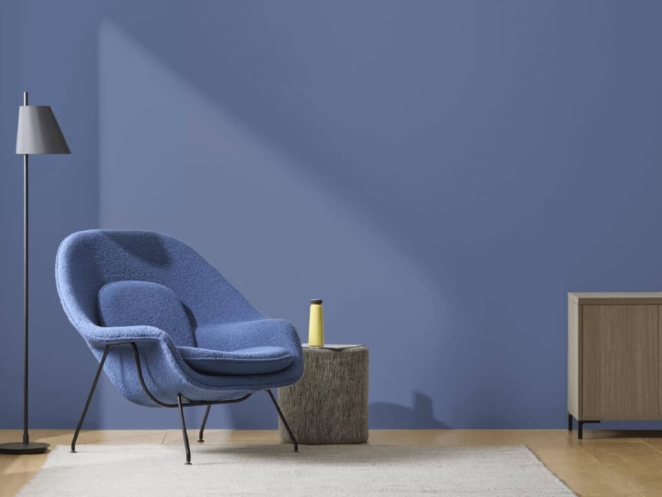
Blue Nova: The Rising Star
One of the standout colours of the year looks set to be the subtle darkness of Blue Nova, a mesmerising blend of violet and blue. This elevated, sumptuous hue is a testament to a growing preference for deep, immersive colours that provide a sense of tranquillity. It works in so many different contexts too. In fashion, for example, this colour works well in fabrics that range from light, airy silks to more substantial wools and synthetics. For graphic design, meanwhile, Blue Nova offers a dynamic backdrop or accent colour, ideal for creating visually striking layouts and brand identities that exude confidence and depth.
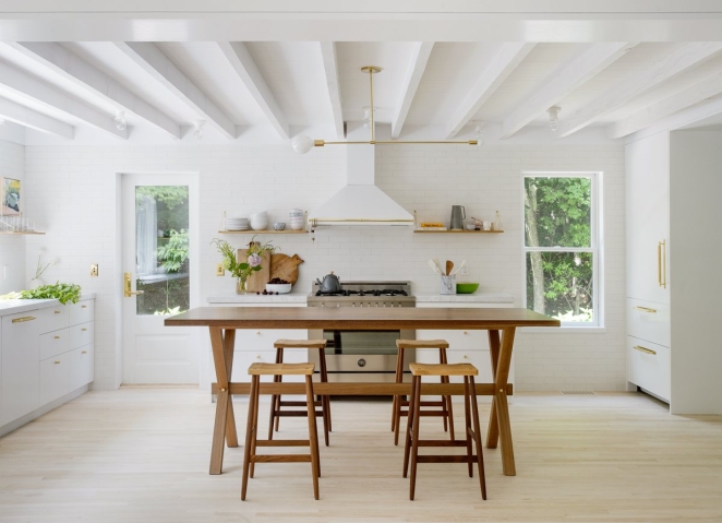
White Opulence: Serene Queen
White continues to be a timeless and versatile choice in the palette of 2024. Among the various shades, White Opulence stands out. This particular shade of white has a unique adaptability that makes it a perfect companion for both minimalistic styles and more vibrant colour schemes.

Cappuccino: Delightful Warmth
Moving into warmer tones, Cappuccino offers a cozy and inviting atmosphere. This neutral, earthy hue strikes a balance between a rich brown and a comforting softness, reminiscent of everyone’s favourite coffee drink. Cappuccino's versatility allows it to pair well with both bright and subdued colours.
Conch Shell: Understated and Earthy
With its understated orange hue. This colour has a muted yet distinctive presence, offering a blend of earthy and pastel tones. This would be a great choice for digital design and UI/UX as it can be used to create a user interface that is friendly and approachable, enhancing the user experience by providing a sense of comfort and ease.
Trends
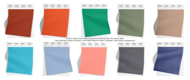
Pantone's Colour Palette: A Spectrum of Possibilities
Pantone, arguably the global authority on colour, has unveiled a range of captivating hues for Spring 2024 that look set to dominate the fashion and design industries. This selection includes a refreshing mix of vibrant and soft pastels, from the zesty Orangeade to the soothing Pastel Lilac. I see these colours being used in product design to infuse everyday objects with a little more personality.
Earth Tones: Back to Nature
A trend towards natural, earthy colours means an emphasis on hues that evoke a sense of calm and connection to the environment. Warm, inviting tones that reflect the natural world are increasingly popular, providing a comforting counterbalance to the fast-paced, digital-centric life. These colours help buildings and outdoor spaces blend seamlessly with their natural surroundings, promoting sustainability and ecological harmony.
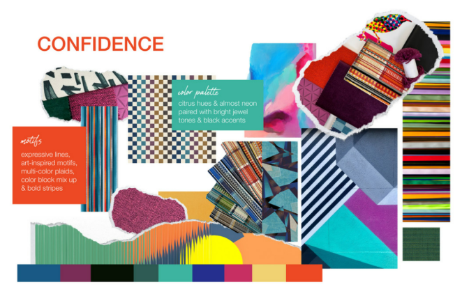
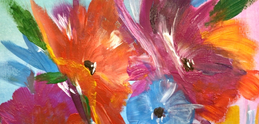
Bright and Bold: A Dose of Optimism
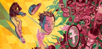
In a departure from the understated, this year also welcomes bright, bold colours that radiate optimism and energy. These colours are all about making a statement. Think vivid oranges, electric blues, and lively greens; colours that grab attention and convey a sense of excitement and fun. These colours can be used in campaigns to create memorable and impactful visuals. In film and television, they can be used to set a specific tone or mood, or to signify key themes and characters.
Soothing Neutrals: Timeless Elegance
Neutrals will remain a staple in the colour trend palette of 2024, offering a timeless elegance that complements any design style. From soft whites to gentle greys, these hues provide a perfect backdrop for both minimalist and eclectic concepts. They also offer a canvas for experimentation, allowing other colours to pop and textures to stand out. These colours are also generally very versatile, allowing for the incorporation of other accent colours or design elements without feeling overwhelming.