
When UKTV set out to unify its expansive portfolio of beloved channels and services under a single, cohesive identity, it wasn’t just about a fresh coat of paint; it was about creating a vibrant and flexible brand ecosystem built to thrive in a digital-first era.
In this exclusive conversation with Peter Allinson, Head of Design at UKTV, we delve into the thinking behind the newly unveiled “U” brand – a master identity that balances the character of long-standing favourites like Dave and Drama while embracing the demands of future-facing, on-demand audiences.
Discover how innovative design, meticulous strategy, and a human-centred approach guided the UKTV team through a transformative journey, bridging linear television heritage with a streaming-savvy future.
What was the brief for the rebrand?
The brief was to create a unified master brand, to bring UKTV's free-to-air and pay channels together under a single cohesive identity. We wanted to shift from a ‘House of Brands’ model to a unified Branded House, making the brand easier to navigate across platforms and ensuring it was adaptable for both traditional and digital-first audiences.
The goal was to simplify the user experience and leverage the strength of individual brands, such as Dave and Drama, while positioning UKTV for long-term growth. The rebrand needed to reflect the company’s move towards becoming a digital-first, audience-led business, emphasising accessibility, diversity, and quality. It was also crucial to enhance UKTV’s brand recognition and create space for seamless cross-promotion across our network of channels and services.
The challenge was to do this without losing the unique personality and equity of the well-loved channel identities. The solution had to appeal to a broad audience, from loyal linear viewers to new digital-first users exploring free streaming options.
How did the initial pitch/brainstorming phase go?
The brainstorming phase was highly collaborative, involving UKTV’s in-house teams alongside agency Wolff Olins, who helped develop the foundational brand strategy and design system. Early discussions focused on creating a master brand that would unify UKTV’s channels while allowing each to retain its individuality.
A key breakthrough was recognising that the U shape itself could serve as the heart of the brand's identity, offering an adaptable, tactile, and warm visual element that could link everything from channel logos to digital navigation. The team also emphasised accessibility and ease of use, which influenced both the visual identity and the creation of digital brand guidelines to ensure a smooth rollout across platforms.
Describe the purpose of the brand and its target audience
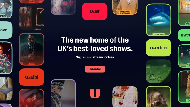
The purpose of the U brand is to create a unified ecosystem that simplifies navigation for viewers across all UKTV channels and services, connecting traditional and digital platforms seamlessly. U aims to serve a broad range of viewers, from long-time fans of UKTV’s linear channels to new, digital-first viewers who are looking for high-quality, free-to-access programming.
With over 8,500 hours of diverse content spanning drama, comedy, factual entertainment, and more, U is home to some of the UK’s best-loved shows. By emphasising inclusivity and accessibility, U appeals to a wide audience, inviting viewers to “lose themselves in what they love.”
What was your thinking behind the rebranding solution?
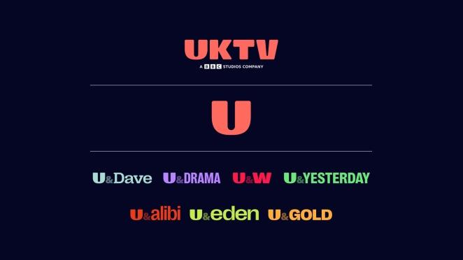
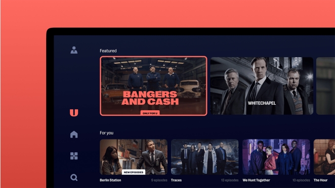
The rebranding solution was focused on creating a system that was as versatile as it was distinctive. The U logo was designed to be bold, memorable, and flexible through its soft, curved shape. These curves extended throughout the design elements, influencing navigational elements and a bespoke suite of over 80 icons, which were crafted to reflect the brand's unique aesthetic.
The system was modular, allowing each channel to maintain its individuality while still fitting seamlessly into the broader U master brand. For example, Dave became U&Dave, while streaming service content categories and FAST channels followed the same principle on digital platforms.
This design approach was integrated into nearly 20,000 assets, including animations, icons and sonic branding, providing consistency across digital and traditional TV platforms. The development of digital brand guidelines was another crucial part of the solution, offering a resource to ensure that the brand was applied consistently across all touch points and by teams both internally and externally.
Did you learn anything new during the project?
One of the main lessons from the rebranding process was the importance of internal alignment. Ensuring that UKTV’s teams understood and embraced the new identity before launching it externally was crucial, which is why the creation of the digital brand guidelines was essential. Another key takeaway was the significance of modularity in design. We learned that creating a flexible system that could adapt across different platforms without losing coherence was vital in today’s media landscape.
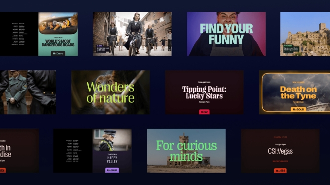
Additionally, the scale of asset creation—nearly 20,000 items—was a logistical challenge that we hadn’t anticipated to that extent. Lastly, the project highlighted the value of cross-disciplinary collaboration. By working closely with Wolff Olins, UKTV was able to create a multifaceted brand that balanced creativity with functionality and offered an opportunity to work with talented and passionate individuals.
What was the biggest challenge? How did you overcome it?
The biggest challenge was unifying such a broad portfolio of brands without losing the distinctive personalities and equity of each channel. This was addressed by creating a modular design system that allowed each channel to retain its individuality while staying connected to the master brand.
For example, channels like Drama maintained their unique tone and audience focus, while still being integrated into the U brand through the U logo and design language. The thoughtful integration of the design system and visual language helped create a consistent identity across all platforms.
To further ease the rollout, the digital brand guidelines provided a clear, centralised resource, helping ensure consistency across the entire portfolio while allowing for customisation when needed.
What kit/tools/software were used to create it?
The rebranding solution leveraged a combination of tools to execute the design across various mediums. Adobe Creative Suite was the primary toolset, with Photoshop and Illustrator used for design work and After Effects for motion graphics and animations. Figma played a key role in collaborative design and prototype creation, while the brand guidelines were built on a custom platform developed by Standards.
What details are you most proud of any why?
We’re particularly proud of the adaptability of the U design system. The U logo’s bold curves and modular design make it instantly recognisable and versatile, enabling it to work across a range of platforms without losing its identity. The digital brand guidelines are another point of pride, as they offer a modern, user-friendly approach to internal communication, ensuring the brand is applied consistently across all touch points.
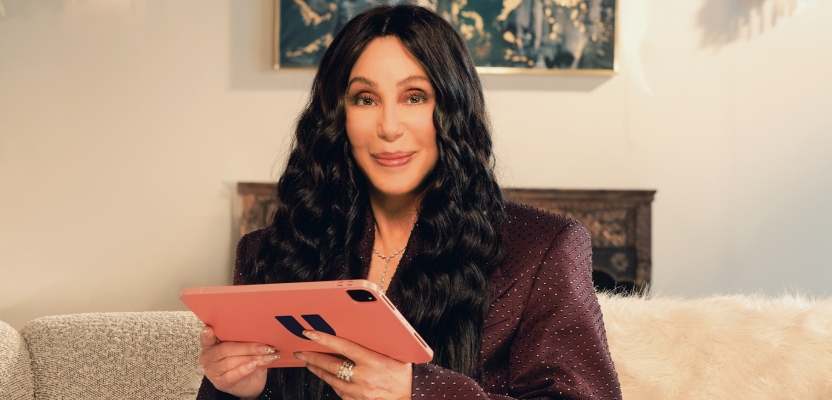
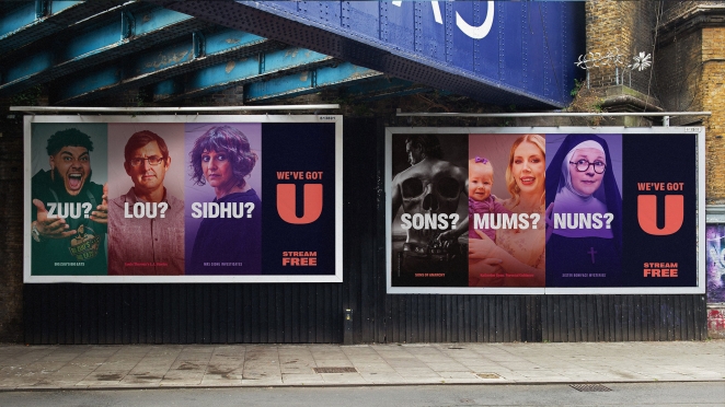
The sonic branding adds an emotional layer to the brand experience, creating a sense of excitement and anticipation for viewers. Finally, the Cher-led ad campaign helped bring the rebrand to life in a memorable way, encapsulating the playful and audience-focused spirit of U.
What visual influences fuelled your solution?
The U logo’s soft, curved design inspired much of the visual system. The tactile, human feel we wanted to achieve was carried through into the iconography, animations, and overall design language. The use of curves and fluidity reflects a broader trend in modern branding that emphasises flexibility and adaptability.
The vibrant colour palette and dynamic animations underscore the brand’s energy and inclusivity. We also ensured that all decisions would pass accessibility standards – for instance colours have AAA combinations to meet the highest standards of contrast, and fonts are typeset to be legible and accessible at varying sizes.
What do you hope it achieves for the brand?
The rebrand is designed to simplify navigation for viewers, unify UKTV’s diverse offerings, and create a brand identity that is both recognisable and adaptable for the future. By connecting the company’s family of channels and streaming services under one master brand, U aims to bridge the gap between linear TV and digital-first platforms.
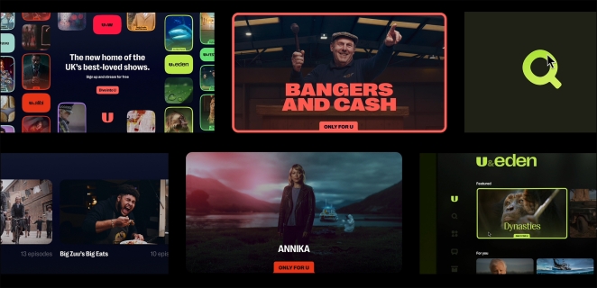
The goal is to attract new viewers while retaining loyal audiences, providing them with a seamless, high-quality viewing experience. Ultimately, U is intended to support UKTV’s long-term growth as a digital-first, audience-led business, providing a scalable system for the future.
How do you ensure consistency in brand messaging and visual identity across various channels and touchpoints?
Consistency is maintained through the modular design system, which provides a clear visual framework while allowing for customisation. This ensures that each channel retains its unique personality but still feels part of the broader U brand. The digital brand guidelines serve as the central resource for all teams, helping them understand how to use the brand elements correctly across platforms.
Regular communication and collaboration between in-house teams ensure that every output aligns with the master brand’s vision. From television to digital platforms, the brand’s messaging and visual identity are applied consistently, ensuring a cohesive viewer experience.
What role did consumer research or market analysis play in shaping the direction of the rebrand?
Consumer research and market analysis were instrumental in shaping the rebrand, particularly in understanding viewer preferences for content discovery. The insights gathered revealed that viewers were increasingly seeking personalised TV experiences, often preferring content that felt hand-picked rather than algorithmically generated.
This led to a focus on making the U brand feel personal, accessible, and user-friendly across both linear and streaming platforms. Additionally, research underscored the importance of retaining the strong equity that established channels like Dave and Drama had built over the years, which helped shape the decision to incorporate these channel names under the larger U brand without sacrificing their distinct identities.
Can you discuss any innovative or unconventional approaches you took in developing the rebranding solution?
An innovative aspect of the rebranding was the way the U logo, originally conceived as a simple letter mark, was expanded into a dynamic design system that could live and breathe across all channels and touch points. Instead of being just a static logo, the curves of the U logo influenced the development of fluid, adaptable graphic elements that were used in everything from channel animations to digital interfaces.
This approach was unconventional in that it took a core visual symbol and allowed it to grow and shift according to the needs of various platforms, making it not only a logo but a living, adaptable part of the brand. Another unique element was the use of sonic branding, which was integrated into the experience, adding an audio layer that helped deepen emotional engagement with the brand.
Were there any unexpected insights or discoveries about the brand that emerged during the rebranding process?
One of the unexpected insights during the rebranding process was just how deeply viewers connected with the established personalities of the individual channels. While the desire for unification was clear from an operational perspective, consumer research highlighted how important it was to retain the equity and familiarity of brands like Dave and Drama. This led to the decision to preserve their names within the U framework, allowing them to coexist with the broader brand while maintaining the core elements that viewers loved.
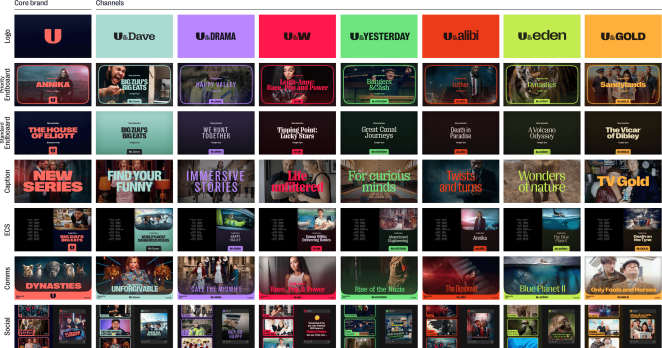
Additionally, as we refined the rebranding, we found that the emphasis on accessibility—through both design and content—was critical in ensuring that the brand resonated with all audience segments, not just digital-first users but also those more accustomed to linear TV.
How did you ensure that the new brand identity resonated with the brand's existing audience while also attracting new ones?
To ensure the new brand identity resonated with both existing and new audiences, we maintained shared design elements from UKTV’s established channels, like the modular elements derived from the U logo.
This preserved the familiarity that loyal viewers associate with their favourite channels, while incorporating subtle updates to modernise the overall aesthetic. Additionally, the brand was designed to be digital-first, ensuring it was well-suited for streaming platforms and other digital touch points.
By embedding accessibility standards—such as high-contrast colours and clear typography—we also made sure the identity was inclusive, allowing us to broaden its appeal. This combination of familiarity, innovation, and accessibility has successfully attracted a new, digital-savvy audience, while still engaging UKTV’s loyal base.
Can you share any behind-the-scenes anecdotes or memorable moments from the rebranding project?
A particularly memorable moment from the project was the intense process of selecting the U brand’s primary and secondary colours. The goal was to identify colours that would unify UKTV’s diverse portfolio while making sure the U master brand stood out.
After numerous iterations and team discussions, we settled on Coral and Navy for the primary colours. Coral was chosen for its warmth, vibrancy, and approachability, while Navy provided confidence, quality, and timelessness—key qualities of UKTV. But it was also a colorway not fully utilized in the on-demand space often saturated with blues and teals.
For the secondary palette, we selected a range of colours tailored to each channel’s unique identity, allowing each one to shine individually while still fitting into the broader U framework. This collaborative process ensured we arrived at a solution that would resonate with both internal stakeholders and audiences.
How do you ensure consistency in brand messaging and visual identity across various channels and touchpoints?
We ensured consistency across UKTV’s channels and platforms by developing digital brand guidelines that serve as a central resource for employees. These guidelines illustrate how to apply key brand elements—such as the U logo, typography, colours iconography, and tone of voice—correctly.
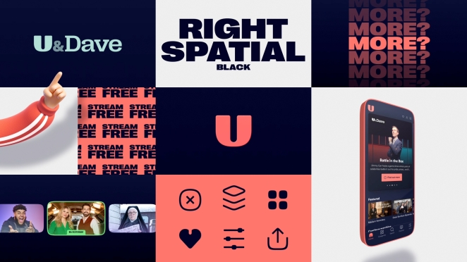
The modular design system, inspired by the curves of the U logo, provides the necessary flexibility for individual channel identities, while maintaining a unified visual aesthetic. To ensure alignment, cross-channel promotions were also implemented to reinforce consistent messaging and visuals. This cohesive system across all touch points allows UKTV to maintain a strong, consistent brand presence across its diverse portfolio.
What would you do differently if you could do it over again?
If given the chance to do it over again, we would have allocated more time for refining the finer details of the rebrand. This would have allowed us to plan more thoroughly for seasonal events and holidays, ensuring every element—from visuals to messaging—was optimised and prepared ahead of time.
Introducing a dedicated tone-of-voice document earlier in the process would also have helped align the brand’s language across all touch points, ensuring the brand felt as cohesive in its voice as it does visually from launch and beyond.
So far the rebrand has been a significant success, meeting its core objective of unifying UKTV’s portfolio under a cohesive and recognisable identity. Engagement across platforms has increased, and the new U identity has reinforced UKTV’s position as a digital-first, audience-led business.
The rebrand has enabled seamless cross-promotion between channels, strengthened brand affinity, and positioned UKTV for sustainable growth. The transition to a unified brand has proven to be both strategically sound and effective in driving long-term success.
Credit list for the work?
Creative Agency: U&Creative
Head of Design: Peter Allinson
Designers: Callum Parish, David Cameron
Project Manager: Charlie Eydmann
Design Producer: Sophie Bryant
Creative Producer: Kathryn Newton
Head of Production: Mary Claire Seiler
Creative Director: Scott Russell
Marketing Director: Nick Gilmer
Marketing Manager: Cheryl Vaz
Chief Marketing Officer: Penny Brough
Brand Design and Strategy: Wolff Olins
Senior Designer: Karina Stolf
Senior Engagement Manager: Alexandra Lewis
Creative Director: Steffan Cummins
Associate CD: James McNaught
Executive Strategy Director: David Stevens
Sonic branding: Zelig Sounds
Composer / Sound Designer: Matthew Wilcock, Joe Worters
Senior Producer: Breda Canning
Aleah Morrison-Basu
Icon Design: We Made This
Brand Guidelines: Standards
Hamish Smyth